Categories
data visualizations Visualization Tools

Visualizing Health

September 27th 2020 by Erika Kacprykowski


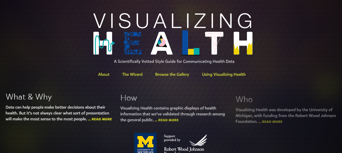
The Visualizing Health Website is a great tool to use as it is very easy to navigate. This website allows you to create infographics regarding health as well as a way to learn information about their health. There are four sections: About, The Wizard, Browse the Gallery, and Using Visualizing Health.

How We Created Our Images, About

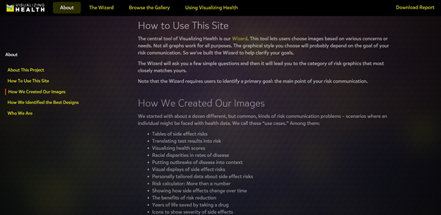
The About page is an introduction to the site. This section explains how to use Visualizing Health, some background to how they created their images, as well as who they are. I found this to be a great tool because it is important to understand where the information is coming from and if they are a reliable tool to use.

The Wizard

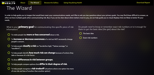
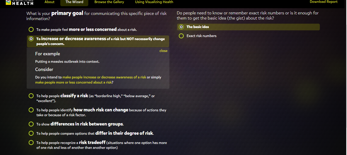
The second section of this website is The Wizard which allows you to search for specific infographic designs based on two questions. These include your primary goals and whether you want it to be general or specific. Once you select a goal, they even give you an example as well as a point to consider. This feature truly helps you understand the difference between the various goals and allows you to make the best choice in order to fit your own individual needs.

Screenshot of Browse the Gallery section

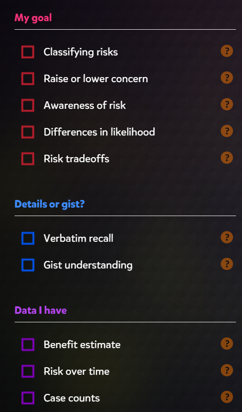
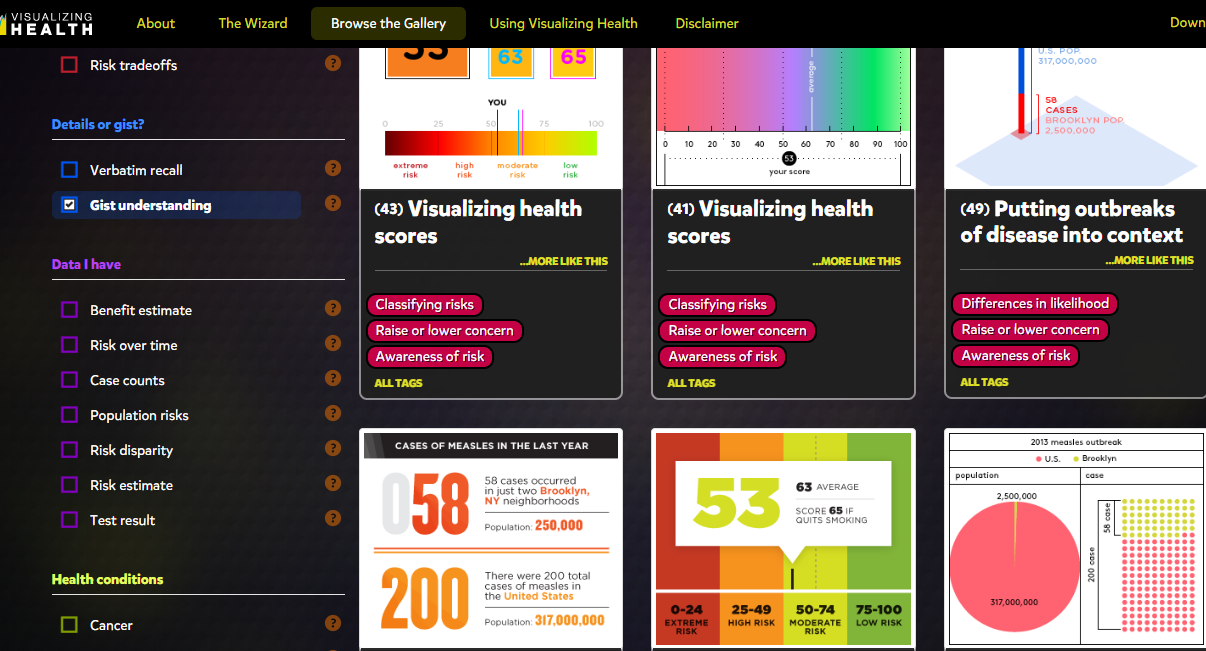
The gallery contains hundreds of charts and graphs based on your goals, wants, and needs. On the left hand side, you have the ability to filter your searches through there. These options include “My goal”, “Details or gist”, “Data I have”, “Health conditions”, and “Graphic type”. This section displays many different styles of graphics according on your own specific goals.

Using Visualizing Health, Risk Calculator

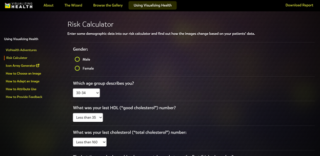
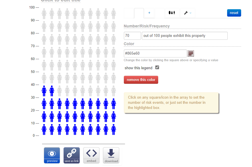
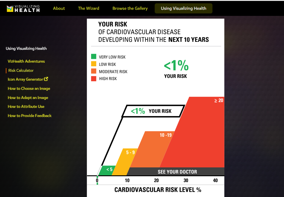
The last section of the website is a how-to page. There are options on the left side (see picture above) which explain how to select the correct image and how to adapt that image as well. This is a great addition for those who are beginners and would like some more help.

Conclusion

This is a great tool for any and all health professionals, including myself. The ability to filter and sort through hundreds of data visualizations is super helpful. It is amazing that there is now a site geared more towards a specific audience. There is a ton of information out there on the internet and it can be difficult to navigate. Visualizing Health seems like a great site I can see myself using.

Categories
data visualizations Uncategorized

Visualizing Health

An interactive website that helps pair visuals to medical information thus making it easier to communicate with patients. The website itself is well organized and is easy to navigate; The University of Michigan also lays out its goals and objectives for the website on the home page.

As I navigated through the website, I found a tab labeled “The Wizard” which asks two questions to help guide users toward an image that helps display the information they want to transmit.

Once past the questions on “The Wizard” then the site guides you to a page that displays multiple colorful images to the right and down the left-hand side is a widget that a user can elaborate more on what they are looking to create.

The generator was for Icon array, which transferred you to another website. On the page, ironarry.com, there were a few questions listed that help generates an icon graph, like posters seen in a doctor’s office. The generator also had options of changing the icon on the chart, male, female, etc.

Being a new user to this website, I decided to try out the calculator, it asked a few simple questions and within seconds I had an easy-to-read visual before my eyes. I was honestly surprised by how simple the chart was to read and I think it is a wonderful tool for people like myself who are usually confused by all the charts and analyze from a doctor’s office.

Overall, I think this website could be helpful to not just medical professionals or patients but to those who are trying to understand and grasp the concept of visual data. I feel like it explains and shows how each type of graph can portray specific knowledge and be used to target consumers in a simple and understandable form. I think what helped me tie in how well visualization can help the brain compute data was manipulating the data on the graphs and seeing it come to life, so to speak, in graph form. Even using the calculator, I was able to insert data I did not quite understand and receive an image that got straight to the point with little to no confusion.

Categories
data visualizations

Examples of Insightful Data Visualizations

I chose this topic to see what type of cool infographics were already out there that could offer us more of a conscious state to the world around us. I’ve been a scientist for a while now, and I noticed that my curiosity with the facts only grows as time goes on.

U.S. Intelligence Funding. Courtesy of the NSA’s biggest whistleblower, Edward Snowden.

That’s a lot of money right? Imagine being in control of that amount of money and the only thing you chose to do with it was to spy on people. Notice how one specific area of spending is “Data Processing and Exploitation”. This is surreal when you think about how much of that money could go towards building communities instead of selling them things or watching them burn so they can mount a response. Terror attacks are to blame for a lot of this.

The world is increasingly dangerous, so I’m on the fence about government surveillance, but does it really take this amount of spending to get done on a yearly basis? Are we spending this much to analyze holes in people’s backyards without their consent? Are we watching people through walls from outer space using thermal vision? How much is actually going on in the world to require this? The money seems to speak for itself, as it usually does, which is the scary part. The U.S. intelligence budget has also increased every year. Yikes. Stranger danger. https://www.dni.gov/index.php/what-we-do/ic-budget

Mass Shootings. Loose motives.

Now, when you look at this graph compared to the last one you may think, “Oh yeah, that money was worth it.” There seems to be a really vile trend growing in America where American citizens are just straight up losing control of their mind and committing hideous acts of violence on their fellow man or woman. These are events that took place at complete random, where the shooter was most likely dealing with inner demons, and reached a deadly level of rage/depression where they could take out their vengeance on complete strangers.

Although these figures are always in the news for people to see, they only seem to be getting worse with most people’s only response being more guns or no guns. These figures also pale in comparison to the total homicide data. I feel that we need to switch the focus to addressing more foundational issues like parenting, bullying (physical/cyber/social), self-destructive tendencies, and mental illness. People are losing their identities more than ever, and shelling up as a defense maneuver. What we’ve come to know is that silence is deadly. Especially, when it comes to not talking about the real issues. https://www.cato.org/blog/are-mass-shootings-becoming-more-frequent

Categories
data visualizations Diagrams Infographics Visualization Tools

Course Hero

Course Hero is a website that provides students various study resources like study guides and textbooks, and their solutions. The one I am specifically going to talk about it their literature infographics. This resource helps students learn about a story’s characters, plot, themes, and more in a visual way. (I will insert an example they provide of a play named “Othello”). Depending on the type of story, the infographics have various information it will provide the reader with. They create colorful infographics with the theme of the story and draw out characters, shapes, and more to grab the reader’s attention. The website also goes into detail with what happens in the chapters, they describe the characters and how they change over time if you click “view study guide for this book”. I would recommend this resource for people who are struggling with understanding a book they are reading.

Othello infographic
Categories
data visualizations Examples Infographics

Insightful Data Visualisation

There are several very popular and well done data visuals that I find attractive and useful and I thought I would share

  1. Covid-19 Spread Data such as the one put together by the John Hopkins University. Probably my favourite data set put together in the last decade. The visuals change with data, it’s attractive, and it almost tells a ‘story’ of the Covid-19 and it’s behaviour around the world

2. Plastic Waste data Set. Made by National Geographic. It is kinetic, interactive , stimulating, and, even though some of it is not that pretty, they do that on purpose to show just how gross you should feel about waste.

3. Sydney Morning Herald’s sexual violence infographic.

this data set that was put together no doubt too much more research, and imagination, and time to put together. It is very interactive and tells a story with the data.

Source: https://en.rockcontent.com/blog/data-visualization-examples/