Categories
data visualizations

Benchmark Comparisons

Benchmarking by definition means “A standard or point of reference against which things may be compared or assessed”. This management tool has been around and widely utilized by many businesses for centuries. It may seem like a simple graph or picture, but it adds great quality and a deeper meaning to a story. It helps users understand performances between different organizations’ products and prices for example the rise and fall of the stock market.

10-K

T-Mobile uses pink in every advertisement, poster, or package, and the letter T stands out from other companies.
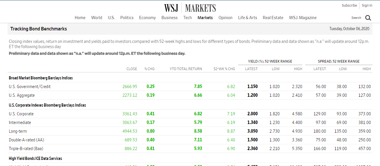
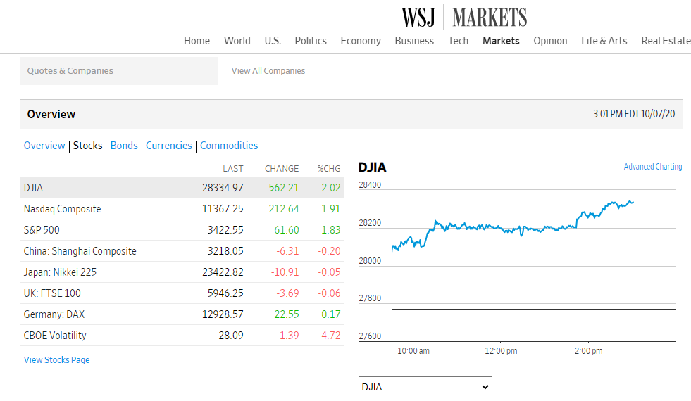
This is another way that WSJ uses benchmarks for comparisons.

The Wall Street Journal (WSJ) is a highly respected newspaper that uses a benchmark to compare the stock market, businesses, travel, and other topics of interest occurring in the U.S and around the world. One way WSJ makes comparisons is by using charts with line graphs to represent and explain data.

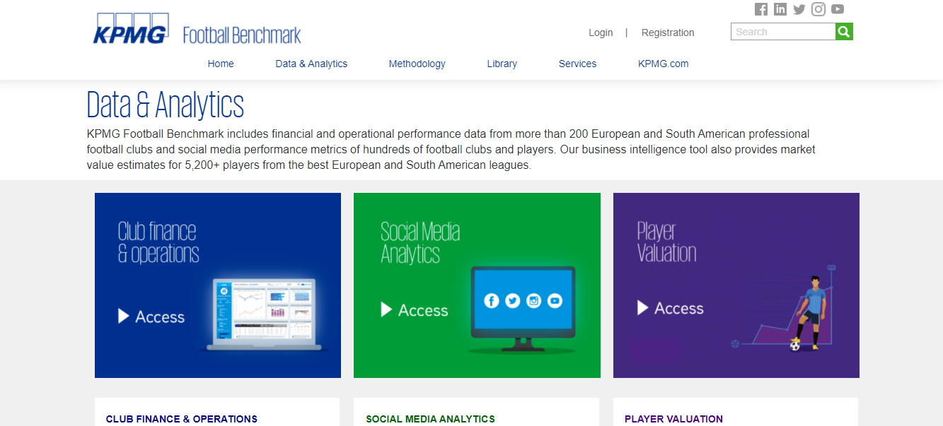
Football (Soccer) Clubs use benchmarks to compare games, players, financial opportunities across Europe, and Sout America. It also uses a benchmark to compare contracts for players.
https://footballbenchmark.com/data_analytics

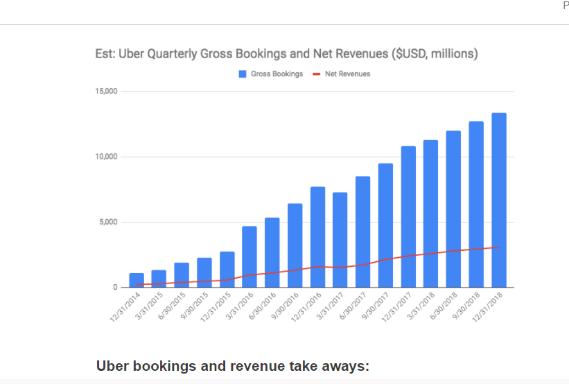
Here is another great example of a benchmark used to compare Uber Gross Bookings & net Revenues from 2014 to 2018. Based on the chart, Uber’s bookings and revenues were very impressive throughout the years.
https://www.rocketblocks.me/blog/uber-metrics.php

Categories
data visualizations

Benchmarks

October 11, 2020 by Erika Kacprzykowski

Benchmarks are added to graphs to add context and are commonly used throughout the media. Below are some examples found online:

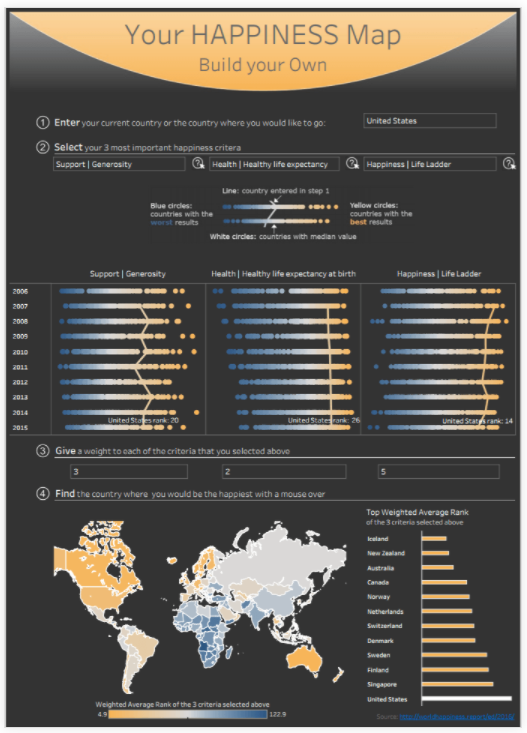
https://www.tableau.com/about/blog/2017/8/two-approaches-benchmarking-tableau-75859

In the image above, you can find the country where you’d be the happiest. By choosing your three most important happiness criteria, you have the ability to find the best country for you. Benchmarks are displayed as orange lines straight down the middle of the diagrams as well as colored dots showing countries with the worst and best results. This can be very helpful and is easy to read.

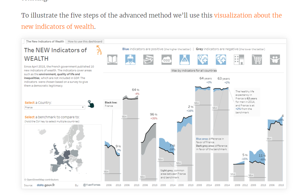
https://www.tableau.com/about/blog/2017/8/two-approaches-benchmarking-tableau-75859

This visualization about the new indicators of wealth cover areas such as environment and quality of life. As there is a lot of information here, benchmarks can be super useful tools in helping understand data. The light blue areas give you a difference in favor of the country selected, the light gray is the common area between the country selected and the benchmark, and the dark grey is the difference in favor of the benchmark. While some visualizations show benchmarks using lines, this one uses shaded areas.

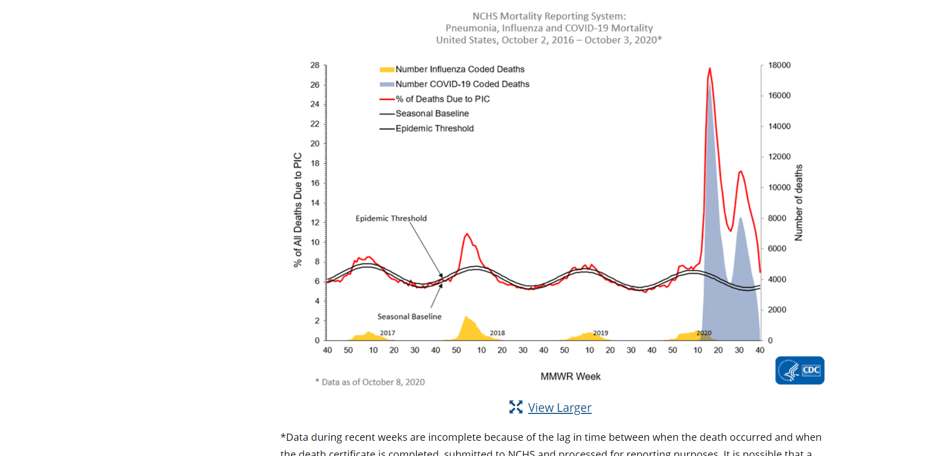
https://www.cdc.gov/coronavirus/2019-ncov/covid-data/covidview/index.html

This screenshot above from the cdc website shows mortality rates of pneumonia, influenza, and COVID-19 in the United States between October 2, 2016- October 3, 2020. The graph shows a seasonal baseline (benchmark) with a black line and uses different colored lines and colors to represent several categories.

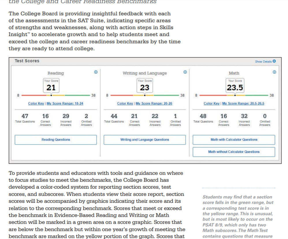
https://collegereadiness.collegeboard.org/pdf/educator-benchmark-brief.pdf

The College Board provides insightful feedback each year with assessments of the SAT exam. Your own score is compared with the corresponding benchmark in Reading, Writing and Language, and Math. These benchmarks are represented by different colors. Red- need to strengthen skills, Yellow- approaching the benchmark, and Green- met or exceeded the benchmark. As they mention, color coding for test scores and subscores show students if they are on the track for college readiness.
Conclusion

Benchmarks are a very useful tool in providing the audience with a number to compare the data to. Whether we notice them or not, they are used daily and can be displayed as lines, areas, different colors, etc.

Categories
data visualizations

Benchmark Infographics

Over this past summer, I was given the chance to upgrade my current laptop to a newer model. This presented me with the problem of deciding what kind of laptop I should buy and what parts I should be looking for. During my search, benchmarking infographics became the most important tool for finding the best deal for my needs.

PC Benchmarkers

There are a variety of free websites that allow you to test combination of PC parts to determine if they fit your needs. Each of these sites presents their results in the form of graphics relating their results to a general benchmark.

When evaluating the performance of a specific GPU, as pictured above, the results are presented based on their percentile position in comparison to other models. In this case, the percentile line serves as the benchmark that allows the observe to visualize how well the product they are looking at stack up to others.

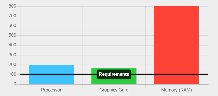
In addition to using the benchmark as an axis, other benchmarking infographics present their benchmarks as a more traditional minimum border. In the graphic above, the minimum requirements of a specific piece of software are presented as the benchmark. This border line allows the person viewing the graphic to see how well the parts of their PC are suited to the programs they wish to use.

It is also possible to turn the information you are studying as a benchmark itself, such as with this graphic. By doing this, you could compare other options and visually see which ones could be improvements.

Categories
data visualizations Visualization Tools

COMPARING NUMBERS

https://exceloffthegrid.com/the-ultimate-guide-to-slopegraphs-in-excel/

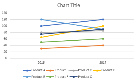
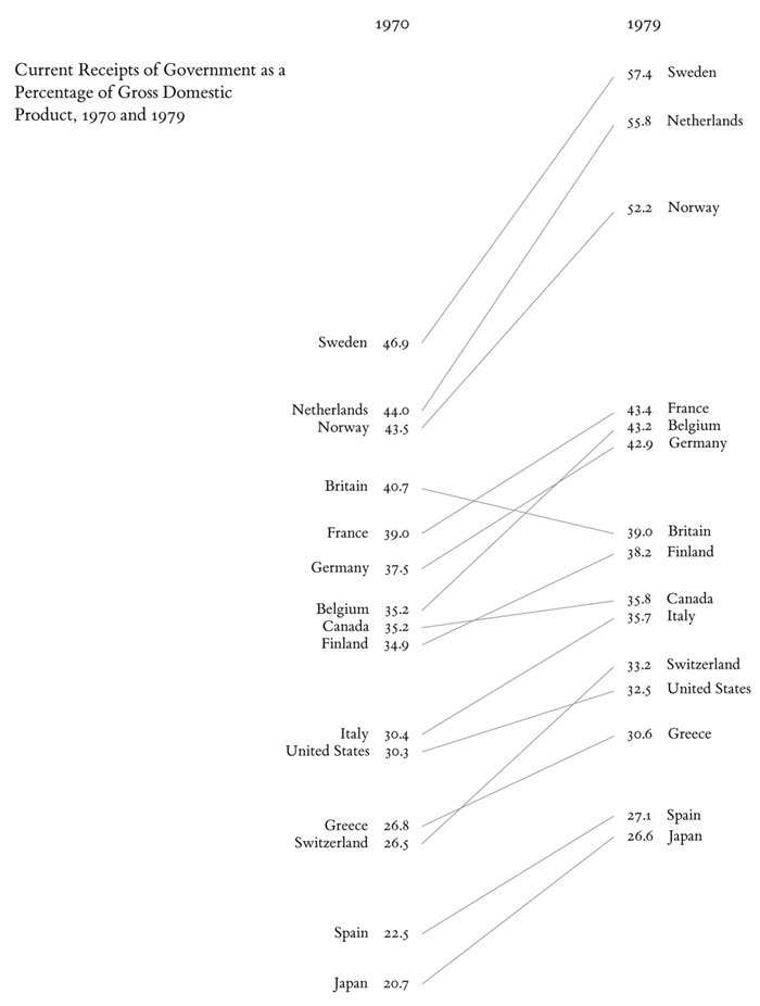
One amazing tools we can use when comparing 2 numbers is a slope Graph.

https://exceloffthegrid.com/the-ultimate-guide-to-slopegraphs-in-excel/

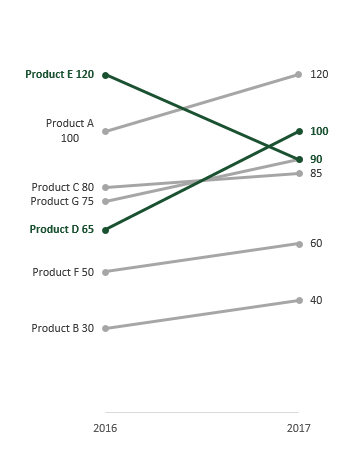
The Slopegraph, not to be confused with a “Slope Graph”, are very good at highlightingthe story of how just one category decreased when other categories increased.

https://www.visme.co/bar-graph-maker/

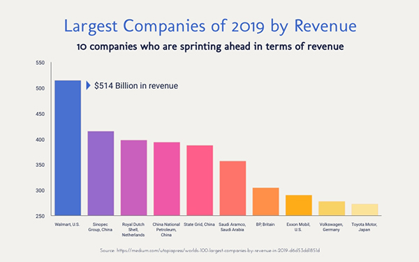
The thing about bar graphs and people, is that, even though humans are good at detecting length, making bar graphs advantageous. But they lack the nuianssce that is sometime neccesarry to make the story behind the data clearer.

The concept behind this data tool was first developed by Edward Tufte, an American Statistician.

https://washingtonmonthly.com/magazine/mayjune-2011/the-information-sage/

He is also the author of The Visual Display of Quantitative Information.

As Tufte notes in his book, this type of chart is useful for seeing:

  • the hierarchy of the countries in both 1970 and 1979 [the order of the countries]
  • the specific numbers associated with each country in each of those years [the data value next to their names]
  • how each country’s numbers changed over time [each country’s slope]
  • how each country’s rate of change compares to the other countries’ rates of change [the slopes compared with one another]
  • any notable deviations in the general trend

https://charliepark.org/slopegraphs/

Here is an Example of his original concept, directly from his book

Categories
data visualizations

Benchmark

First of all, I want to explain what a benchmark infographic is before I begin my comparison. The word benchmark itself means something that is used to mark a standard in which others can be measured by or judged by. So, it would only make sense if a benchmark infographic is a graph that portrays that same content as the meaning of the word. Benchmark graphs can be used in any style of visualization and simply serves the purpose of indicating where that standard lies within the graphic.

To be honest, during my research I expected to find more benchmark graphics that pertained to business. I expected to find graphs that involved a company’s earnings and if they are meeting their “minimal required business”. What I didn’t expect to find were Benchmarks that involved the current pandemic. In my mind, I didn’t see how exactly a benchmark would be implied for a virus.

http://health.hamiltontn.org/AllServices/Coronavirus(COVID-19).aspx

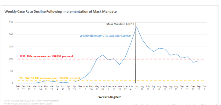
The graph above uses a double dashed benchmark line, the yellow is the standard before the outbreak and the red is the standard they would like to stay under for the number of new cases. the dark solid benchmark vertical line marks a significant period of time to use for further research.

https://news.utexas.edu/2020/03/26/a-new-texas-covid-19-pandemic-toolkit-shows-the-importance-of-social-distancing/

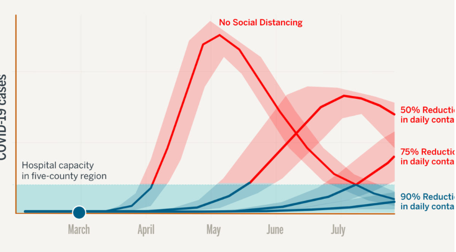
I found this way of indicating the bench line the most interesting because they shaded in a whole section that they wanted to highlight. The data set on the graph shows where some of the hospitals started at and even one coming back down below the 90% reduction mark. The colors are also very significant in the graph the benchmark being a cool calm blue and the data that exceeds the benchmark area is red as in hot, or dangerous.

https://www.cdc.gov/coronavirus/2019-ncov/covid-data/covidview/index.html

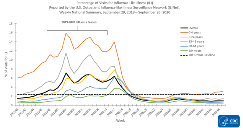
The above graph comes from the CDC and using the benchmark dashed line as the baseline mark. It is comparing weeks versus hospital visits for Influenza-like illnesses. The reason the benchmark line is here is to show the normal range as opposed to the spikes of visits. Giving a reader a visualization point to base measurements off of is important to accurately paint the picture.

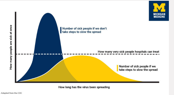
https://healthblog.uofmhealth.org/wellness-prevention/flattening-curve-for-covid-19-what-does-it-mean-and-how-can-you-help

This infographic uses a dashed line to indicate the number of people a hospital can treat at a time. Using a bell-curved graph to show the readers why it is important to take the steps and be precaution during the pandemic. They are indicating if people step up the curve stay below the benchmark standard.

The way I have understood the differences in the benchmark indicators is that if its a dashed line it seems to be more of a recommendation or goal. Whenever I’ve seen a solid line the information seems to be more important or must meet the requirement. I think if a line is colored it indicates the importance, the example above the double-lined benchmark had a yellow and red line, from my schema, I know yellow is cautious and red dangerous. I think it is important for people to understand what they are reading so, they don’t have to try to interpret the information and interpret it wrong. People need to be given a standard to base information off of as a way to compute it properly.

Categories
Color Scheme data visualizations Design Examples Pie charts

Comparing numbers!

Data visualizations can be very effective when comparing two or more numbers. They are a great way to showcase data and to convey a story through numbers. But conveying a story efficiently through data visualizations is not as simple as putting together a quick graph in Excel. There are many ways in which data visualizations can actually distract readers from the message or leave them feeling confused; when used properly they can be a powerful tool that can enhance your data. The video below illustrates how certain aspects of design such as color, size and orientation can enhance your data visualizations.

https://vimeo.com/29684853

While researching data visualizations comparing numbers, I came across two examples that stood out to me. This first visualization illustrates a poorly designed bar graph that has been overly labelled.

data visualization design 5

The graph to the left is distracting and there are several components that are fighting for the readers attention compared to the graph on the right that is simple and straight to the point. In this case, a horizontal bar graph which allows the reader to quickly read the information from left to right is a better choice than the vertical bar graph. Simplifying the graph by taking away the gridlines as well as some of the axis labels helps to reduce some of the clutter in the first graph.

The graph below is another visualization that stood out to me.

data visualization design 4

When creating charts or graphs, people tend to feel the need to distinguish each category with different colors (I know that this is definitely something I do as well). Comparing these two charts side by side, you can see how using different shades of a single color can be more effective than using 5 different colors to differentiate categories; keep in mind to make sure the shades are not too similar. Adding extra “design” elements to the chart is also unnecessary at times such as the black border around the pie graph and the pattern in the “mediocre” slice. By taking away some of these “chart junk” elements, the graph becomes more simplified and can be interpreted quickly and efficiently.

Categories
data visualizations Uncategorized

Comparing Numbers

Data is all around us, in different shapes and forms, and sometimes it is hard to decipher. Using visuals to compare data can make all the difference in comprehension, as long as itself is clear and concise. I found a video from Visme that gives a few pointers and explanations on how to improve Data Storytelling.

I felt it was important to share this video because comparing numbers is not just bar graphs and digits, it is a way to get information out to viewers. It is a type of storytelling that uses minimum words but insinuating on a focal point that helps the reader understand clearly.

Tools

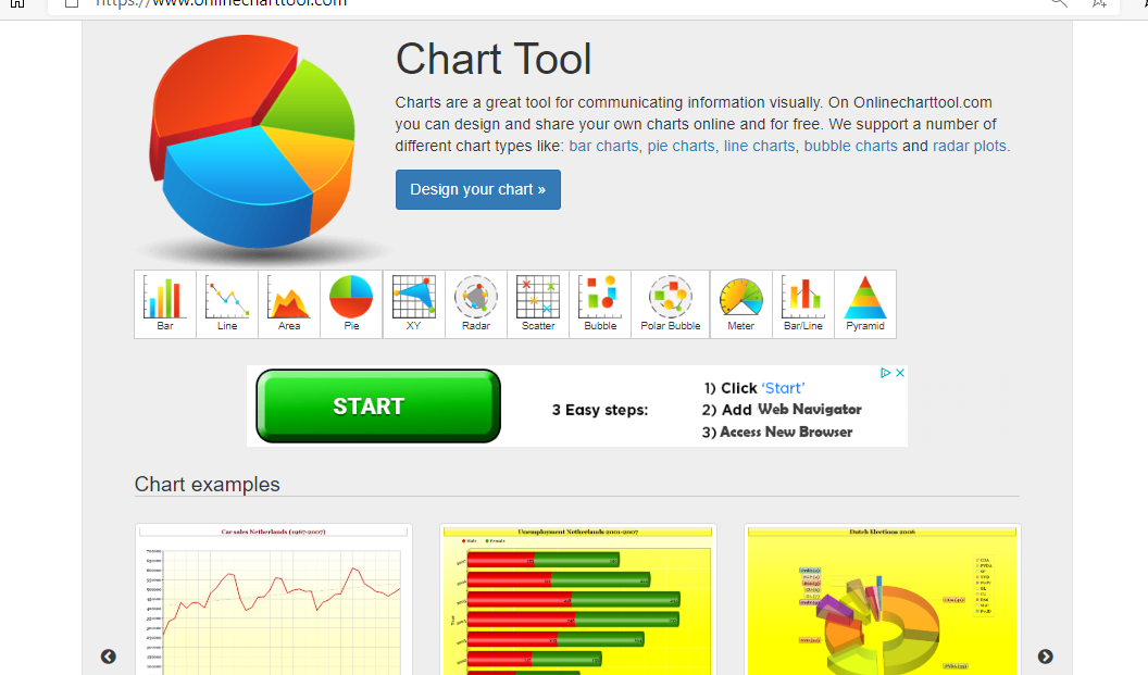
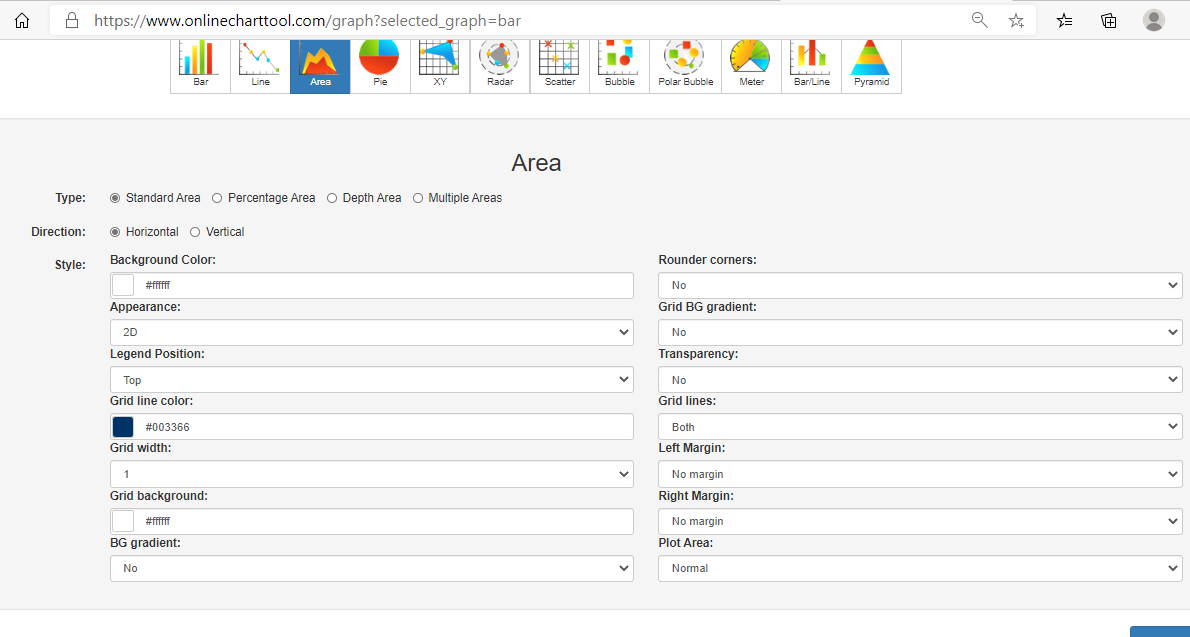
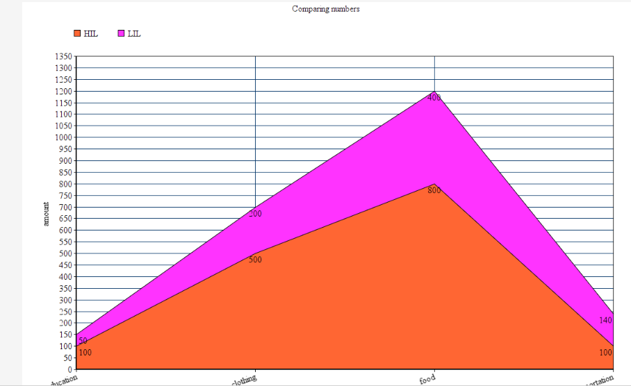
Online charts is a free website I found that is simple to use and can create a variety of charts and graphs in just a few minutes. It allows users to construct multiple types of charts and manipulate color, font, and data input.

Home page of Chart tools
Data input page
Finished Product

Users can download their graphs into different formats, such as, jpg. and pdf.

Covid-19 and Education

As I was looking through UNICEF’s website I noticed a separate link just for data and found some well-created infographics that are not only current and relevant but perfect examples of comparing numbers. Covid-19 has created devastation all over the globe and continues to do so today. Children around the world are feeling the impact due to the pandemic, not only home life but in their education. Below are a few infographics that I felt highlighted the five tips from the video above and accentuated their intended purpose while comparing numbers.

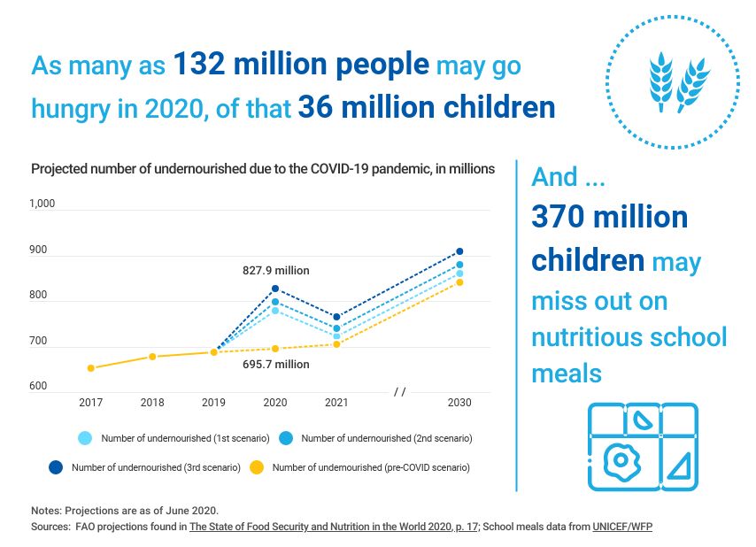
A well labeled graph comparing prior undernourished children to current and projected scenarios.

A representation of children affected by school closures due to Covid-19.
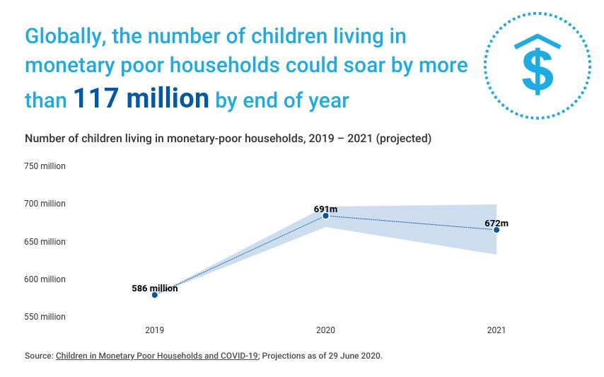
A projection graph comparing the possibility of economic decline due to the pandemic.

If you take a look at all three graphs you can easily read and understand the visualizations set forth. Each graph has a focal point which is portrayed using colors, patterns, and contrasting visuals. The graphs all are labeled properly with limited distraction, making them readable. All of these graphs read left to right following the rule of thumb of conventions, each comparison with a time line keeps the time line on the x-axis to avoid confusion. I think

Categories
data visualizations Examples How Two Or More Numbers Are Alike Or Not

Comparing Numbers

I am going to be showing examples of insightful data visualizations that compare numbers.

  1. The first one is from a website named datapine.
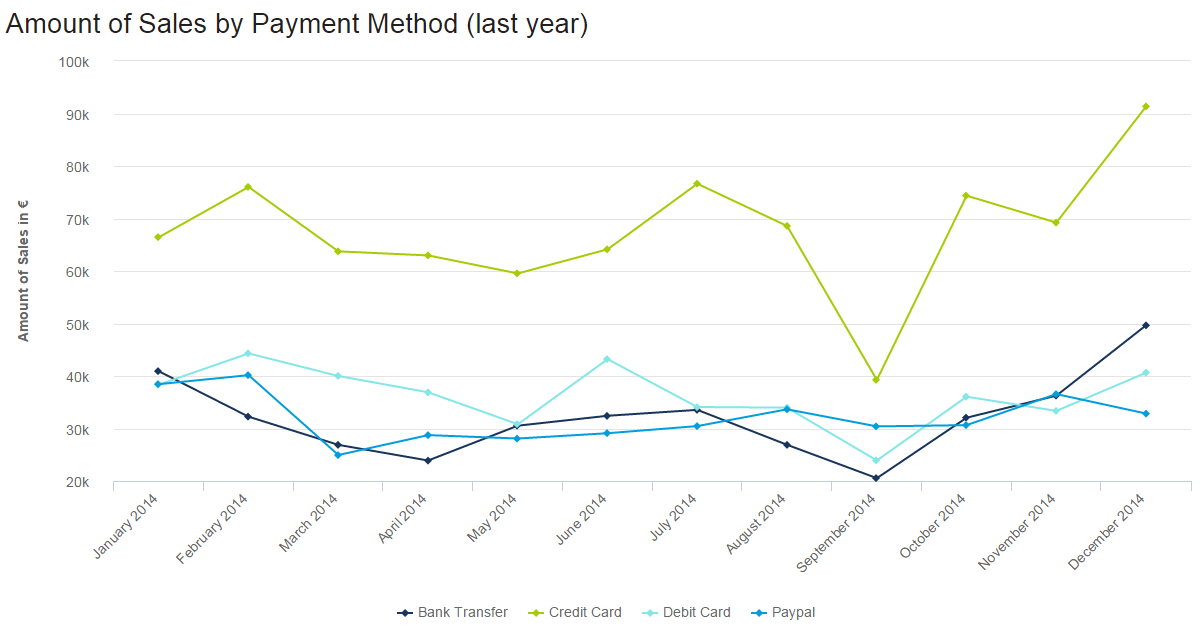
Sales graph in the form of line chart: amount of sales by payment method

In this line graph, the number of how many sales were made by various payment methods is being shown, different months and years, and how they changed over time. The lowest was abut 20k being used by bank transfers. The highest was about 90k being used for credit card payments. For credit cards, September seems to go very low. With these numbers and information being presented we can take many guessed on why people only use certain payments a certain amount of times at a certain time in point.

2. The second example is from a website named venngage.

Simple Comparison Table Infographic Templates

This website provided this infographic as an example of how companies highlight features and pursued buyers to buy certain products. They use the phone they want you to buy and compare it to one that has fewer features or different features than the newer one. Most of the info involves numbers, from screen size, cost of the phone to GB’s, and the weight of the phone.

3. Lastly, from the same website venngage.

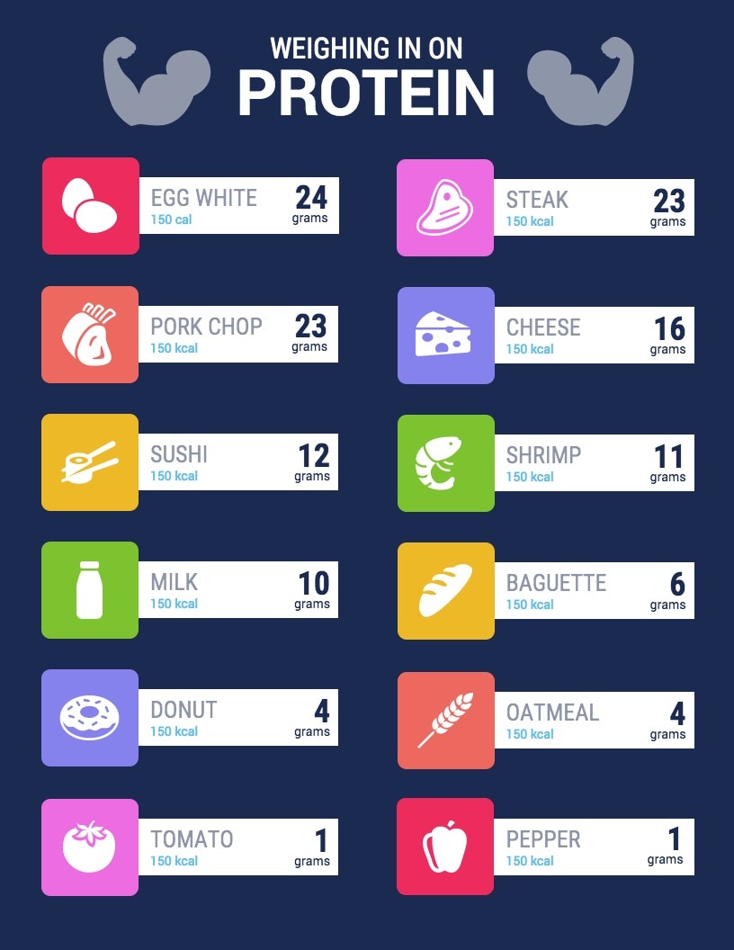
Healthy Food Comparison Infographic Templates

This is an example of an infographic comparing and contrasting the number of grams of protein certain foods have. They bolded those numbers because they were most important for people to see. This is an easy infographic to follow. You just look at the food item, then it tells you the number of calories (they vary) it contains and gives you the protein it contains in grams.

Categories
data visualizations Visualization Tools

Visualizing Health

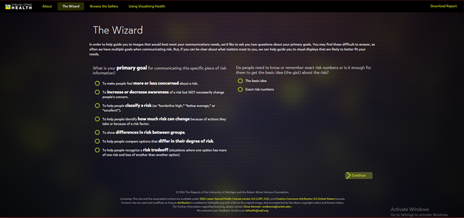
VizHealth is a collaborative project developed by the University of Michigan and the Robert Johnson Wood Foundation. This tool allows users to choose from 54 original data visualizations which have been tested through research amongst the general public. Utilizing The Wizard tool allows users to figure out what the primary goal for communicating the risk is and whether their audience needs to understand the basic idea or to remember exact risk numbers.

Figure 1. The Wizard tool from Visualizing Health.

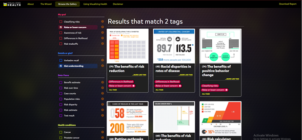
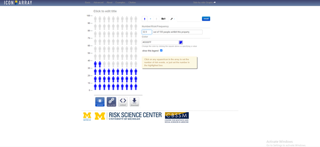
Based on the answer to these two questions, the tool will display graphics that best match your needs. These images can then be modified to fit your own data. You can also browse through the gallery according to specific tags to find the most effective visualization for you. This is a great tool that can be used by anyone from students to professionals as these graphics have already been tested and proven effective to convey information to the general public. There is also an external link to an Icon Array Generator provided by the University of Michigan Risk Science Center that users can utilize to create their own custom images.   

Figure 2. Gallery of 54 graphics that can be downloaded from Visualizing Health. Results shown for raise or lower concern and gist understanding tags.
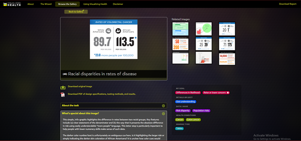
Figure 3. Racial disparities in rates of disease visualization from Visualizing Health. Users can choose to download the original image or view the PDF file detailing design specs, testing methods and results for that specific image.


Fig. 4 External link to Icon Array Generator from the University of Michigan Risk Science Center.

Categories
data visualizations

Visualizing Health

This site appears to be made with only good intentions. I like that the website chose not to host the public’s graphs, being they could be inaccurate and lead to a lot of disinformation. This site can be useful to help the general public have more understanding of how their personal decisions can impact their health. Many people are unaware of how they have affected their overall health through positive or negative decisions.

Here we can see that anyone can use these graphs, and the creators would like to know how we’re using them. It is made clear that completed graphs are to be used for the users’ own objectives, and not for the website’s.

The site used information gained through surveys to test the effectiveness of their images.

3 tools were used to test the effectiveness of their images. This shows that the makers of this site are serious about getting the best possible images out to the public.

The site helps to bring risk factors to light with easily digestible infographics to choose from.

The user is able to choose options from the panel to make it easier to find a template.

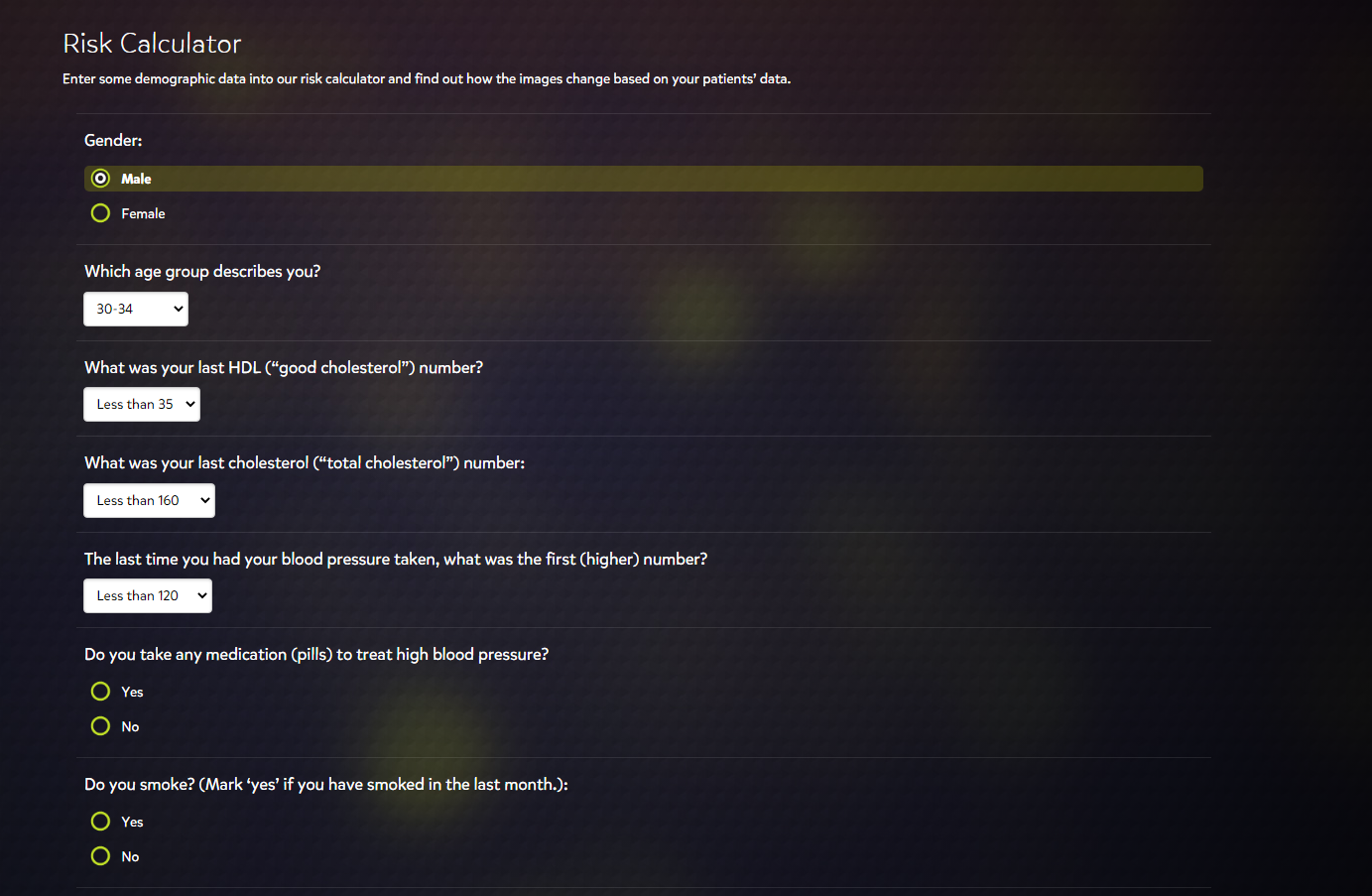
The design of the site is user-friendly. A person not well-versed in technology could easily make some digital graphics from this site. There appears to be some lack of variety in the risk calculator, however. I noticed that the risk calculator’s youngest age group option was 30-34. If we wanted to use the risk calculator for an age group younger than 30, the option would not be available.

These are not all the risk factors to take into account for a patient, but it is a decent general overview to start with for plotting data.