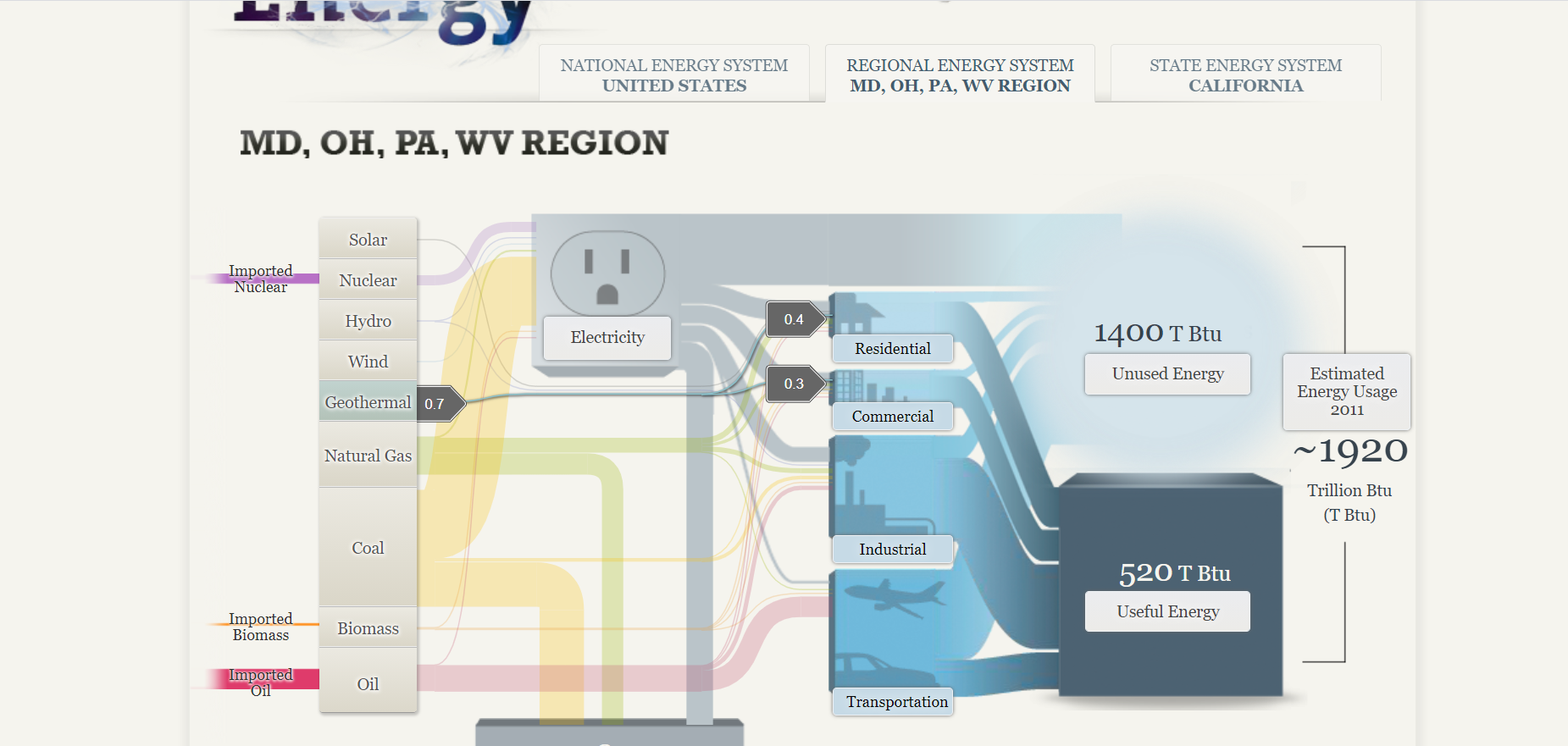
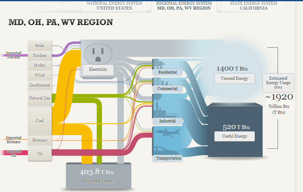
The Sankey visualization about our energy systems in America breaks down the percentages of different energy sources in varying states. Initially, it was confusing to read, specifically the image below, however the other tabs were quite interesting.
This visual breaks up the different types of energy and shows where each one is used (residential, commercial, industrial, and transportation). The numbers (to the left) are a bit confusing to me because I’m not quite sure what they represent. With that said, I do enjoy how interactive this page is. Just by hovering over the different types of energies, the visual becomes a bit clearer. It was surprising to me that in 2011, 1920 Trillion Btu was the estimated energy usage. I wonder what these numbers would be like now, especially during quarantine.
How We Use Energy:
http://needtoknow.nas.edu/energy/energy-use/
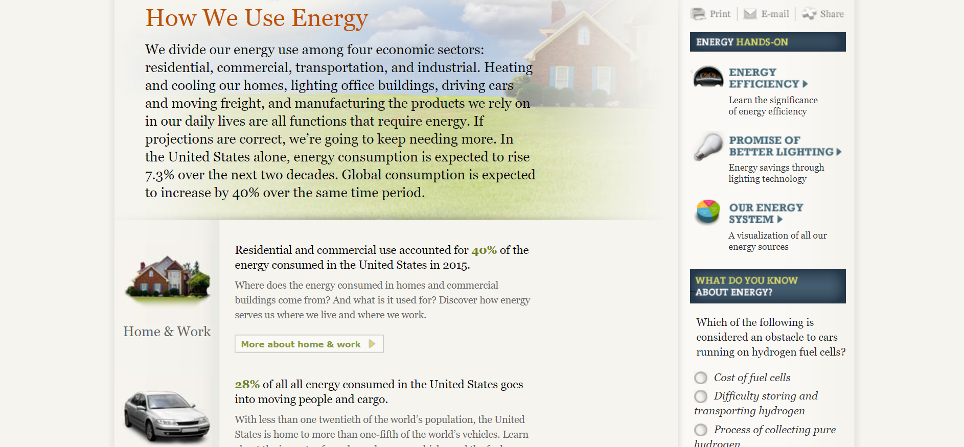
This section of the website is very helpful as it gives some background of the topic. I specifically like the quizzes on the side of the page because they keep the reader engaged and interested. The statistics are also very interesting to read. I like how the reader can look more into a specific topic that interests them. For example, 28% of all energy in the United States is used to transportation.
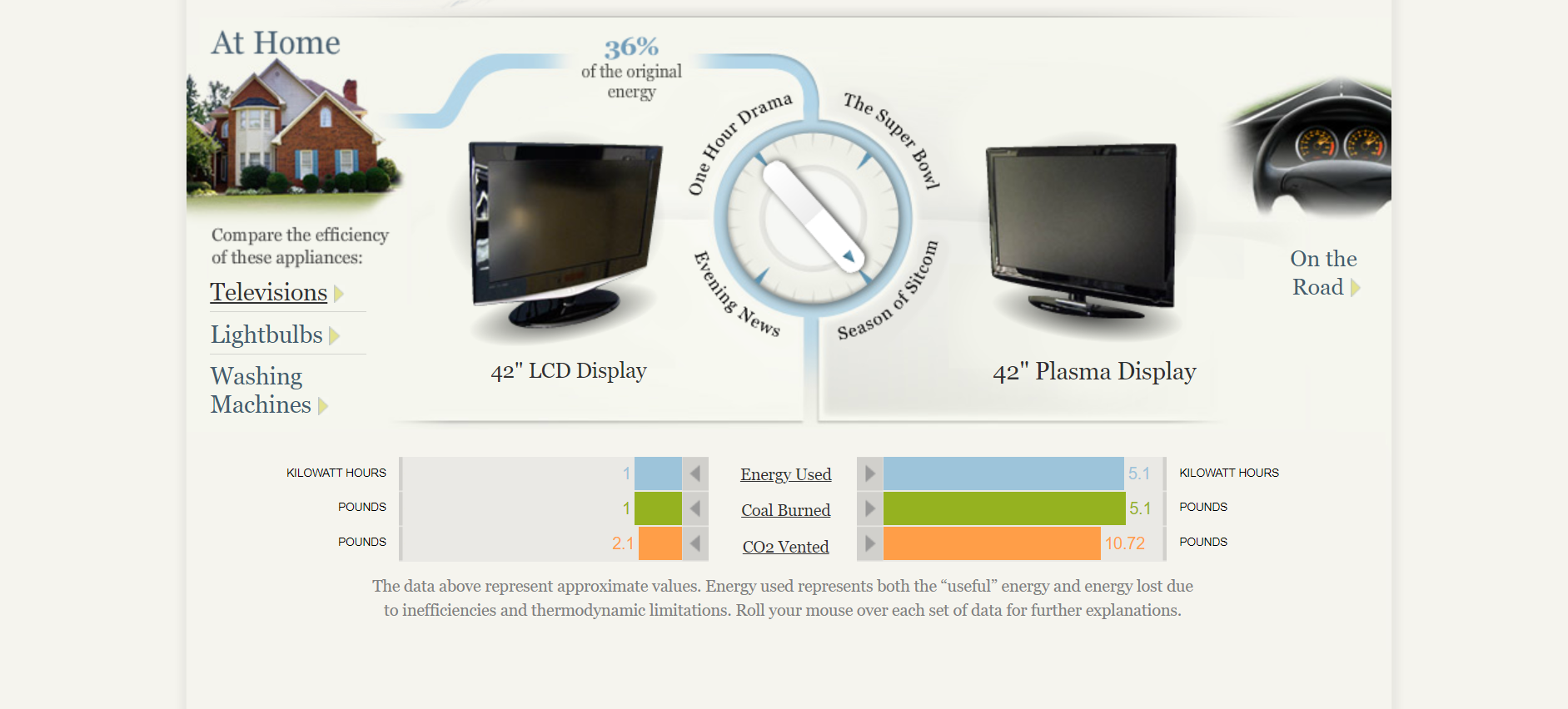
One great feature of this website is that they break up energy usage into homes (including televisions, lightbulbs, and washing machines) and road life. The “At Home” section is very interesting and even allows the reader to turn that dial in the middle of the screen to view the specific number of energy used, coal burned, and CO2 vented.
In Conclusion..
This site is extremely interactive which is why it is so great. There are many great statistics and explanations of how energy is used. Another great feature is that the reader can dive in deeper on a particular category that intrigues them.
The Sankey visualization about our energy system in America was rather interesting by breaking down the percentages in the different energy sources that are used and by focusing on specific regions to give the reader is a better understanding. Below the Sankey diagram describes the regional energy region and the amount of energy sources it use in total. At first, it was difficult to understand what the numerals meant, but after studying it, it became a little clearer.
Coal is mostly used in this region for various purposes compared to the other sources.
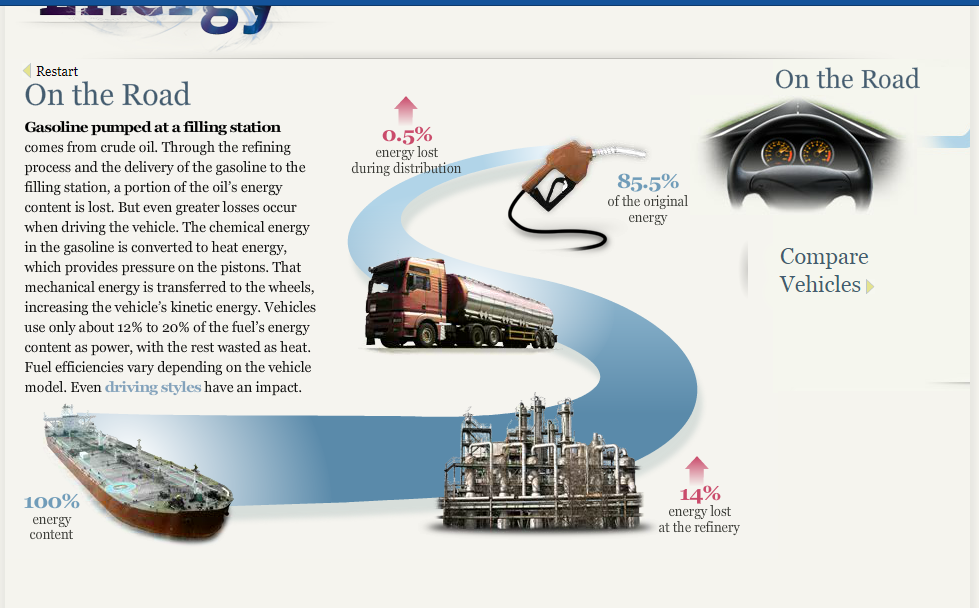
On the Road: This is a breakdown on how much energy is lost before it reaches its original destination. The energy that is lost turns into toxic gas such as Carbon Dioxide. Interestingly, vehicles only use about 12% to 20% out of the 85.5% of energy for power while the rest is used as wasted heat.
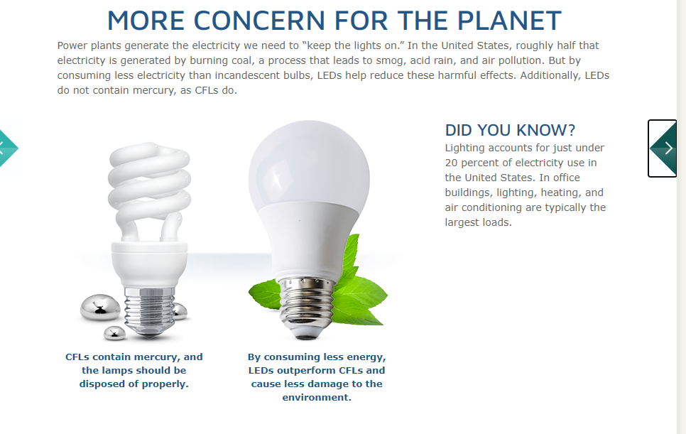
Concern for the planet: Over the decades, lighting has been improved to save energy and help reduce pollution into the air. This visualization shows that much more needs to be done to save our planet. Since America burns a high percentage of Coal based on the Sankey diagrams, LED bulbs have been encouraged in many public places because it burns less Coal and it is cheaper.
Overall, the Sankey diagram is very interesting to use to describe data, but it is important that when using this type of diagram only the relevant information should be used to remove confusion and misunderstanding. As for our energy system, the data allowed the reader to understand just how much energy is wasted daily and the process that occurs to transport the energy to our homes, vehicles and jobs. With this, we should do our part by monitoring what we do with our electricity and try to save energy as best as we can.
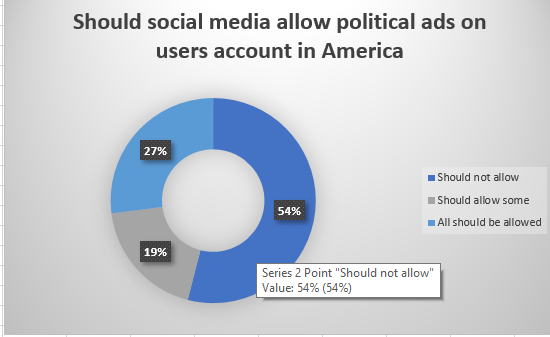
All over the media, pie charts can be seen to represent data in the form of a visualization. BUT WHY?…
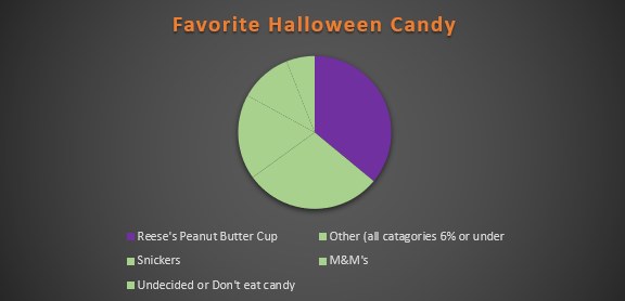
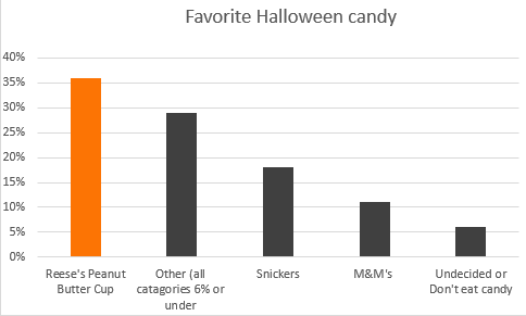
A pie chart allows the readers to understand the data without needing the specific numbers. Pie charts, when used accurately, can display a pieces of information within a specific population (sample) so a reader can see, depending on the size of the shape, roughly how it compares to the rest of the data. A bar graph is great for comparing multiple populations, and a pie graph works better for comparing within a particular population or within a whole. Using a pie chart allows readers to envision the data as one piece and can help condense data that can be confusing. It focuses on how each piece compares to the population; they can be manipulated to focus specifically on aspect of the pie. Pie charts are great to reveal the results of a poll and can neatly display the information. For example, I used data from a poll I found from Monmouth University about Halloween candy.
from a sample of 1,161 people
In this particular chart, I wanted to hone in on how Reese’s compares to the whole sample set. It is easy to see that though it is not the whole chart it takes up a large portion of the candy poll.
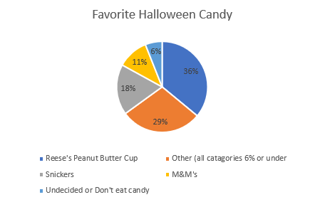
from a sample of 1,161 people
In this chart, I wanted to place focus on each candy and it’s comparison to one another. Leaving it up to readers to pick and choose which candy and how they want to compare it.
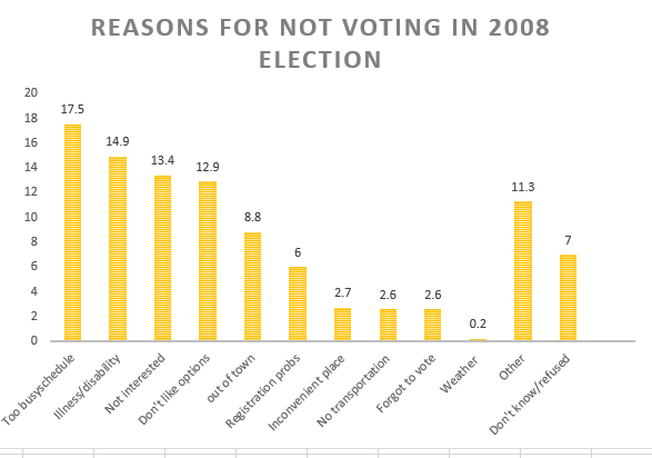
Take a moment and compare the two charts above, both use the same data and both have emphasis on the same value. The only difference between the two is the way the information is presented, a bar graph shows us that Reese’s earned the highest amount of votes on the candy poll. The pie graph, however, emphasizes on how much out of the whole sample Reese’s possesses.
Tips for creating pie Charts…
-Make sure the percentages equal 100%, otherwise the chart with be misleading and confusing to read.
– Use visually appealing colors, and if your goal is to place emphasis on a specific value chose a bold color to stand out amongst the rest.
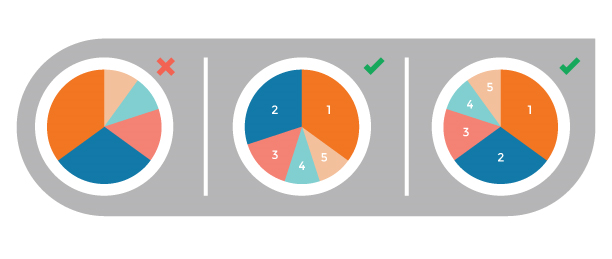
– Organize information, keep in mind the way humans naturally read in a circle; clockwise or counter-clockwise (not across or up and down) . you will want to make sure data goes in a descending order.
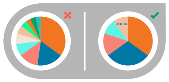
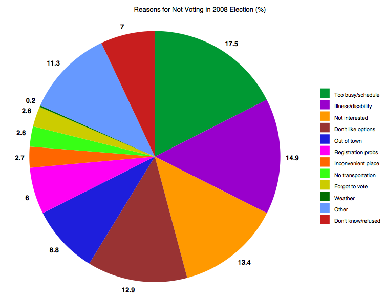
Pie charts are excellent for expressing proportions, especially those that have percentages. Pie charts tell a whole story but then divide it into smaller segments to better understand and visualize what the story is trying to portray. The best way to use pie charts is when expressing 2 to 6 different categories. A pie chart can be used to express the percentages of people with heart disease and those without, or people with BMW and those with Sudan. Pie Charts are most effective if labeled correctly, have few slices, and the colors show each slice with good contrast.
There are good Pie Charts, and there are poor quality pie charts.
There are also different types of Pie Charts to represent data, depending on the type of data and how someone wants their data to be displayed.
This pie chart is sliced into three sections to portion out the data. It gives the audience a visual of how big the percentage is.
This donut pie chart has a hole in the middle to separate the slices, which allow the audience to pull the slices apart and analyze it.
The colors used in this pie chart represent the slices and their data clearly. The numbers are organized in a clockwise direction and are in order with the legend,making it easy to understand and read.
This is the same data as in the pie chart to the left. The data is best represented in a pie chart because with the pie chart, the slices give the audience a better visual of how many percentage or number.
These are some websites explaining how to effectively use pie charts and when it should be used:
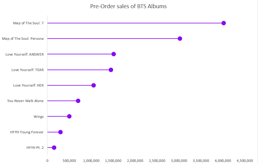
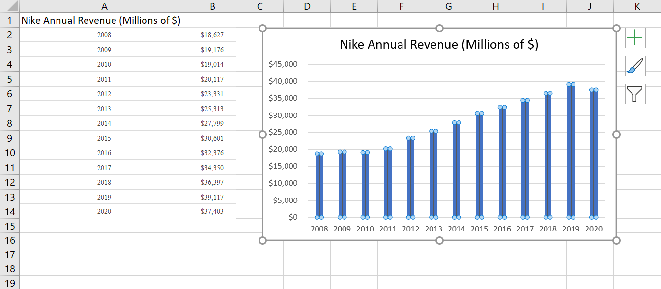
The Lollipop chart seemed like a lot of special formatting from the beginning and I was pretty much right. It is just a bar graph that you edit to make it look better. As always, I spent way to long looking for data, but stumbled upon BTS pre-order sale numbers while I was taking a break on Twitter. It took a lot of time and it probably isn’t a type of graph I would use often, but the style is easier on the eyes that a bar graph, especially if there are a lot of bars.
BTS official album pre-sale numbers from 2015-Present
Like I said before, lollipop charts are best used when you have a lot of data to display, at least 20 different points, unlike my 9. It’s also saves on ink if someone would be printing this out to give to people or hand up. My biggest problem with this is that the circles aren’t an accurate representation of the number, the data point is located at the center of the dot and that makes it harder to read the true number. If you aren’t looking to be so precise with the visual and are looking to just show how the data points relate to each other, then using this graph is fine.
Lollipop charts are alternatives to traditional bar graphs that present their data in more visually appealing ways. They are best used when the differences between the data you are trying to present is quite large. When using a standard bar graph, this can make the chart look very cluttered and impeded the viewers ability to quickly discern what the chart is trying to say. The lollipop chart gets around this issue by forgoing the use of wide bars and instead using small columns ending dots, similar to a lollipop, to show the end point of the data. Ben Neville, a blogger at the data visualization site Tableau.com, has a post that looks much deeper into the topic than I do here.
My Lollipop Chart
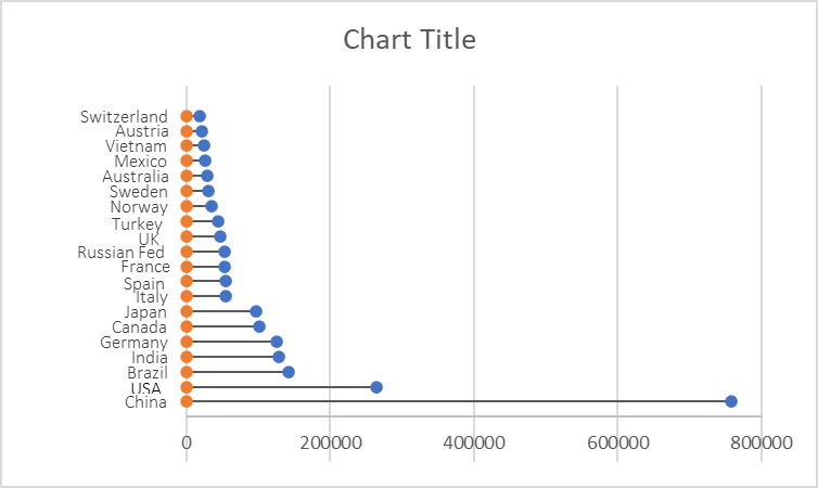
As you all are probably aware of by now, I am very interested in renewable energy, so I have decided to look into the renewable energy capacity of the top 20 producing countries. This data can be found on the International Renewable Energy Agency’s website. I created mine by following the steps outlined in the “Effective Data Visualization” textbook.
Lollipop Charts, like the name infers, look like little lollipops and is used as a visual infographic. Like many other charts, lollipop graphs are used to compare different variables of data. A lot like a bar graph lollipop charts compare the size and ending points of the data set.
As you can see from both charts above, which I made using Microsoft Excel, lollipop charts can be vertical or horizontal depending on the user’s preference. The pros of using a lollipop chart as opposed to a bar graph are that it puts focus on the end data points rather than the whole graph and it allows for less visual distractions. Colors can still be used but in a minimal way that does not make a chart seem overwhelming. Lollipop charts also allow for sharing a lot of data without losing its visual aesthetics.
While looking at tutorials on how to make a lollipop chart and the different tools available, I came across an article. This article titled “Lollipop charts, Why & how, Story Telling with Lollipops” written by Dario Weitz, is a great resource as to why and how to use a lollipop chart. The author touches base on the pro’s, con’s, and even the similarities of using this specific graph.
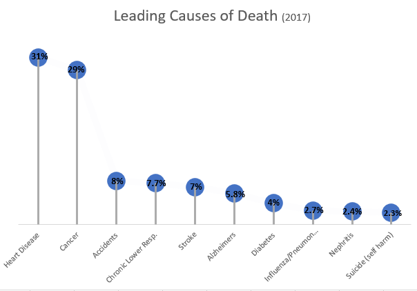
Lollipop charts are alternatives to bar and column charts and are used to compare categorial data. They can be vertical or horizontal and are great tools for large datasets or when the numbers are extremely high. In short, these charts include circles at the ends of their lines to highlight the data value. These charts make the visualization easier to read and more appealing as a big chunk is taken out of the bar or column. The most important part of these graphs is where the lines end, telling us the value.
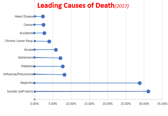
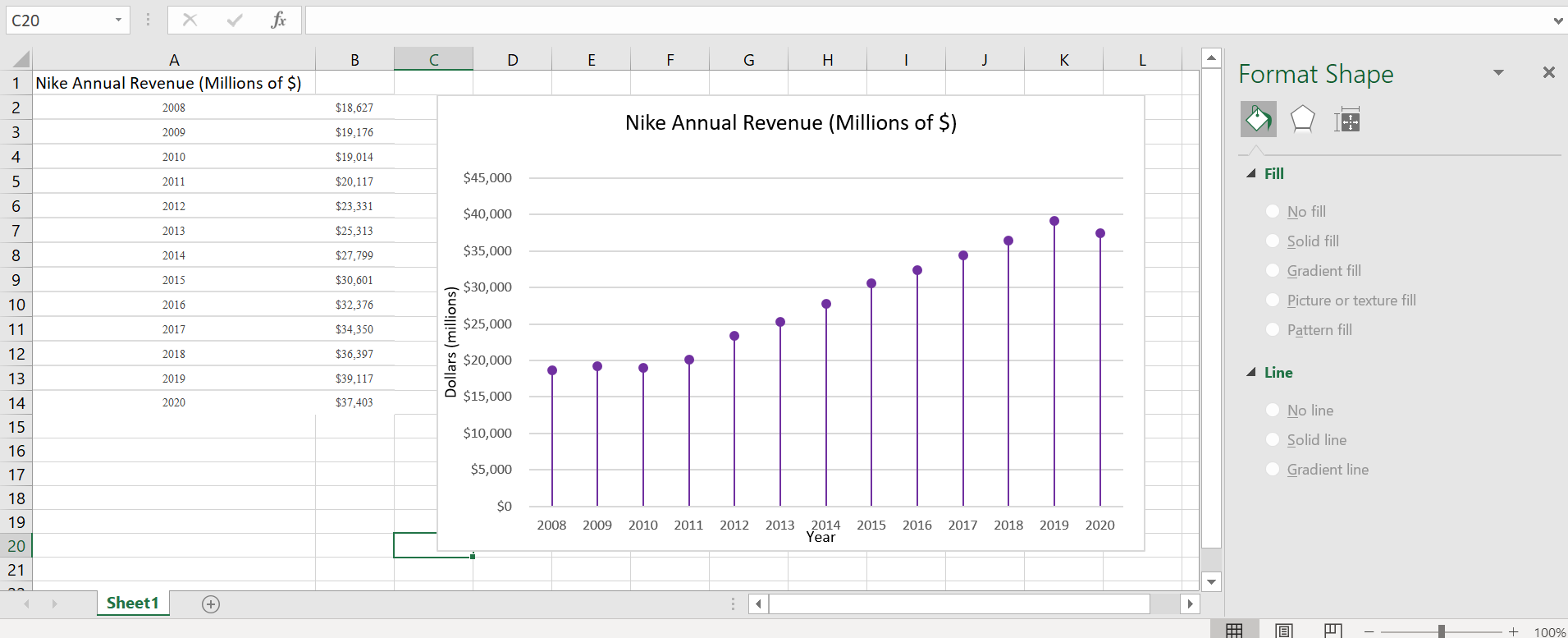
Below is the lollipop chart that I created using a site called https://excelk.com/en/lollipop-chart/. The site included a few steps to turning any bar graph into a lollipop chart. I found that using this website was much easier than following the textbook.
As for my dataset, I found Nike’s annual revenue over the course of 12 years on https://www.macrotrends.net/stocks/charts/NKE/nike/revenue
The first step was to create a simple bar graph by highlighting the dataset and adding error bars by clicking “Add Chart Elements” and “Error Bars”. In order to get the lollipop effect, right click on one of the error bars and click “Format Error Bars”. In the direction group, select “minus”, in the end style group, select “no cap”, and in the error amount group, enter a value of 100% under the percentage field.
Under the fill and line menu, click on the line which starts with the circle and change the columns to transparent. This way, only a line and circle are visible. Label the x-axis and y-axis and title.
Overall, this site was extremely helpful in creating a lollipop graph. It appears challenging at first, especially in the text, but it was fairly simple. These graphs are great to use for comparative data and are visually more appealing than the typical bar graph.
When looking at a comparison infographic, sometimes it’s difficult to determine the standard for comparing two or more things. One solution is to apply a benchmark to the chart, but there are many ways to go about it.
Benchmark comparisons in the news
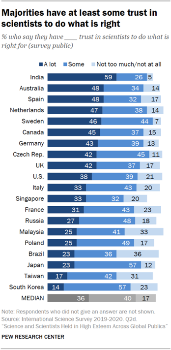
As someone who has a professional interest in the natural sciences, it saddens me to look at the news and discover that not everyone in the United States trusts scientists to do the right thing. More often than not, the media cites misinformation and alleged government propaganda as sources for such distrust. However, I do sometimes wonder what opinion people from other countries have of scientists. Recently, I read a Pew Research Center report about the scientific community’s relationship to the general public, and I was surprised that people in countries like India and the Netherlands have far more trust in their nation’s scientists than the American public has in ours.
On the other end of the spectrum, I found myself wondering why nations like Japan and South Korea are skeptical of scientists. They are among the world’s leaders in technological advances, yet the people don’t seem to trust scientists to do the right thing. When compared to median values, the United States exceeds the benchmark, if only by a slight margin, which gives me hope that the vocal minority that distrusts scientists will one day see their error and learn to trust science.
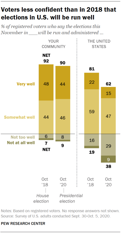
Another way of showing a benchmark is by comparing positive and negative values to determine favorable perspectives. With the United States presidential election fast approaching, the public is more divided than ever on whether or not this year’s elections will be run well. It is likely that a divide in partisan politics and factors like the current COVID-19 pandemic and ongoing police brutality protests are responsible for this immense discourse.
Based on Pew Research Center’s data, I estimate that conservative-leaning voters believe that the election will be handled well. On the other hand, liberal-leaning voters believe that this year’s election will run into a series of blunders or be subject to manipulative interference. As someone who wants to see Donald Trump and his alleged enablers voted out for the sake of the rest of the nation, I am hoping for the best but preparing for the worst.
What about comparisons related to topics I enjoy?
Even when I am not catching up on the news, I still enjoy looking at comparisons for the things I love. For example, I’ve been playing Square Enix’s Final Fantasy XIV Online (shorthand: “FFXIV”) for about a year, and have a strong interest in joining the small community of players who spend most of their time on high-end or difficult pieces of content. When a new piece of content comes out, one of the first places I go to look for information is FF Logs. Their tools analyze combat data and give players a sense of their overall performance and where they can improve. They also have statistical charts that show performance averages for each of the game’s 17 combat classes (jobs). For example, one of the most difficult “raid dungeons” currently in the game goes by the name of “Eden’s Verse: Refulgence.” (shorthand: “E8”). Raids in FFXIV typically have two modes of difficulty, normal and “savage,” with the exception of specially-themed “ultimate” raids. The community typically pays attention to statistics and ranking for savage raids. In the first few weeks of release, Eden’s Verse: Refulgence (Savage) (shorthand: E8S) proved to be a difficult challenge for most raid groups.
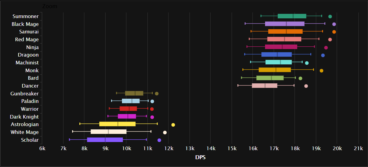
A box plot comparing the minimum, lower quartile, median, upper quartile, and maximum damage per second (DPS) for all 17 jobs in one of Final Fantasy XIV Online’s more difficult fights. Source: FF Logs.
Combat jobs in FFXIV are divided into three major roles: tanks, healers, and damage per second (DPS). The box plot chart above shows an aggregate ranking for job performance in E8S over the course of two weeks across all percentiles. DPS jobs typically put out far greater damage than tanks or healers, with magic-based DPS jobs having the highest damage output. The only exception to that rule is the samurai job, which is typically described as being a selfish DPS job that brings little party support to a fight as it deals heavy hits at melee range.
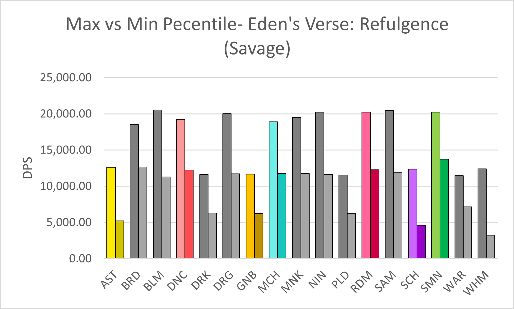
Viewed from a different perspective– say, comparing the maximum and minimum percentiles for E8S damage– certain trends seem to appear among the 17 jobs, and it reflects in how well the player performs in the fight. The best players in the world generally fare much better and clear the raid faster than players who barely have a grasp of their jobs or exhibit poor performance.
A chart comparing the damage per second (DPS) output for E8S, in the maximum and minimum percentiles, across all 17 jobs in Final Fantasy XIV Online (job abbreviations are used). The jobs I play the most are highlighted in color. Source: FF Logs.
Compared to others who play the same jobs as me (color-highlighted in the chart above), I would say that I am somewhere between the two extremes. However, in the case of the job I play the most, red mage, I tend to lean toward the lower end of the spectrum. I recall running a four-person dungeon once with some of my friends a few months before the COVID-19 pandemic exploded. One of them, who went in with a tank job, had a third-party tool open to analyze everyone’s damage output in real-time (which is against the developer’s terms of service, but Square Enix doesn’t crack down on third-party tools if players don’t discuss them publicly in-game), and once the program crunched the numbers, he uploaded the data to FF Logs and sent me a link to the log over Discord. As I looked it over, he laughed in voice chat and likely shook his head at how low my damage output was. Another one of my friends, a healer who did significantly better than me, pointed out that at least I knew my spellcasting priority rotation as a red mage and the random black mage who got matched with our three-player party did less damage than me. I didn’t care that my damage output was sub-par, though. I was happy just to run content with my friends.
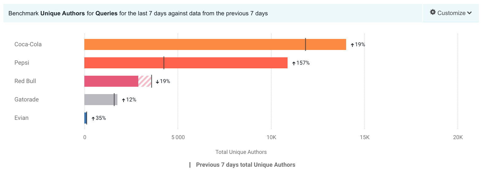
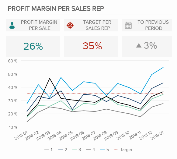
Adding a benchmark to your visualization can enhance the story to a reader. A visual target allows readers to easily determine whether or not a goal has been met. Benchmarks can be in the form of a line, indicator dots, overlapping bars or combo charts. Depending on the needs of your visual, the best way to display a benchmark will vary. Here are some examples of different visualizations using benchmarks.
This take on a bullet graph uses a a benchmark line to compare how well different brands are doing relative to the brand’s previous performance. I think the use of a patterned filler to show that a company is not performing as well is unique. Especially for this data set, with only one company underperforming, this benchmark stands out.
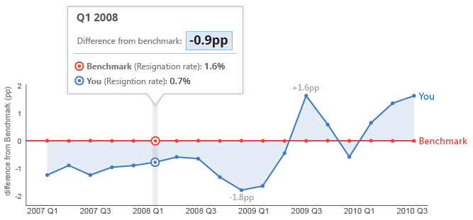
This graph features a line at 0 as the benchmark with another line showing how far off from the benchmark they are. With the benchmark at 0 you can easily see whether or not you are underperforming.