Here, I pulled information from the World Health Organization’s (WHO) daily COVID-19 database as of December 2, 2020.
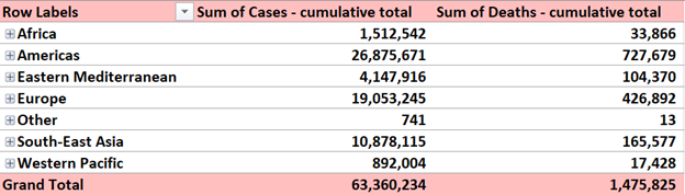
Here, I pulled information from the World Health Organization’s (WHO) daily COVID-19 database as of December 2, 2020.
This week we learned about pivot tables.
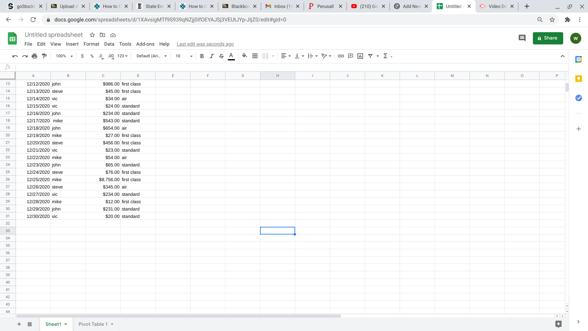
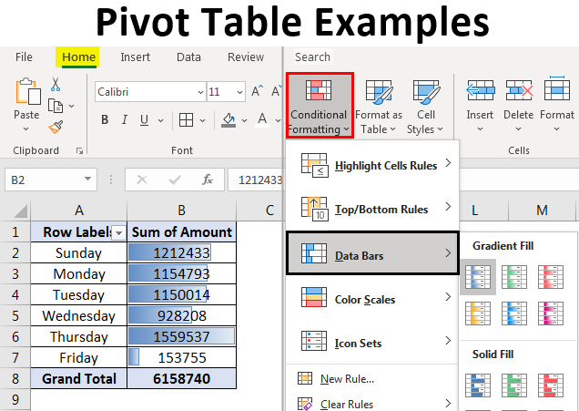
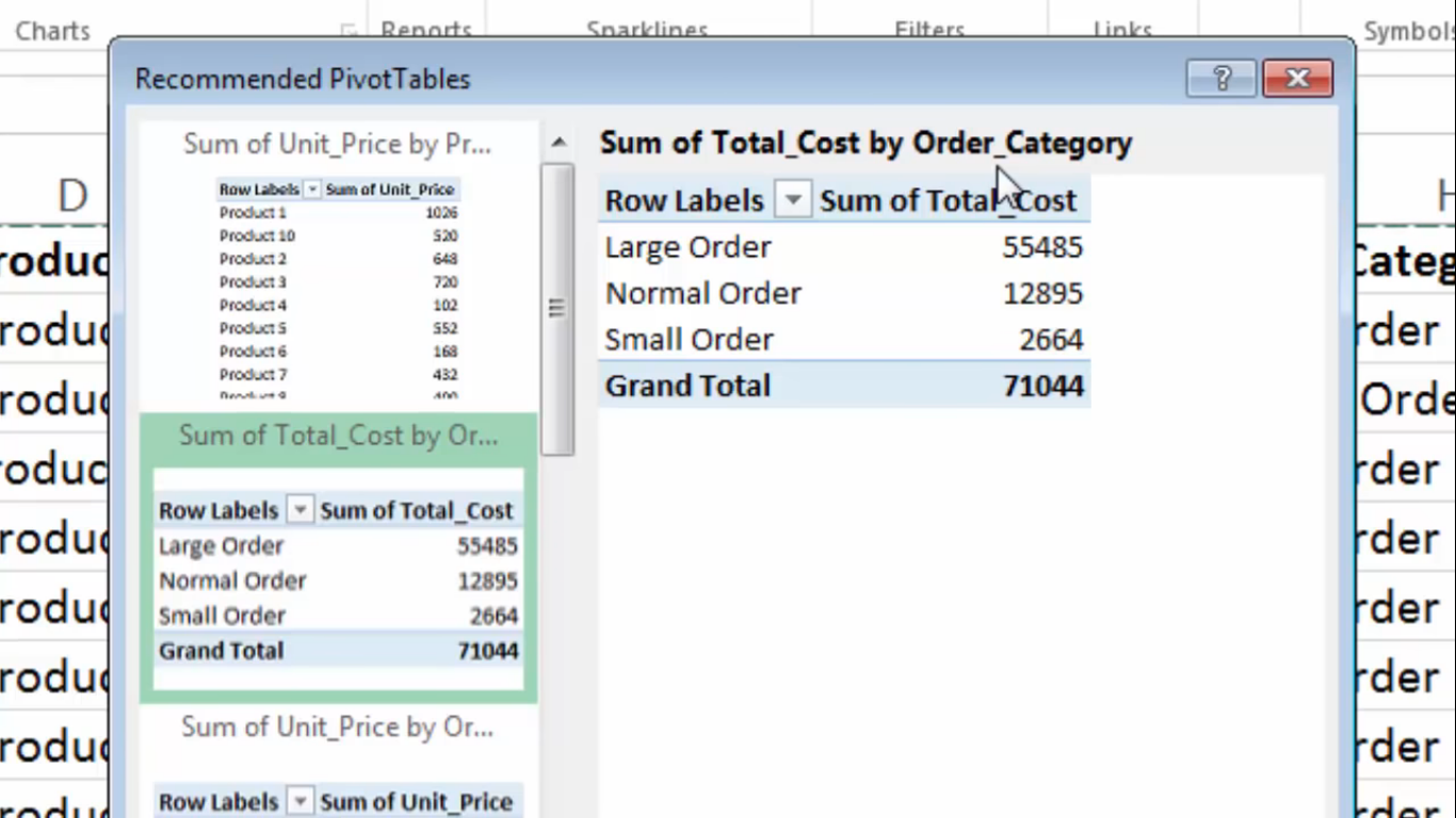
A pivot table is a tool that allows creators to summarize, organize, and sort (by sums, averages, etc) their data sets. Pivot tables are simple to create and allows creators to manipulate what exactly the chart focuses on. A few examples, I found during research, shows the different uses as well as highlight how the table makes comprehension of data go much smoother.
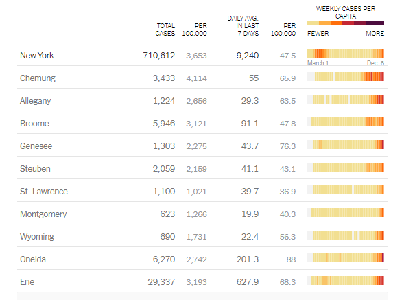
The above pivot table was an example I found that was updated in real-time and created by the New York government to keep residents updated on the amount and averages related to Covid-19 deaths. It is well organized and listed by individual counties throughout the state.
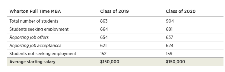
A much smaller but straight to the point pivot table I found on the inquires website highlights the average income graduates receiving after attending Wharton college. It shows slight changes between the comparison years but puts emphasis on starting salaries. The intended purpose of this table was more for persuasion on why students shoule attend this institution.
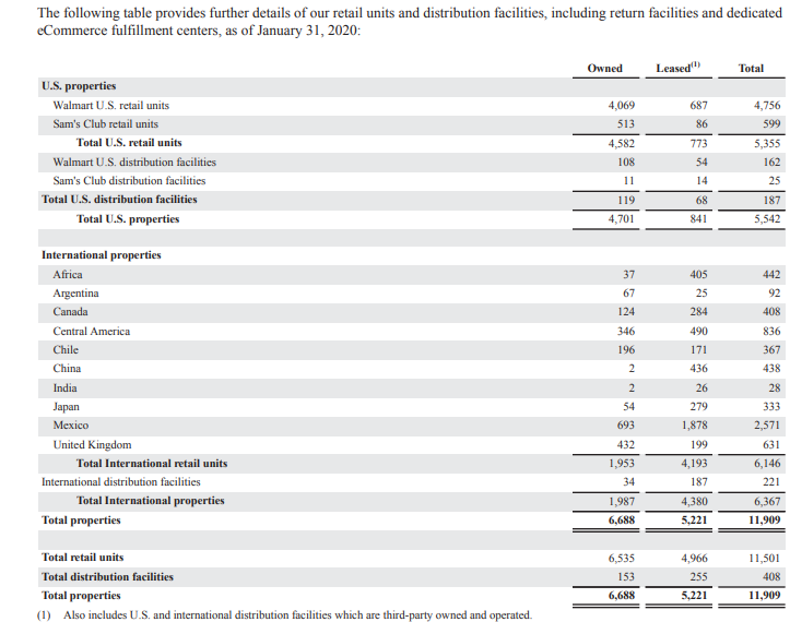
Another use I found for a pivot table was an annual report of business earnings and spending. Large corporations, such as Walmart release annual data for public analysis. The use of the pivot table above makes the data easier to understand and follow. This particular chart highlights the properties worldwide owned by the Walmart Corporation.
Pivot tables have a larger variety of uses because the table can be manipulated to place emphasis on specific areas. Here is a beginners guide to creating and using pivot tables.
A Pivot Table is one of the basic data analysis tools. It is a summary of your data. Pivot Tables can help answer many important business-related questions. They are used to pass information.
A Pivot Table can:
Above is another example of a Pivot Table. This table organizes the data and groups and sorts the information in a way that makes it easier to read. A Pivot Table was a good choice for this data.
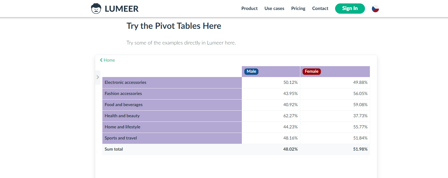
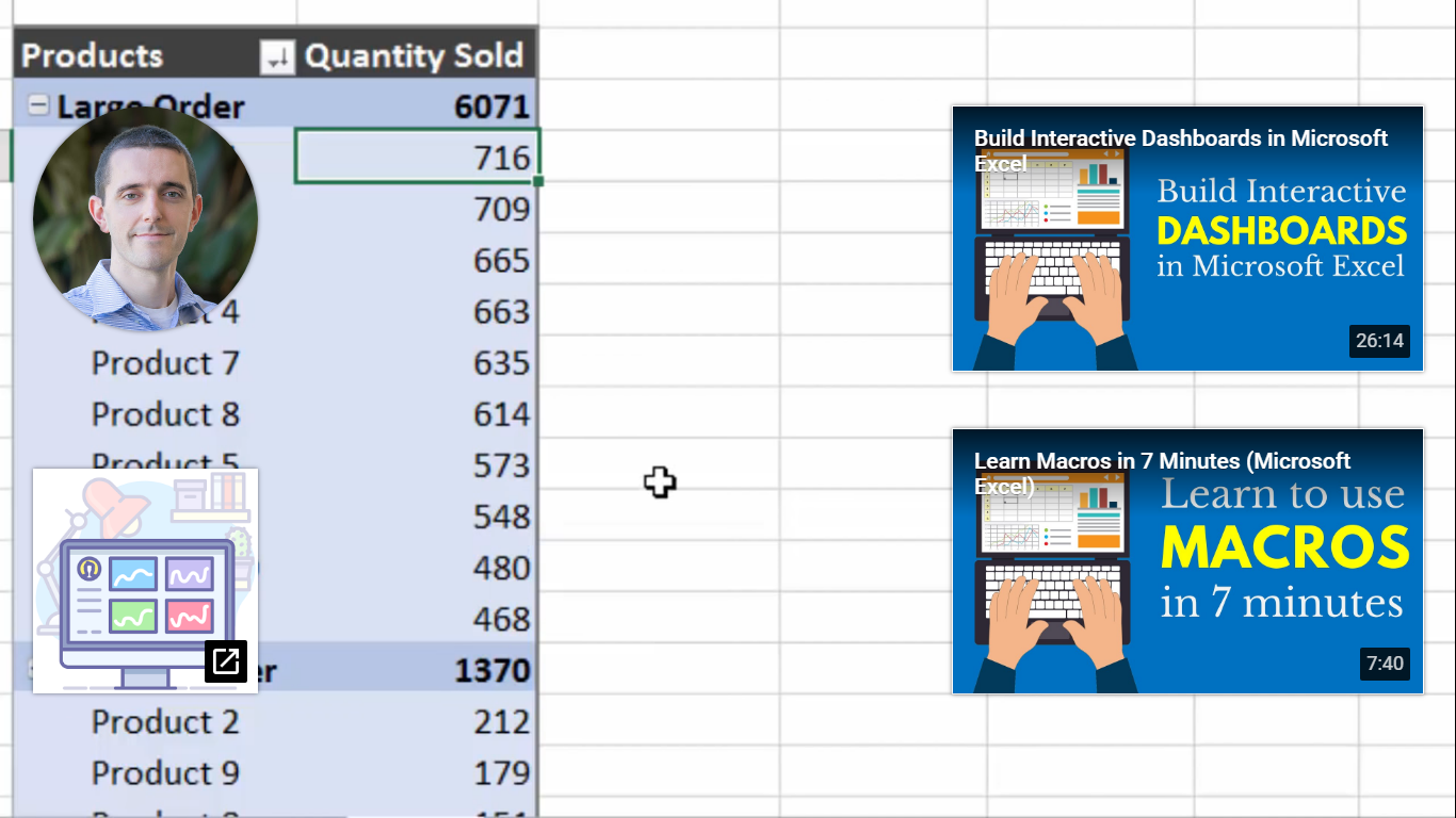
Lumeer.IO offers web-based automated pivot tables that connect users through a cloud and help them to work remotely. I added the video to show how useful this website can be for people that need to work on a project.

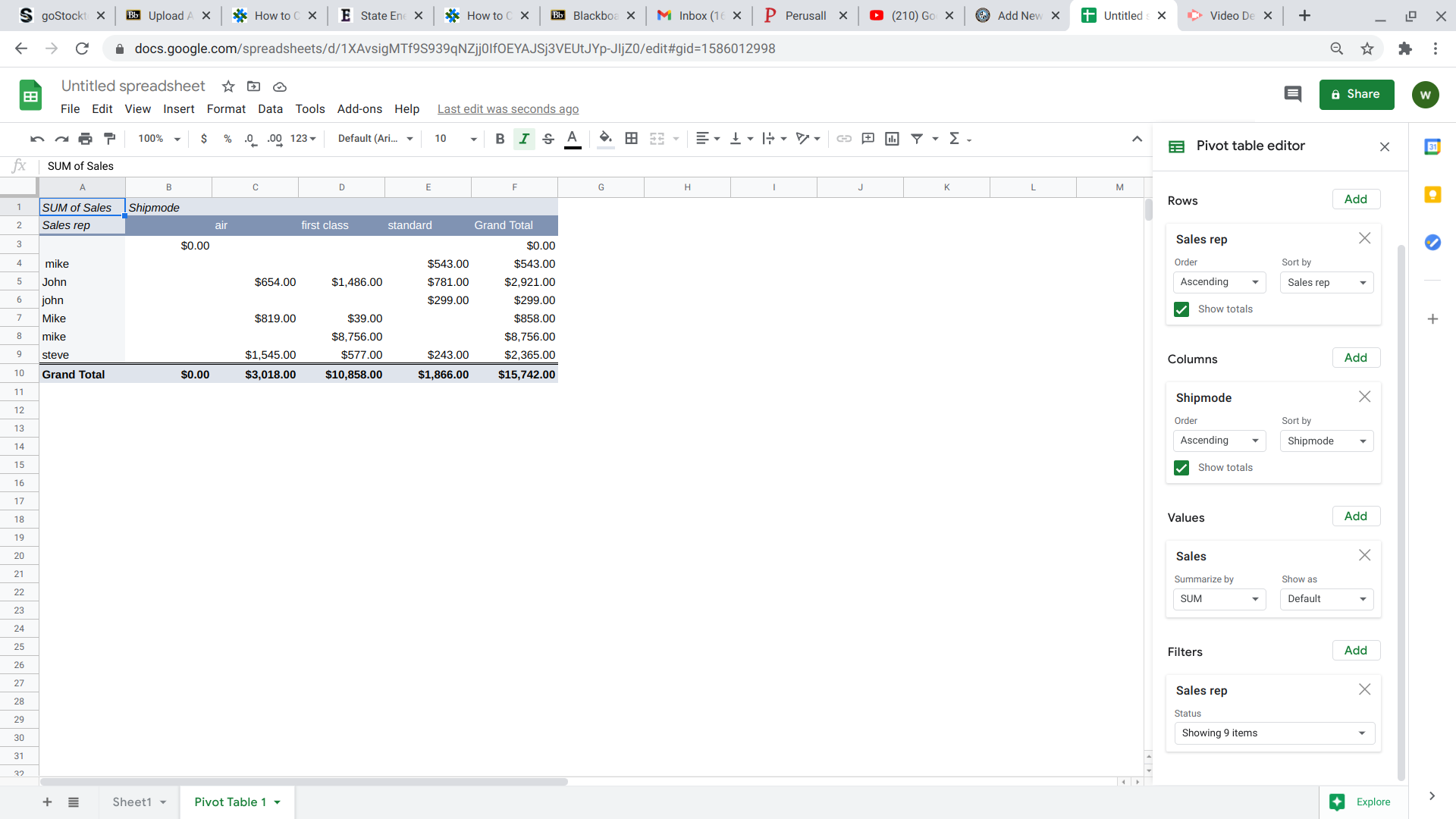
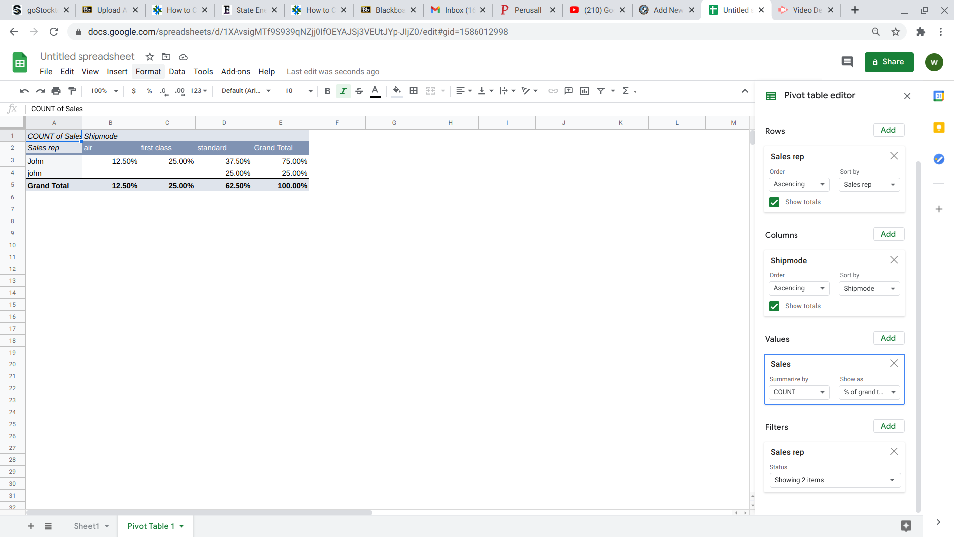
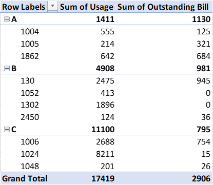
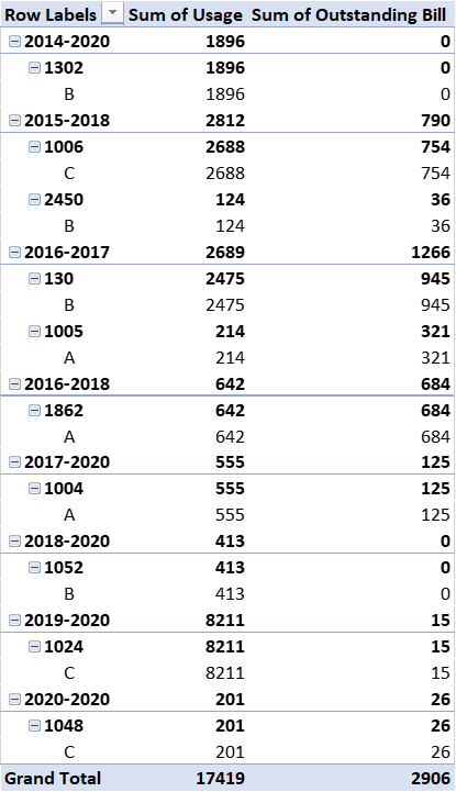
Time worked on an assignment by individual assignees. The pivot table above could be useful to help keep track of people working together. This can help the team see individual and collective efforts on the project. We can see who has worked the most by who has the higher percentage and a representation of that as its regular value.
This pivot table could be very useful to the manager of a store. This shows which genders are buying more of a certain category of product. It also shows who is buying more products overall by the sum total. Knowing these trends can help a store to plan accordingly for bigger revenue.
The Excel tutoring site EXCELJET describes pivot tables as, “one of the most powerful and useful features in Excel”. These interactive tables allow users to breakdown large data sheets into more manageable pieces that can focus on specific areas of the data. EXCELJET offers a quick and easy tutorial that breaks down each step needed to create an amazing pivot table.
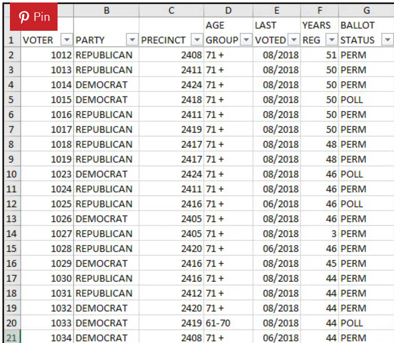
I was lucky enough to have used pivot tables before as part of an internship with a utilities company. They tables were a huge help when we needed to categorize and sort through large amounts of customer data.

The table above is just a small sample of the type of data we would have to work with and they would often include thousands of customers. Pivot Tables allowed us to quickly organize this data into whatever form we needed. Whether that was….
by the type of services they used,
the length of the time that they were customers,

or to quickly find certain accounts for auditing purposes.
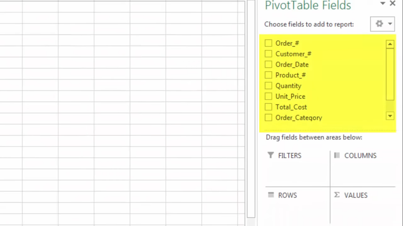
A pivot table shows statistics like averages and sums with various fields that summarize data. I came across a youtube video that explains what a pivot table is, what it contains, and how to make one. The first screenshot, it shows a pivot table and some of the fields the person decided was the best fir for their data.
Pivot tables are a great feature in Excel that allows you to analyze large data sets very quickly. This short video gives a brief introduction on what they are and how they function.
Here are 3 different times a pivot table can be useful when analyzing data in the real world:
You have an endless list of sales data for various products as well as regions. You want to see which products have been bringing in the most money in each respective region but adding up the columns in Excel would take a lifetime. This is a perfect example in which a Pivot Table would come in handy.

It allows you to rearrange the data so that you can see sales by product and region in less than a minute. You also have the option of displaying the total sales by product as well as grand totals for each region.
2. Show product sales as percentages of total sales
You can also use Pivot Tables to display percentages along with the totals to see how various products are performing compared to each other.

3. Get an employee head count across departments
Pivot Tables in Excel allow you to quickly count rows that share something in common. You have a list of employees and their respective departments and need to figure out how many employees are in each department. A Pivot Table allows you to quickly summarize this information without having to do a manual count.
Pivot Tables are an easy and organized way to keep records of numerical data without creating an entire new table for every new data. Below are a few examples of pivot tables. If someone does not know how to begin creating a pivot table, there are numerous tutorials on the internet to explain the process step by step.

The deck of 52 cards can be placed in a pivot table based on its colors, signs, and numbers.
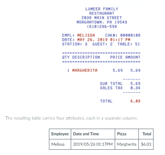
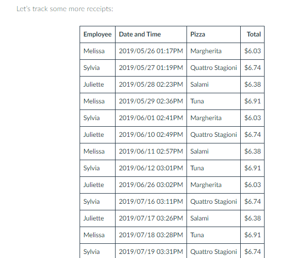
Pivot tables are used by business owners like pizza restaurants to keep record of its daily sales for a week, months, or years.
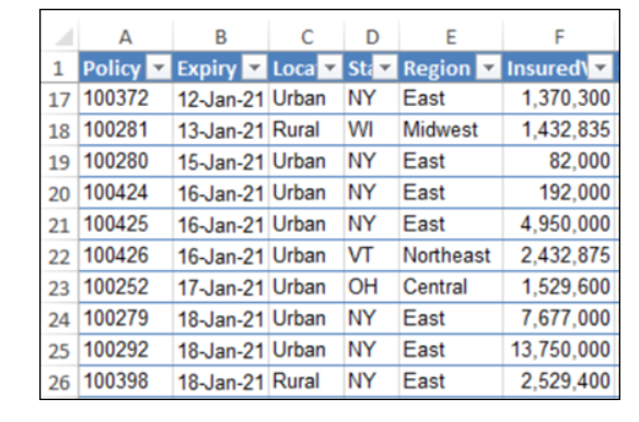
Insurance Policies use Pivot Tables to keep record datas for different states, years and geographical location within each state.
Reference: https://www.lumeer.io/pivot-table-complete-guide/
https://8020consulting.com/the-power-of-pivot-tables/
https://www.contextures.com/xlsampledata01.html
The National Academies of Sciences, Engineering, and Medicine dedicated an interactive website to Energy and “everything you need to know”. While browsing through the well-organized web page, I found a multitude of statistics, using different visualizations from big numbers to timelines and everything in between.
Here are a few examples of different visuals throughout the website.
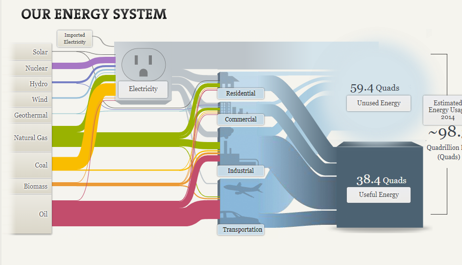
I was pleasantly surprised by the amount of information found throughout each section and how well they put visuals to use. Not only did the visuals keep the website intriguing but made the information clear and easy to obtain. for example:
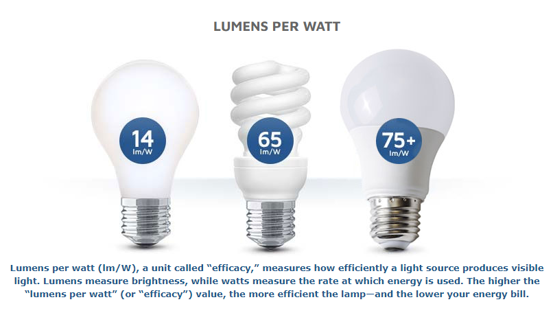
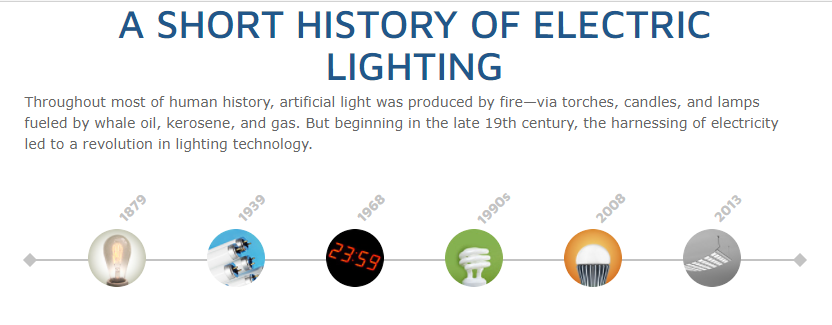
This simple visualization draws a clear connection between each variable and shows a comparison to the amount of light each produces per watt of electricity. There is little room left for misunderstanding because the visual is clearly labeled and the description helps interpret the picture. I think using pictures of each type of light bulb was smart because if this was a graph and was labeled incandescent, CFL, and LED it could lead to confusion on which lightbulb is which.
Though I was for the most part impressed with the visuals and the way the information was presented, I did find a few things I would have changed.
for example: BIG NUMBERS
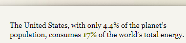
I personally think the wow factor in this statistic was hindered by the lack of emphasis on the numbers. I think they should have chosen a much bigger font to place the focus on US energy consumption.
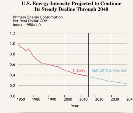
Line graph:
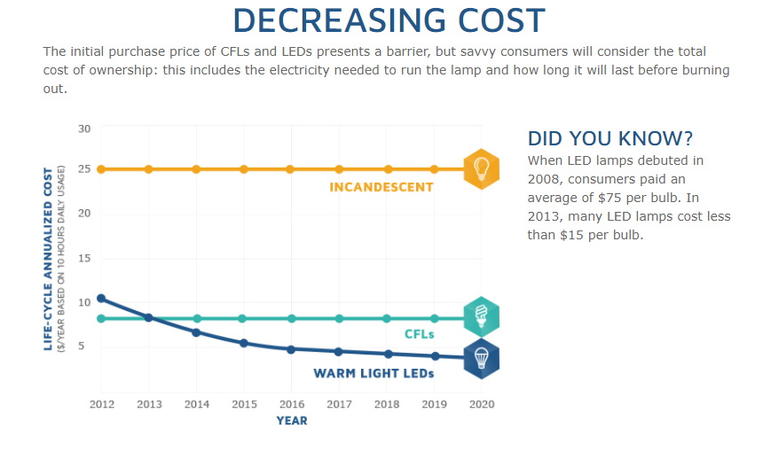
I think this graph is confusing because incandescent’s line stays consistent it gives off the impression of a benchmark line. I think at a glance without acknowledging the giving information it looks like CFLs and LEDs are falling short of a benchmark.
Listed Statistics
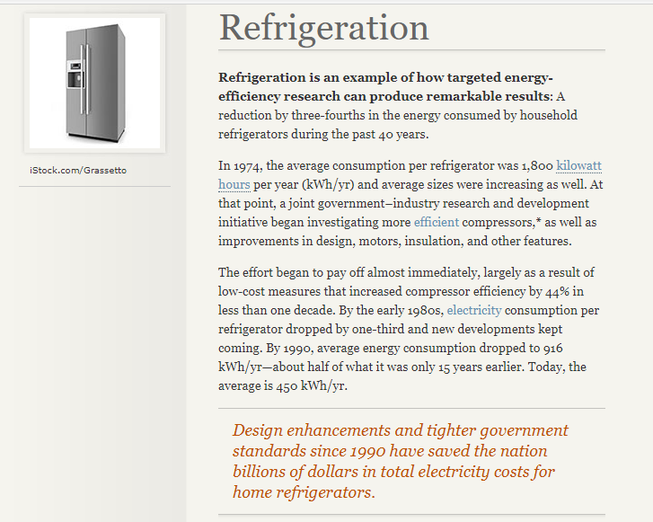
Personally, this section is just a lot of words to get lost in, when reading about the reduction of energy use in refrigeration over the years. I think that using a visualization here would keep this page more interesting and keep readers from disengaging.
Overall, I found this website to be a great resource and very knowledgeable. The visualizations were, for the most part, extremely well done and appealing.