Here, I pulled information from the World Health Organization’s (WHO) daily COVID-19 database as of December 2, 2020.
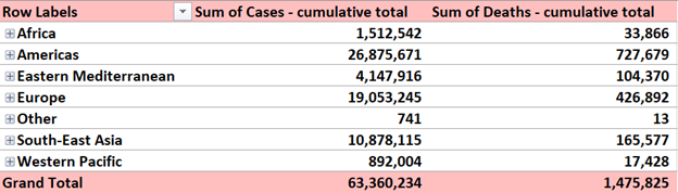
Here, I pulled information from the World Health Organization’s (WHO) daily COVID-19 database as of December 2, 2020.

Energy consumption is a major issue in the United States that spans across multiple topics, from the oil industry’s environmental impact to the debate over alternative sources such as nuclear power and hydro dams. Yet, most Americans are largely unaware of how much energy gets consumed daily, focusing more on where the energy comes from.
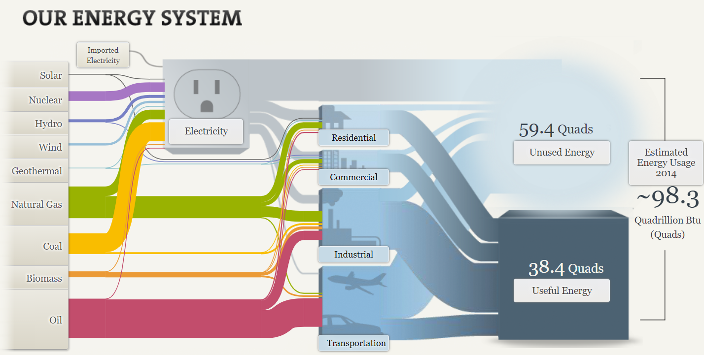
The National Academies of Science, Engineering, and Medicine compiled a Sankey chart depicting America’s energy usage in 2014. Much to my surprise, about 60 percent, or 59.4 quads, of generated energy went unused. Clicking on each point in the Sankey chart brings up a tooltip containing details about each source and how much energy gets used.
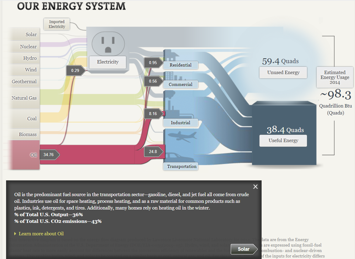
Unsurprisingly, petroleum products were the largest energy source in 2014, primarily used in industry and transportation. The second and third-largest energy sources were natural gas and coal, both of which were converted into electricity to power residential homes, commercial and industrial businesses.
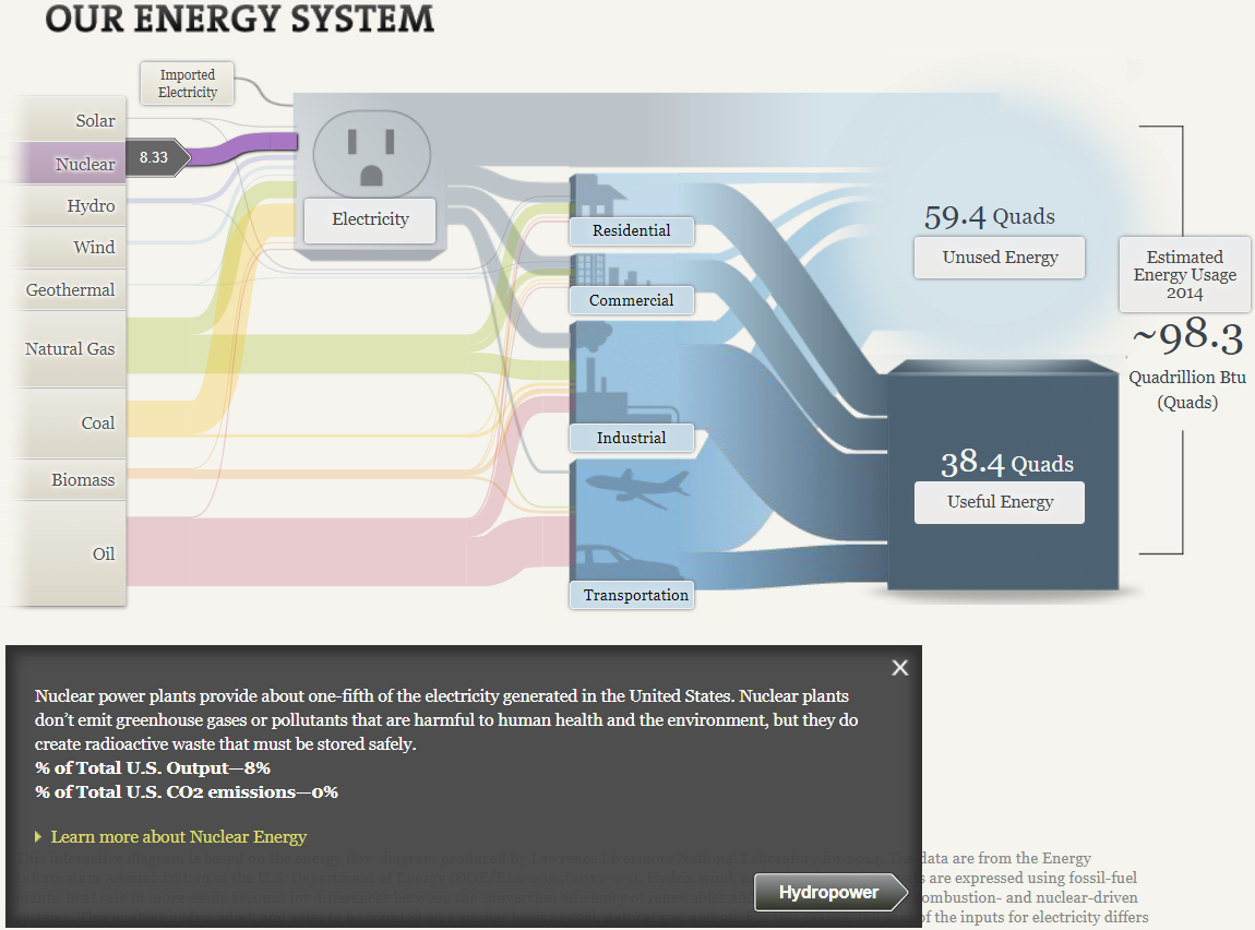
Nuclear energy is possibly the most controversial alternative energy source due to its implications in disaster events (Chernobyl in 1986, and Fukushima Daiichi in 2011) and the nuclear arms race. As the tooltip states, nuclear energy provided one-fifth of the nation’s electricity. While they don’t create any carbon emissions, radioactive waste from the power plants is still a health hazard. Additionally, opponents of nuclear power cite the potential for these power plants to be weaponized or targeted by terrorists if the health risks involved in handling radioactive materials aren’t enough to raise concern.
Pie charts are useful for depicting parts of a whole in a dataset. However, most people think that pie charts are a one-size-fits-all solution for data visualization, often making a visual mess of the data or telling a misleading story about its message.
Recently, the Pew Research Center published a report about the value of online instruction in the wake of the ongoing COVID-19 pandemic. The majority of participants in one study covered in the report say that online instruction does not have the same value as in-person instruction.
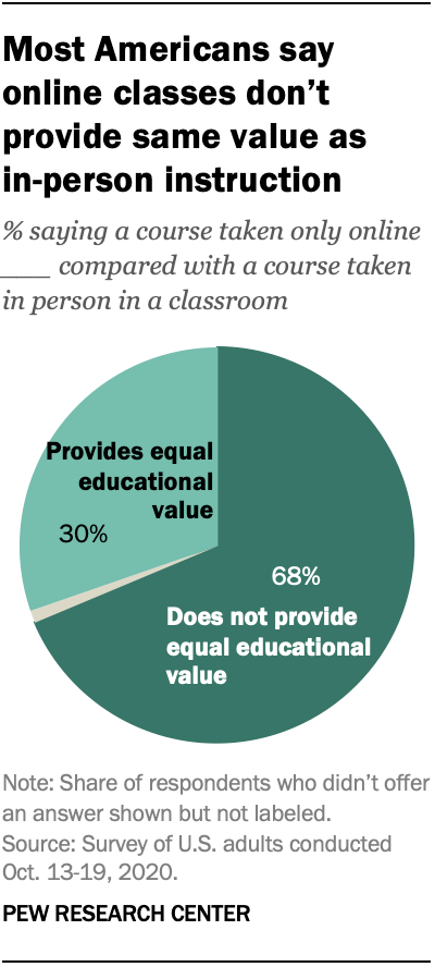
Looking at the pie chart above from a design perspective, the researchers used a darker shade of teal to depict the majority opinion. In comparison, the lighter shade shows the minority opinion. The pie slice that is greyed out represents the 2% of survey participants who did not answer or had no opinion.
While looking for data that is better suited to a pie chart, I recall a census site created by a small group of Final Fantasy XIV Online players, XIV Census. Though the data shown on the site may not be up-to-date (only shows data collected as of April 2020), I did find a pie chart for Grand Company statistics. Hovering my mouse over each slice only shows the number of characters enlisted in each Grand Company, as well as players who have not progressed far enough into the game’s story to select a company. However, the information does not list the percentages, so I took it upon myself to properly graph the data.
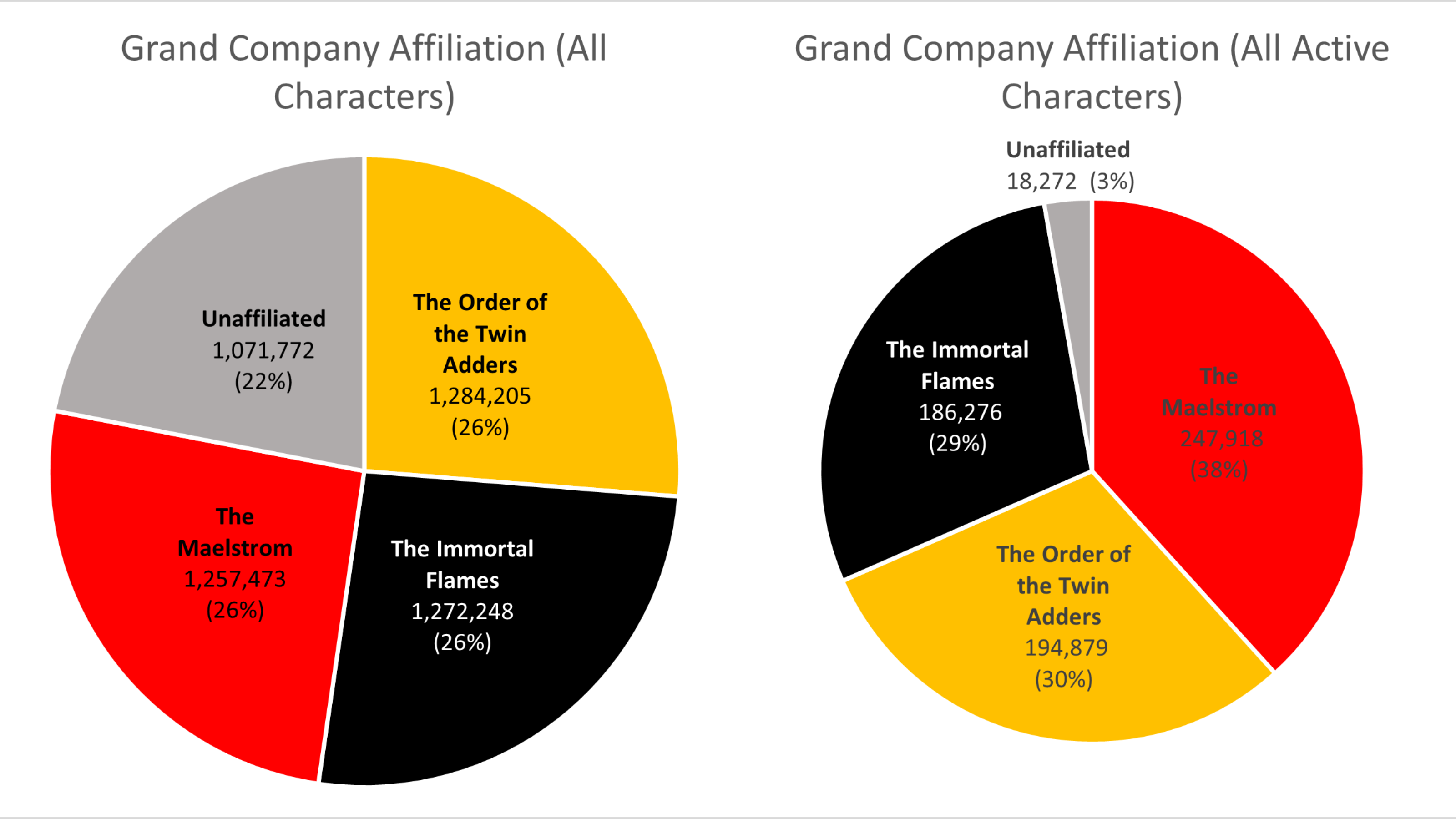
The chart on the left depicts Grand Company affiliation across all characters, while the chart on the right shows where all active characters are enlisted. Among all characters, the Company distribution seems fairly equal. Compared to the number of active players, however, it is evident that the Maelstrom and Order of the Twin Adder are the two most popular Grand Companies.
Since people typically have a hard time differentiating angles, pie charts have a very limited use as a data visualization tool. But there are special cases in which a pie chart could help your data stand out. Pie charts are used to represent data as a whole so it is important to make sure your percentages add up to 100%. In order to make your pie chart as effective as possible, it is best to use them for visualizations that don’t need many slices so that the graph is as simple as possible. Pie charts can also be used to highlight one piece of data to make a statement which can be seen in the graph I created down below.
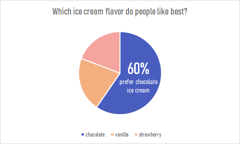
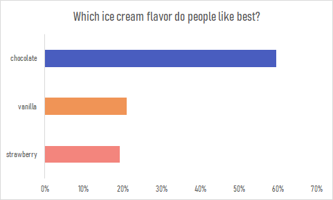
Pie charts are a great way to display simple survey results such as the one used to create the chart. The pie chart I created uses survey data from 104 participants to answer the question of which ice cream flavor is preferred by people. The results show that the majority of participants prefer chocolate ice cream over strawberry or vanilla. This information is highlighted in the pie chart to make the visualization effective. The audience can quickly pick up this information and answer the survey question easily. This data could also be presented in a bar graph such as the one down below. Although the horizontal bar graph is also easy to read and depicts the same story, the pie chart is the more effective chart in this case. It is minimalistic, straight to the point and contains less labels and text overall. The pie chart also compares the categories as a whole while a bar graph is not an effective method for that. More information on the usage and design of pie charts can be found here.
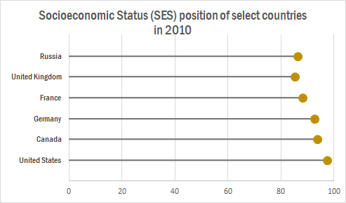
The lollipop chart is a variation of the traditional horizontal bar graph. It is used to rank categories, show trends over time or to compare categories. The lollipop chart eliminates most of the text show in a traditional horizontal bar graph, making it more approachable and minimalistic which allows readers to quickly gather information accurately.
The chart below shows a lollipop graph created in Excel. It displays the Socioeconomic Status rankings of 6 major countries in 2010. The graph has minimal information and therefore is easy to read. The reader can quickly learn that the United States has the highest SES ranking while the UK has the lowest.
This type of chart can be used with any data that can be represented by a standard bar or column chart. It is especially useful when you have a large amount of categories to represent, making a bar graph too cluttered. Lollipop graphs can also be vertical like the one shown below taken from Visualbi. A vertical lollipop graph allows you to add labels inside the lollipop to easily highlight values. To learn more about lollipop graphs and how to create them click here.

It is no secret that a majority of the United States thinks poorly of President Donald Trump, especially given his handling of the ongoing COVID-19 pandemic among other issues. But what do the nation’s overseas allies think of him? A Pew Research report published on September 15, 2020 details how the United States’ image waned on the global stage since Trump took office, and the numbers are damning.
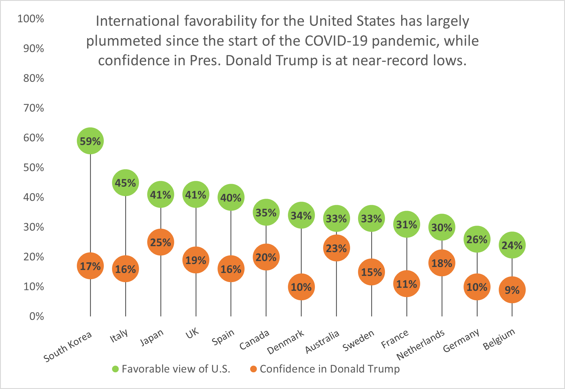
South Korea has the highest approval rating of the United States’ image out of thirteen nations surveyed, yet it holds little confidence in President Trump’s ability to lead the U.S. Fourteen points behind South Korea is Italy with a 45% approval rating, while Belgium holds the least favorable view of the United States and the lowest confidence in Trump.
Lollipop charts like this one are a visually-appealing alternative to column or bar charts because they cut down on the amount of space the chart ink takes up; instead, they focus on the data points themselves and showing how they rank among other categories.

Lollipop Charts, like the name infers, look like little lollipops and is used as a visual infographic. Like many other charts, lollipop graphs are used to compare different variables of data. A lot like a bar graph lollipop charts compare the size and ending points of the data set.
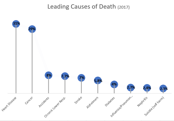
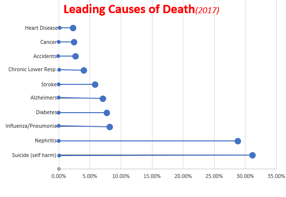
Data for both charts can be found here from the Centers for Disease Control and Prevention Website, as well as, the following pdf.
https://www.cdc.gov/nchs/data/nvsr/nvsr68/nvsr68_09-508.pdf
As you can see from both charts above, which I made using Microsoft Excel, lollipop charts can be vertical or horizontal depending on the user’s preference. The pros of using a lollipop chart as opposed to a bar graph are that it puts focus on the end data points rather than the whole graph and it allows for less visual distractions. Colors can still be used but in a minimal way that does not make a chart seem overwhelming. Lollipop charts also allow for sharing a lot of data without losing its visual aesthetics.
While looking at tutorials on how to make a lollipop chart and the different tools available, I came across an article. This article titled “Lollipop charts, Why & how, Story Telling with Lollipops” written by Dario Weitz, is a great resource as to why and how to use a lollipop chart. The author touches base on the pro’s, con’s, and even the similarities of using this specific graph.
When looking at a comparison infographic, sometimes it’s difficult to determine the standard for comparing two or more things. One solution is to apply a benchmark to the chart, but there are many ways to go about it.
As someone who has a professional interest in the natural sciences, it saddens me to look at the news and discover that not everyone in the United States trusts scientists to do the right thing. More often than not, the media cites misinformation and alleged government propaganda as sources for such distrust. However, I do sometimes wonder what opinion people from other countries have of scientists. Recently, I read a Pew Research Center report about the scientific community’s relationship to the general public, and I was surprised that people in countries like India and the Netherlands have far more trust in their nation’s scientists than the American public has in ours.
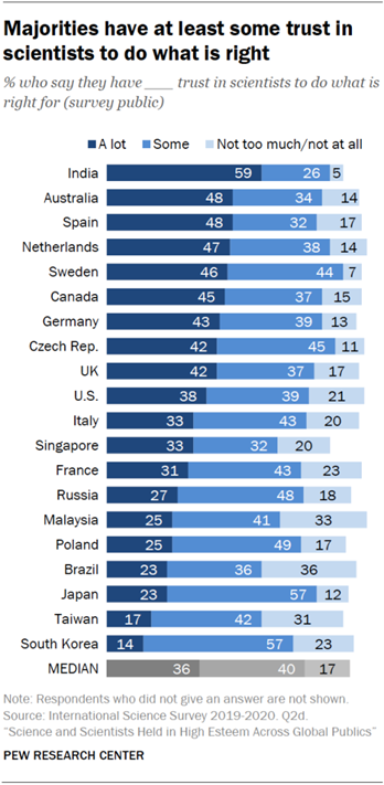
On the other end of the spectrum, I found myself wondering why nations like Japan and South Korea are skeptical of scientists. They are among the world’s leaders in technological advances, yet the people don’t seem to trust scientists to do the right thing. When compared to median values, the United States exceeds the benchmark, if only by a slight margin, which gives me hope that the vocal minority that distrusts scientists will one day see their error and learn to trust science.
Another way of showing a benchmark is by comparing positive and negative values to determine favorable perspectives. With the United States presidential election fast approaching, the public is more divided than ever on whether or not this year’s elections will be run well. It is likely that a divide in partisan politics and factors like the current COVID-19 pandemic and ongoing police brutality protests are responsible for this immense discourse.
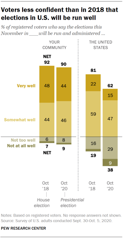
Based on Pew Research Center’s data, I estimate that conservative-leaning voters believe that the election will be handled well. On the other hand, liberal-leaning voters believe that this year’s election will run into a series of blunders or be subject to manipulative interference. As someone who wants to see Donald Trump and his alleged enablers voted out for the sake of the rest of the nation, I am hoping for the best but preparing for the worst.
Even when I am not catching up on the news, I still enjoy looking at comparisons for the things I love. For example, I’ve been playing Square Enix’s Final Fantasy XIV Online (shorthand: “FFXIV”) for about a year, and have a strong interest in joining the small community of players who spend most of their time on high-end or difficult pieces of content. When a new piece of content comes out, one of the first places I go to look for information is FF Logs. Their tools analyze combat data and give players a sense of their overall performance and where they can improve. They also have statistical charts that show performance averages for each of the game’s 17 combat classes (jobs). For example, one of the most difficult “raid dungeons” currently in the game goes by the name of “Eden’s Verse: Refulgence.” (shorthand: “E8”). Raids in FFXIV typically have two modes of difficulty, normal and “savage,” with the exception of specially-themed “ultimate” raids. The community typically pays attention to statistics and ranking for savage raids. In the first few weeks of release, Eden’s Verse: Refulgence (Savage) (shorthand: E8S) proved to be a difficult challenge for most raid groups.
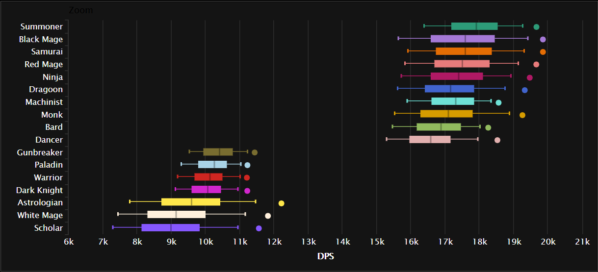
Combat jobs in FFXIV are divided into three major roles: tanks, healers, and damage per second (DPS). The box plot chart above shows an aggregate ranking for job performance in E8S over the course of two weeks across all percentiles. DPS jobs typically put out far greater damage than tanks or healers, with magic-based DPS jobs having the highest damage output. The only exception to that rule is the samurai job, which is typically described as being a selfish DPS job that brings little party support to a fight as it deals heavy hits at melee range.
Viewed from a different perspective– say, comparing the maximum and minimum percentiles for E8S damage– certain trends seem to appear among the 17 jobs, and it reflects in how well the player performs in the fight. The best players in the world generally fare much better and clear the raid faster than players who barely have a grasp of their jobs or exhibit poor performance.
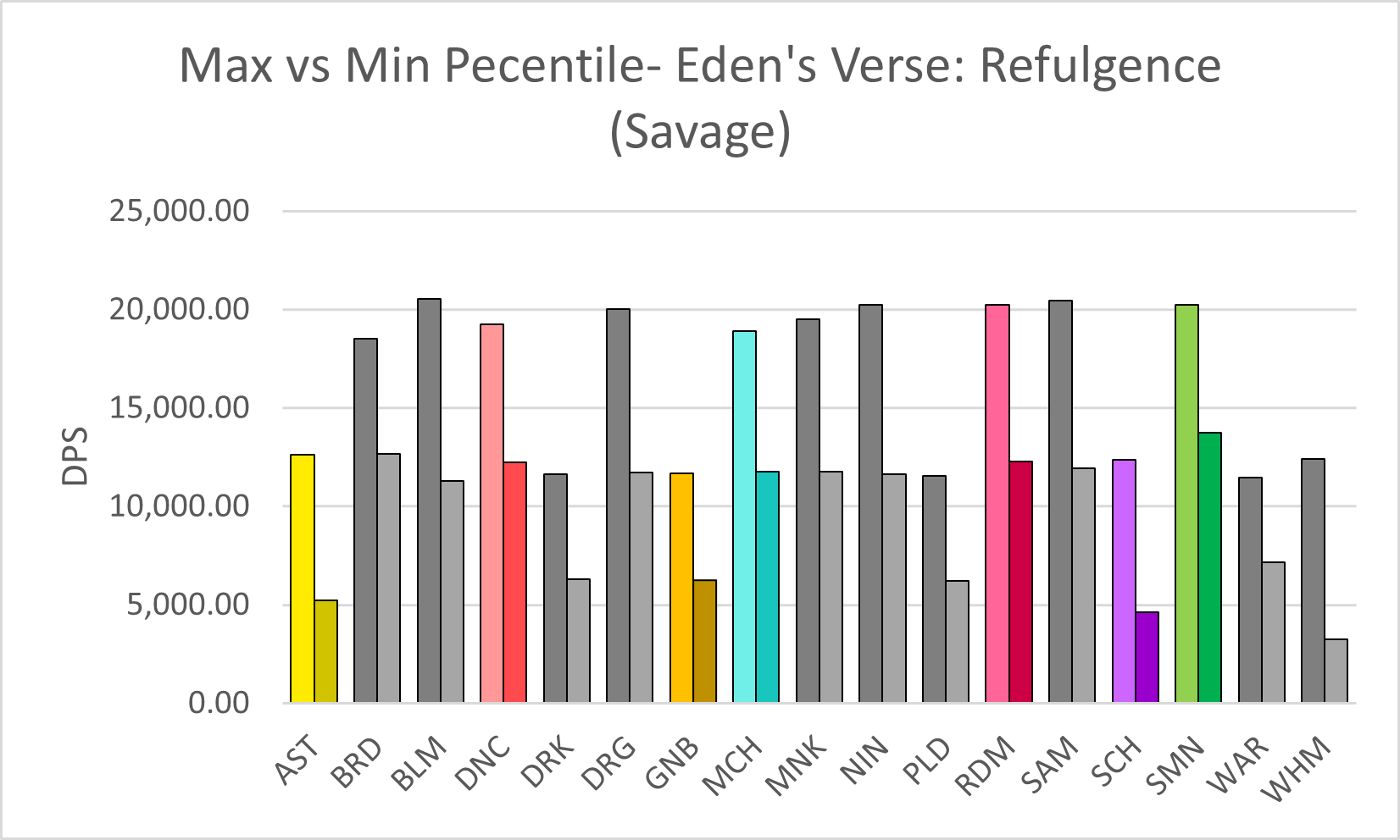
Compared to others who play the same jobs as me (color-highlighted in the chart above), I would say that I am somewhere between the two extremes. However, in the case of the job I play the most, red mage, I tend to lean toward the lower end of the spectrum. I recall running a four-person dungeon once with some of my friends a few months before the COVID-19 pandemic exploded. One of them, who went in with a tank job, had a third-party tool open to analyze everyone’s damage output in real-time (which is against the developer’s terms of service, but Square Enix doesn’t crack down on third-party tools if players don’t discuss them publicly in-game), and once the program crunched the numbers, he uploaded the data to FF Logs and sent me a link to the log over Discord. As I looked it over, he laughed in voice chat and likely shook his head at how low my damage output was. Another one of my friends, a healer who did significantly better than me, pointed out that at least I knew my spellcasting priority rotation as a red mage and the random black mage who got matched with our three-player party did less damage than me. I didn’t care that my damage output was sub-par, though. I was happy just to run content with my friends.
Data is everywhere. It’s been said ad nauseam, but advances in technology at scientific methodology have made it possible to collect and display data more efficiently. The major problem, however, is making sense of a set of data. Often, people ask, “What do these numbers mean,” especially when attempting to compare two or more numbers. Thankfully, data visualization makes it easier to comprehend the data and its message. The only problem is figuring out how to tell a story by comparing numbers using data visualization.
Prior to the emergence of the COVID-19 pandemic, I rarely pay attention to the political climate in the United States, opting instead to focus on my academics or escape to virtual worlds via computer gaming. Yet deep down, I’ve always wondered if others like me do pay attention to politics and other news topics, especially where a presidential election is concerned.
Pulling data from Google Trends, I went ahead to see how interested Americans have been in previous elections since the year 2000. However, the data only goes as far back as 2004, since Google implemented search interest trend analysis around that time.
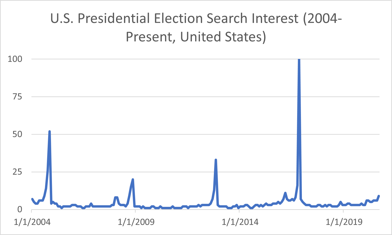
There are four significant peaks in search interest (shown in the chart above), and those spikes occurred in November of each general election year– 2004, 2008, 2012, and 2016– when the polls opened to the public on Election Day. In 2004, George W. Bush won his second term as President, though the search interest pales compared to 2016’s peak. That year, businessman Donald Trump ran for office and won the Electoral College vote to become the 45th president of the United States despite losing the popular vote to Hillary Clinton. Initially, in March of that year, Americans thought someone like him wouldn’t be able to secure the presidency. I recall seeing memes on the internet emerging around when he announced his candidacy but thought nothing else of it until he won the election. Based on the data from previous years, I can guess that search interest will spike again this year around Election Day. With issues such as COVID-19 and social unrest in the wake of George Floyd’s death at the hands of police officers, the search interest peak among U.S. voters will most likely dwarf that of 2016’s data.
When the search interest data is viewed another way, say on a map of the nation, it’s evident that some states had a stronger interest in election results than others.
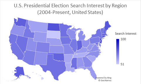
Some regions on the map, such as the District of Columbia and smaller states like New Jersey, do not have data labels tied to them due to graphing limitations in Excel. Still, Google Trends does show that the District of Columbia has the highest volume of interest when it comes to the presidential election. After that, New Jersey comes in second on a top-five comparison chart, followed by North Dakota, Maine, and Alaska.
The data provided by Google trends gives a general idea of how interested Americans are in general elections. But what do those numbers look like among demographics, and what do Americans look for in a candidate?
Moving forward, I decided to pay a visit to the Pew Research Center’s website, which holds a repository of data trends for this year’s presidential election. The topics covered range from election-related social movements to hot-button issues such as COVID-19 and police reform.
One issue that Donald Trump has made a fuss about for the past four years is voter fraud, but it seems that more Americans are paying attention to those claims, especially where fraud resulting in Trump’s re-election is concerned. President Trump has allegedly made moves to attempt to block mail-in voting, a move that health experts say is more pandemic-friendly than in-person voting. Political analysts believe that if Americans are encouraged to vote by mail, the results could spell the end of Donald Trump’s presidency. Moreover, there is media documentation of President Trump crying foul on mail-in voting as a means of committing voter fraud.
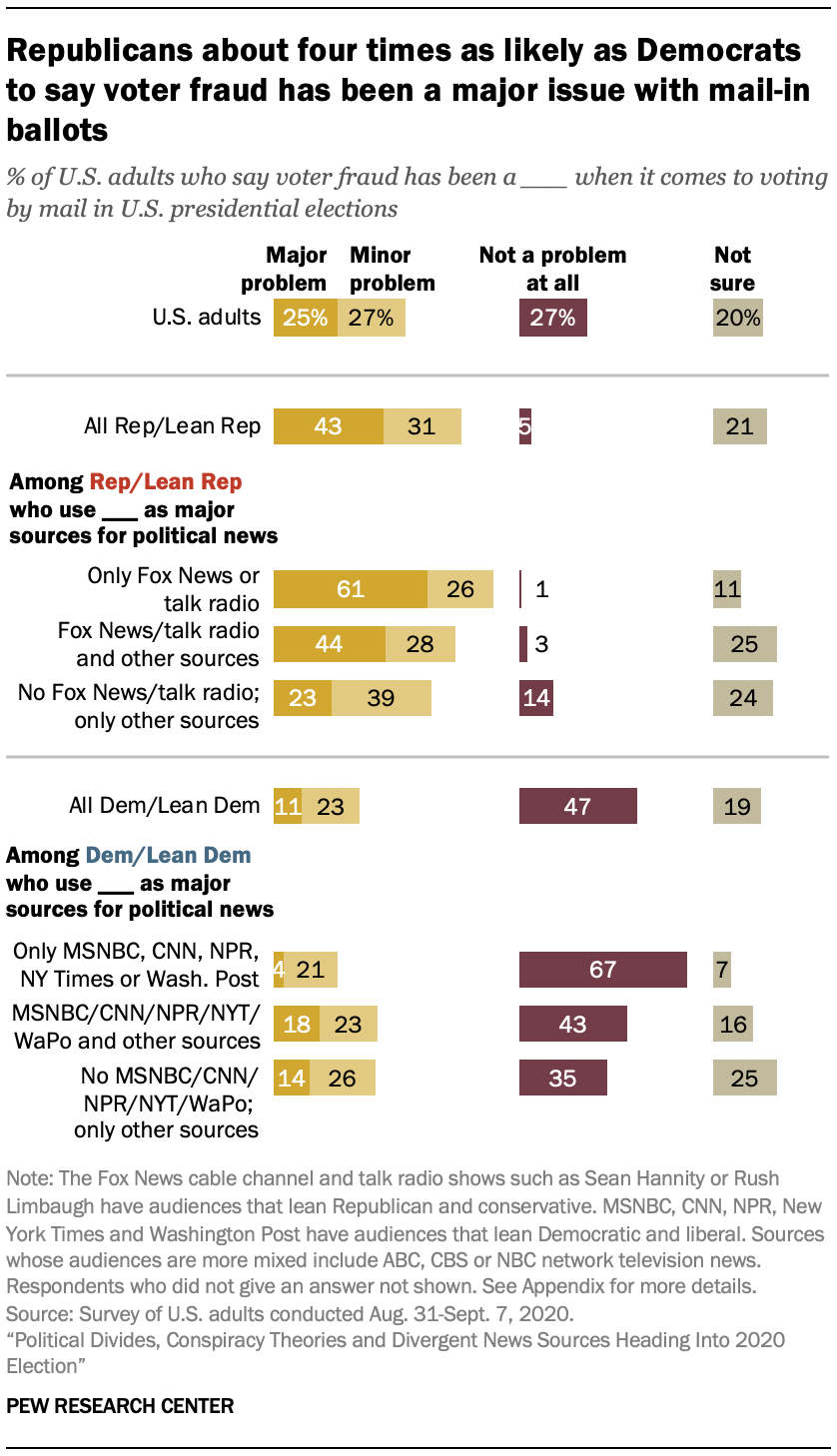
However, the Pew Research Center’s data shows that it’s mostly Republican voters who share President Trump’s sentiment about voter fraud. Democrats, on the other hand, do not seem to be concerned about the issue. Furthermore, the research shows that voter preference in news sources may influence political opinion. The disclaimer states that Republican voters tend to watch Fox News or listen to radio talk shows, while Democrats prefer to get their news from MSNBC and the New York Times.
Political divide based on news source is one matter facing the nation this election year, but influence from conspiracy theorists and foreign powers is quite another. Misinformation propagated by groups such as QAnon and Russian government-backed “troll farms” has led to confusion about the election, even paranoia, and cases of domestic terrorism.
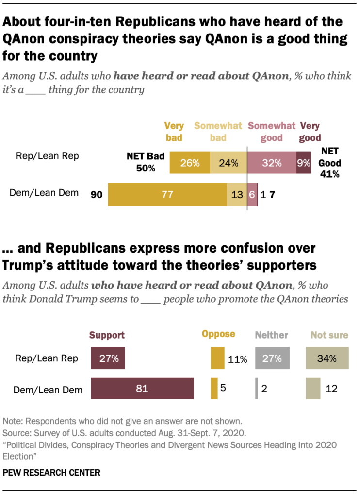
Roughly 47% of registered American voters have heard about QAnon. Among those who have heard o the conspiracy theory group, 40% of Republican-leaning voters believe that QAnon’s claims chalk up to being a good thing. On the other hand, 90% of Democratic-leaning voters believe that the misinformation QAnon spreads is bad for the country. Moreover, QAnon isn’t the only roadblock in getting clear-cut, unbiased information about the election. Since Donald Trump’s election, numerous reports have been published exposing negative influence on the United States’ affairs from global powers such as Russia. Many of those reports center on online “troll farms” funded and backed by the Kremlin. Their purpose is to flood social media sites such as Facebook with misleading information about Trump’s opponents in the hopes that their false claims would be shared by unsuspecting and uneducated users. Even worse, many Americans fear that hackers supported by foreign governments will alter the election results or create other forms of chaos that would impact the election.
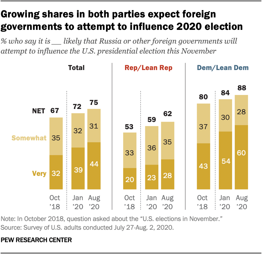
Two years ago, 67% of Americans in both parties believed that Russia would attempt to influence the U.S. elections in some capacity, with 50% of Republicans believing that Russia would interfere with the election compared to 80% of Democrats who expect it. The Pew Research Center asked the same question twice this year amid the COVID-19 pandemic, and the results show an increased concern in election interference by the Russians or other foreign countries. 75% of Americans reported in August that they are concerned that Russia would try to interfere with the election, likely in favor of Donald Trump; 62% of Republicans and 88% of Democrats said the chance of foreign interference occurring would be possible.
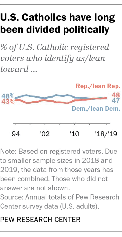
What surprised me the most was a report on Catholic voters. According to the Pew Research Center, Catholics in the United States are “split down the middle politically,” with 48% leaning toward Republican policy and 47% leaning toward the Democratic approach. Furthermore, Catholics are swing voters: in 2016, 52% of Catholics voted for Donald Trump versus 44% who voted for Hillary Clinton, while the percentage clocked in at 54% to 45% in favor of Barack Obama when he ran against John McCain in 2008.
As someone who grew up in a Catholic household that often voted Republican, I can attest to how my parents’ beliefs shaped mine, at least until I arrived at an age where I decided to forge my fate. Once I became a registered voter, I turned my back on voting Republican vs. Democrat, opting to support independent candidates despite not knowing anything about politics. That was the case until this year when COVID-19 took the world by surprise and changed everything. Still, I carried on and shut politics out of my mind, once more focusing on my studies and learning more about the virus. Then a report came out exposing Donald Trump for covering up the seriousness of the pandemic. I had a feeling he was downplaying the issue to keep the American public from panicking. Still, the fact that he made moves to politicize the plague for his benefit infuriated me to no end. It was then that I knew that he had to go, for the sake of the nation’s health.
Data visualization can help voters make informed decisions on candidates and national issues and reflect trends in voting patterns. It is especially apparent in the partisan divide between Republican and Democrat voters today, though it doesn’t have to be that way. Regardless of your political beliefs, it is imperative to know that every voice counts, including yours. Now more than ever, the fate of the United States rests in her people’s hands. Whether you choose to go in-person to the polls or submit your ballot by mail…
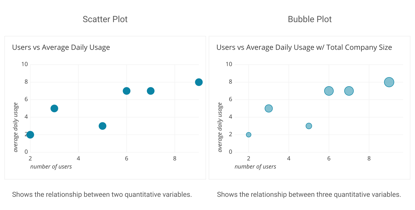
Utilizing the right visualization to display numerical data is important when presenting accurate, and meaningful data to the audience. Numerical data seen through visualization allows the audience to interact with the data and compare the numbers and understand the information that is being displayed on the charts. One major advantage of data visualization is to help the audience see patterns, links, and trends that may not otherwise be visible through text-based information. While some visualizations are meaningful in representing numerical or statistical data, there are visualizations that are not hence, it is important to choose the most appropriate chart to reach your audience.
Examples of Visualizations to Compare Numbers
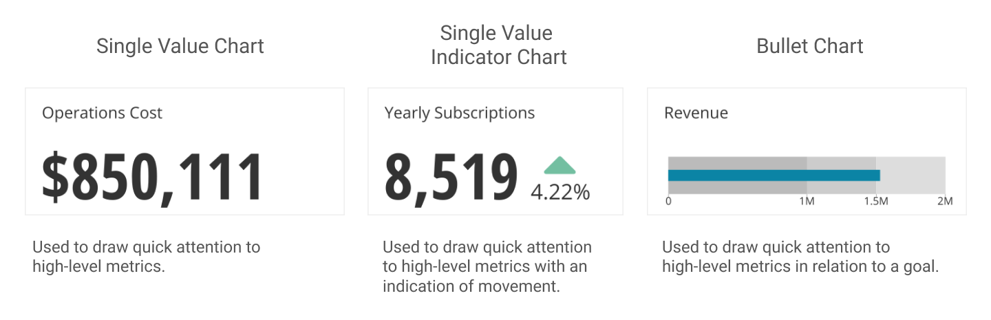
The Single Value Chart is a phenomenal tool for comparing single value digits. Displaying Revenue figures and calculating Operation costs are best used on this type of chart.
Four categories when displaying numbers:
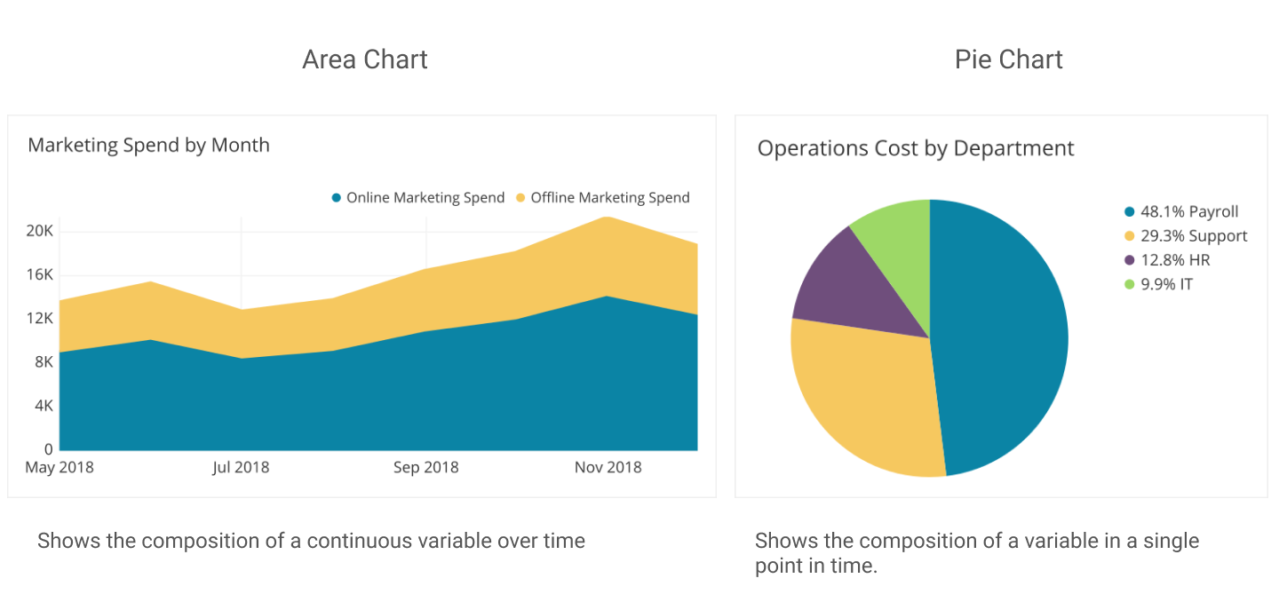
2. Composition: This chart is used to display how sets of a whole data are created into smaller divisions to highlight differences of each of the smaller parts to the total value.
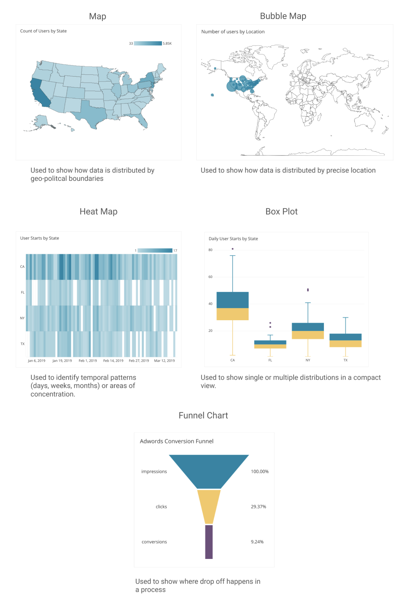
3. Distribution- When displaying data values about a population within an area, the distribution map is helpful to accurately, and clearly represent figures within the specific location.
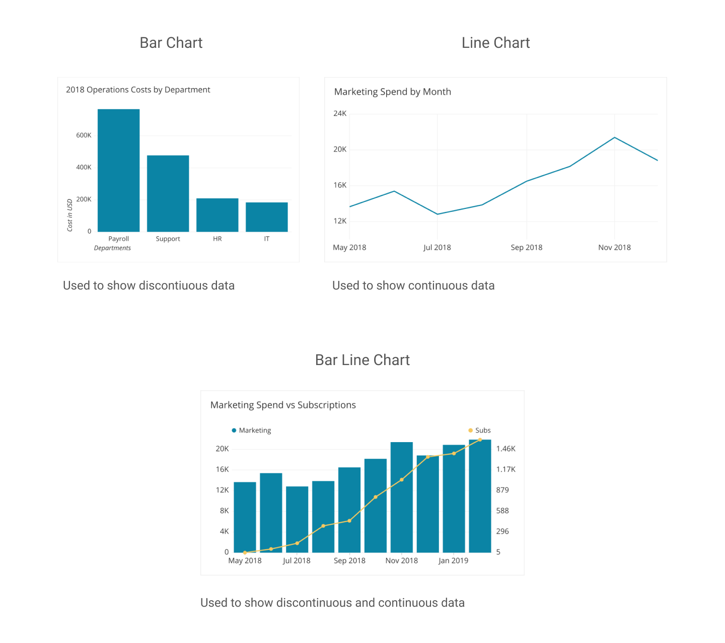
4.Comparison – These types of charts are very helpful in understanding and displaying data of multiple information over a period of time.
https://dataschool.com/how-to-design-a-dashboard/find-the-best-visualizations-for-your-metrics/