Categories
Uncategorized

Pivot Tables

What is a pivot table?

A pivot table is a tool in Excel that allows users to interact with their large, raw dataset to gain a better understanding of specific topics within the dataset.

When is a pivot table useful?

Pivot tables are extremely useful when dealing with any dataset that contains a vast amount of variables. Additionally, they are useful in cases where you are looking to identify specific variables within the dataset and how they interact with other variables within the same dataset.

Examples of pivot tables:

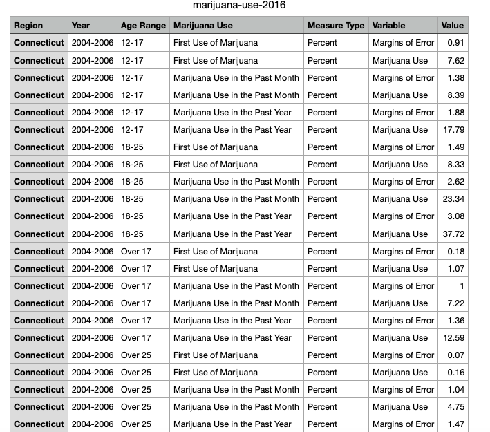
Pictured below is an example of a raw dataset which can be found here. While this is not the entire dataset you can begin to see that if this contained hundreds of rows this could be confusing to look at and would need to be formatted in a better way.

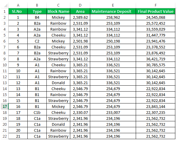
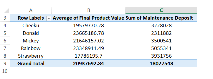
That is where the pivot table comes in! From the raw data we can then select specific variables to look at and compare to other variables in the same dataset. Below you see one example of a pivot table that was created using the raw dataset above. You see in this table only the block names, final average of product & sum of maintenance deposit are shown.

Pivot tables make it extremely easy to simplify your large and overwhelming data sets into clean and clear tables. Pivot tables can be used in almost any instance where there is statistical values being computed such as sums or averages.

Categories
Uncategorized

SANKEY

This website is an excellent tool for those collecting data that concerns the U.S. primary energy sources. You are greeted by a bar graph visualization portraying the “start” button for the visualization but also some insightful information about the energy usage in 2014. While this is not a lot of information to start with, it is enough to entice the audience to delving into the presentation further.

Once you begin the presentation you are greeted by the following visualization pictured below!

The above visualization contains a lot of information to say the least! The very first thing I notice about this visualization are the colors. Pictured above you see the colorful “cords” on the left hand side of the visualization, and blue tubes on the left. The colors in this visual do wonders to help the audience interpret each individual topic. However, this visual would not be very useful in a presentation where the presenter did not wish to explain this visual. This is because the audience will need some context of where to look on the visualization and why for the presentation. Each topic on this visualization is also a link to a different screen containing data and visualizations concerning the topic selected.

For this blog post, I choose to delve into “residential” energy use. As seen above, a small pop-up appears containing a more information on residential energy use within the U.S. How crazy is it that the residential energy use accounted for 21% of the total amount of U.S. energy usage!?

Once navigating to view more information about U.S. residential energy usage, I found this pie chart visualization. In 2015, the largest contributor to U.S. residential energy usage was space heating (27.3%) followed by water heating (13.1%). Space cooling (11.8%) came in third and was followed by multiple other factors that contribute 8% of less. I do think this visual was effective in communicating what it needs to. However, I do feel that the colors distract from each individual topic. I think this would be more effective to use the pie chart to point to one colored factor (such as space heating) and leave the other factors in a grey/ neutral tone.

Categories
Uncategorized

A Case For Pie Charts!

Pie charts are a very interesting visualization as they cause some uproar for being invaluable and basic. Even with this belief, there will always be a great case for using a pie chart! In this blog you will explore one of these examples to better understand when you should and should not use a pie chart.

Example:

Today, we will explore a case that is perfect to visualize in a pie chart. This case is, coronavirus (COVID-19) cases in the United States versus the United States population. As you can already see, our pie chart will have two slices. A very important rule for pie charts is to stick with four or less slices per visual. This allows your audience to better understand what you are showing them.

Step One:

The first step in creating your pie chart is to collect your applicable data. Here I used the World Health Organization’s Coronavirus Disease Dashboard & the United States Census population data from 2010. Both of these resources are pictured below.

Americas cases (19,040,071) data was used in creating this pie chart example.
United States 2010 population (308,745,538) data was used in creating this pie chart example.

Step Two:

The second step in creating your pie chart is to construct your data in Excel. Pictured below is what the data table in Excel was for this pie chart example.

Step Three:

The third & final step in creating your pie chart visualization is to simply insert a pie chart visual & format your pie chart exactly how you’d like it. Remember, your audience craves something that is clean, clear & concise with it’s information. Do not clutter your pie chart with excess data causing it to have too many slices. Also consider highlighting your “important” data with color and making the other data a neutral color (like grey). An example of this can be seen below in the pictured final product of the United States COVID-19 cases example pie chart.

Wrapping It Up:

Remember, in order to have an effective visual you must only include the needed data and nothing more. A pie chart is a visualization that is best suited for simple datasets where complex datasets may need more then four slices and this is a no-go for pie charts! Allow color to help you highlight specific key details easier to your audience. I’m certain you noticed your eyes peeking at the red slice for COVID-19 U.S. cases in the above pie chart before the grey slice for U.S. population. This was exactly what I had intended the red to do, grab your attention! Using this information you will now understand how to create an effective pie chart visualization!

Categories
Uncategorized

Lollipop Graphs!

What is a lollipop graph?

A lollipop graph is a visualization that is great for comparing up to three different types of data such as year to year or before, during and after. Typically, a lollipop graph can be used where a bar graph would be used and is often more visually appealing. Lollipop graphs are not ideal when you are using a dataset with stacked-bars or with data that has very similar end results. An example of this would be an experimental dataset with thousands of results ranging from 0.00 to 0.05. It would be extremely difficult for an audience to differentiate what exact values the bars are representing.

How to create a lollipop graph…

When looking for a dataset to create a lollipop graph with it is important that you choose one that is appropriately measured by a scatter plot, as this is used to create your final visualization. Keeping this in mind, I selected to create my visual using the average gas prices over the past twenty years, this dataset is pictured below.

After selecting a dataset I moved into Excel to begin creating my lollipop graph! First, you should translate your selected dataset into a table in Excel, as pictured below using my example dataset.

Once you have your dataset translated into an Excel table, you will insert a basic scatter plot graph to represent your data and make a few other formatting changes. These will include adding horizontal error bars, changing the error bars direction & altering the error amount. Once you have completed this your lollipop graph should look similar to the one I produced using my dataset below.

As you can see, a lollipop graph is a much more visually appealing when compared to a simple bar graph. While it may be a little more work to create, it can make a huge difference in what your audience takes away from your visualization.

Categories
Uncategorized

Benchmark Graphs & The Election.

The presidential election is a topic that brings about many different types of visualizations. One search on google and you will be bombarded with statistics for each candidate. Below we will look at simple visualizations that have been generated by CNN for each presidential candidate.

Above you see a visualization that depicts how each candidate is polling nationally. You can find the article this visual is captured from here. It is quite apparent to see that according to this visual, Biden has the overall support for the presidency. One thing that this visual does that is very helpful for the audience is highlighting the trending candidate’s (in this case Biden) numbers with their associated party color (blue for Biden, red for Trump). This visualization also included other news sources & polling agencies results to ensure that there were no extreme cases.

In the visualization above you immediately notice that there are not as many polling agencies listed for results. This is because after viewing the national polling for each candidate, the article allows us to narrow in on exactly how each candidate is polling within the states, here I selected New Jersey. Based off this visual for NJ, you notice that Biden has over half of its support with trump staying consistent around 35%.

In the above visual Texas was selected and as you can see right away, this visualization looks a bit different then the two prior. Immediately your eyes are drawn to the red highlighted percentages for Trump. However, as you view the entire visualization you notice that only two of the entire five polling agencies were able to determine a difference between the two candidates. The last three polling agencies were unable to determine if there was more or less support for Trump/ Biden because the final percentages they came up with, were within the margin of error.

Categories
Examples Visualization Tools

Comparing Numbers

A clean & concise visualization is critical for your audience’s understanding of what your selected topic may be. Without this, your audience is likely to struggle with the content presented to them as they will not grasp the important topics you had hoped they would. When designing a visual that involves comparing numbers, it is crucial that you only include what is most important for your topic at hand. This is because if you overload your visual with too much information, your audience will become overwhelmed and leave your presentation feeling more confused about the topic, and this is exactly what we should attempt to avoid.

As you can see in the above visual, there is one main point being conveyed to the audience with three measured categories. The main point of this visual is to show what the future of workplaces may adapt to become. Each one of the three measured categories is given a specific color that all of its data is highlighted in. This does wonders for your audience’s understanding! This is because your audience can quickly identify that the red 69% of the doughnut is portraying that employees could be paid based on their performance rather than hours worked as commonly seen today. As you can see, this visual is very effective in communicating only the data it needs to and contains no extra information or frills that could grab the audience’s attention away from the main points.

Seen above is a vertical bar-graph that depicts the revenue of new customers for a company over a specific time span. As seen in the legended below the x-axis, the blue vertical bars represent the number of new customers and the orange trend line represents the revenue generated from these new customers. With this visual we can clearly see that this company had a large uptake in new customers from before March of 2015 until May of 2015. We can also see that this company did not have nearly as many customers in September of 2014 but they still generated more income off of these customers then they did in November of 2014. This visual is very easy to understand upon first glance and does not leave room for your audience to have many questions about what this data is portraying. This is exactly what you should be aiming for when creating your own visuals comparing numbers.

Above is a short three minute video explaining exactly what data visualization is and why it is crucial in everyday life. This video highlights how a data visualization should be constructed and how these visualizations can benefit more than just the person that created them.

Categories
Uncategorized

Visualizing Health; A Reflection.

Visualizing Health offers a wonderful tool to assist you in selecting the appropriate visualization for your dataset. Upon entering the website, you are greeted by the homepage pictured below.

Once on the homepage navigate to “The Wizard” tab, highlighted in green in the photo above. You will then be brought to a new page that asks you to further explain what your primary goal is for your visualization & exactly how much knowledge your audience should take away from your visualization.

If someone is looking to create a visualization for the differences in risk for two medical conditions over time, they may select the highlighted options in the photo above. Selected is, “to show differences in risk between groups” as the two different medical conditions (sexual & urinating problems) are measured in individuals who had reconstructive surgery and those who choose radiation. It is not crucial for people to understand exact figures, just that one may have a better effect then the other. This is why “the basic idea” is selected.

Shown above is one of the numerous visualizations that “The Wizard” recommended for the data set. As you can see, this visualization is clear & direct in communicating that for sexual problems, surgery was a better overall choice for patients. For the case of urinating problems, surgery also appears to be the better overall choice although it could be questionable as a longer term solution.

Visualizing Health is a wonderful website to explore if you find yourself wondering if there is a better way to depict your data. Taking the time to look through this website will offer any user insight into what clean & concise visualizations look like. Keeping this website on hand could be the difference between creating an average visualization, and a perfect one!

Categories
Infographics

Datasets, An Overview

What is a Dataset?

“A collection of related sets of information that is composed of separate elements but can be manipulated as a unit by a computer.”

~Oxford Languages

The following video provides insightful knowledge into what a dataset is along with several concrete examples.

Finding Datasets Using Scientific Research:

Upon navigating to the Connecticut Data Collaborative website & downloading the “Marijuana Use” CSV, you will be shown results to a study conducted to determine the usage of marijuana in individuals aged twelve years and older. Upon first glance this may seem like an overwhelming amount of information. Fret not, there are actually many different possible datasets within this study! Below you will see there is also a sample of the data included in this study.

  1. Location: Where would you like your dataset to take place? For this example your options would be Connecticut, Eastern Region, North Central Region, Northeast, Northwestern Region, South Central Region, Southwest Region & United States.
  2. Time: Over what time span would you like your data set to take place? The possibilities within this example would be 2004 through 2006, 2006 through 2008, 2008 through 2010, 2010 through 2012, 2012 through 2014 & 2014 through 2016. You could also choose to measure a span of four years (such as 2006 through 2010) or even the entire span of the study (2004 through 2016).
  3. Age: How old do you want the participants in your observed dataset to be? Possibilities within this example are 12 to 17, 18 to 25, over 17 & over 25.

It is important to understand how to select the appropriate dataset(s) from scientific research as if you do not, it is likely that you will select a dataset that is not the best suited for your topic at hand. Always be sure to have a clear and concise understanding of what it is you would like to present to you target audience.