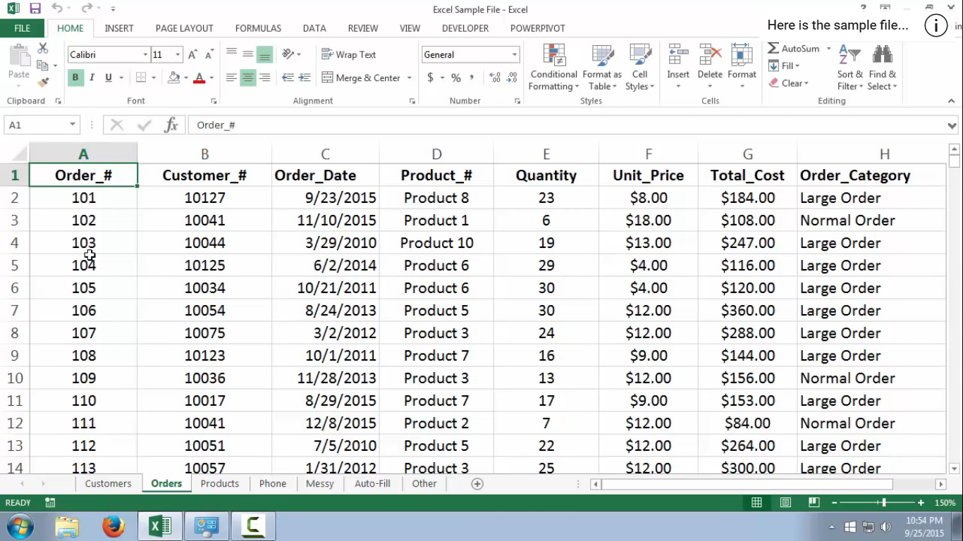
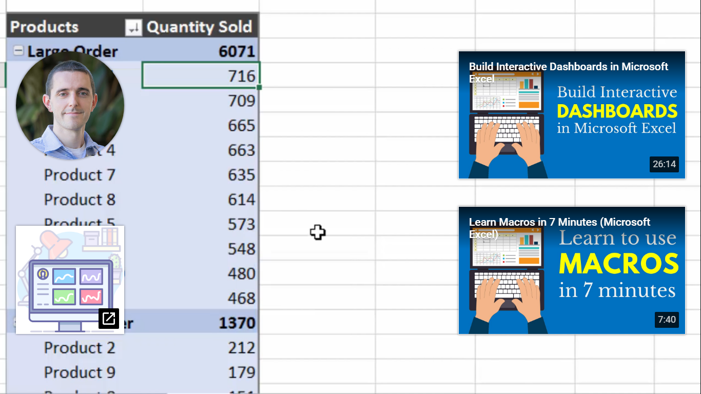
A pivot table shows statistics like averages and sums with various fields that summarize data. I came across a youtube video that explains what a pivot table is, what it contains, and how to make one. The first screenshot, it shows a pivot table and some of the fields the person decided was the best fir for their data.
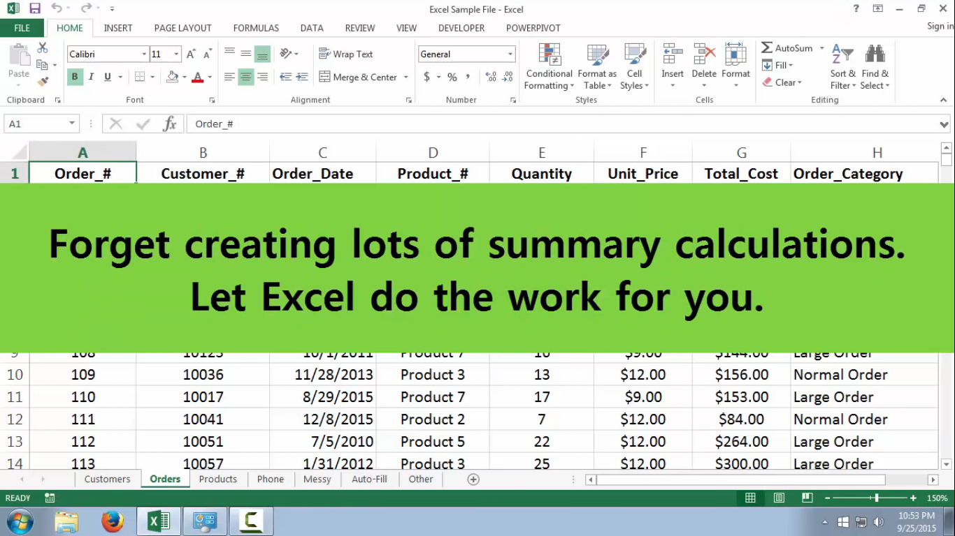
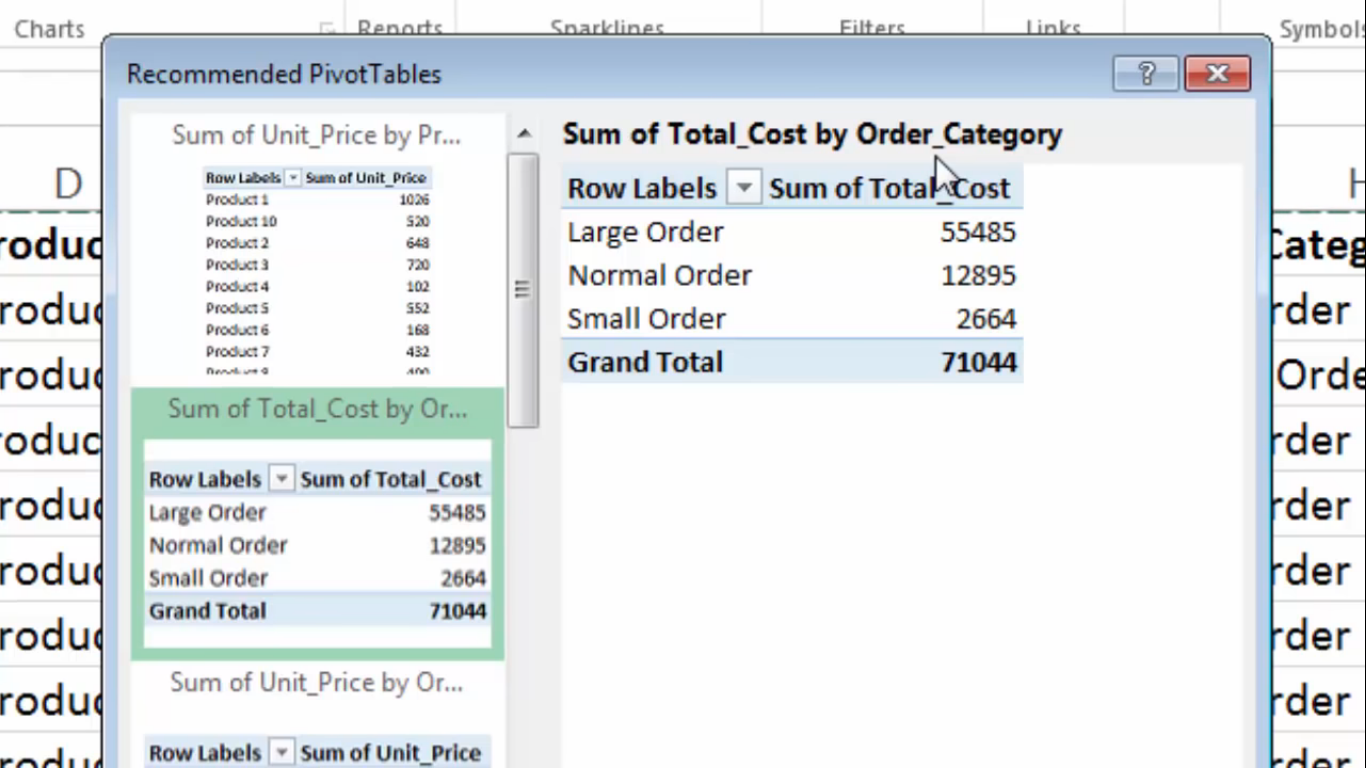
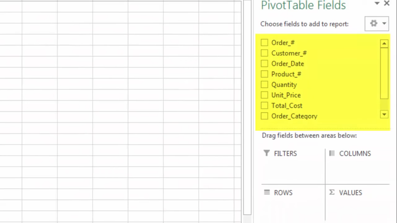
Here the speaker mentioned how pivot tables show summaries. You can enter calculations to excel and it will calculate the formula for you and continue to add the numbers that come after. Next, the speaker shows how you can choose the type of pivot table for your data. They are also recommendations on how to display your data. The next slide just shows how you can sort fields to columns, rows etc. Here I wanted to show the end result but I could not figure out how to take the YouTube icons for other videos out. The speaker color-coded the table so it would be easier for us to read. He also changed labels to “products” and “quantity sold” so readers would understand what the values represent. I found these example and tables easy to use because it is labeled and it is color-coded which helps people look at the table easier. I also find it easy that we do not have to manually plug-in formulas or each number we want to represent. We can highlight the whole row for the formula to apply.
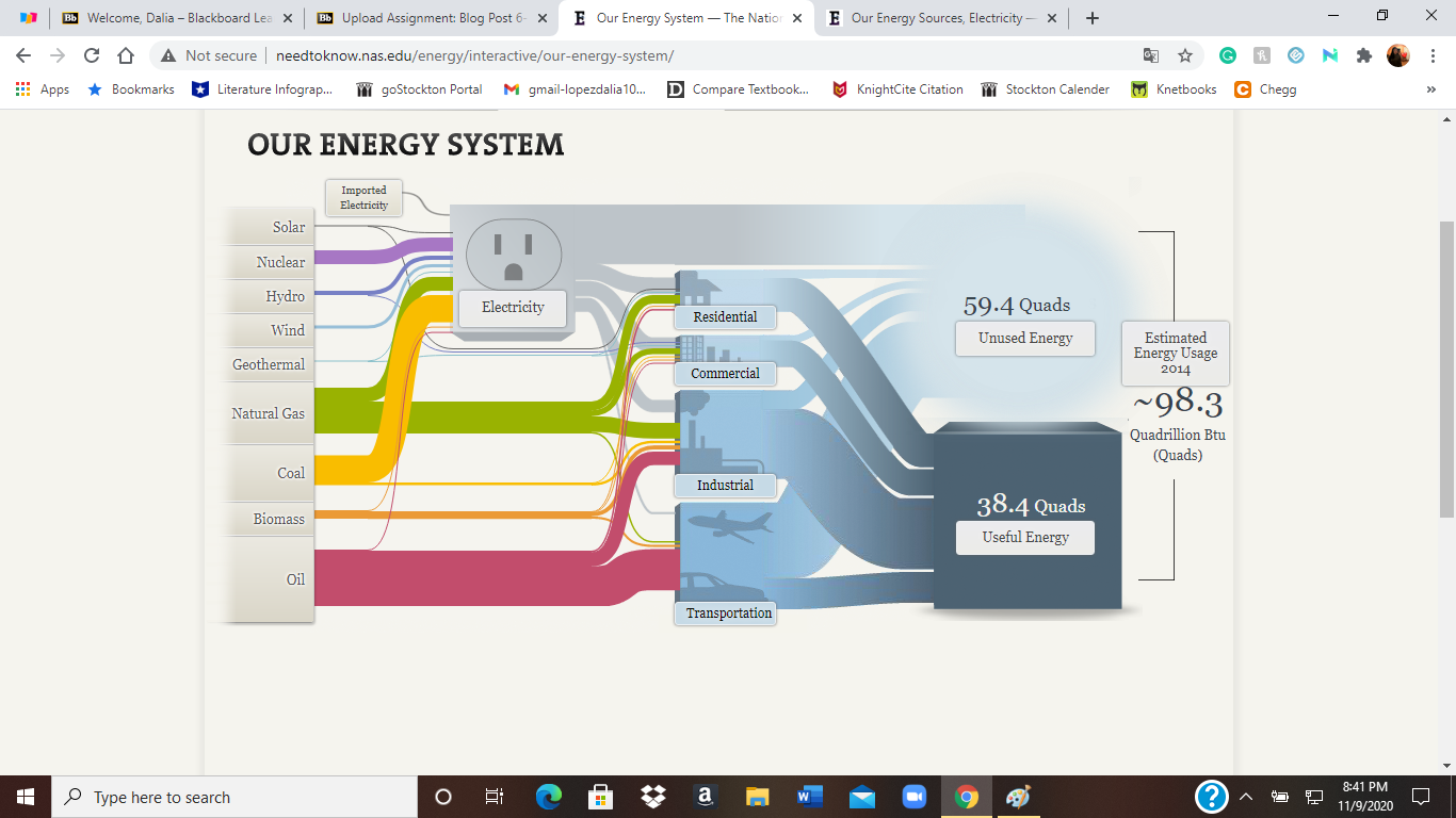
My first impression of the Sankey visualizations was that they were confusing. I just saw too many options to click on, I did not know where to start. After I started selecting more options on the National Energy System United States, I started to understand each click just lead to information about a certain topic. For example, when I clicked on Geothermal, I learned that high temperatures of geothermal fields conduct electricity. A small number of homes and use this energy for heating and cooling also.
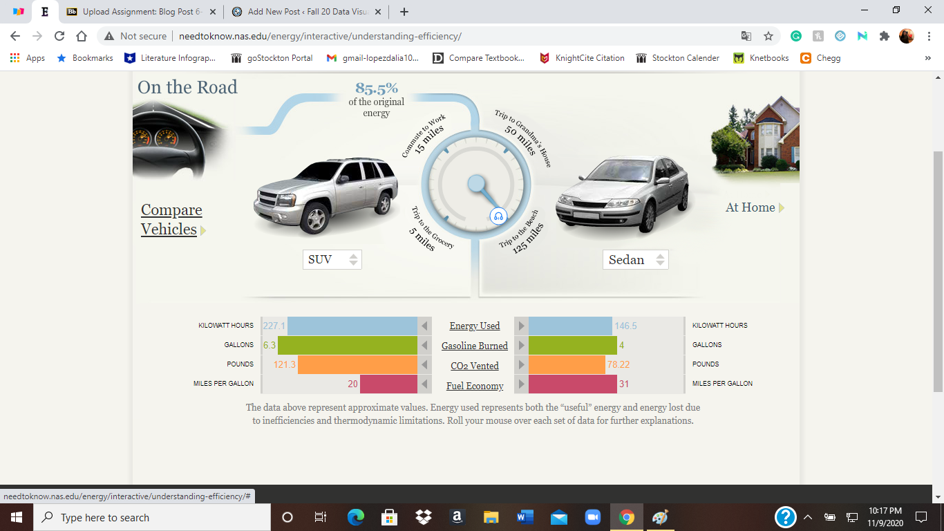
I enjoyed the interactive visuals of comparing cars and the energies they produce. I got to choose the cars and distances I wanted to compare. It was an easy visual to follow. I liked how easy it was to understand the energies they produced. For example, I knew that driving lets out carbon dioxide, but I did not know it was measured by pounds. Which still sounds pretty odd to me. Overall the SUV used more energy than a sedan.
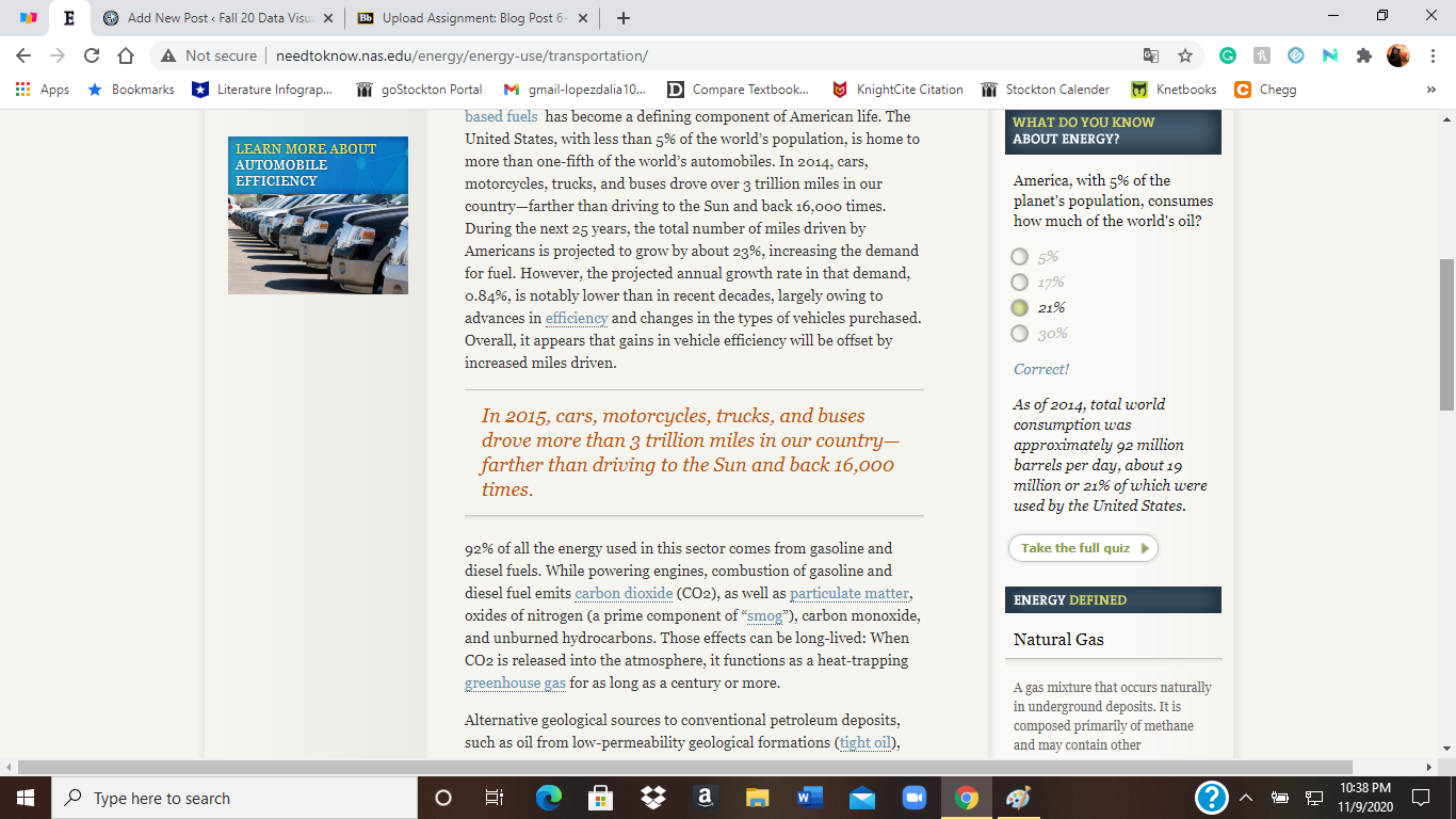
When I was looking at information on our transportation, a quiz, definitions, and hands-on activities pop up on the sides. The quizzes caught my attention. I thought it was a nice way to keep students interacting with the website. It made it less boring to just read paragraphs of information. I continued to finish the quiz and learned that ever since the beginning of the industrial revolution CO2 atmosphere concentrations have increased by 43%.
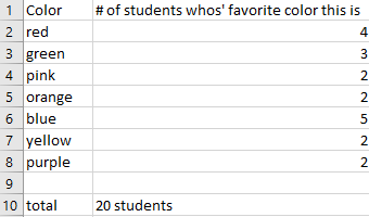
I believe one of the easiest ways to show how a pie chart should be used is to use “people’s favorites” of any topic. I provided a made-up survey of students and their favorite colors (out of 20 students). I plugged in the survey into excel, highlighted it, then inserted a pie chart with that information.
I thought something easy for the design of this pie chart was to right click on a section of the pie chart, then click on add data label, and lastly add data callout to have the number of and percentages labeled for each section.This is the end result.
The website I provided explains what a pie chart is, the way to make a pie chart, how to get the percentages for each section of the data for the pie chart, and more. https://www.mathsisfun.com/data/pie-charts.html
This week we all created lollipop charts. While looking online for different explanations on how to make a lollipop chart, I came across a really easy one. It did not explain the steps clearly towards the end but I figured it out with the textbook for the last few steps. Compared to the textbook this website: excelk.com went straight to the end product in a few steps.
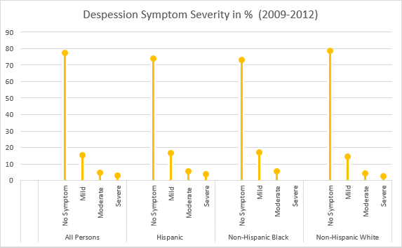
A lollipop chart is just like a bar graph, but easier to follow when you need to display a large number of values and when those values are high. This type of chart is also more appealing to look at.
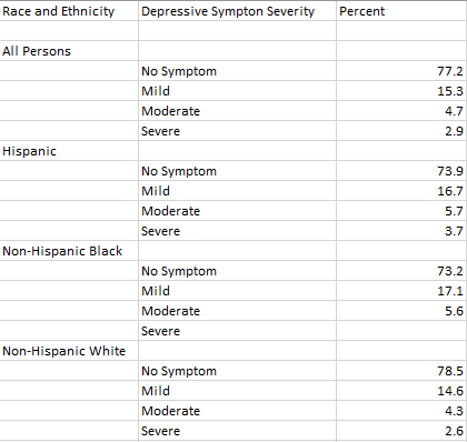
For my data set, I was looking through the CDC website and came across Depression in the US Household Population. They had graphs displaying the percentage of symptoms persons of ages 12+ with depression. I picked to use race and ethnicity as my x-axis vs gender, and ages. But also the PDF form which included the data set.
I will say this lollipop graph was pretty easy to make thanks to the website I used. The only problem I came across is trying to change the colors on each of the x-axes ( I wanted no symptom, mild, moderate, and severe on the graph to have their own color to better distinguish the severities.) I also wanted to add data labels, but I could not figure out how to.
This graph shows persons of ages 12 and over by the severity of depressive symptoms and their race and Hispanic origin in the US, 2009-2012.
When looking for data visualizations with benchmarks I expected various graphs that had to do with scores. There is a score that you are expected to achieve, and they mark it either on a scale or display it on charts/graphs.
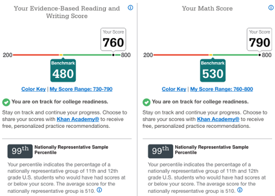
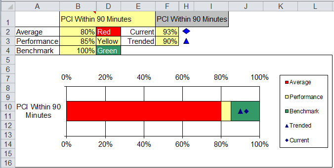
As soon as I understood what a benchmark was I thought about the way we get results for the SATs. This is an example of a benchmark on a scale for writing and math scores on the SATs. They also use the color yellow to point it out. Also, for the scores it was on a scale from 200-800. https://blog.prepscholar.com/sat-percentiles-and-score-rankingsThis graph shows the average subject scores of Legolas vs the class averages in gray. The benchmark in this graph would be that gray/class averages, which is what they are comparing Legolas too. https://usefulgyaan.wordpress.com/2014/04/18/comparing-series-against-average-or-benchmark/. For this graph, they are showing the performance (yellow), average (red), and benchmark (green) of Primary PCI being able to treat patients within the first 90 minutes of contact with the medical system. Here the benchmark is being used as the color green on the chart. https://www.qimacros.com/quality-tools/delta-chart-excel/
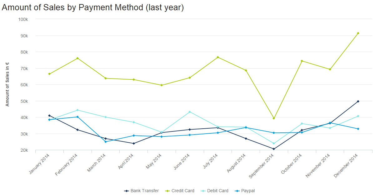
In this line graph, the number of how many sales were made by various payment methods is being shown, different months and years, and how they changed over time. The lowest was abut 20k being used by bank transfers. The highest was about 90k being used for credit card payments. For credit cards, September seems to go very low. With these numbers and information being presented we can take many guessed on why people only use certain payments a certain amount of times at a certain time in point.
2. The second example is from a website named venngage.
This website provided this infographic as an example of how companies highlight features and pursued buyers to buy certain products. They use the phone they want you to buy and compare it to one that has fewer features or different features than the newer one. Most of the info involves numbers, from screen size, cost of the phone to GB’s, and the weight of the phone.
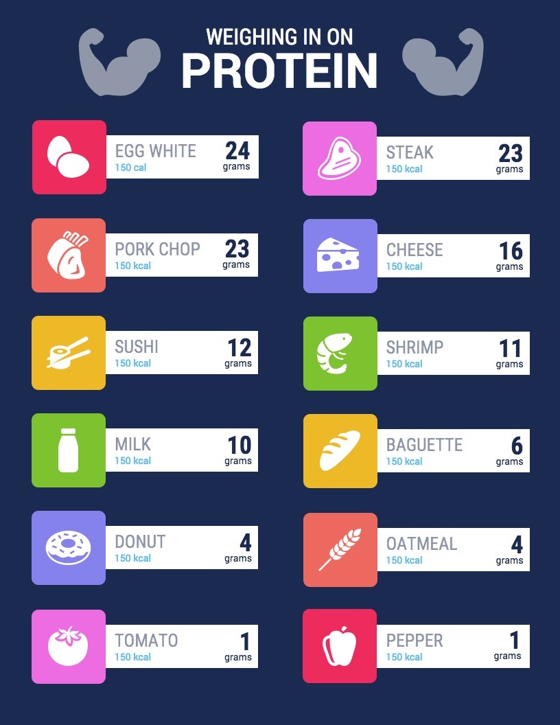
This is an example of an infographic comparing and contrasting the number of grams of protein certain foods have. They bolded those numbers because they were most important for people to see. This is an easy infographic to follow. You just look at the food item, then it tells you the number of calories (they vary) it contains and gives you the protein it contains in grams.
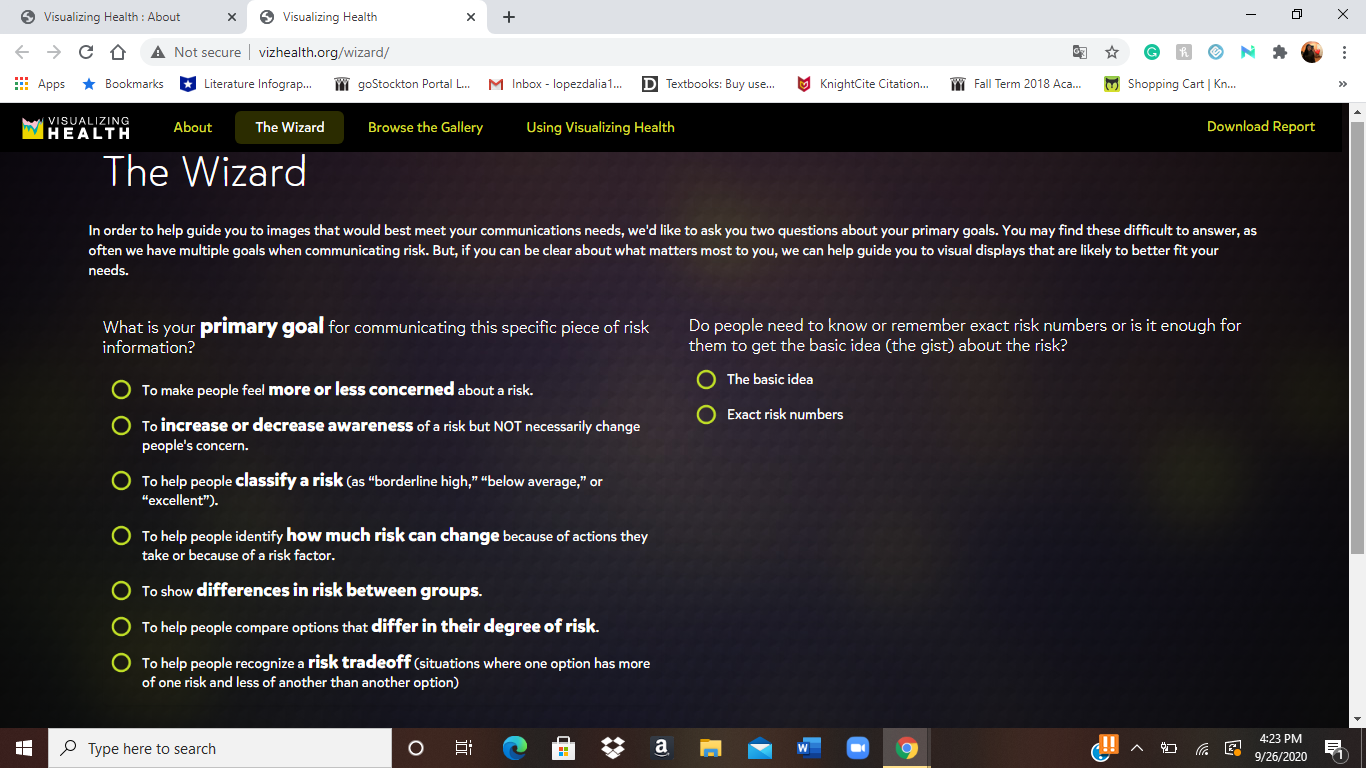
Vizhealth is a website created to help view/explain/visualize health risks and overall help us make decisions over our health. While looking through the website it takes you through steps to get to the visualization that best fits your needs. It shows you various styles of visualization according to questions they ask you (primary goal – awareness, classify risk, differences in risk between groups, degree of risk, and lastly whether the type of visualization basic idea or exact risk number). They also provide a fun comic, risk calculator, and a generator to help view population risks with icons.
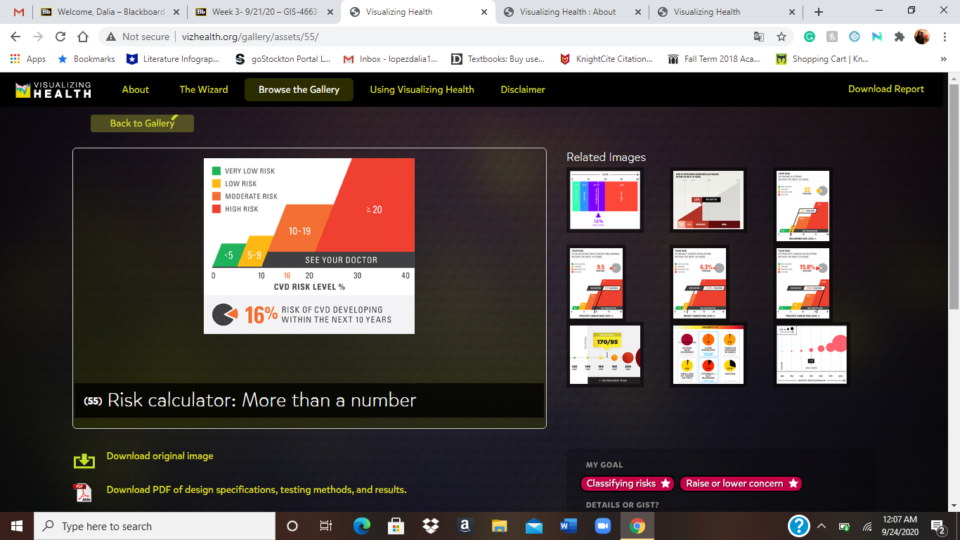
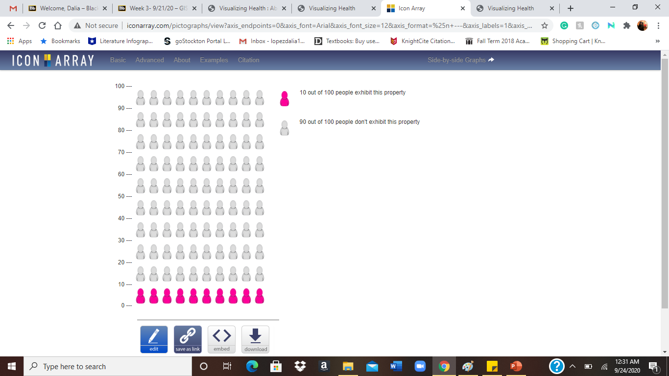
The creators of this website have a wizard tool that helps you find the right visual display for you to understand certain health information. This basically helps narrow down the display option to one that fits any need you have. For the wizard at first, I tried the options “To help people classify a risk (as”borderline high,” “below average,” or “excellent.”). and “exact risk numbers” This is one fo the visualizations that popped up for my needs. It shows you the different risk levels and then shows you where you are at. It provides the number for you and you just look for it on the risk levels. For most visuals, it gives you options to download a pdf of the design specifications, testing methods, and results. This is an example of the Generator that helps visualize risk population with icons. I typed in 10 out of 100 people exhibit this property. This highlighted the amount of people that the sentence was about. In gray was the people that didn’t exhibited the property.
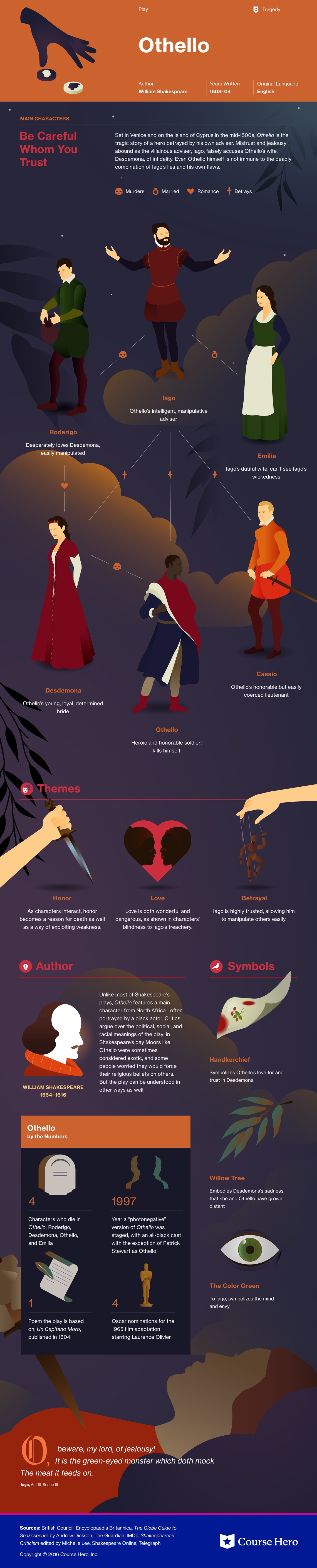
Course Hero is a website that provides students various study resources like study guides and textbooks, and their solutions. The one I am specifically going to talk about it their literature infographics. This resource helps students learn about a story’s characters, plot, themes, and more in a visual way. (I will insert an example they provide of a play named “Othello”). Depending on the type of story, the infographics have various information it will provide the reader with. They create colorful infographics with the theme of the story and draw out characters, shapes, and more to grab the reader’s attention. The website also goes into detail with what happens in the chapters, they describe the characters and how they change over time if you click “view study guide for this book”. I would recommend this resource for people who are struggling with understanding a book they are reading.