Categories
data visualizations pivot tables

Pivot Tables

A pivot table is a tool that allows creators to summarize, organize, and sort (by sums, averages, etc) their data sets. Pivot tables are simple to create and allows creators to manipulate what exactly the chart focuses on. A few examples, I found during research, shows the different uses as well as highlight how the table makes comprehension of data go much smoother.

https://www.nytimes.com/interactive/2020/us/new-york-coronavirus-cases.html

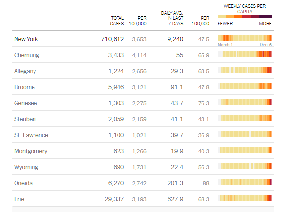
The above pivot table was an example I found that was updated in real-time and created by the New York government to keep residents updated on the amount and averages related to Covid-19 deaths. It is well organized and listed by individual counties throughout the state.

https://www.inquirer.com/business/wharton-mba-graduate-admissions-salaries-recession-pandemic-coronavirus-20201126.html

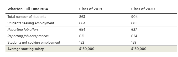
A much smaller but straight to the point pivot table I found on the inquires website highlights the average income graduates receiving after attending Wharton college. It shows slight changes between the comparison years but puts emphasis on starting salaries. The intended purpose of this table was more for persuasion on why students shoule attend this institution.

https://corporate.walmart.com/media-library/document/2020-walmart-annual-report/_proxyDocument?id=00000171-a3ea-dfc0-af71-b3fea8490000

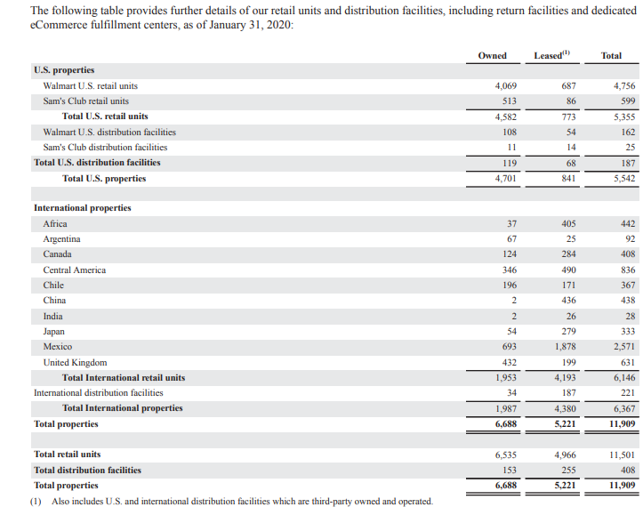
Another use I found for a pivot table was an annual report of business earnings and spending. Large corporations, such as Walmart release annual data for public analysis. The use of the pivot table above makes the data easier to understand and follow. This particular chart highlights the properties worldwide owned by the Walmart Corporation.

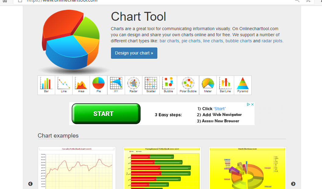
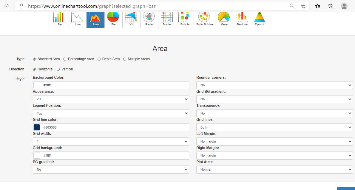
Pivot tables have a larger variety of uses because the table can be manipulated to place emphasis on specific areas. Here is a beginners guide to creating and using pivot tables.

Categories
data visualizations Sankey Diagrams

SANKEY

The National Academies of Sciences, Engineering, and Medicine dedicated an interactive website to Energy and “everything you need to know”. While browsing through the well-organized web page, I found a multitude of statistics, using different visualizations from big numbers to timelines and everything in between.

Here are a few examples of different visuals throughout the website.

I was pleasantly surprised by the amount of information found throughout each section and how well they put visuals to use. Not only did the visuals keep the website intriguing but made the information clear and easy to obtain. for example:

Interactive visualization link

This simple visualization draws a clear connection between each variable and shows a comparison to the amount of light each produces per watt of electricity. There is little room left for misunderstanding because the visual is clearly labeled and the description helps interpret the picture. I think using pictures of each type of light bulb was smart because if this was a graph and was labeled incandescent, CFL, and LED it could lead to confusion on which lightbulb is which.

Though I was for the most part impressed with the visuals and the way the information was presented, I did find a few things I would have changed.

for example: BIG NUMBERS

I personally think the wow factor in this statistic was hindered by the lack of emphasis on the numbers. I think they should have chosen a much bigger font to place the focus on US energy consumption.

Line graph:

I think this graph is confusing because incandescent’s line stays consistent it gives off the impression of a benchmark line. I think at a glance without acknowledging the giving information it looks like CFLs and LEDs are falling short of a benchmark.

Listed Statistics

Personally, this section is just a lot of words to get lost in, when reading about the reduction of energy use in refrigeration over the years. I think that using a visualization here would keep this page more interesting and keep readers from disengaging.

Overall, I found this website to be a great resource and very knowledgeable. The visualizations were, for the most part, extremely well done and appealing.

Categories
data visualizations Pie charts

Pie Charts

All over the media, pie charts can be seen to represent data in the form of a visualization. BUT WHY?…

A pie chart allows the readers to understand the data without needing the specific numbers. Pie charts, when used accurately, can display a pieces of information within a specific population (sample) so a reader can see, depending on the size of the shape, roughly how it compares to the rest of the data. A bar graph is great for comparing multiple populations, and a pie graph works better for comparing within a particular population or within a whole. Using a pie chart allows readers to envision the data as one piece and can help condense data that can be confusing. It focuses on how each piece compares to the population; they can be manipulated to focus specifically on aspect of the pie. Pie charts are great to reveal the results of a poll and can neatly display the information. For example, I used data from a poll I found from Monmouth University about Halloween candy.

from a sample of 1,161 people

In this particular chart, I wanted to hone in on how Reese’s compares to the whole sample set. It is easy to see that though it is not the whole chart it takes up a large portion of the candy poll.

from a sample of 1,161 people

In this chart, I wanted to place focus on each candy and it’s comparison to one another. Leaving it up to readers to pick and choose which candy and how they want to compare it.

Take a moment and compare the two charts above, both use the same data and both have emphasis on the same value. The only difference between the two is the way the information is presented, a bar graph shows us that Reese’s earned the highest amount of votes on the candy poll. The pie graph, however, emphasizes on how much out of the whole sample Reese’s possesses.

Tips for creating pie Charts…

-Make sure the percentages equal 100%, otherwise the chart with be misleading and confusing to read.

– Use visually appealing colors, and if your goal is to place emphasis on a specific value chose a bold color to stand out amongst the rest.

– Organize information, keep in mind the way humans naturally read in a circle; clockwise or counter-clockwise (not across or up and down) . you will want to make sure data goes in a descending order.

https://visage.co/data-visualization-101-pie-charts/

-Use smaller data sets to avoid overcrowding

https://visage.co/data-visualization-101-pie-charts/

Categories
Data Visualization and Art data visualizations Infographics

Lollipop Charts

Lollipop Charts, like the name infers, look like little lollipops and is used as a visual infographic. Like many other charts, lollipop graphs are used to compare different variables of data. A lot like a bar graph lollipop charts compare the size and ending points of the data set.

vertical lollipop chart
Horizontal lollipop chart

Data for both charts can be found here from the Centers for Disease Control and Prevention Website, as well as, the following pdf.
https://www.cdc.gov/nchs/data/nvsr/nvsr68/nvsr68_09-508.pdf

As you can see from both charts above, which I made using Microsoft Excel, lollipop charts can be vertical or horizontal depending on the user’s preference. The pros of using a lollipop chart as opposed to a bar graph are that it puts focus on the end data points rather than the whole graph and it allows for less visual distractions. Colors can still be used but in a minimal way that does not make a chart seem overwhelming. Lollipop charts also allow for sharing a lot of data without losing its visual aesthetics.

While looking at tutorials on how to make a lollipop chart and the different tools available, I came across an article. This article titled “Lollipop charts, Why & how, Story Telling with Lollipops” written by Dario Weitz, is a great resource as to why and how to use a lollipop chart. The author touches base on the pro’s, con’s, and even the similarities of using this specific graph.

Categories
data visualizations

Benchmark

First of all, I want to explain what a benchmark infographic is before I begin my comparison. The word benchmark itself means something that is used to mark a standard in which others can be measured by or judged by. So, it would only make sense if a benchmark infographic is a graph that portrays that same content as the meaning of the word. Benchmark graphs can be used in any style of visualization and simply serves the purpose of indicating where that standard lies within the graphic.

To be honest, during my research I expected to find more benchmark graphics that pertained to business. I expected to find graphs that involved a company’s earnings and if they are meeting their “minimal required business”. What I didn’t expect to find were Benchmarks that involved the current pandemic. In my mind, I didn’t see how exactly a benchmark would be implied for a virus.

http://health.hamiltontn.org/AllServices/Coronavirus(COVID-19).aspx

The graph above uses a double dashed benchmark line, the yellow is the standard before the outbreak and the red is the standard they would like to stay under for the number of new cases. the dark solid benchmark vertical line marks a significant period of time to use for further research.

https://news.utexas.edu/2020/03/26/a-new-texas-covid-19-pandemic-toolkit-shows-the-importance-of-social-distancing/

I found this way of indicating the bench line the most interesting because they shaded in a whole section that they wanted to highlight. The data set on the graph shows where some of the hospitals started at and even one coming back down below the 90% reduction mark. The colors are also very significant in the graph the benchmark being a cool calm blue and the data that exceeds the benchmark area is red as in hot, or dangerous.

https://www.cdc.gov/coronavirus/2019-ncov/covid-data/covidview/index.html

The above graph comes from the CDC and using the benchmark dashed line as the baseline mark. It is comparing weeks versus hospital visits for Influenza-like illnesses. The reason the benchmark line is here is to show the normal range as opposed to the spikes of visits. Giving a reader a visualization point to base measurements off of is important to accurately paint the picture.

https://healthblog.uofmhealth.org/wellness-prevention/flattening-curve-for-covid-19-what-does-it-mean-and-how-can-you-help

This infographic uses a dashed line to indicate the number of people a hospital can treat at a time. Using a bell-curved graph to show the readers why it is important to take the steps and be precaution during the pandemic. They are indicating if people step up the curve stay below the benchmark standard.

The way I have understood the differences in the benchmark indicators is that if its a dashed line it seems to be more of a recommendation or goal. Whenever I’ve seen a solid line the information seems to be more important or must meet the requirement. I think if a line is colored it indicates the importance, the example above the double-lined benchmark had a yellow and red line, from my schema, I know yellow is cautious and red dangerous. I think it is important for people to understand what they are reading so, they don’t have to try to interpret the information and interpret it wrong. People need to be given a standard to base information off of as a way to compute it properly.

Categories
data visualizations Uncategorized

Comparing Numbers

Data is all around us, in different shapes and forms, and sometimes it is hard to decipher. Using visuals to compare data can make all the difference in comprehension, as long as itself is clear and concise. I found a video from Visme that gives a few pointers and explanations on how to improve Data Storytelling.

I felt it was important to share this video because comparing numbers is not just bar graphs and digits, it is a way to get information out to viewers. It is a type of storytelling that uses minimum words but insinuating on a focal point that helps the reader understand clearly.

Tools

Online charts is a free website I found that is simple to use and can create a variety of charts and graphs in just a few minutes. It allows users to construct multiple types of charts and manipulate color, font, and data input.

Home page of Chart tools
Data input page
Finished Product

Users can download their graphs into different formats, such as, jpg. and pdf.

Covid-19 and Education

As I was looking through UNICEF’s website I noticed a separate link just for data and found some well-created infographics that are not only current and relevant but perfect examples of comparing numbers. Covid-19 has created devastation all over the globe and continues to do so today. Children around the world are feeling the impact due to the pandemic, not only home life but in their education. Below are a few infographics that I felt highlighted the five tips from the video above and accentuated their intended purpose while comparing numbers.

A well labeled graph comparing prior undernourished children to current and projected scenarios.

A representation of children affected by school closures due to Covid-19.
A projection graph comparing the possibility of economic decline due to the pandemic.

If you take a look at all three graphs you can easily read and understand the visualizations set forth. Each graph has a focal point which is portrayed using colors, patterns, and contrasting visuals. The graphs all are labeled properly with limited distraction, making them readable. All of these graphs read left to right following the rule of thumb of conventions, each comparison with a time line keeps the time line on the x-axis to avoid confusion. I think

Categories
data visualizations Uncategorized

Visualizing Health

An interactive website that helps pair visuals to medical information thus making it easier to communicate with patients. The website itself is well organized and is easy to navigate; The University of Michigan also lays out its goals and objectives for the website on the home page.

As I navigated through the website, I found a tab labeled “The Wizard” which asks two questions to help guide users toward an image that helps display the information they want to transmit.

Once past the questions on “The Wizard” then the site guides you to a page that displays multiple colorful images to the right and down the left-hand side is a widget that a user can elaborate more on what they are looking to create.

The generator was for Icon array, which transferred you to another website. On the page, ironarry.com, there were a few questions listed that help generates an icon graph, like posters seen in a doctor’s office. The generator also had options of changing the icon on the chart, male, female, etc.

Being a new user to this website, I decided to try out the calculator, it asked a few simple questions and within seconds I had an easy-to-read visual before my eyes. I was honestly surprised by how simple the chart was to read and I think it is a wonderful tool for people like myself who are usually confused by all the charts and analyze from a doctor’s office.

Overall, I think this website could be helpful to not just medical professionals or patients but to those who are trying to understand and grasp the concept of visual data. I feel like it explains and shows how each type of graph can portray specific knowledge and be used to target consumers in a simple and understandable form. I think what helped me tie in how well visualization can help the brain compute data was manipulating the data on the graphs and seeing it come to life, so to speak, in graph form. Even using the calculator, I was able to insert data I did not quite understand and receive an image that got straight to the point with little to no confusion.

Categories
Infographics

Infographics

Why infographics

Think about seeing posters on a wall, are you more inclined to stop and read the one with just a paragraph of information or would you rather stop for a poster with bold lines, colors, images, and minimal wording? Most people will be drawn to the second poster because it engages us and attracts our eyes. This is why infographics are so popular, it gets the point across in a visually aesthetic way while effectively getting information to you in just a few words.

Infographics can be used for just about anything, what caught my attention is its use in our education system. Infographics can be used to help guide younger students with directions and instruction, especially students who don’t know how to read yet, it can give visual cues and help students recognize words. Infographics can also help students who are visual learners, which means they learn best by using their vision.