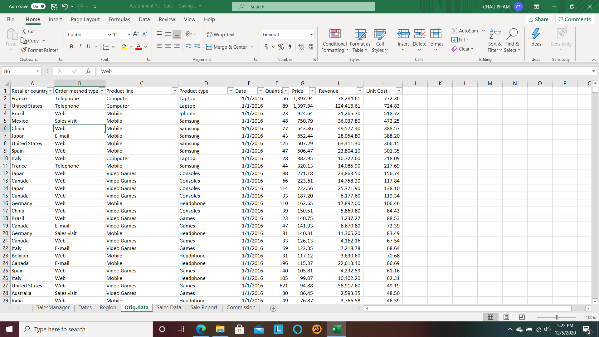
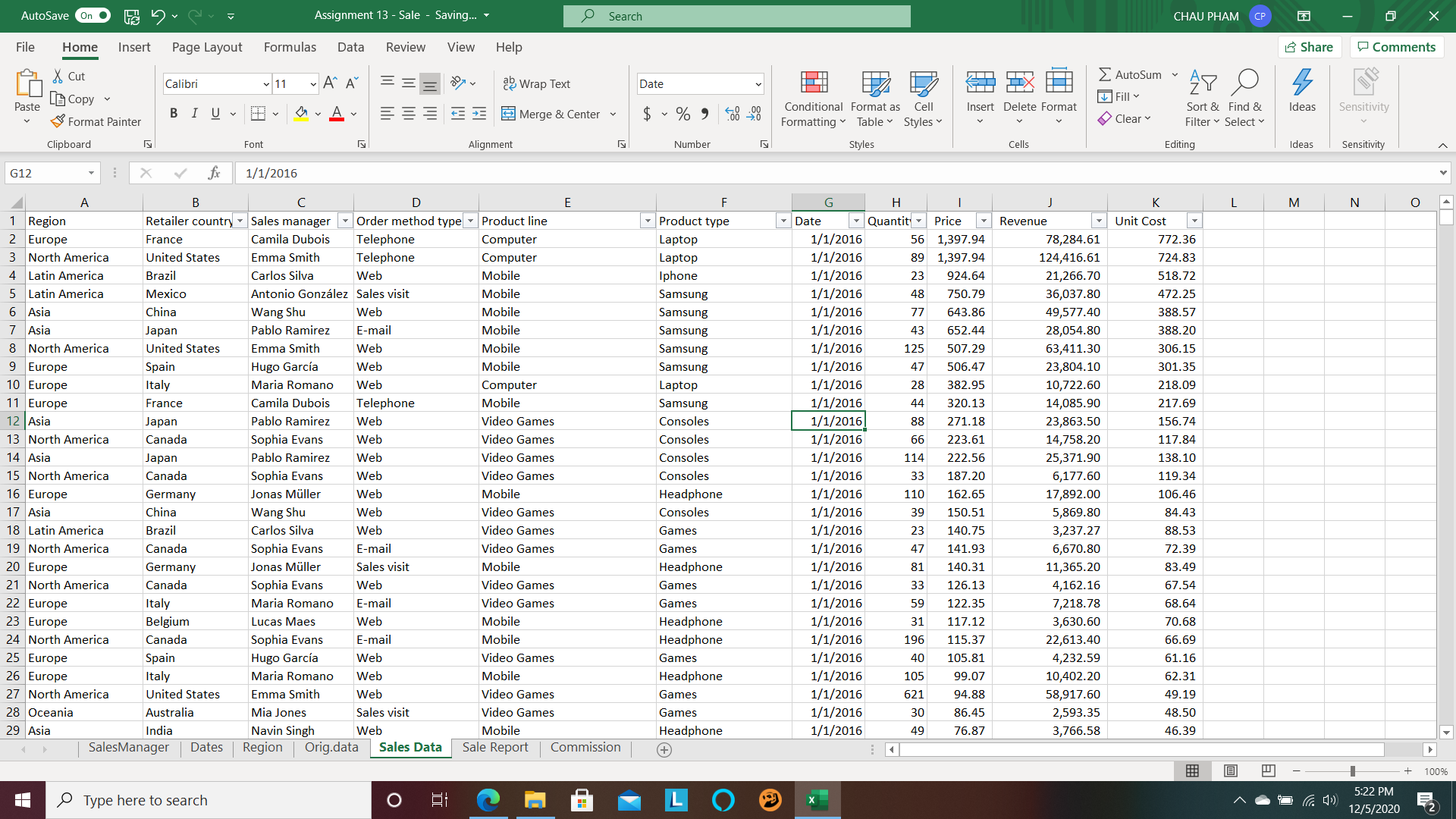
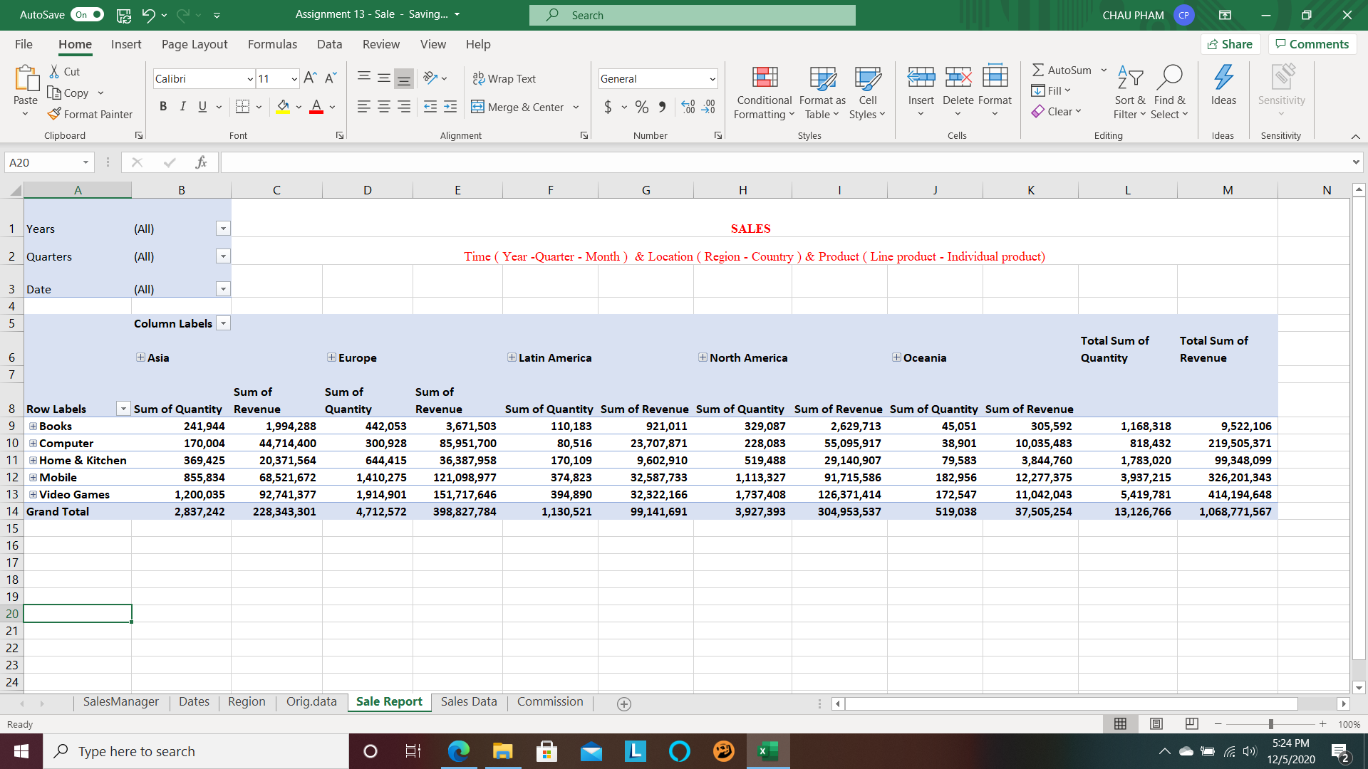
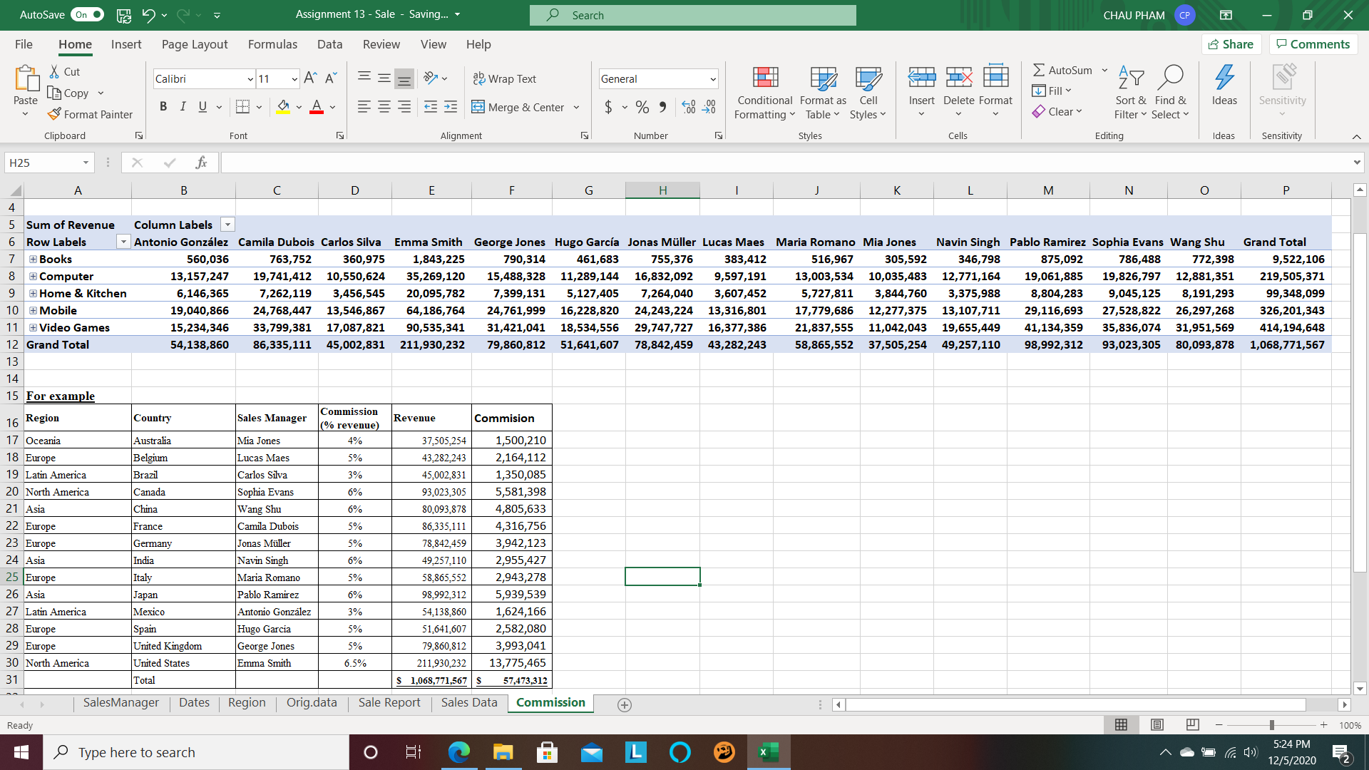
“Interactivity is necessary when we have a lot of data to cut through”. Pivot table is a powerful tool that Microsoft Excel introduce with us to conduct data base on the expectation of user. Pivot table can support us make reports with relevant and faithful presentation in the workplace. It also helps us in other field with useful numbers.
The website of the National Academic of Sciences, Engineering, and Medicine. The source data is provided by Energy Information Administration of the U.S. Department of Energy and from its reports and studies.
Within my limited time, I tried to look for some knowledge about our energy system, as well as how the authors can tell us by visualization in 4 main parts
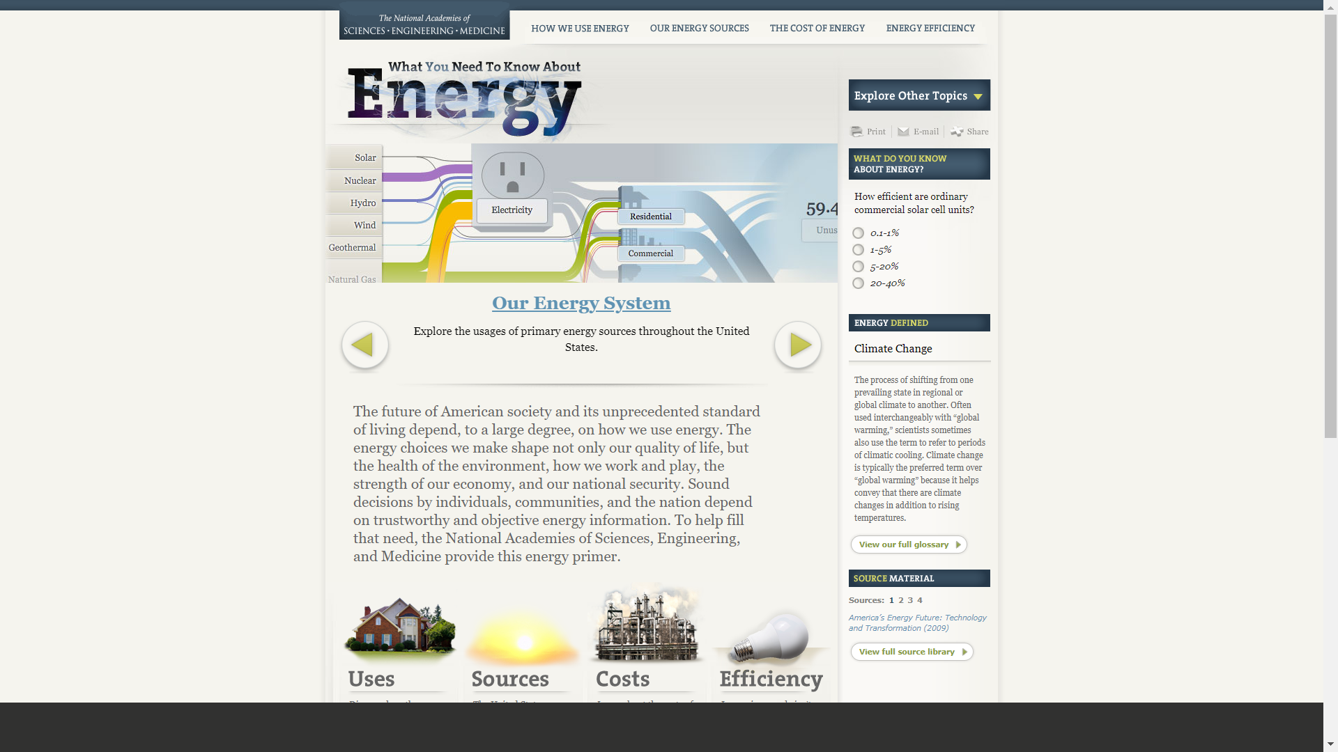
How we use energy
Our energy source
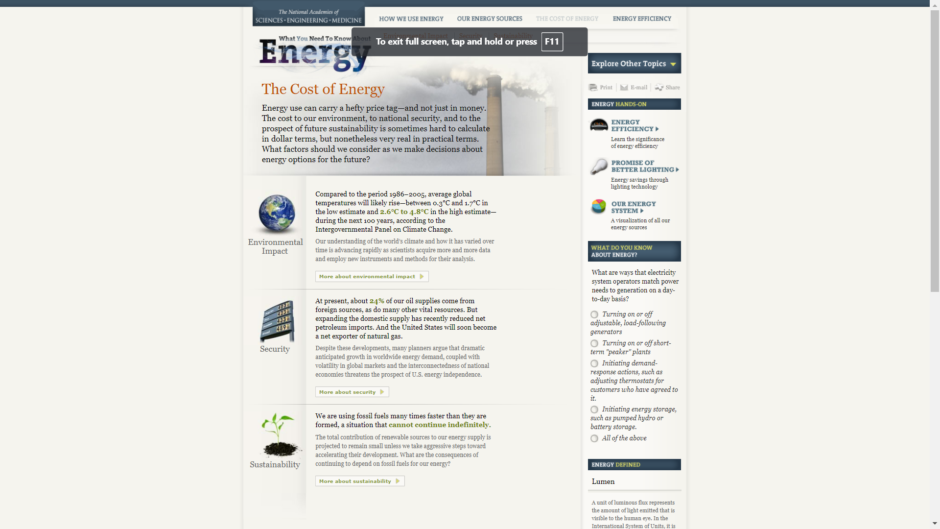
The cost of energy
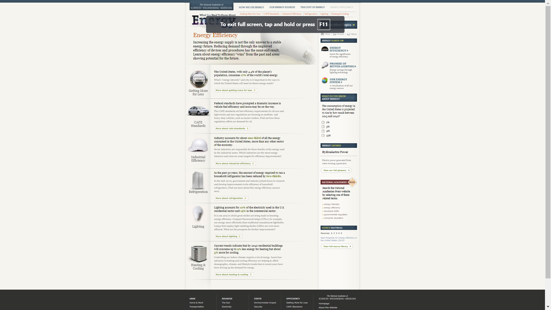
Energy efficiency
How we use energy
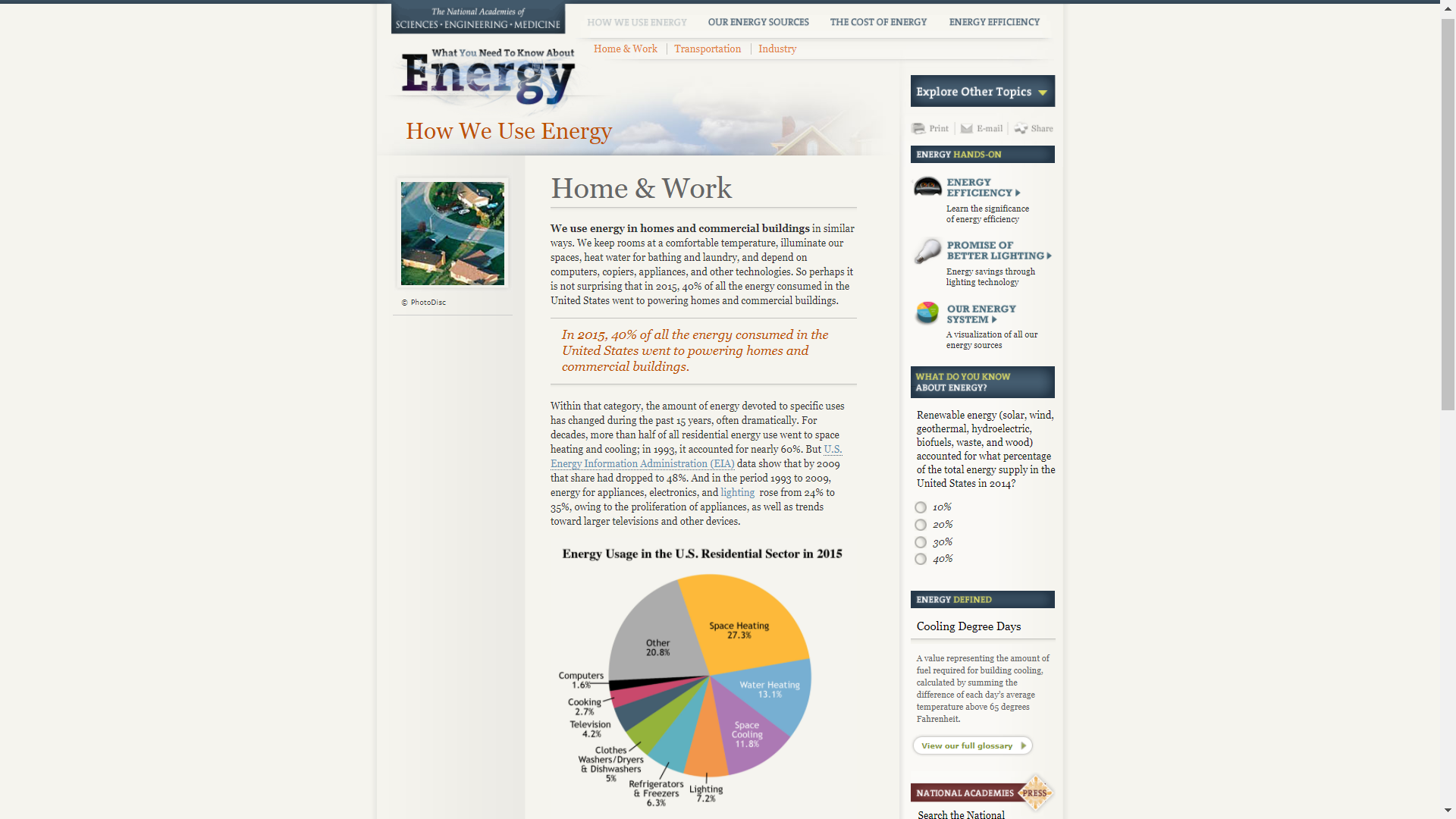
Among four economic sectors of residential, commercial, transportation, and industry; I consider ” Home & Work” that include about 40% of the energy consumed in the United States in 2015. Instead of carefully read information, it is easy for me to understand how much useful energy is in our life along full data by visualization with the pie chart. The data chart also shows the comparation of different way of consumptions in 2015. I will be more interesting to know the demand trend of different types of consumption with the line chart.
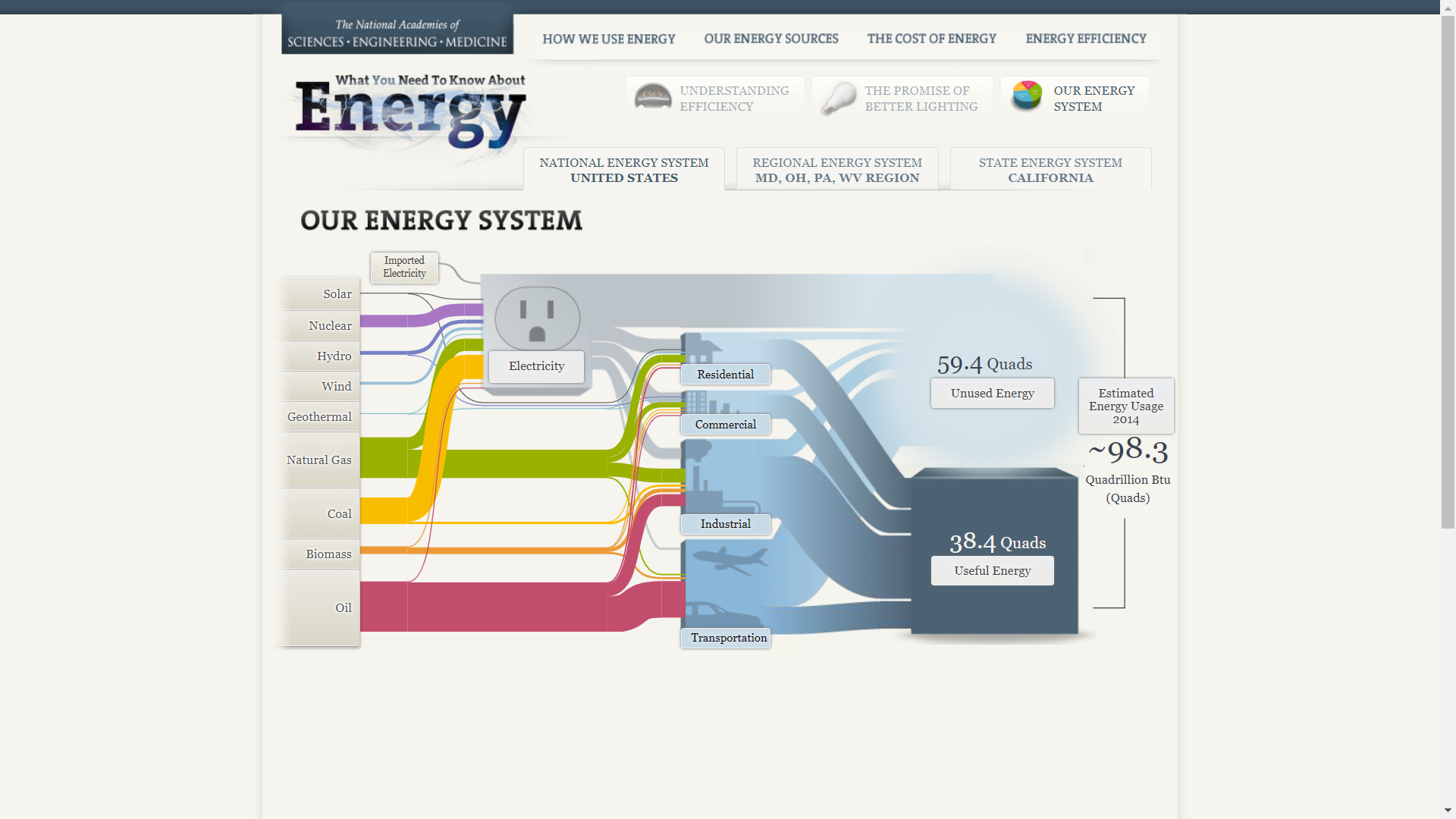
2. Our energy source
Of course, this part I am very consider. I want to know what on the hand of U.S. Energy system and its capability. Also, I like the way the authors express the direct and indirectly supply from energy sources to consumptions.
It is happy to hope we have enough affordable energy in the future. I love U.S government, because they love their people. They always take care us from how to reserve to supply enough energy for our life and every fields in U.S. They know how to invest to exploit nature energy sources in long time due to decline in other limited energy sources, as well as to look for the solution to limit the waste of energy in the process of production, supply, and consumption. On the other hand, if we significantly dependent on the energy source of other country, we can lost some favorited points in our competitive advantage position. The photograph helps me to have this pride emotion.
3. The cost of energy
We need to consider the cost of energy, but I did not see any charts and photograph yet.
4. Energy efficiency
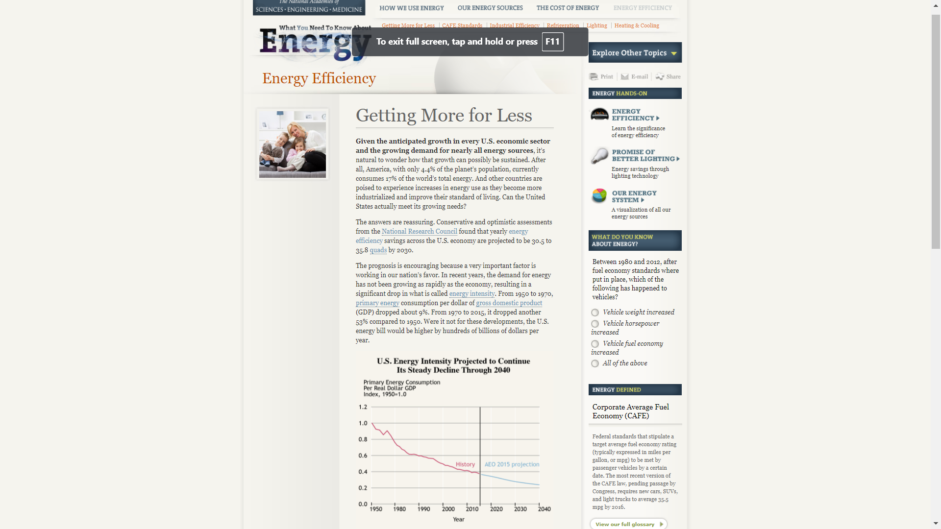
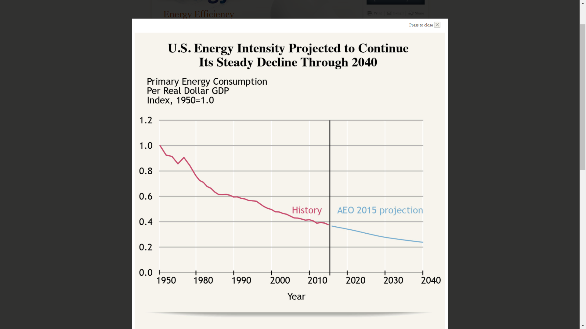
We hope the stable energy in future, but how to ensure and solve the problem. If increasing supply can make our headache, why we don’t think about reducing its demand by its efficiency? The authors of the website pointed out that “the demand for energy has not been growing as rapidly as the economy, resulting in significant drop in what is called energy intense“
The above chart shows U.S. Energy Intensity Projected to continue its steady decline through 2040. The chart author used was the right chart for the right data to effectively communicate with us about an important consideration in our country.
Now, for the issue of energy in United States of America, the government expect the contribute from fields of technology, economic benefit, research, as well as government mandate and others.
Thank you. `
Reference
The National Academic of Sciences, Engineering, and Medicine. (2020). What You Need to Know about Energy . Retrieved from http://needtoknow.nas.edu/energy/
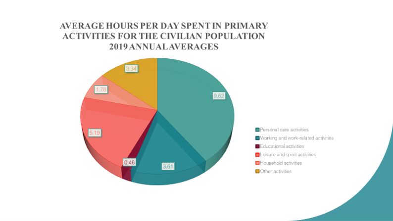
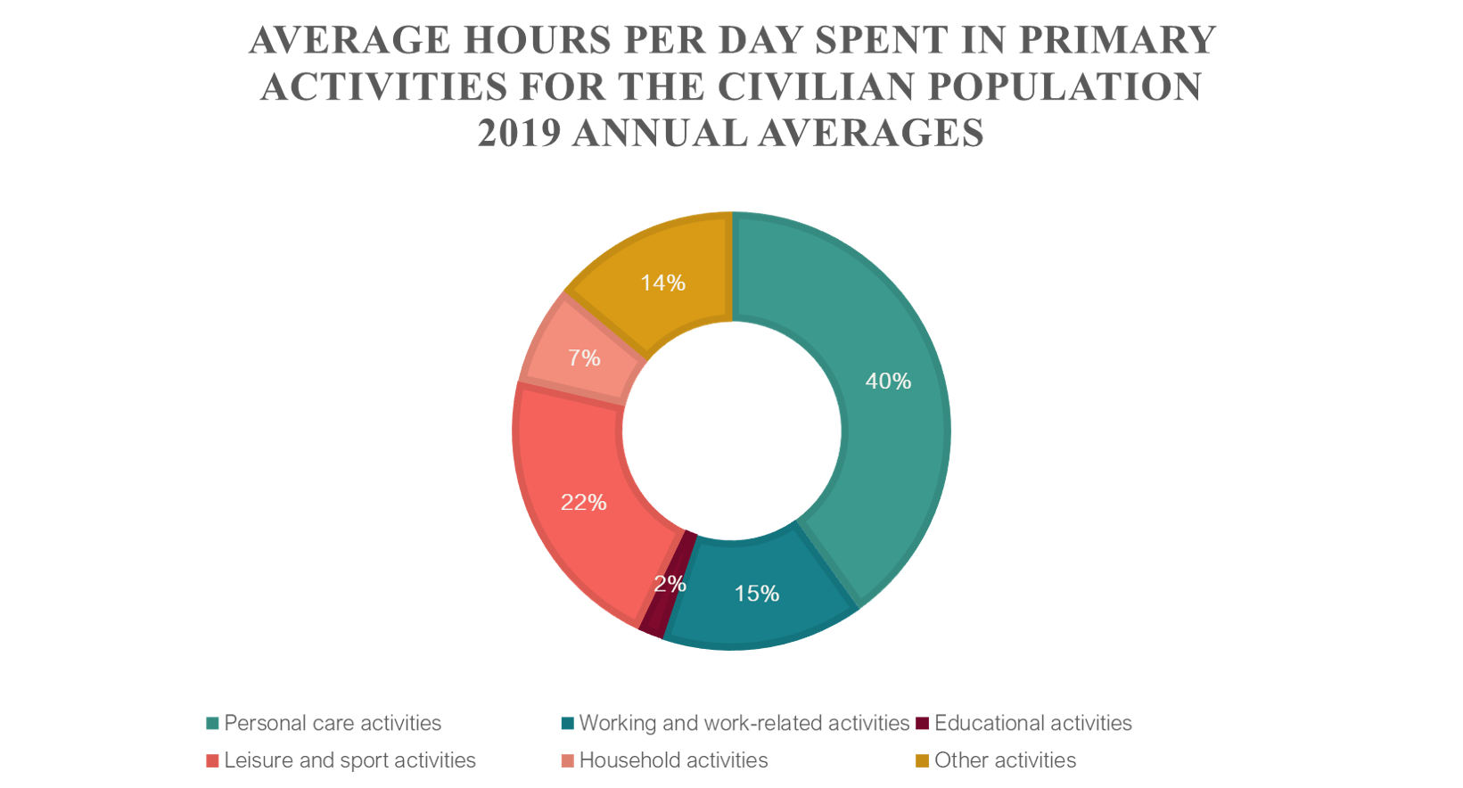
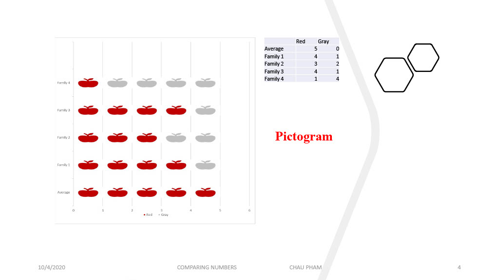
If you want effectively communicate data visualization in which ” part-to-whole data is represented in binned quantitative values”, let’s use pie charts
I introduce 2 pie charts to display average hours per day spent in primary activities for civilian population, 2019 annual averages that refer to person 15 years old and over. For more data details, please visit the website https://www.bls.gov/news.release/atus.toc.htm. American Time Use Survey Summary and tables are available.
Other charts can displays data correctly , but is is less effective to express its relative between data and part-to-whole data as pie charts
It is not so difficult for us to create these charts with a little computer skill.
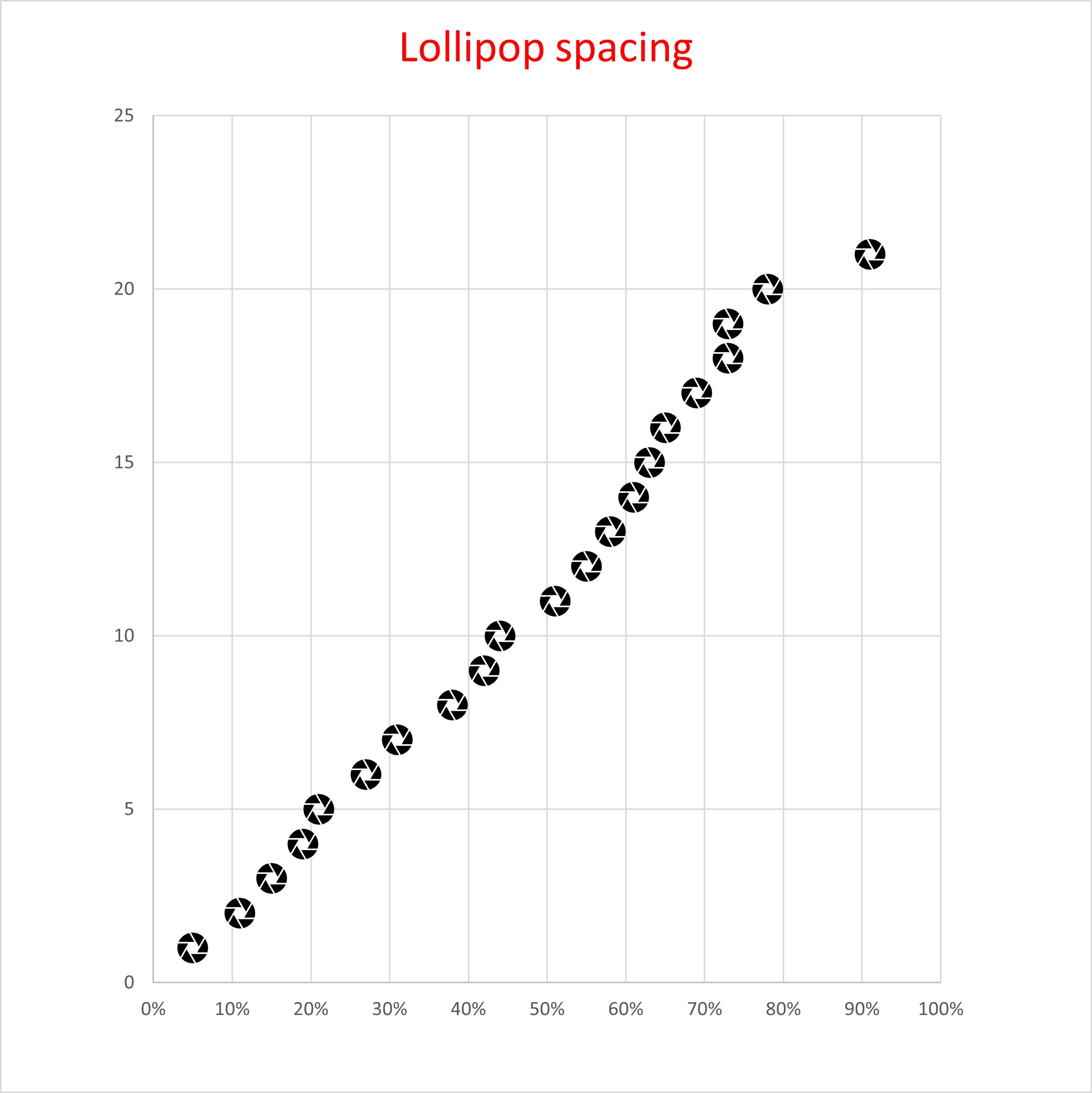
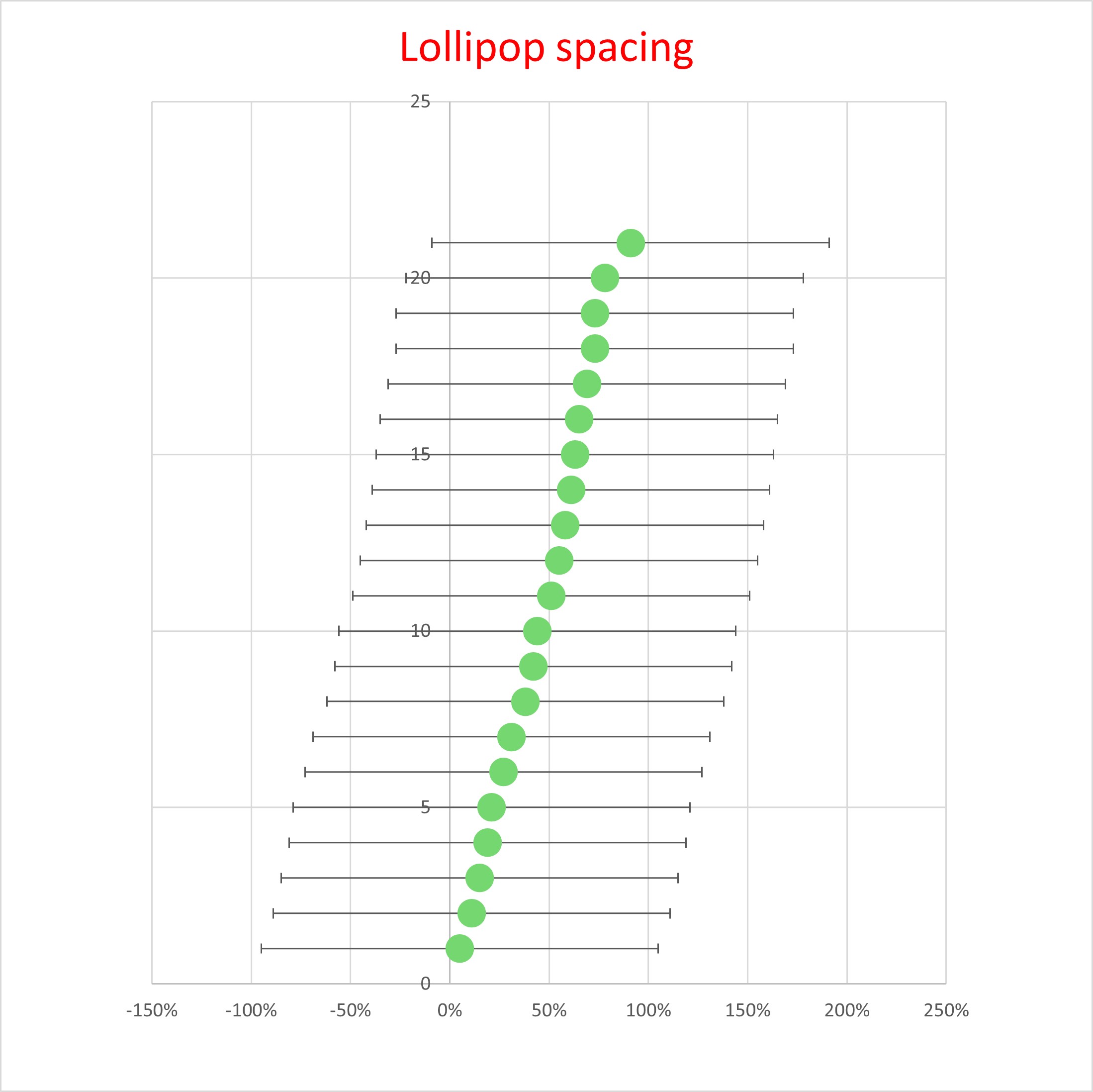
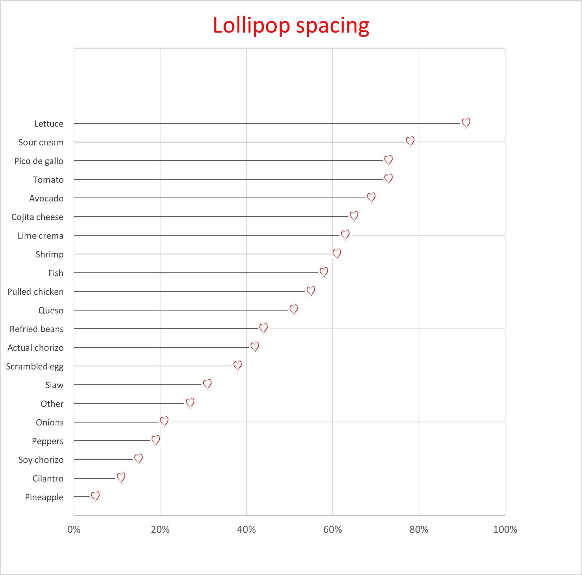
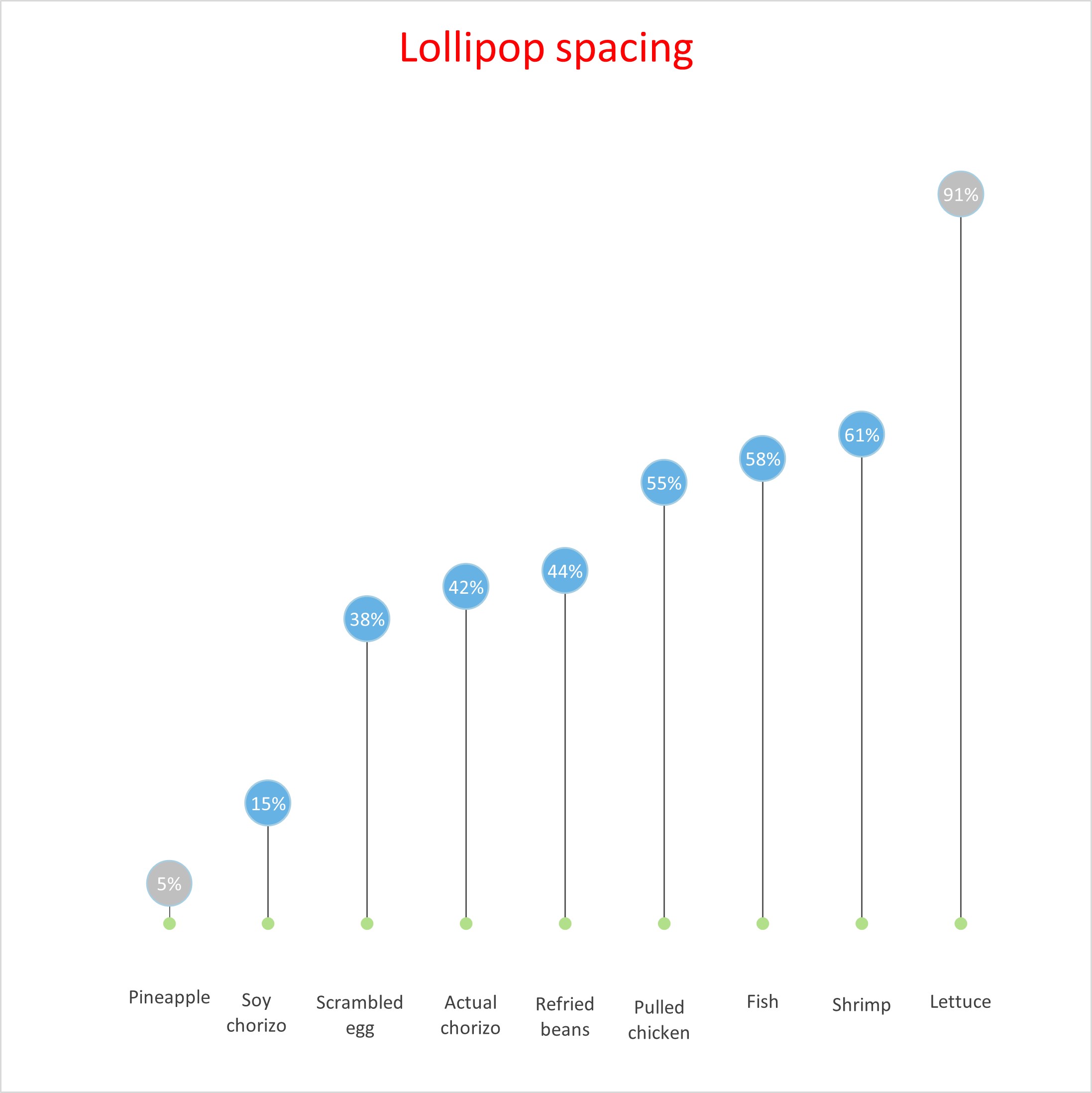
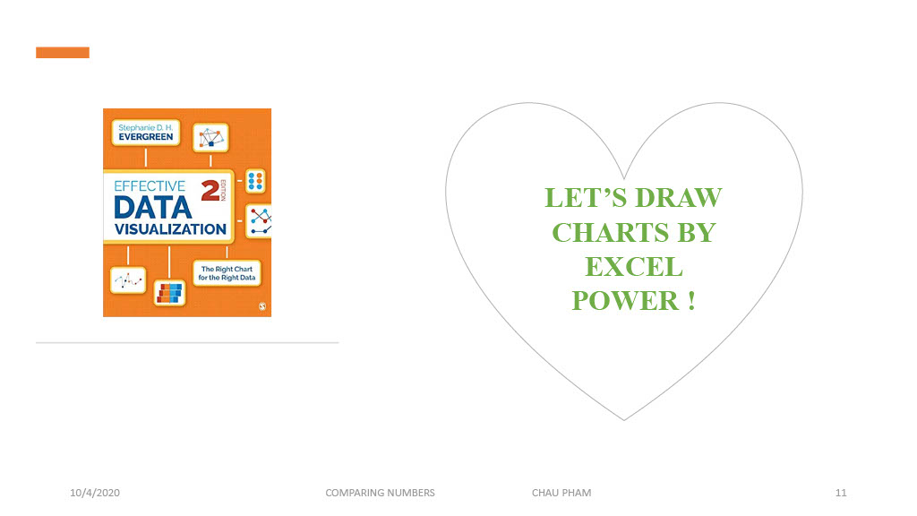
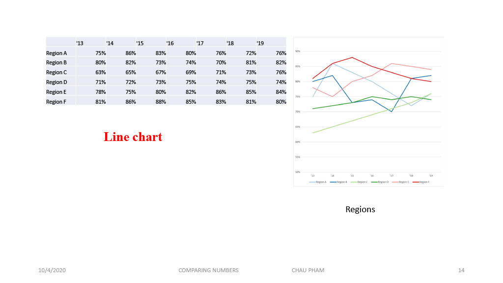
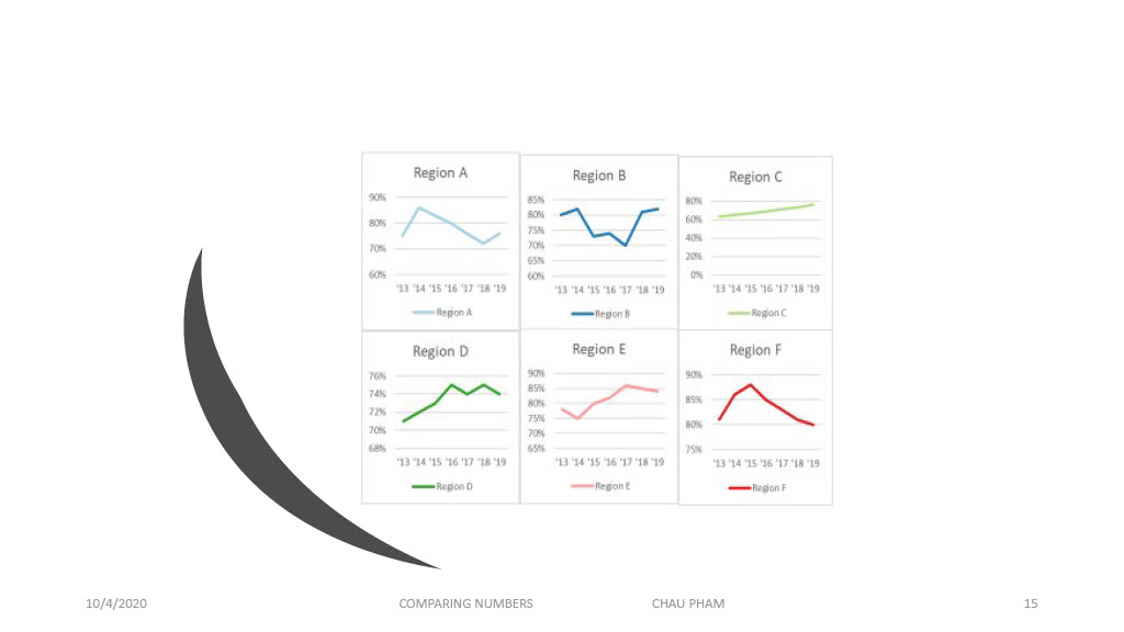
The charts were made by Excel base on the data set from Chapter 5 of the book Effective Data Visualization 2 edition of Stephanie D.H. Evergreen. If you want to display data set with dots, you can use the lollipop chart.
I am not sure whether cost of ink and paper is one of advantage for using them.
I choose this website to introduce with you that relate to technology field.
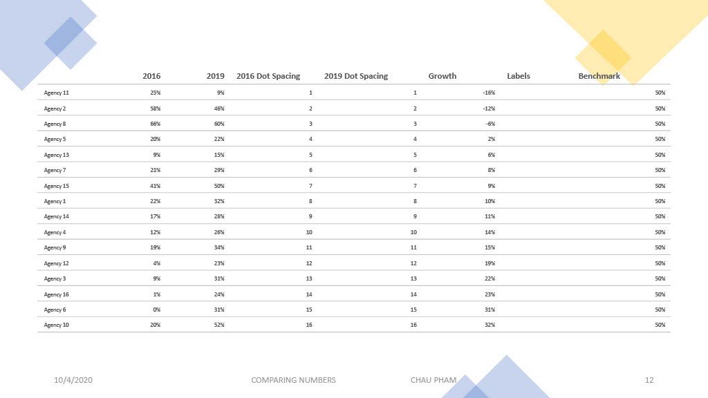
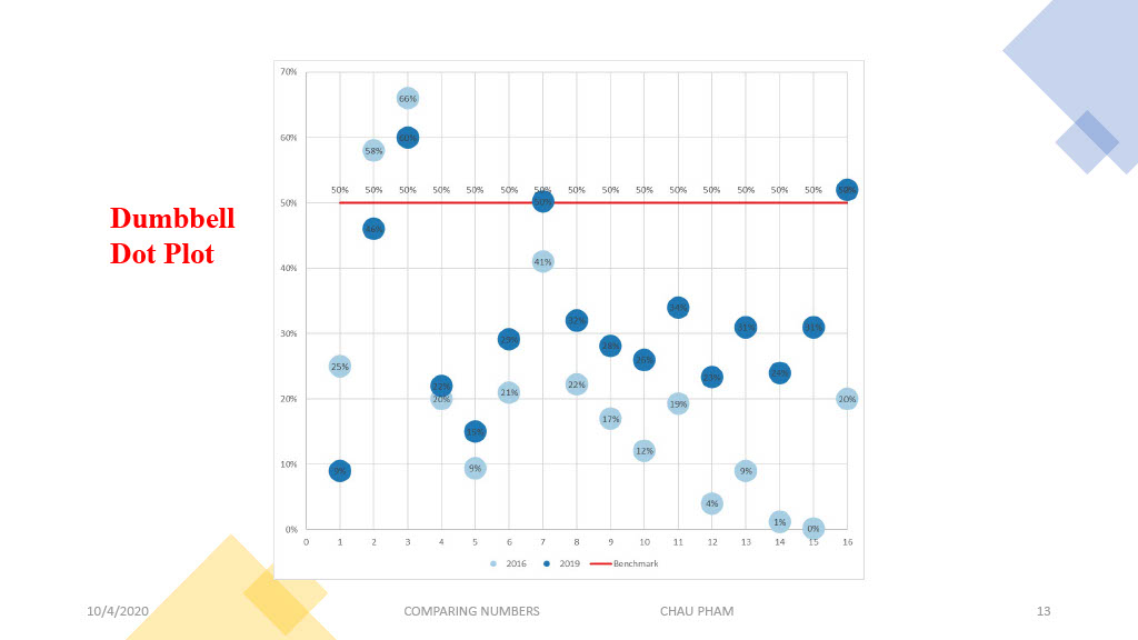
However, I see the difference of benchmark and benchmarking
“Benchmarks are reference points or measurements used for comparison, usually with the connotation that the benchmark is a ‘good’ standard against which comparison can be made. Benchmarking is a process of finding good practice and of learning from others”
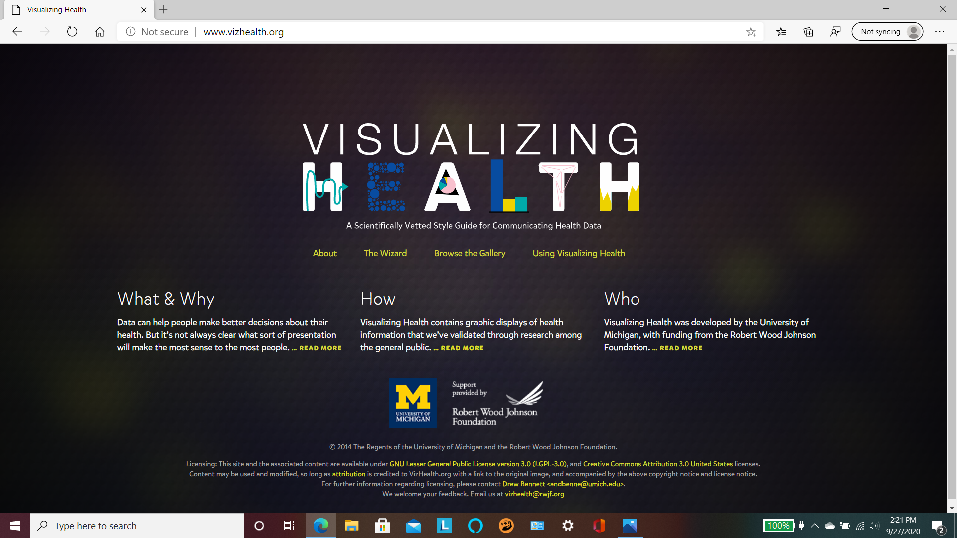
I was usually proud about my health. So, I felt relaxed to visit this website. Visualizing Health was a project of the Robert Wood Johnson Foundation and the University of Michigan Center for Health Communications Research. My belief was increased after reading this information.
What I was waiting for not take VizHealth adventure? It was not useless for me to make better decision for my health despite its disclaimer. 6 of candies was not 10, but they were better than nothing, they were not? Also, I could enjoy the knowledge of data visualization in health field.
The authors of website promise that there would be a real- world story to help me to understand how my images would be adapted by visualization. But what should I do to limit my images within so much images in its gallery. Yes, a “wizard tool” was available for me to use, as well as risk calculator.
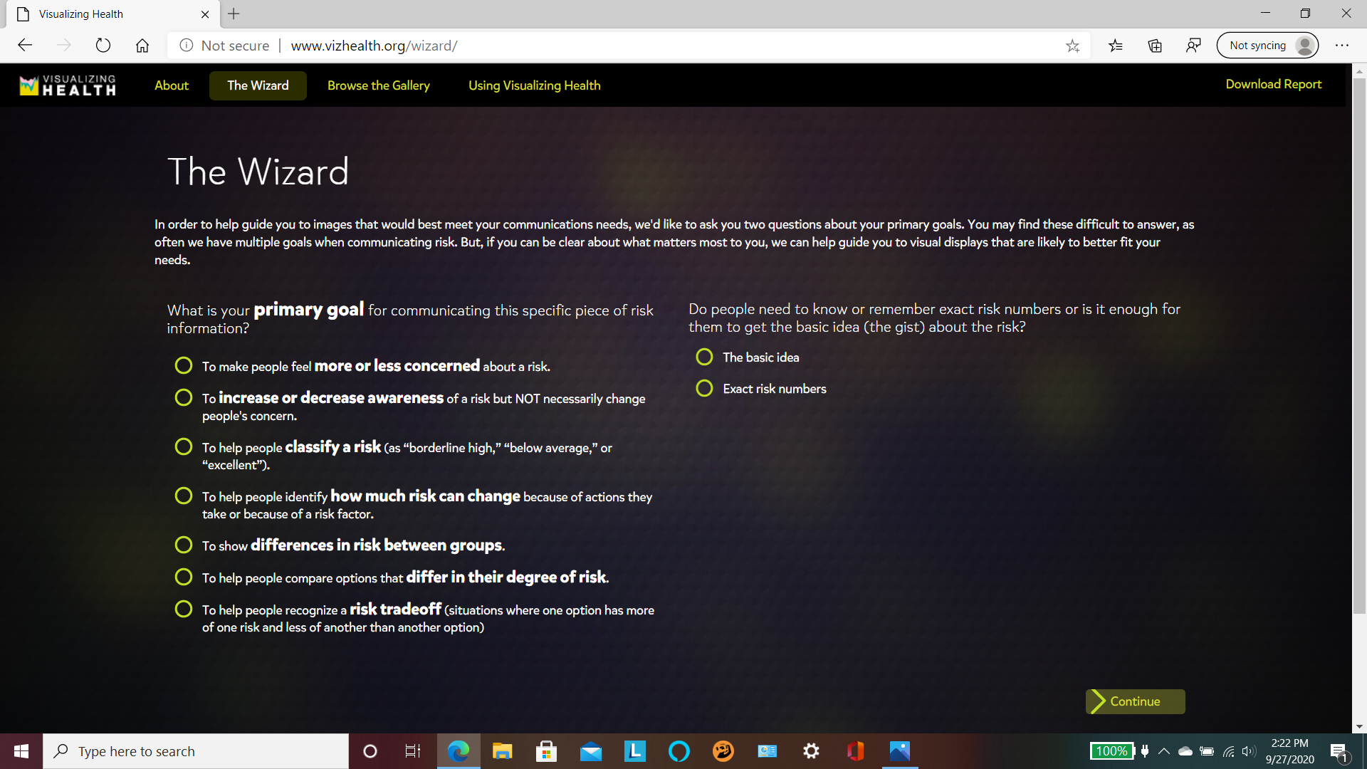
I started with wizard tool by answer some questions
Ok, the result were here. It was helpful for me to narrow my images by selections of ” My goals, Details or gist, Data I have, Health conditions, and Graphic type” . Two first selections were results from taking Wizard.
Next, I smiled to choose a specific type of graph for displaying my result. Otherwise, I could enter a matrix of health images? Could you have 11 your lovers at the same time? I only chose 1 lover and some friends. I was busy.
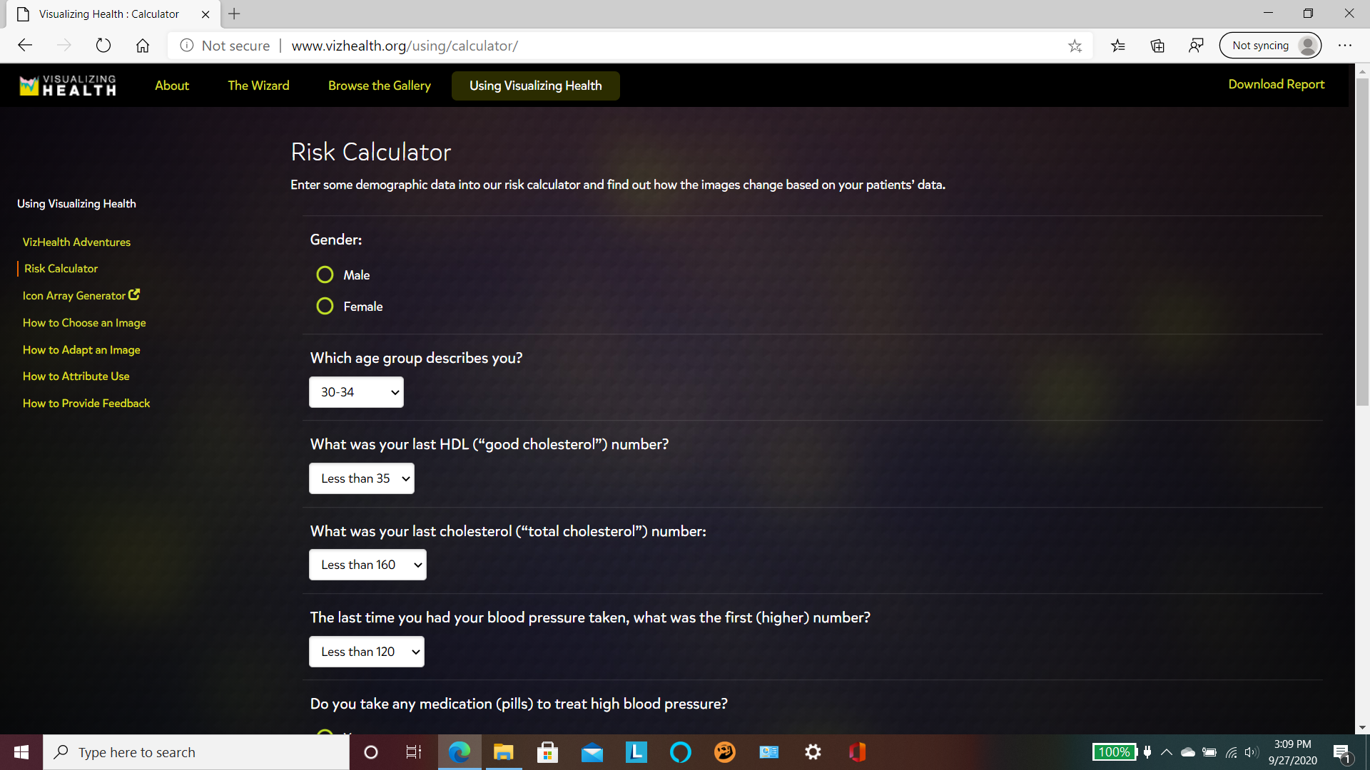
Ok, Let’s started with calculate my risk !
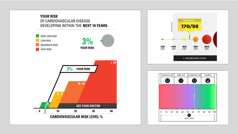
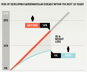
After that, I had my Cardiovascular risk level, the score of Health Risk Assessments ( HRA), as well as the translating test results into risk. Unlike secret data, I were available to share with all you. It were looked like…
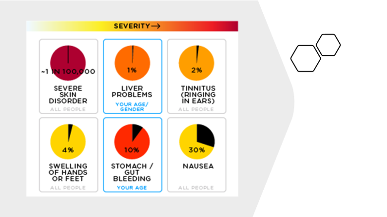
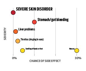
Did you agree with me that it was important to access our health risk? It was not less useful to understand about health risk factor such as gen, gender, age, health condition, as well as living and working environment. So, the website remined me about attention for variety … These images were looked like…
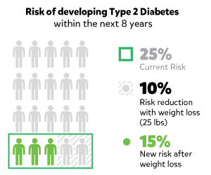
The benefit of risk reduction and the benefit of positive change were also pointed. These images are looked like…, but not mine…
Some recommendations about treatment choice, specially for color cancer or diabetes were available. But not me… I was Ok!
Finally, I made decision not to visit doctor due to my health…!
More thinking…! 09/28/2020…
I would like to thank authors of the website and my instructor for this opportunity. It is not easy to make ideas about health visualization without their health knowledge and talent, specially their creativeness, organizational and computer skills. The images / infographics are lovely and understandable.
More ever, I was inspired to learn more some health knowledge while answering some questions, as well as how to make these lovely images/ infographics. Also, I got a little experience to determine where is starting point for a difficult math problem.