This week we learned about pivot tables.
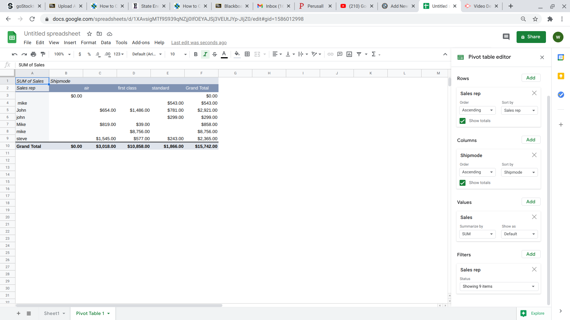
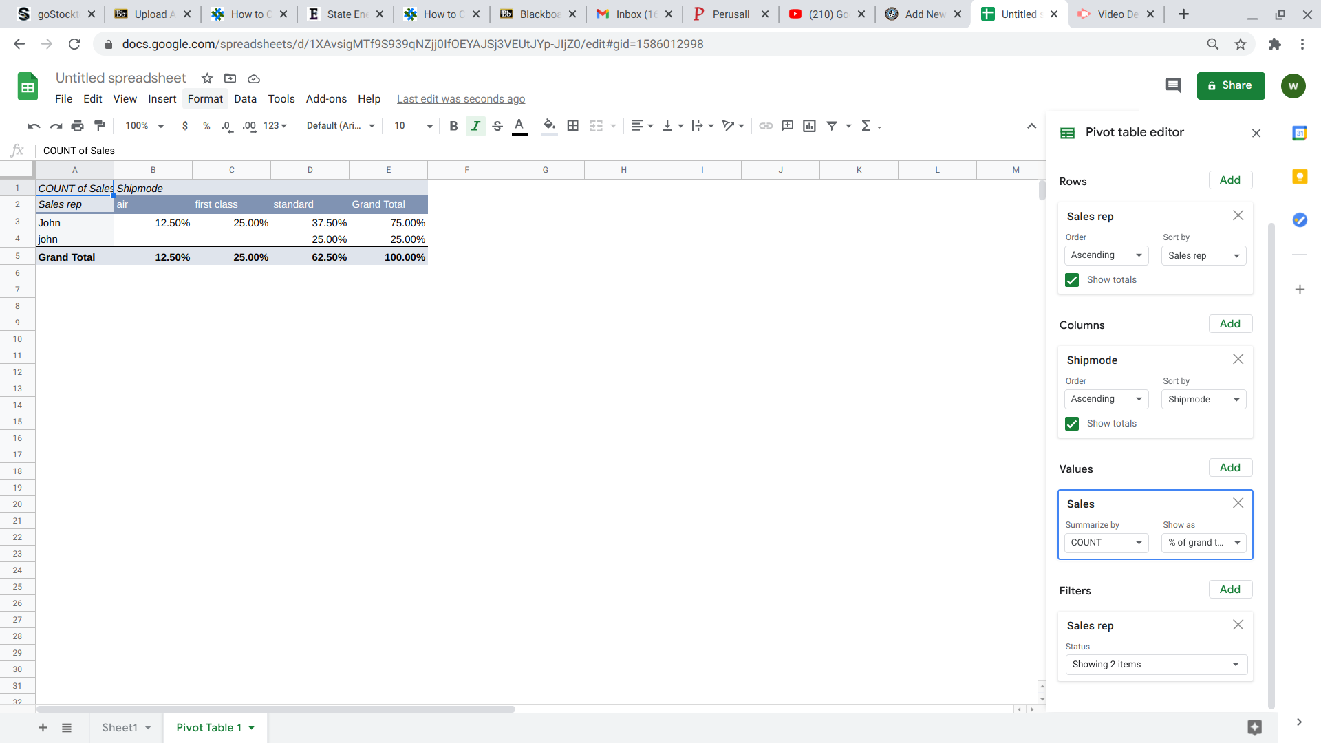
This week we learned about pivot tables.
This week we took a look at “http://needtoknow.nas.edu/energy/interactive/california-energy-system/
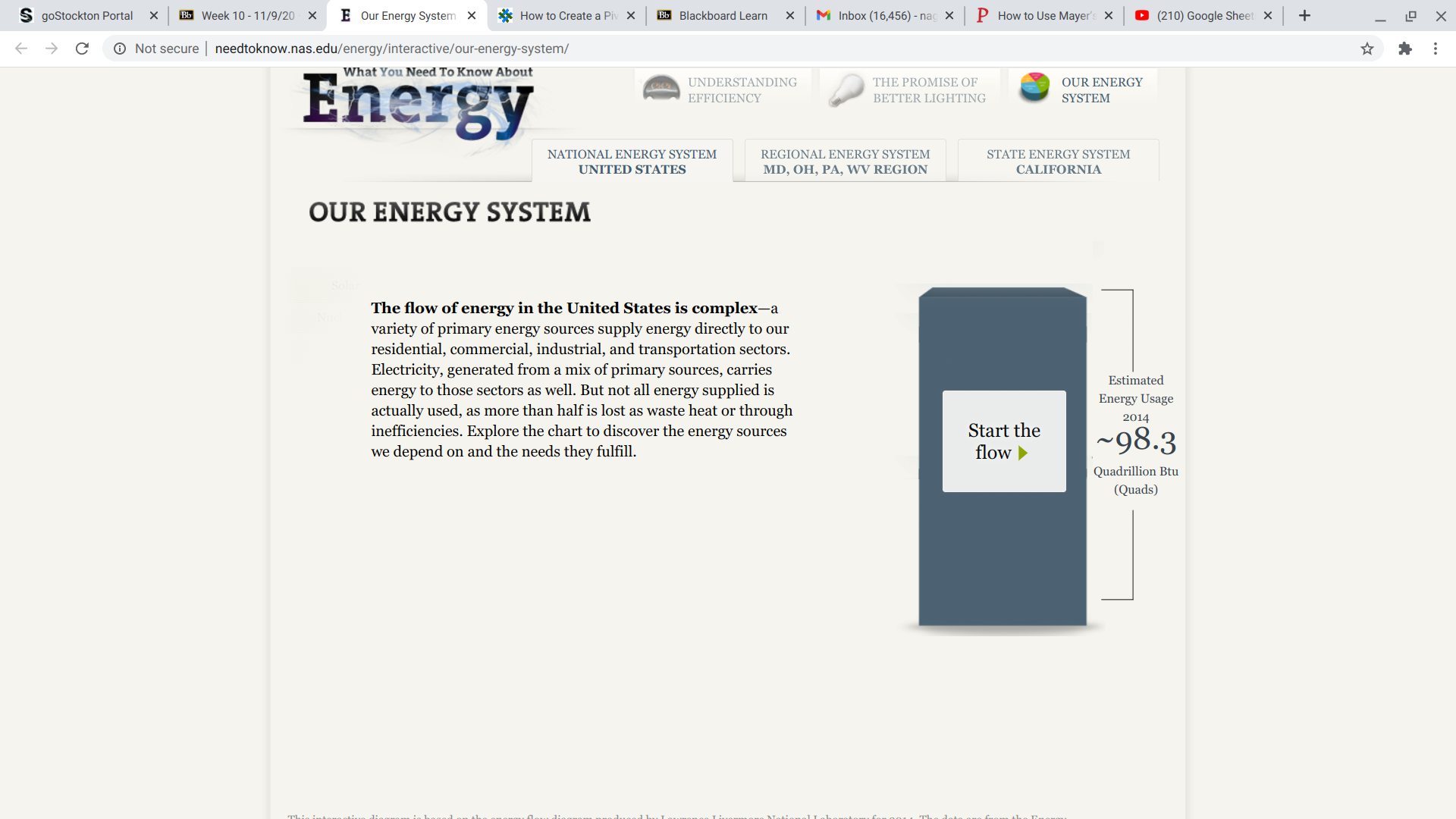
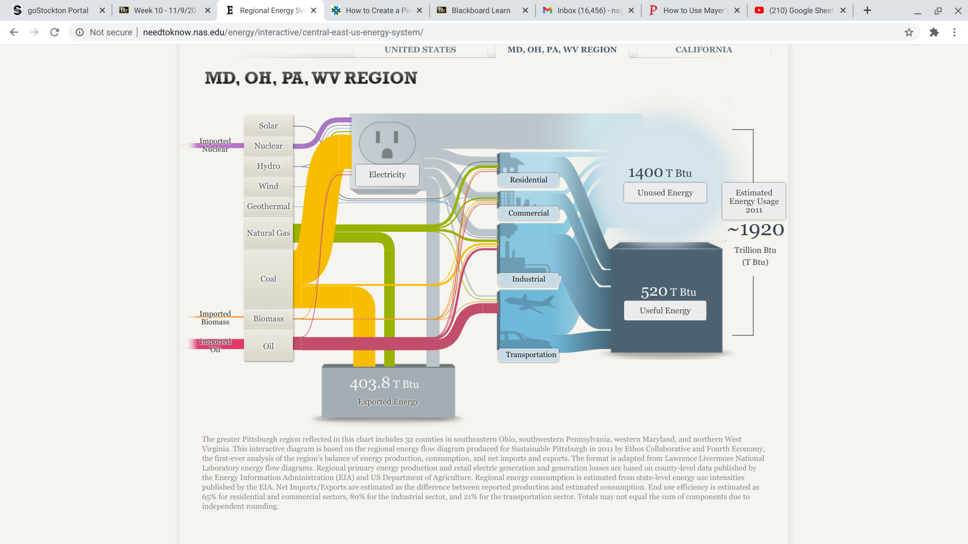
The information was broken down into regions
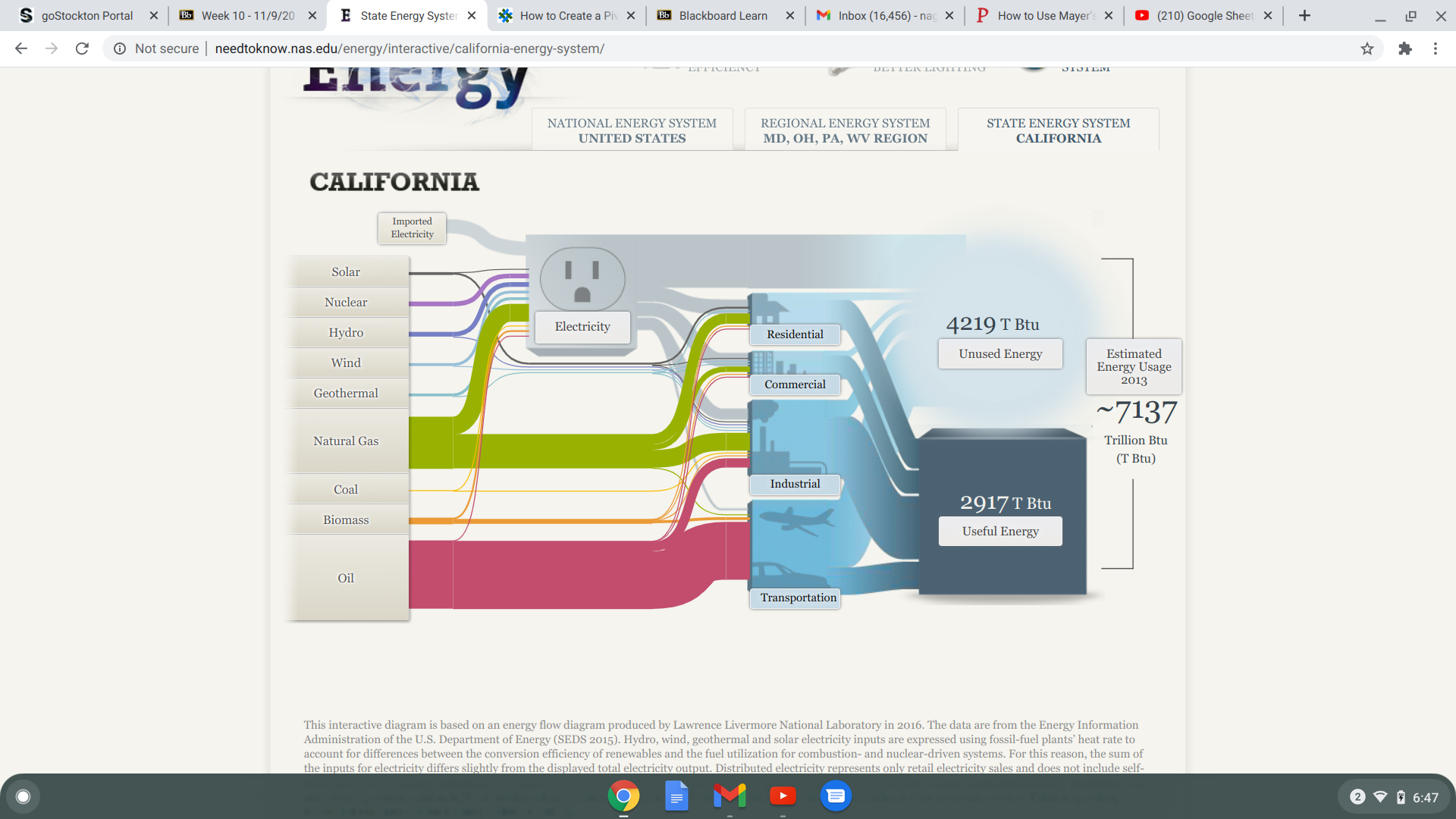
Then the regions themselves were further broken down into the different type of energies.
So this week we were asked to come up with a perfect case for the use of a pie chart. So…….
To answer my first question i started doing some research, it turns out that The pie chart has been around for over 200 years. It was first invented in 1801 by Scottish writer on political economy William Playfair (1759-1823), nowadays known as the inventor of statistical graphs. At the time Playfair believed “making an appeal to the eye when proportion and magnitude are concerned, is the best and readiest method of conveying a distinct idea” and the pie chart and bar chart were born. Some people believe that he also invented the line chart, but that story is better left for another time.
https://infogram.com/blog/the-infamous-pie-chart-history-pros-cons-and-best-practices/
The problem with Pie charts has a lot to do with our physiology. we as human beings are good at telling the difference between lengths but not so much when it comes to comparing angular differences. Meaning that compared to say a bar graph pie charts are not as efficient at getting their points across due to the extra time it takes for interpretation. as well as the need for more chart elements like clear labels to aid with quick interpretation of the graph.
However if you want to visualize pieces of a whole then a pie chart is your best choice. So for this assignment I decided I was going to breakdown a product i use often and turn its respect constituents into data points for a pie chart that i will post shorty.
The product I chose to to break down for my data is coconut oil. I’ve always know that coconut oil had many health benefits. But hypocritical to that notion, I’ve never really know what was in it? I use coconut oil as a moisturizer so I’m going to focus on the fatty content.
A quick google search for ” fatty composition of coconut oil” gave me this :
Coconut oil is made up of 7 know fatty acids plus one unknow acid
So I plugged those numbers into excel and this is what i got as my data table
| Fatty acid Compositon of coconut oil | |
| Acid | Percentage |
| Capryilic | 7.0% |
| Decnoic | 8.0% |
| Lauric | 48.0% |
| Myristic | 16.0% |
| Palmitic | 9.5% |
| Oleic | 6.5% |
| OTHER | 5.0% |
Then i turned those lovely points into a pie chart.
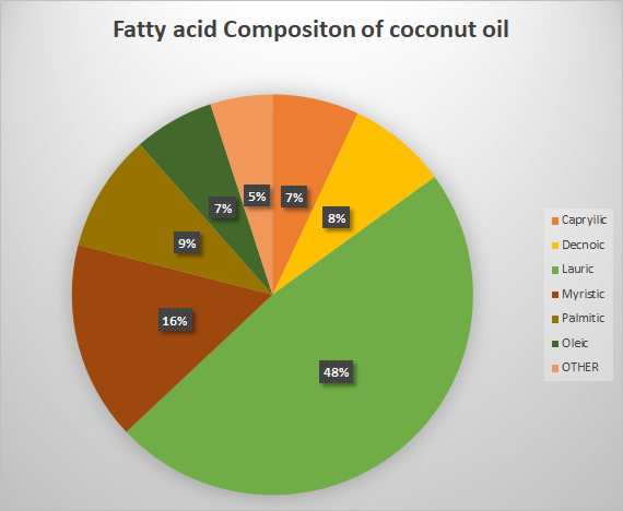
Interesting enough Lauric acid had the biggest portion of coconut oil’s fatty acid of composition, coming in at 48%!
Due to the fact that im more interested in how each component compares to the whole i believe this is a better option for a visual even when compared to the beloved bar graph.
This was a very fun activity and I look forward to doing more like it for my individual project.
This week we were asked to create a lollipop chart and then blog about our experience.
The Lollipop chart is way of taking a column graph/ chart and making it less visually overwhelming. I dont know about you but my visual appetite is big, so the simpler the better, especially when conveying a non-artistic message is you “point”.
while working on previous assignments we strived for simplicity by simply deleting the elements of the chart that were not helpful in getting our point across.
we deleted tick marks, lightened grid lines and even removed an axis line. so, what Left?
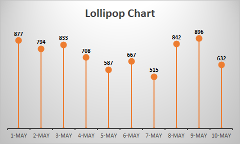
All that ink making up each bar. Some research has shown that this “ink-friendly design impacts readability and leads to faster response times and greater accuracy
| Date | Calls | |
| 1-May | 877 | |
| 2-May | 794 | |
| 3-May | 833 | |
| 4-May | 708 | |
| 5-May | 587 | |
| 6-May | 667 | |
| 7-May | 515 | |
| 8-May | 842 | |
| 9-May | 896 | |
| 10-May | 632 | |
To make my own i started with 10 simple data entries then i inserted a clustered column chart.
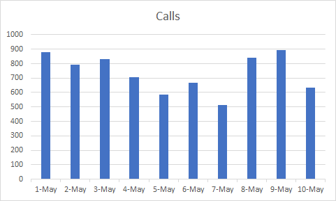
The hardest part for me was those darn grid lines, so after my 25th time of reading the instructions i finally got it.
This was the hardest chart to figure out how to make but the easiest once to figure out how, it is a pretty straight forward data visual.
As you very well may know, bar graphs are great at displaying differences between groups when there is a comparison that needs to be made
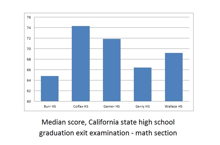
https://www.varsitytutors.com/ged_math-help/bar-graphs
Bar graphs are an awesome tool….but they aren’t perfect
Bar graphs only tell you what your group performances were. But what if you had a specific goal or mark in mind? And that is where benchmark lines fall short, in their story telling ability.
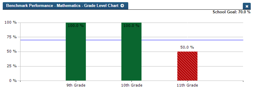
2. More effectively Track the Progress of Business Goals and Objectives
3. Set performance expectations
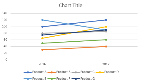
One amazing tools we can use when comparing 2 numbers is a slope Graph.
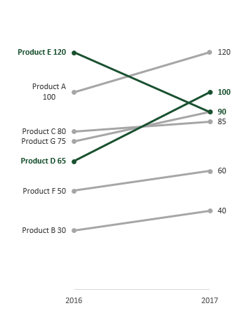
The Slopegraph, not to be confused with a “Slope Graph”, are very good at highlightingthe story of how just one category decreased when other categories increased.
The thing about bar graphs and people, is that, even though humans are good at detecting length, making bar graphs advantageous. But they lack the nuianssce that is sometime neccesarry to make the story behind the data clearer.
The concept behind this data tool was first developed by Edward Tufte, an American Statistician.

He is also the author of The Visual Display of Quantitative Information.
As Tufte notes in his book, this type of chart is useful for seeing:
https://charliepark.org/slopegraphs/
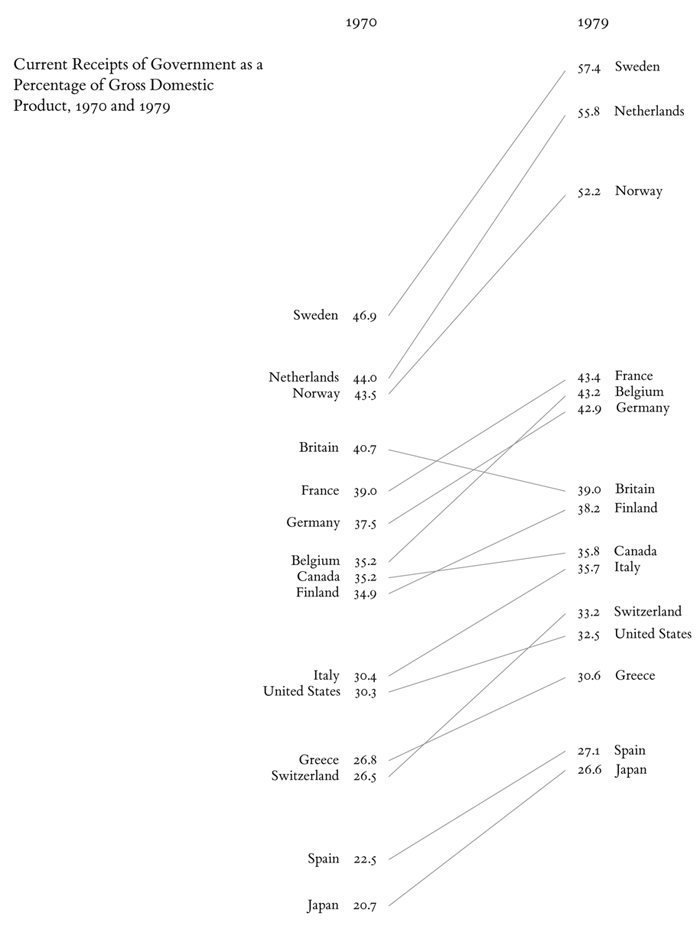
Here is an Example of his original concept, directly from his book
This week i had the opportunity to visit Michigan University’s Visualizing Health site and here how it went!


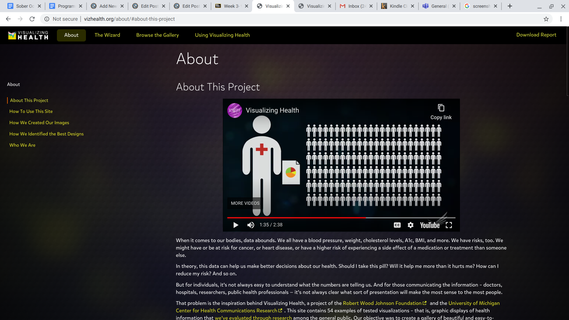
All in all, I had a very informative time going through the site!
Excel is one of the most useful tools for creating Data Visualizations