Categories
Uncategorized

Pivot Table

A pivot table is a great way to show the summary of your data. It is really useful if you have information or data that can be put and interpreted by groups or sums of groups.

Pivot Tables in Excel - Easy Excel Tutorial

Pivot tables allow large information that is in excel to be simplified. A lot of people shy away from excel ,like myself, because the information can look and seem very. overwhelming. Putting the information into a pivot table allows simplicity.

Tom's Tutorials For Excel: Automatically Refreshing Your Pivot Table – Tom  Urtis
The data to the left is shortened and simplified into the pivot table that is shown to the right and it set up into groups by states.

Pivot tables are an easy way to track trends. For example, the image above shows a trend by state of clothing items sold. You can do a pivot table for just about anything but I think it makes the most sense to do it for large data only.

Categories
Uncategorized

Our Energy System – Sankey

My initial reaction to this visualization is that it looked kind of boring but then I actually started to play around with it and it was super simple to navigate. It is formulated just like a website and they made each section of the homepage really easy to read and it wasn’t overwhelming.

When you first click start you get redirected to another animation which is the one below

It was an interactive animation and each part of the animation puts a different data set up for the respective category. Aside from the data. set, they give a description on the data which I thought was pretty cool!

The next part of the presentation was where they compared homes and vehicles. I thought it was really nice to see the side by side comparisons of the cars.

The back to back bar graph in the bottom is a really easy way to share the facts about each car and it is really clean. There isn’t too much information on the side but it is also the perfect amount of information to get the point across clearly and affectively.

Lastly, I thought it was a great idea to put the side “advertisement” shown below. It’s an easy and smart way to get the attention of the audience to explore the rest of the page. Overall, I thought it was a super easy page to navigate and it definitely catches the audiences attention from the beginning to the end.

Categories
Uncategorized

Pie Chart

Pie charts are really good at displaying data in a simple form. They are easy to look at and they are not overwhelming with data. They are meant to be simple and are amazing at displaying part-to-whole data.

This chart took me no more than 5 minutes to make and I think it’s pretty self explanatory. I think the different kind of eating habits for women. The data set is just made up but I did it just as an example to show how simple it can look. I also changed the colors so that it’s easier to identify the different sections. I think it is so easy to read and it is visually appealing to the eyes.

Categories
Uncategorized

The Lollipop Chart

When I first looked at Chapter 5 I thought it was way too complicated but the lollipop chart ended up being the easiest chart for me to understand. A lollipop is basically a bar graph but in my opinion is looks way more appealing. Lollipop charts look cleaner and simpler than the standard bar graph which are bulkier and look to cluttered.

The chart I made was just a sample data set of COVID tests that were done on the first of every month. The numbers on the set are not accurate but I was just playing around with the numbers so I could understand how the chart would actually work and how it would look.

My example was a simple example of a lollipop chart but there are so many different ways to actually display this type of chart. Similar to the back to back bar graphs, you can create a lollipop chart that looks the same. You can also switch the axis and make the chart of the y axis going horizontal instead of vertical on the x axis. The image below shows a combination of both the horizontal graph and also the back to back graph.

Categories
Infographics

Tools for Making Infographics Cool!

Ashley Morales

September 20, 2020

Why are Infographics Important?

Most people look at infographics without actually knowing that they are and how much they have actually been beneficial to us. Little did we know that ever graph or pie chart or even an advertisement was an example of an infographic. They are a quick and easy way to get the point across to the reader without confusing them or spitting a whole bunch of information at them.

There are a whole bunch of cool tools and websites that can help make your infographics exciting and will help draw attention to your readers.

Here is a list of some of those tools:

  • Visme, which is actually a multi purpose site that allows you to make presentations, infographics, advertisements and much more.
  • Easel.ly, on the other hand, can be used strictly for infographics. They have different templates that cater to different types of audiences and themes that you can choose from.
  • PiktoChart is really good if you need some quick graphs or charts done.

Other tips for infographics:

  • Always make sure to make it clear for all types of readers and listeners.
  • Make it simple. The whole purpose of infographics are to make hard information and graphs easy to understand.
  • It is okay to have black spaces! The point is to make it visually easy to look at. If you have way too much going it could easily distract those with short attention spans.
  • Grab their attention. Similar to an essay, you are. going to have to hook the readers in, usually with a title or some kind of visual
Categories
Uncategorized

Benchmark

Although benchmarks can show us a variety of things, I think they are best at showing us comparisons. You can compare almost anything and everything. When you compare something you are basically showing how well something or someone performs compared to one another. For example you can compare the brands Tesla and Honda; you could compare the pricing, the style, how much you would save on gas and so on.

An article by Pew Research Center does some analysis on our presidential candidates. The article is meant to reflect on traits of both candidates and how voters are viewing each one. This particular benchmark to the left is the percentage of voters that think Trump or Biden would be a Great, Good, Average, Poor, or Terrible president. It is interesting because Trump has the highest percentage for both great and terrible.

Similar to the benchmark previously mentioned, the one to the right shows the percentage of voters that think the. candidates are great, good, average, poor, or terrible. It goes a little more in detail by adding the percentages for both sides of the spectrum. It gives Biden’s supporters on Trump and Trump’s supporters on Biden.

In general, both graphs are just comparisons of performances from both of the candidates. This doesn’t explain to us which one is the better candidate because that is up to your own personal beliefs on each stance but it gives you a look into what other people are thinking about your candidates and you can kind of get an insight on how the election could go but it is not a definite answer.

Categories
Uncategorized

Tools that Help Construct Visualizations that Compare Numbers

There are so many tools to help you create visualizations but a lot of them are kind of animated, which is fine but sometimes you need something that is going to help you bring out some data that needs to be shown. There is a software that could be used on your desktop, mobile device or even online.

Tableau is good for all types of graphs, scatterplots, line graphs. You name it and you can literally make it happen. They even have diagrams that you can choose from like the map of the country or even the whole world. Let’s say you need to compare cases of COVID between New Jersey and Florida, you would be able to show the hotspots in both regions.

In the image shown is an example of how you can use the maps in different ways. You can keep track of trends and even combine different types of charts, graphs, diagrams to bring together a full visualization of data.

Categories
Uncategorized

VizHealth

I would just like to say that the Visualizing Health Website is a dream come true for all Hospital Marketing departments. This site is very easy to navigate because they made the tabs really simple to understand.

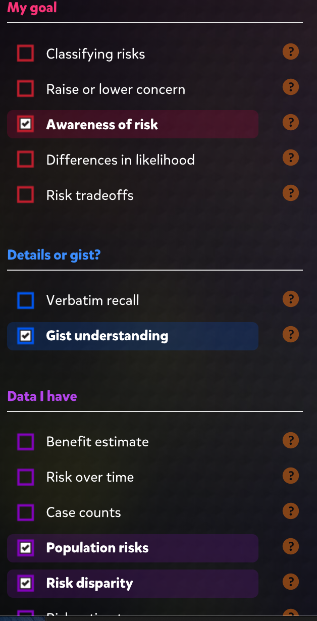
There are four tabs: the about section which is basically the history of the website and their purpose, the Wizard which separated into two main questions, what is the primary goal and whether you want it to be a general idea or specific.

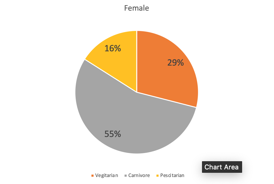
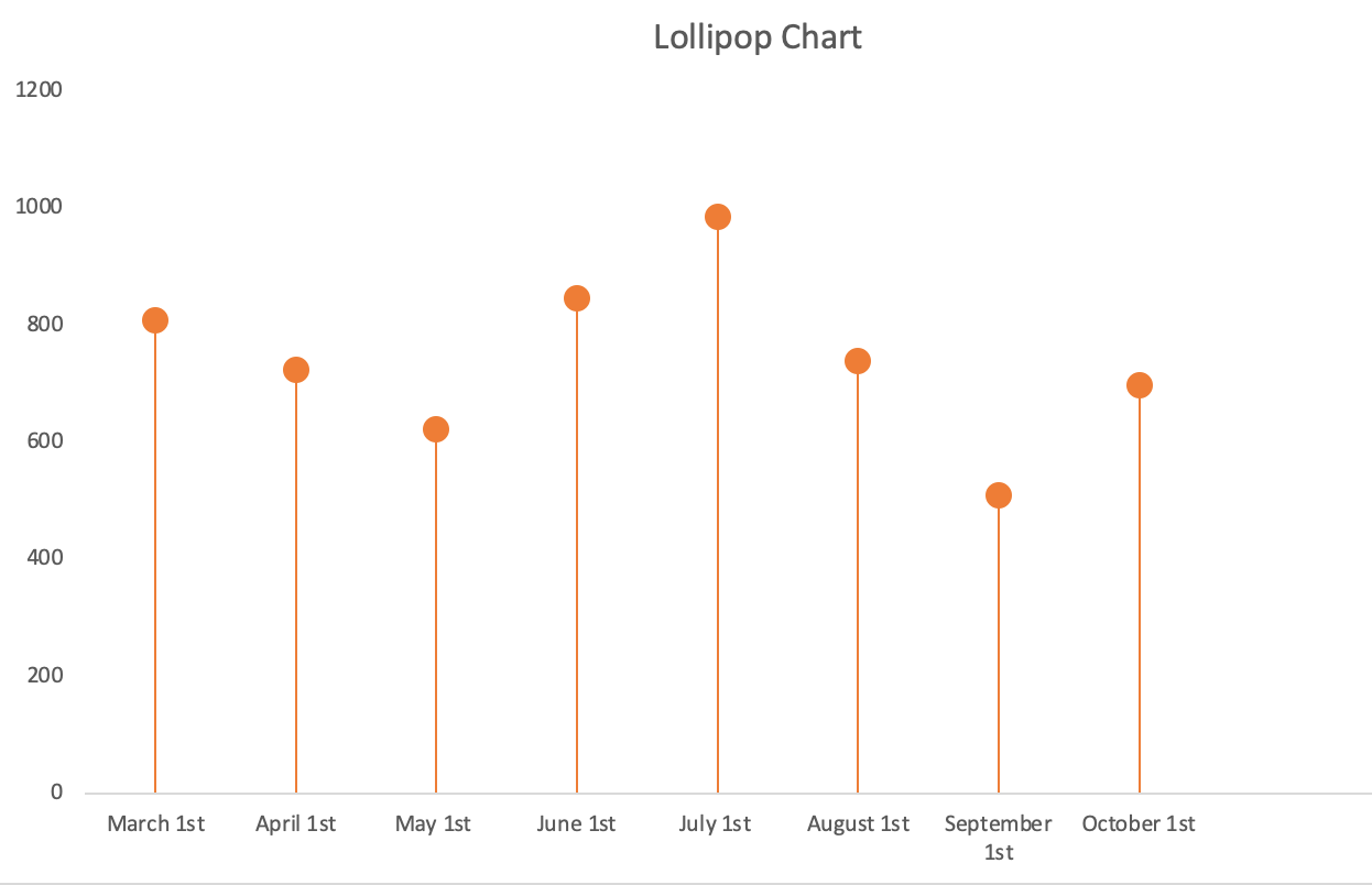
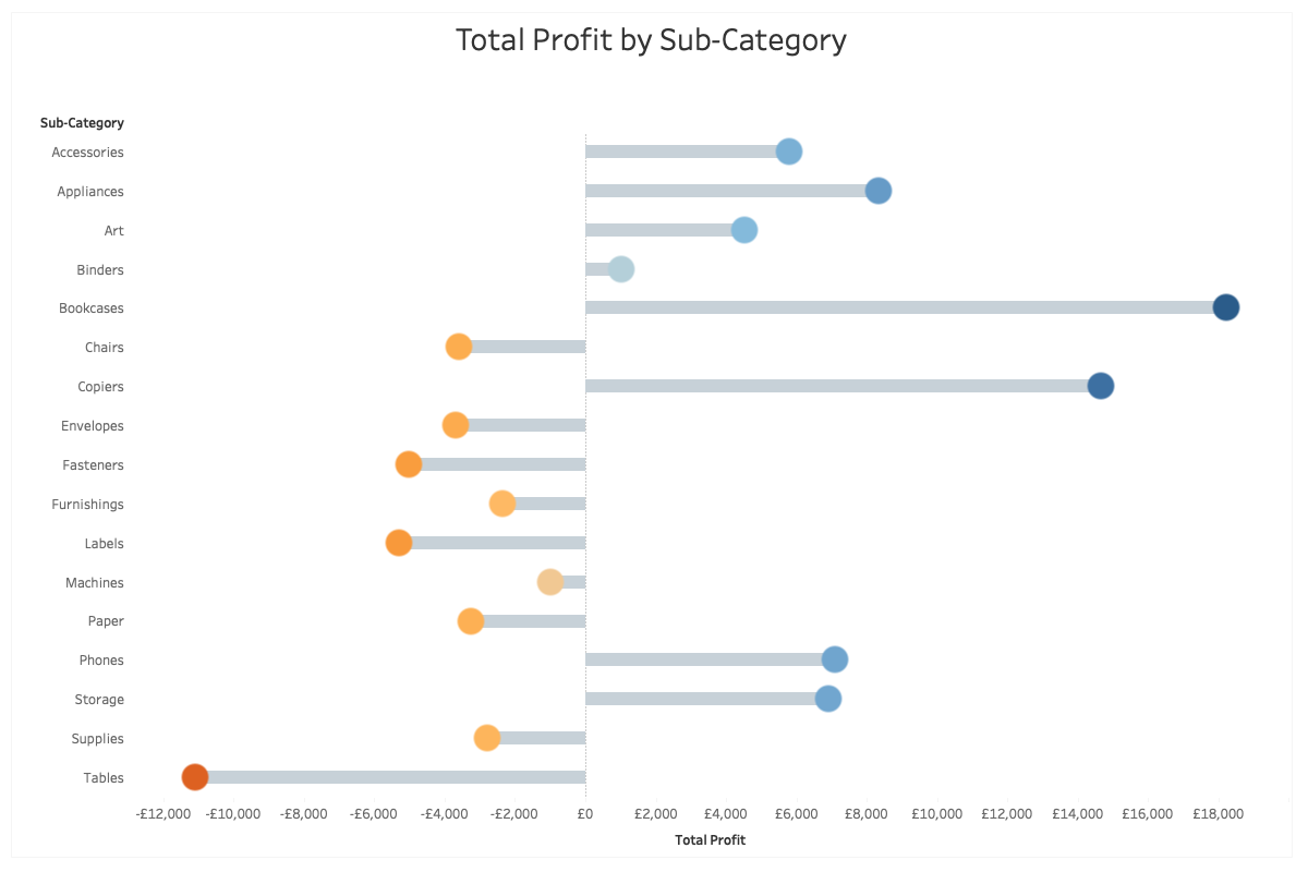
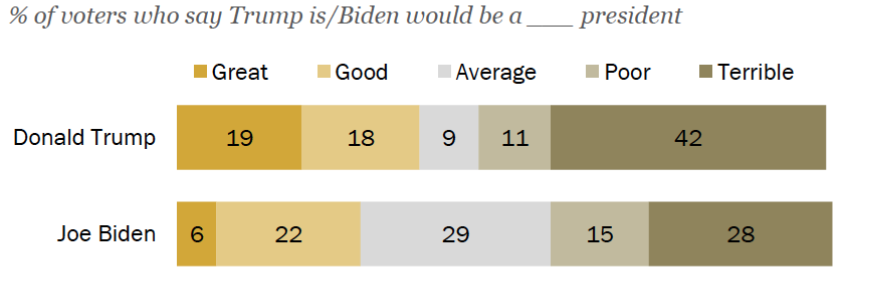
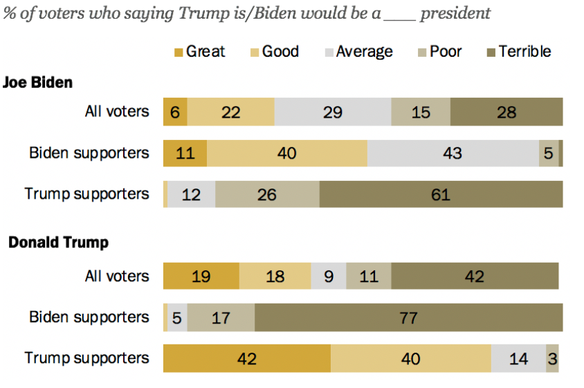
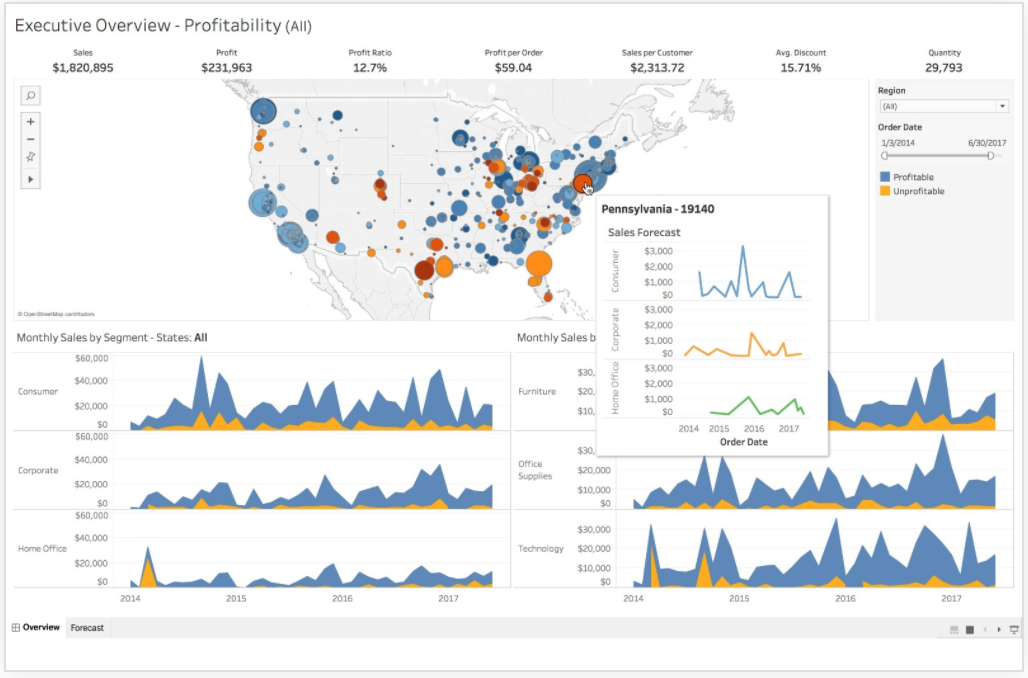
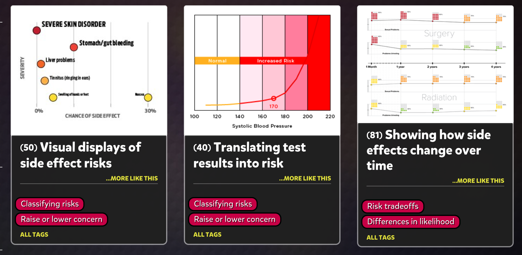
The next part if the gallery that has hundreds of charts and graphs about almost everything health related that one could think of.

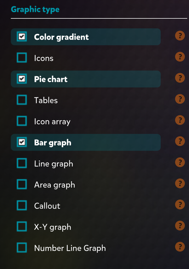
The left side of the page is separated into sections and you can filter your searches through there. You can choose what you want you goal to be and what data you want to present. Then towards the end of the filters there is an option to choose what graph time you. This is great because not all graphs fit the needs of your audience and not all of them have the same effect.

The last part of the site is basically a how to page. It explains how to pick the correct image to fit your needs and how to adapt the image when you pick the one to that is the best for you.

The graphs that you can choose from will look like this and when you click on them there is an option to download them. Since these graphs are so specific to some data and research that has been done, they also give you an option to look at that data that is presented in a graph form as an actual PDF document.

In conclusion, this is a gem for all health care professionals including myself. It’s amazing how there is really something out here for everything you could possibly need. This is something I will for sure be using in the future!