I think pivot tables are one of the best ways to display data but get the least amount of attention. I say this because I both make and see them everywhere yet had no idea what they were actually called.
The table above is offering an example on food versus how much of one product was sold. This is an especially helpful layout when considering when to add or remove certain products from an itinerary. Being able to see by order or day what products are or aren’t selling is a great way to negate some costs.
Personally, I’m not in the business of needed to see what sells over what as I don’t own a restaurant or store of any kind but I imagine that this could be helpful even in situations that aren’t monetary. I have a large collection of makeup and I think this would be a great way to organize my collection to make sure I get use out of all products.
So off the bat I imagined I was in for a somewhat dull interactive, because how could you possibly top a website called snakey, even though I had no idea what it was about.
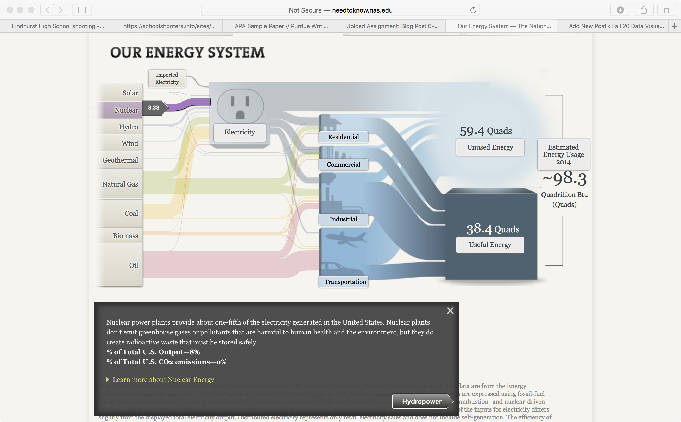
I was pleasantly surprised! Mostly because I have a vague and slightly threatening interest in nuclear chemistry (threatening in the sense that I’ve read a lot of books on the subject and vague because come on… there’s a lot to know and I’m a neuroscience student with a full time job. I’m busy). In the technical sense, I’m fully aware of the problems nuclear energy has and can cause (hi, Chernobyl, Three Mile Island, and Fukushima) and that it isn’t exactly the lowest cost form of renewable energy but I was excited nonetheless.
Please ignore the open tabs. I take a behavioral analysis class and my individual project is a behavioral profile on school shooters.
Naturally the first place I went to was the nuclear energy system tab. As previously mentioned I knew that it isn’t a super popular form of energy but I was surprised to see that the data had gone up from the Three Mile Island incident back in 1979. The thing about nuclear energy (other than the extreme danger to those around a reactor if something goes wrong, or the massive amounts of radioactive isotopes that spread through the air and ecosystem in the event of an explosion) is the safe storing of radioactive waste. Uranium has a half life of 4.5 billion years and even then it only gets broken down into radian-226. Uranium waste is highly radioactive and notoriously difficult to store, so it makes sense that it isn’t the most popular form of energy.
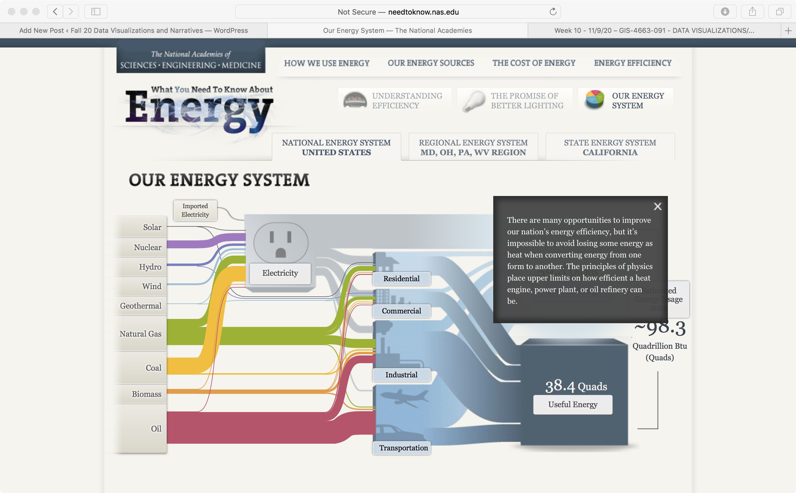
Now, for the design.
This website still feels like it’s in a beta version. I’m not a wiz with coding or anything but just by looking at it and comparing it with other websites that have been beta’d (Instagram, Twitter and Facebook all were beta at one point) it just feels outdated. I checked to see the copyright year, just in case this website was out of date but it wasn’t. It just looks old. I find the use of clunky graphic and text boxes to be unappealing visually. Having your data pop up in front of your graphic kind of defeats the purpose.
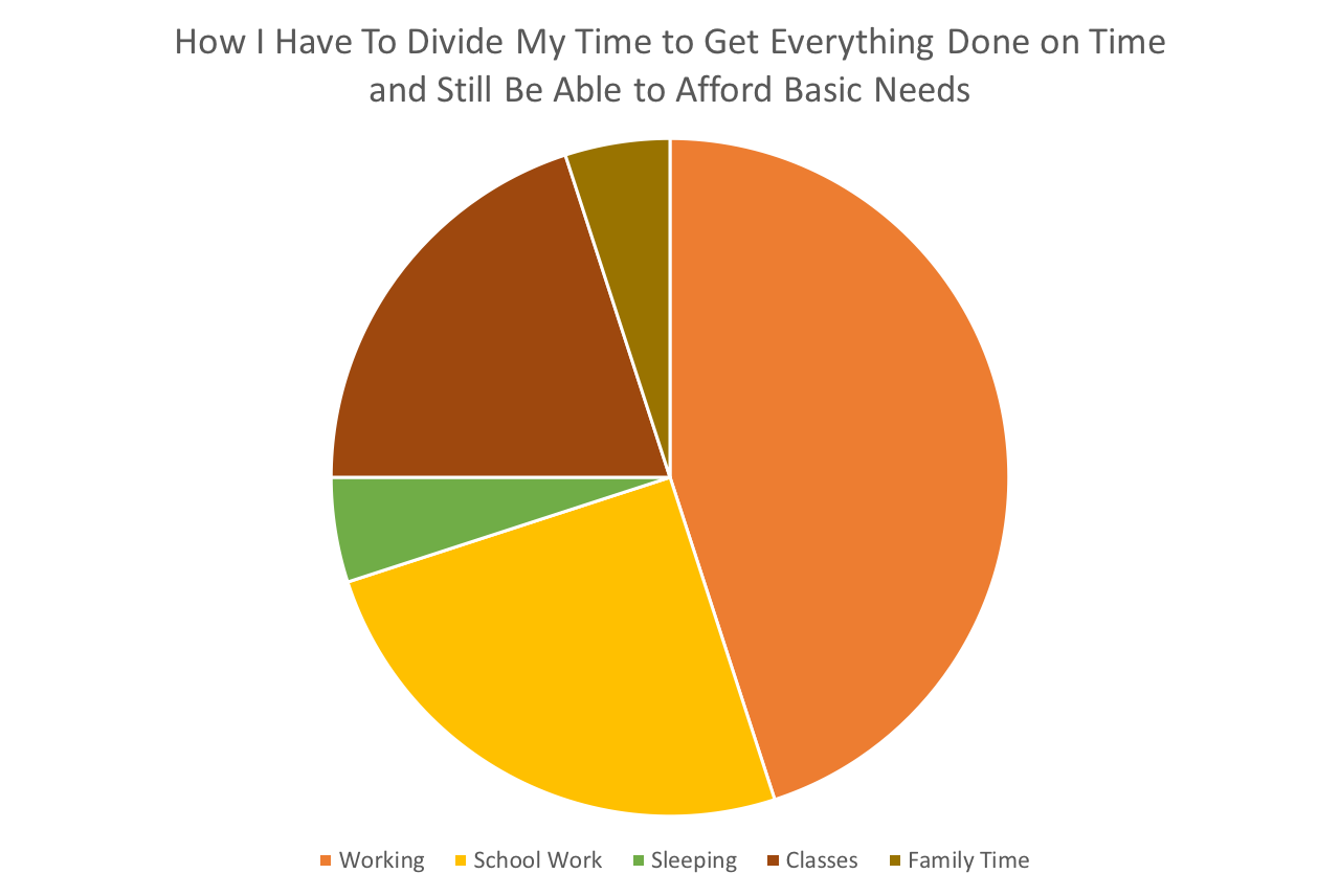
So with the semester starting to speed up it’s no surprise to literally anyone that I’m starting to fray around the edges a little bit. I don’t handle stress well, what can I say. Anyway, I thought this pie chart would be a good way for me to easily display how my time has to get broken up in order to live. See below.
I think this is definitely the best way to display this data. I wanted to emphasize how much time work takes out of my life. I think it worked. I also think that it’s best to use a pie chart when trying to show a large difference between several things.
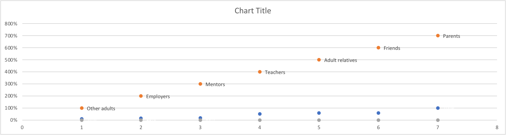
So this week I completely failed at trying to make a lollipop chart. I refuse to be too hard on myself because at one point I had been sitting at my kitchen table for over two hours trying to follow the directions from the book. The image below is what I ended up with.
I’m truly not sure where I went wrong. The petty side of my personality is saying who even cares. It’s just a bar graph that’s harder to read than normal. But I know before 3:00 tomorrow I will be trying again. And again. And if I can’t get it right then I’m willing to take that L.
Below is what a lollipop graph… should probably look like. Frankly, I don’t think I’m too far off. I think I can get there. But this has officially passed 3-D bar graph as my least favorite way to display data.
policyviz.com
A live look at me trying to figure out how the hell to make a lollipop graph and why can’t I get mine to look like hers and where are these supposed tools that will help me build one online
The graph above (via nytimes.com) displays several major natural disasters and alongside them, the amount of money required to get things back to a normal state.
The graph below (also via nytimes.com) displays the importance and reasoning behind flattening the curve of COVID cases. In this graph, the benchmark is the healthcare system capacity.
I think it can be pretty easy to forget how much millions and billions actually are.
This can be thought of in several ways. A billion pounds of water will weigh more than a million. A billion pounds of anything is too much, and a billion of anything is a hoard of resources.
NowThisNews via youtube.com
End World Hunger 11 Billion Dollars
Jeff Bezos 72.8 Billion Dollars
Warren Buffet 75.6 Billion Dollars
Bill Gates 80.6 Billion Dollars
Me 11.23$ an Hour
IISD.com, Worlds Billionaire Club (as of 2017).
The next time you think of defending Jeff Bezos, remember that you and him are not alike. You are closer to poverty than you ever will be to being a billionaire.
This is one million in numerical terms
1,000,000
This is one billion in numerical terms
1,000,000,000
This is how much Jeff Bezos is worth (as of 2017)
$72,800,000,000
This is how much a teacher makes on average in New Jersey (as of 2019)
About the Project Page, detailing the what and why.
I personally found the first page of the website a little bothersome, mostly due to the speed at which all of the available widgets appeared. I thought it was kind of annoying to have to wait for everything to load and then load again. Seemed counterproductive for someone trying to do research.
All of the gallery images on this site are available for widespread use through a creative commons license. You are free to duplicate, adapt, and modify the images as you see fit—we just ask that you abide by the Creative Commons Attribution terms.