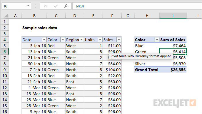
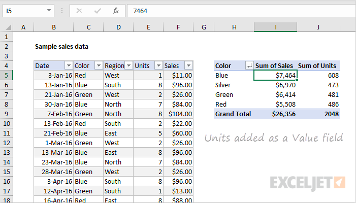
Pivot Tables are essentially reports that companies use for their own personal checks and balances. What sets them apart from statistical charts is the fact that they are very interactive. Instead of having a multitude of confusing formulas, you can have a very simple table where you can choose what variables you want to compare.
In my research, I found a lot of interesting ways to use Pivot Tables. This website was particularly helpful in simplifying what the tables are used for and how to construct one.
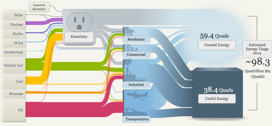
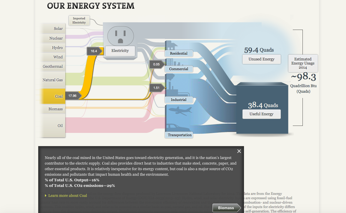
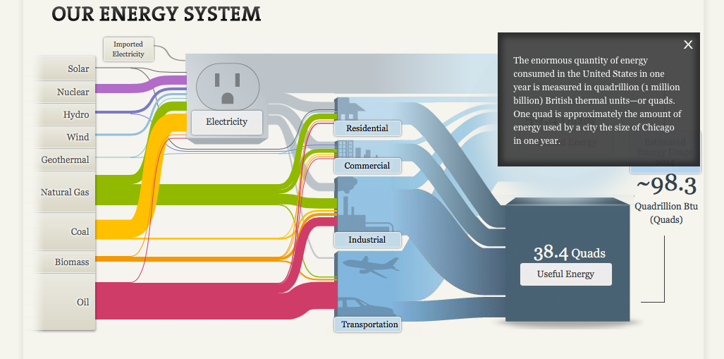
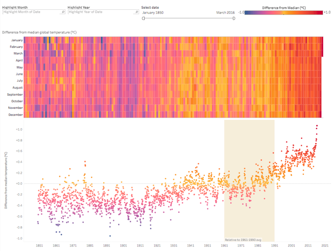
I really enjoyed this website. The interactivity alone was awesome, paired with the interesting data. The energy chart was really to navigate and understand.
Each of the colors represented the forms of energy really well and puts a lot of our energy production into perspective. As you can see, Oil (In Red) is represented as the largest because it’s one of our main forms of producing energy for transportation.
Clicking on each stream will give you facts about the energy you’re interested I researching and it will then conduct you to the next part in which this certain material is used in the energy making process. In this specific instance, coal is mainly used to produce electricity.
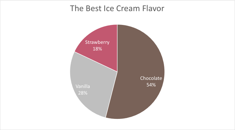
Pie charts are one of the easiest ways to represent your data. Some people seem to like using these charts and including them in their data stories. Others can’t stand them for a multitude of reasons.
I am a personal fan of pie charts when they are done correctly. In cases of 2 or 3 pieces of data, a pie chart can show you how each of their values differ in proportion to the size of their slice. But when you have 5 or more values, the chart can become crammed and you cannot accurately visualize the data.
In this example, the values are easily identified and even have the values within their slices. This is a great way to show the significance of a number.
In this example, it’s a lot harder to see each of the data sets. Sure, the slices are labeled. But things are beginning to get cluttered and overwhelming. A simple bar chart would be much better to show these ratios.
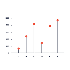
I think Lollipop Graphs are really interesting and creative ways to show your data. The first interesting thing is that you can create them in one of two ways: Either through Scatter Plot Graphs or through Bar Charts.
Lollipop Graphs are very simple, yet they show you exactly what you need. and that’s their exact purpose.
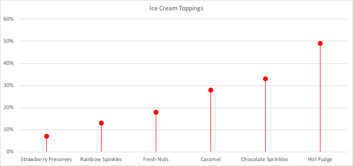
In my Lollipop Graph, I chose a data set about popular ice cream toppings. I chose to show them in ascending order because I thought it looked a lot better. It is very minimalistic, but I believe it gets the point across.
While doing some more research, I found some more variation of Lollipop charts like the ‘Cleveland Dot Plot’, which has a shorter line and shows two subgroups. More of these examples can be found at https://www.data-to-viz.com/graph/lollipop.html.
In business, benchmarking is used to measure a company’s success. If you can see a clear and present gap, you can figure out what to fix before things get out of hand. Companies can gain a competitive edge by studying their competitors and can have a fighting chance.
There are lots of different ways to represent a benchmark on a graph. Sometimes it’s as simple as making a line, other times you have to compare multiple things so one line won’t do.
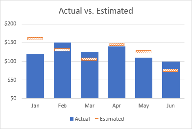
In this example, we have a combo chart. this explains the many benchmarks that were set each month.
A benchmark is essential a goal for a company to set. You reach that goal by just passing the line. In my first example, you can see in June, the company set the benchmark very low and were able to pass it.
In this graph, we’re now counting two variables (Fatalities and Total Accidents)
In this graph, the company us representing the frequency for all of their fatalities. This is a benchmark that you would want to see decreasing.
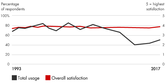
Companies can use this data to show how well their products are doing. While the overall satisfaction is remaining constant, the company has seen a dramatic decrease in the usage of their product. This can tell a company that they need to make a change in their production.
Will they have a follow-up question the need answered?
After answering these questions, you must then create your infographic. In an article on tableau.com, we find 5 new ways to convey our information in an effective way.
Number 1: The Right Charts and Graphs are Key.
Bar Graphs, Pie Charts, Histograms, etc., we need a physical representation of our data. By showing these, our reader can get a good sense of why the data is significant.
Number 2: Predictable Patterns.
We love to see patterns and symmetry in everything we do. Visually, it makes everything look clean and neat. It also helps us understand the data better. An extra long column or a outlier on a chart can show us the abnormalities in our data.
Number 3: Clear Color Cues.
Just like patterns and symmetry, colors have an effect of the human brain too. Some colors may be to harsh like neon yellow. Some colors maybe be too drab and dull like gray. But when you have colors that catch your eye, data can become visually pleasing.
Number 4: Use Familiar Shapes and Designs for Simplicity
If I were to show you the outline of a house, you would know it’s a house. By making your data easy to understand, you’re doing everyone a favor. Simplicity is key when making and Infographic.
Number 5: Everything You Do Is Intentional.
Every placement of an image and every passage you right is done for a specific reason. You should be accurate and not withhold any information, but you should also be concise. Make your data visually pleasing and minimal, but don’t make it boring. These are very vague restrictions, but they also give you a lot of room to be creative.
Find even more presentation tips and tricks at Tableau.Com!
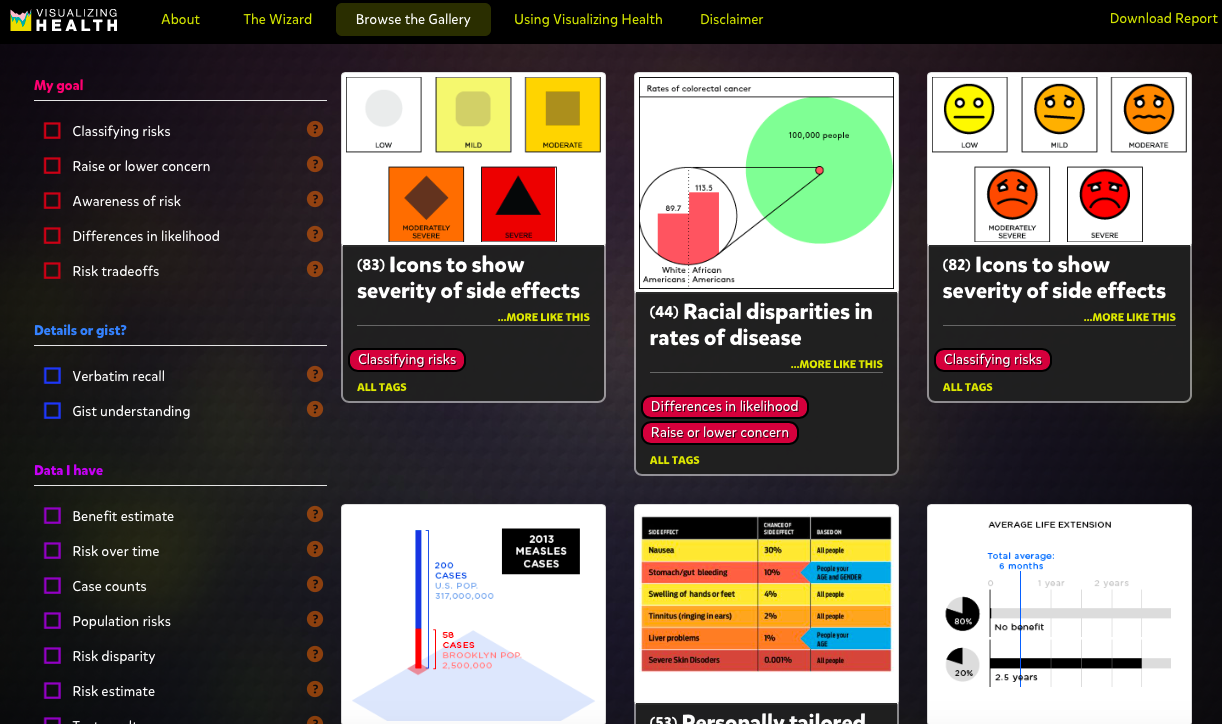
In a collaboration study with the University of Michigan Center for Health Communication and the Robert Wood Johnson Foundation, vizhealth was born! This website is an ambitious way to communicate what we need to know about our bodies in the simplest of forms. Data is what drives us to come to decisions. When we receive news about our health, those of us who don’t have medical degree’s are dumbstruck and don’t know what steps to take next. Visualize Health is your next step.
“This site contains 54 examples of tested visualizations – that is, graphic displays of health information that we’ve evaluated through research among the general public. Our objective was to create a gallery of beautiful and easy-to-make-sense-of graphs, charts, and images that effectively communicate risk information. Health data that makes sense.”
vizhealth.org
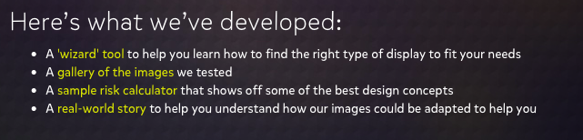
Here are some of the features from the site!
Using the ‘Wizard Tool’, you can edit the site to specify what your will help you in the most effective way. The gallery of images on the site are helpful visual aids that really help you understand your needs.
The risk calculator is very useful and shows off the newest and best designs for infographics. Combined with stories from other people, you can get a real idea of the help you need!
If you want to become a serious Infographic Designer, www.vizhealth.org is the place you should start.
How to present data without losing your reader’s attention!
Summary: “Information graphics translate data into a visual medium that is easy to understand and engaging. Integrated visuals with text and pictures that strengthen each other are the goal, but hard to achieve.” -Lexie Kane (2018)
Click “Summary” to access the website.
Honest Information-
The information included in your infographic needs to be accurate and sourced.
Make sure you have extra links to your data as well as popular sources.
This will give the viewer more reason to use your information.
Minimalism is Key-
Keep your infographic design simple.
Use about 3-5 colors that compliment each other.
Make sure your words don’t crowd the data.
You essentially want your infographic to show your data in a professional way but also be able to have a 5 year old understand it.
Interactivity-
Having an interactive infographic is a great way to get your viewer involved with your presentation.
Sliding objects and adding preferences to the information they want to see automatically keeps the viewer invested.
Being able to narrow down what data they want to see is very important. It combines all 3 of these examples into one!