
This site was very informative for me, I had actually never taken the time out to look at how our energy is distributed, nor what actual sources we use.
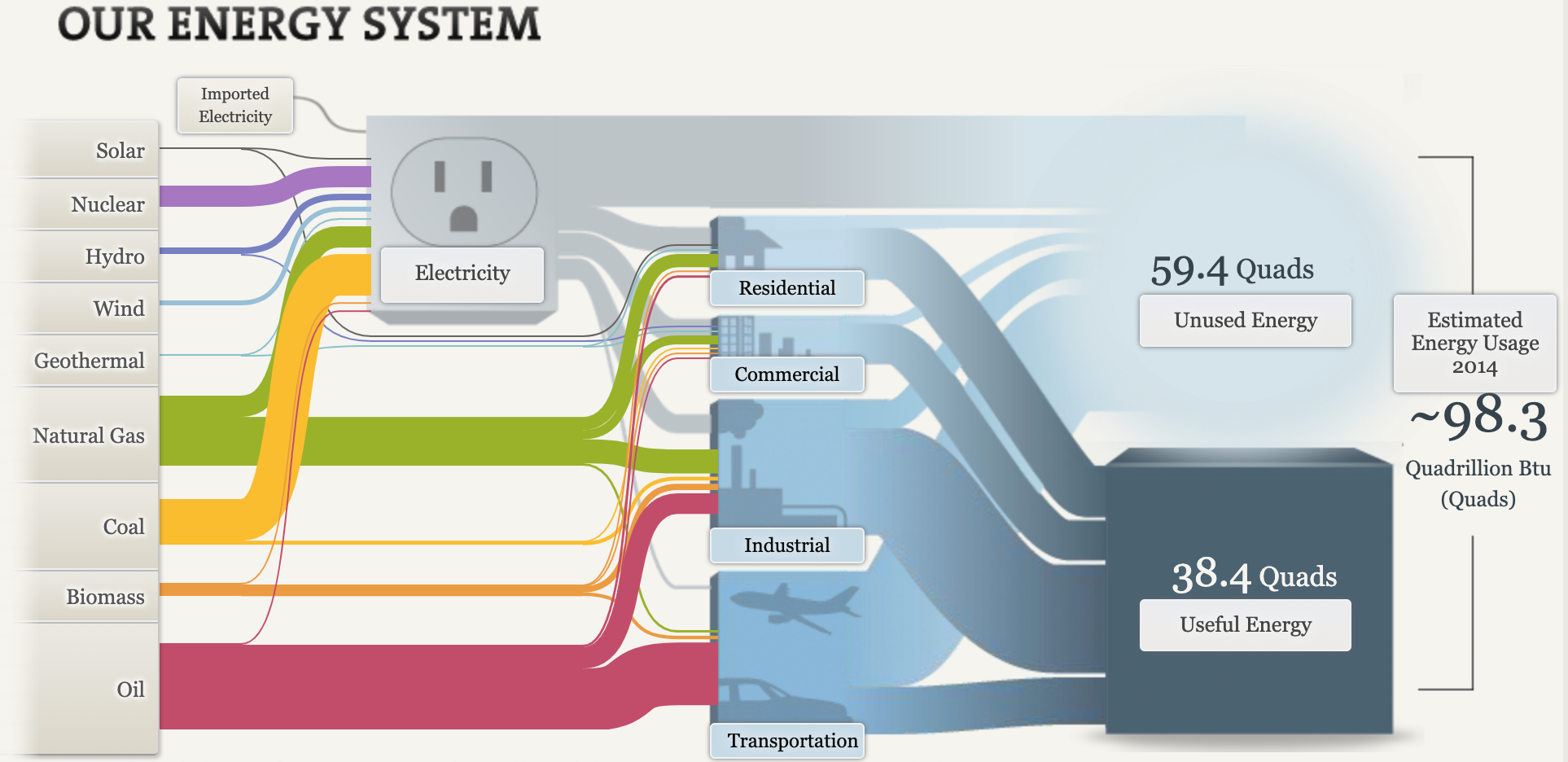
The photo above shows an overview of our energy system, I think this was a great visual, I loved how I was able to interface with it.
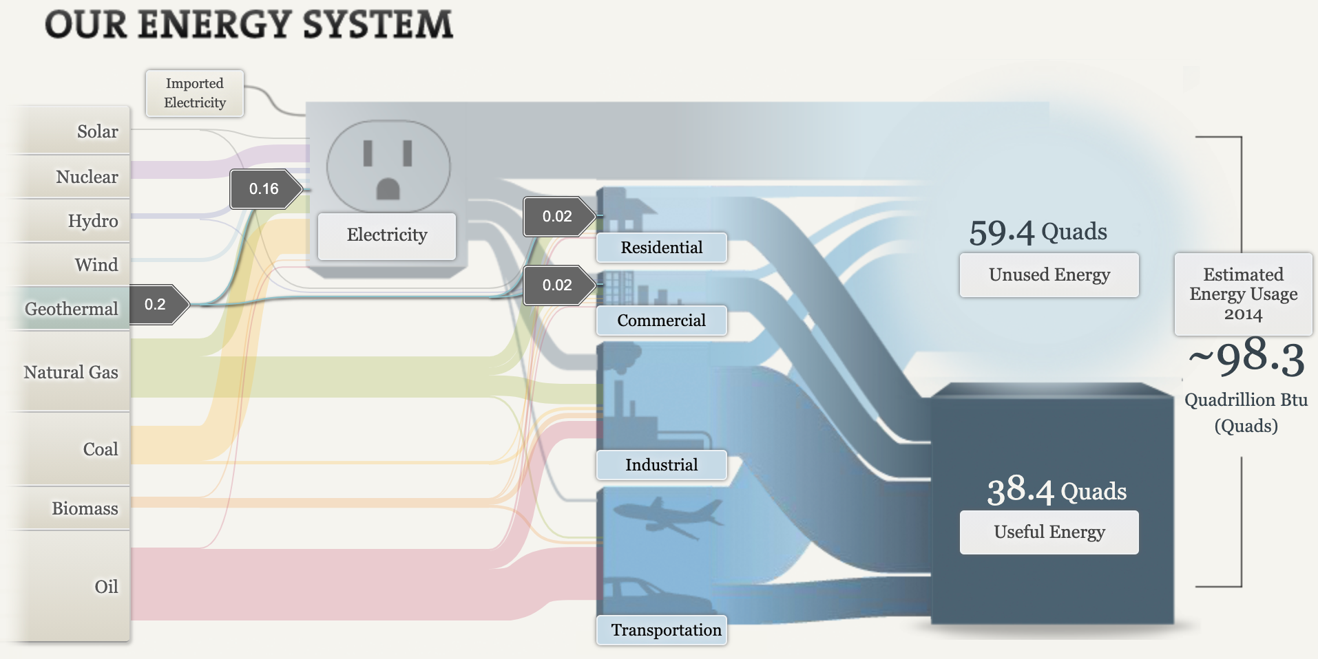
One thing that really caught my attention was geothermal, seeing this caused me to do more research on the subject. Although the US uses a small amount of this form, the State of California uses much more of Geothermal as a whole .
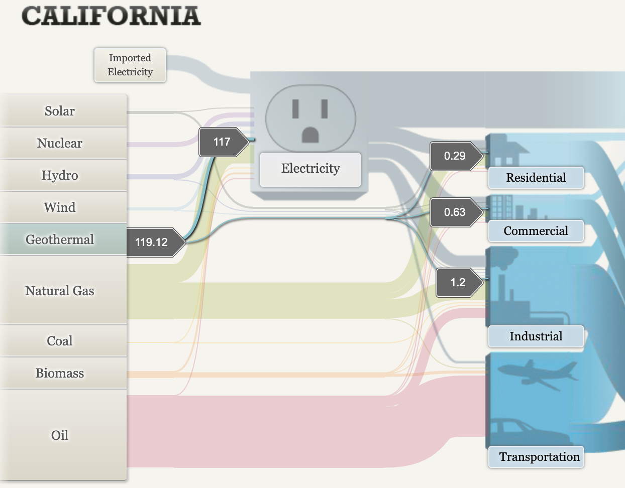
Overall, I loved the visualizations, I think that one improvement that I would’ve made sure that even the simplest mind could understand what the numbers meant. Other than that I think it was very informative, and left an impression on me to want to learn more about energy in the United States.

There are numerous uses for Pie charts, especially as conveyors of information. When trying to present some any kind of data that is relative to a whole, this is the graph you would use. While it may depend on what kind of data you are trying to get across, I think these are easy to make, the technical parts can be time consuming if you aren’t great at creating them.
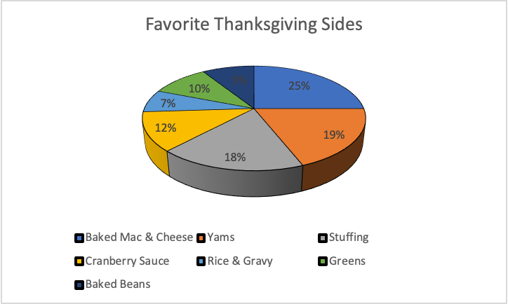
I chose to convey this type of information, but I believe that any kind of graph would have gotten the information I wanted to convey. It’s just a simple 3D bar graph made using excel. The types of foods went into one cell, while the percentages went into the other. After inserting the type of pie chart you want, from there the labeling, and other technical things lookovers, and there you have a pie chart. =]