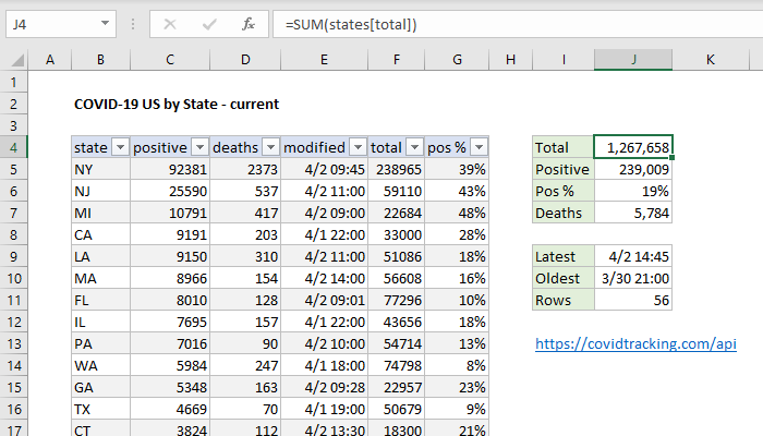
If you have an abundance of information in diffrent catagories that you need to show. Then the pivot table is the way to go. A PivotTable is a powerful tool to calculate, summarize, and analyze data that lets you see comparisons, patterns, and trends in your data. One perfect case to use a pivot table is the data from the Corona Virus. With Covid-19 affecting so many people around the world, the statstics are huge and can be confusing. Luckily, a pivot table can easily express this data as seen in the example below!
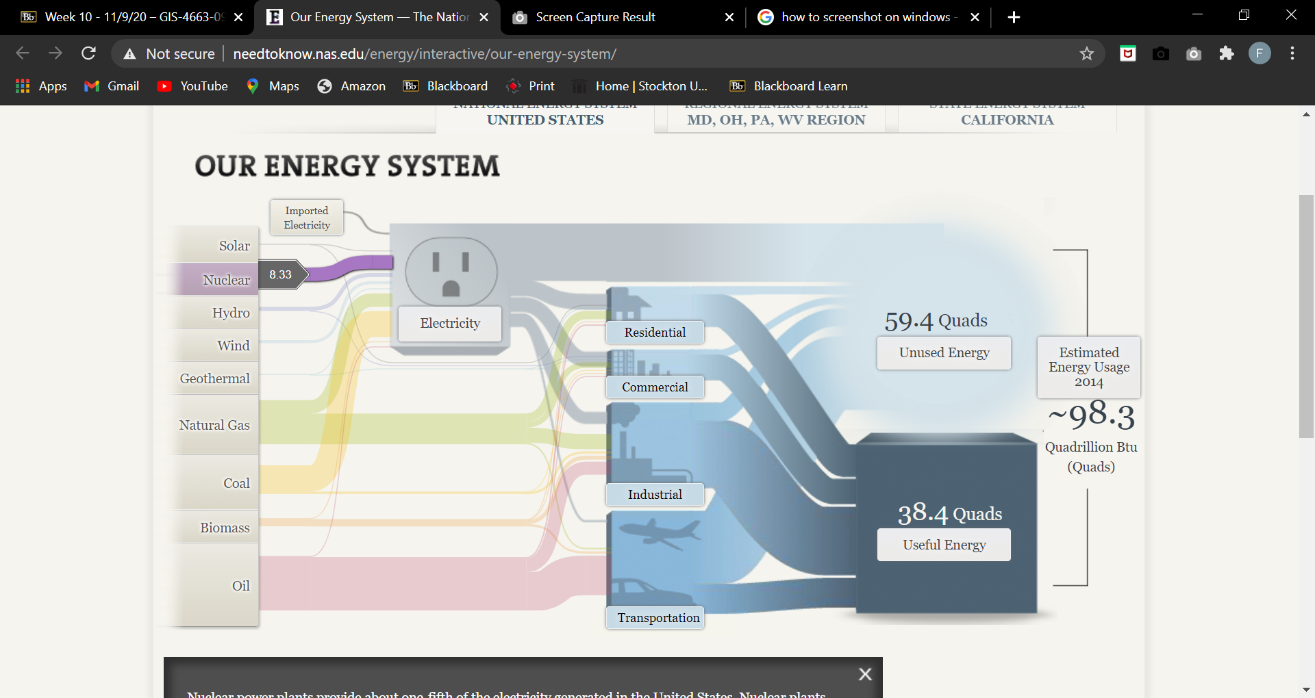
The Sankey Energy Visualization was good way to express energy consumption data to an audience. But it is more involved and requires a bit more effort in order to understand what is going on. The basic set up of the cables going to each industry such as commercial, residential, industrial, and transportation do a look a bit messy but require some focus to follow to each catagory. Below is a picture of the basic set up of this interactive visualalzation.
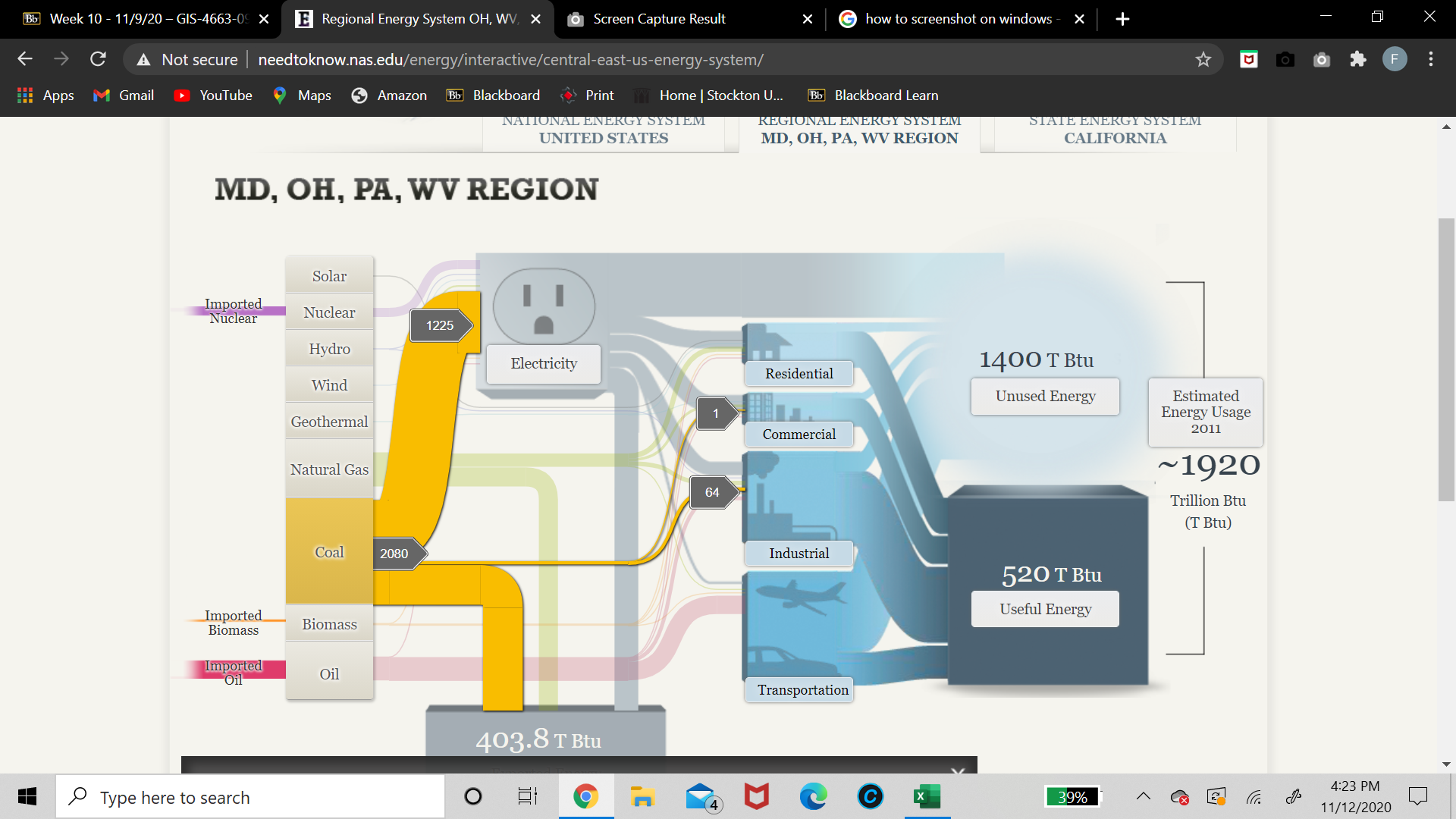
However, once understood, the Sankey Energy Visualization becomes a great source of information. One thing i did find intresting was that the entire nation relies on nuclear energy for electricty. I found this out by clicking on the nuclear energy tab. One thing that was not suprising was that regional energy system of MA, OH, PA and WV relies on coal for their main soure of electricity. This wasnt to suprising as these regions are dominated by coal. Below is a screen shot of how i found that out
All togther The Sankey Energy Visualization is a great interactive data visualization as long as you take a couple minutes to nagivate through it and understand it fully!
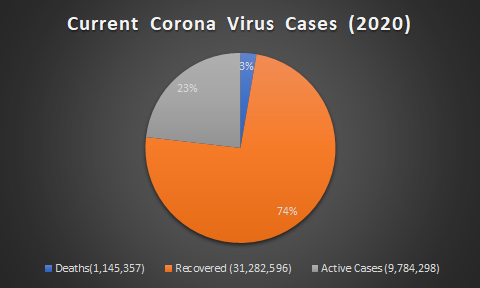
Simply put, pie charts are best to use when you are trying to compare parts of a whole. They do not show changes over time. A simple organized pie chart can show lots information that can be read easily. A pie chart is a circular graph that is broken down into segments. These segments represent each category’s contribution to display parts of a whole. Therefore, if the data you have does not follow this, then you should use a diffrent type of graph.
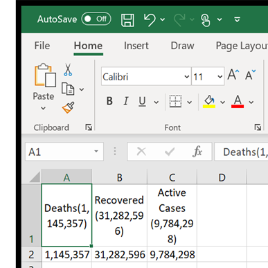
In my case, i decided to use current corona virus cases around the world. In the data i found, it has the total amount of cases, deaths resulting from the virus and the recovered. Below is a example of how i layed out my data in excel.
And from there, it is as simple as going to the insert tab and inserting a 2D pie chart.
The result is a easy to read pie chart that shows your data effectivly. From there you can go crazy with colors but dont forget to label your data and create a title for the data you are trying to represent!
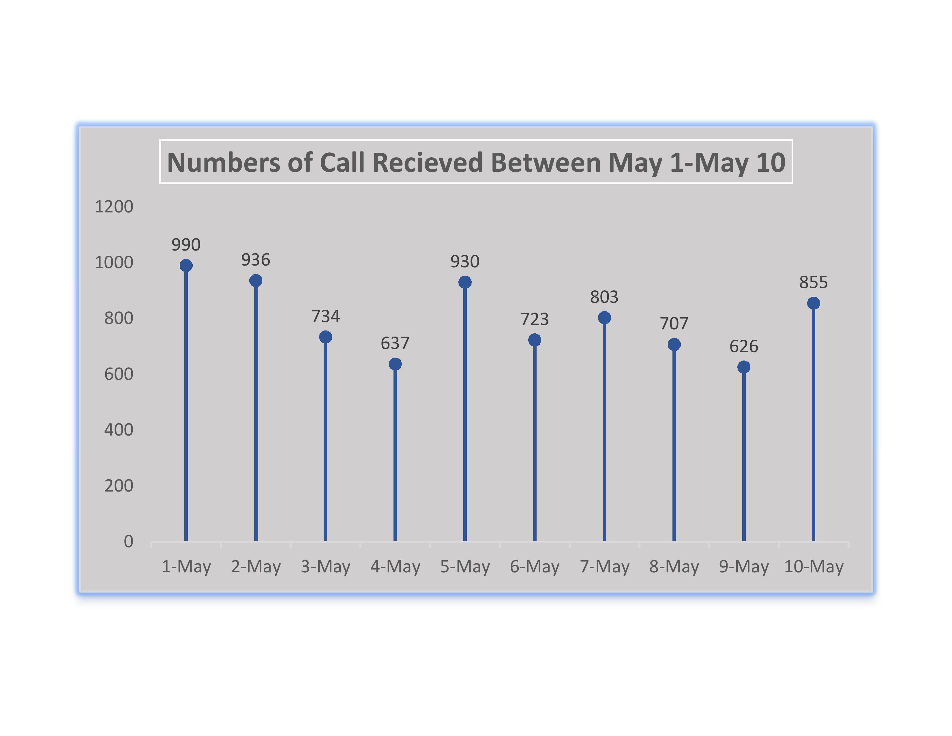
A lolipop chart is a type of modified bar graph. These charts can either be visually attractive or just confusing depending on your data. It is very important to recoginze what data you have when it comes to creating charts and this is also true with lolipop charts. If your data has high number values then a bar graph will look too agressive with columns being too high. This is when a lolipop chart should be used. Instead of a traditional bars in a bar graph, a thin bar will replace the columns and the thin line will have a bulbous end. Below is a lolipop chart representing a high amount of calls that a company recieved within 10 days.
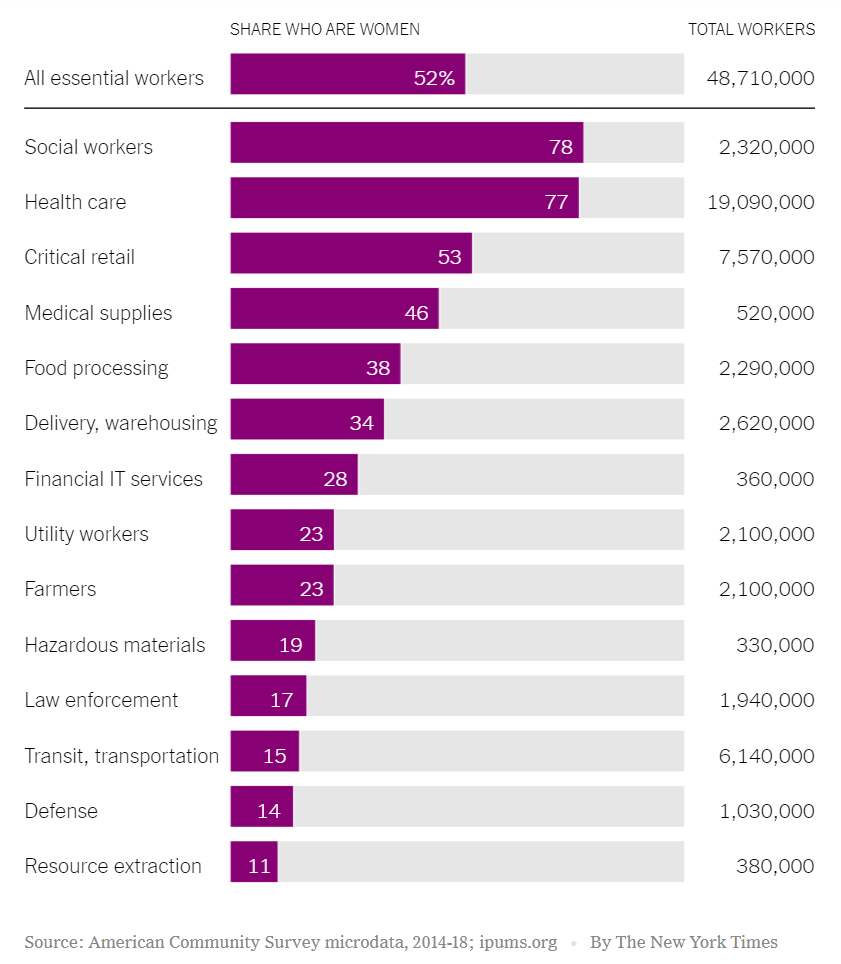
2020 has been a mess of year. With outbreak of Covid-19 in early march, which has us now in a pandemic, the term essential workers has been bought up a million times. At first, many people were not to sure who exactly essential workers were. To clear this up, the New York Times posted a handy benchmark graph as seen below.
More intrestingly, This graph shows the share of essential workers who are women. 52% of ALL essential workers are women. Evenmore, they make up for more than half of the workers in social work and in the healthcare field. The simplicity of this benchmark graph makes it easy to anayzle the data of who are essential workers in the Covid-19 pandemic.
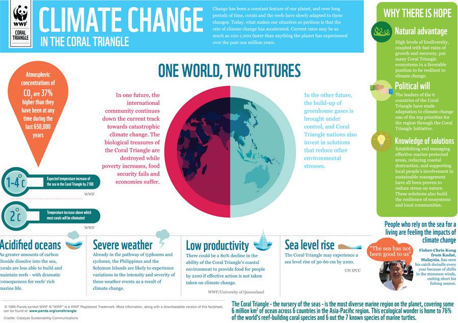
Below is a neat infographic regarding the concern of global warming. As global warming continues to rise each year, the effects that it takes on our planet shows more and more. However, this infographic compares a world where leaders take action to prevent global warming. But it also has another world if nothing is done about it. In the left is the world where nothing is done about climate change. It highlights key devasting effects that could occur on planet earth. On the right side is a world where we taking action on climate change. It shows how there is still hope in defeating this ongoing issue. There are also key points in this inforgraphic that highlights the effects of climate change in the coral triangle.
Visualizing Health is a handy website that helps you create infographics regarding health. In addition, it provides people with a simple way to retain information about their health. For example, instead of a long paragraph that one may have to read, this website combines important information and portrays it in images.
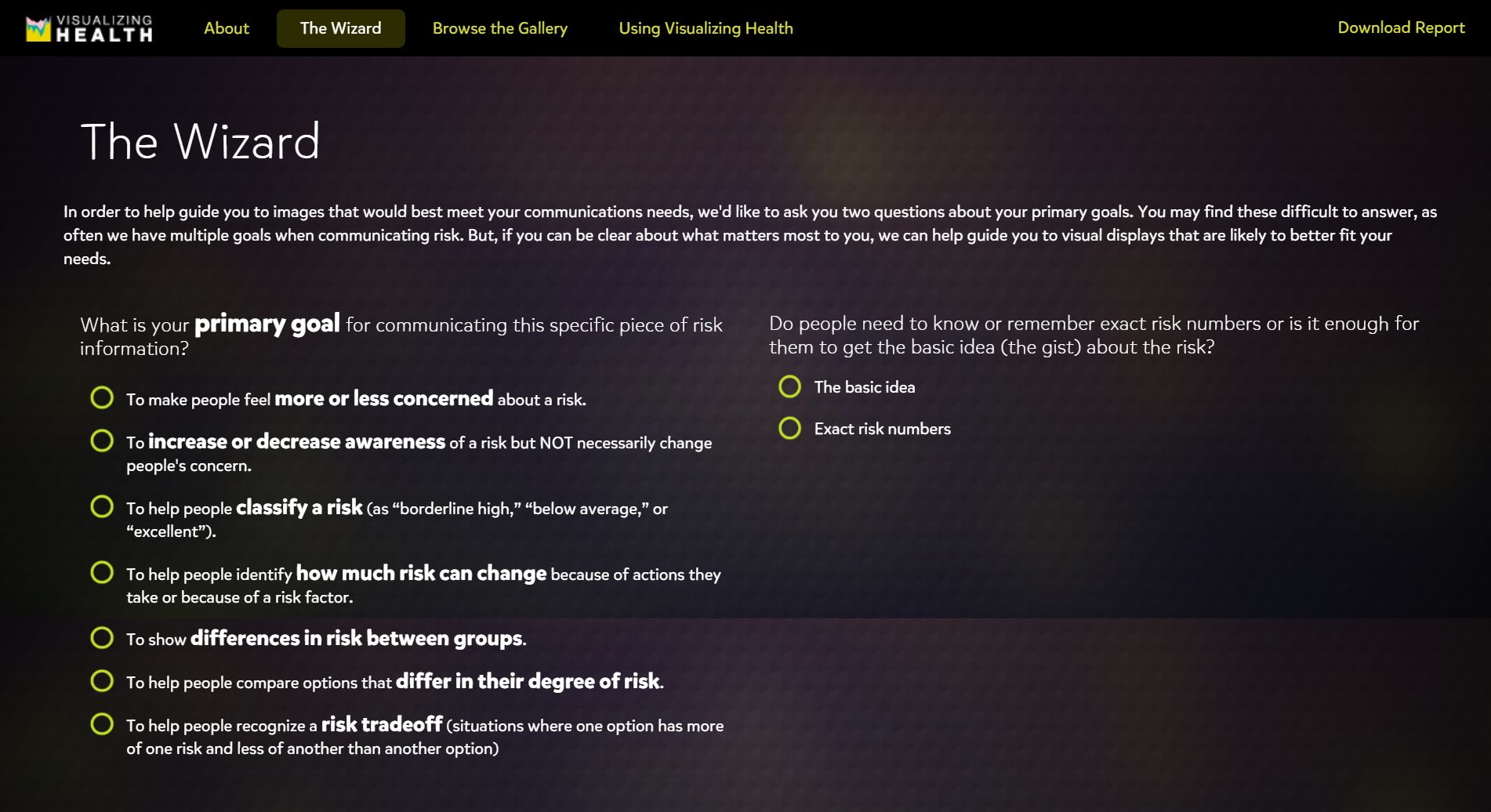
Visualizing Health also has a handy tool called “The Wizard”. By asking two questions, the Wizard helps you narrow down your communication goals and your primary needs. This then filters out infographics that best suit your needs.
Questions that the wizard asks you are in the photo above.
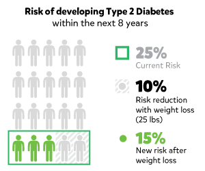
After completing my questions and letting the wizard do its work, one eye catching inforgraphic that it found for me was this one.
This image was a product of me choosing option of “increasing the awarness of a risk by a lifestyle change” and the topic i chose was “diabetes.
All together, Visualizing Health is a handy website that provides information in eye catching images. Most importantly, if focuses on the health of people by educating them and on how they can make themselves better.
In todays world of technology, the process of creating infographics can be done very easily. One site that is very useful is called www.canva.com. Canva is a graphic design platform that allows users to create social media graphics, presentations, posters, documents and other visual content. Users can choose from many professional designed templates, and edit the designs and upload their own photos through a drag and drop interface. Below is some of the many infographics that users have created on Canva. Their website also includes many free templates to use as a base for your infographic. Most importanly, Canva is free!