Pivot Tables are best described as summary tables because they display the most important information the researcher, company, or student is trying to represent. They are typically easy to create and are a very organized way to record numerical data. Below are a couple examples of how Pivot Tables are used.
https://www.lumeer.io/pivot-table-complete-guide/
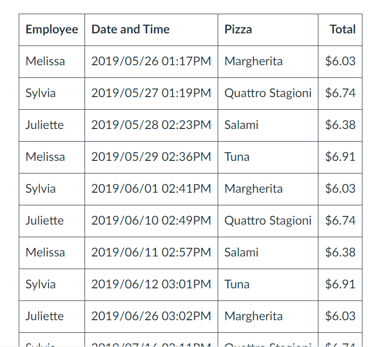
One way Pivot Tables can be helpful is when tracking receipts. As you can see, the table is very neat and organized. The data is laid out in such a way that is easy to read.
https://www.lumeer.io/pivot-table-complete-guide/
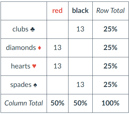
The deck of cards can be divided into symbols, numbers, and colors. From here, each column and row are totaled to make the information easier for the reader to understand.
Conclusion
There are many more examples out there such as insurance companies and restaurants. However, in all these examples Pivot Tables are always grouped items, records, and/or rows into categories and they count the number of items in each category.
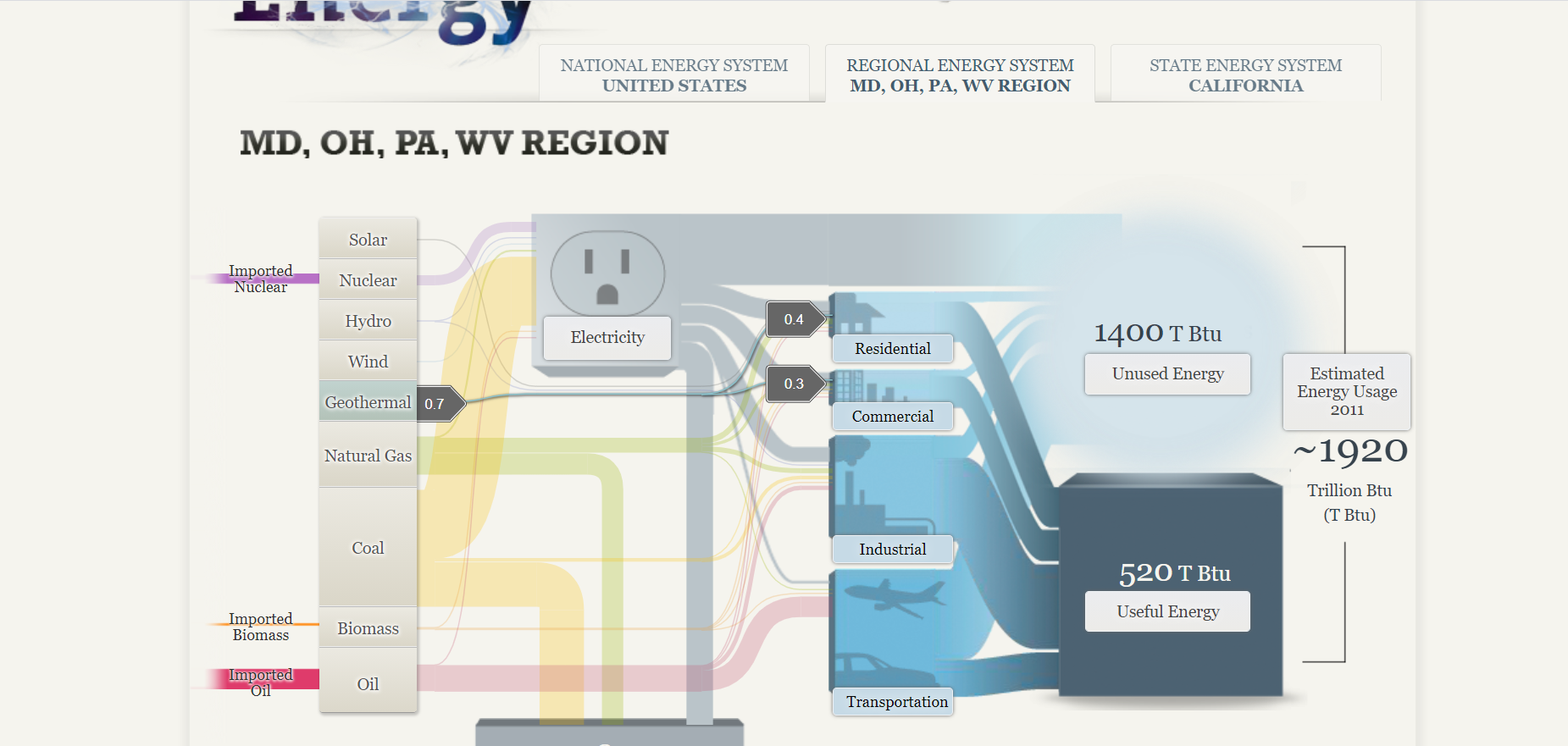
The Sankey visualization about our energy systems in America breaks down the percentages of different energy sources in varying states. Initially, it was confusing to read, specifically the image below, however the other tabs were quite interesting.
This visual breaks up the different types of energy and shows where each one is used (residential, commercial, industrial, and transportation). The numbers (to the left) are a bit confusing to me because I’m not quite sure what they represent. With that said, I do enjoy how interactive this page is. Just by hovering over the different types of energies, the visual becomes a bit clearer. It was surprising to me that in 2011, 1920 Trillion Btu was the estimated energy usage. I wonder what these numbers would be like now, especially during quarantine.
How We Use Energy:
http://needtoknow.nas.edu/energy/energy-use/
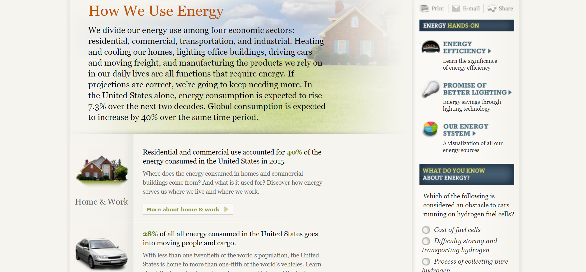
This section of the website is very helpful as it gives some background of the topic. I specifically like the quizzes on the side of the page because they keep the reader engaged and interested. The statistics are also very interesting to read. I like how the reader can look more into a specific topic that interests them. For example, 28% of all energy in the United States is used to transportation.
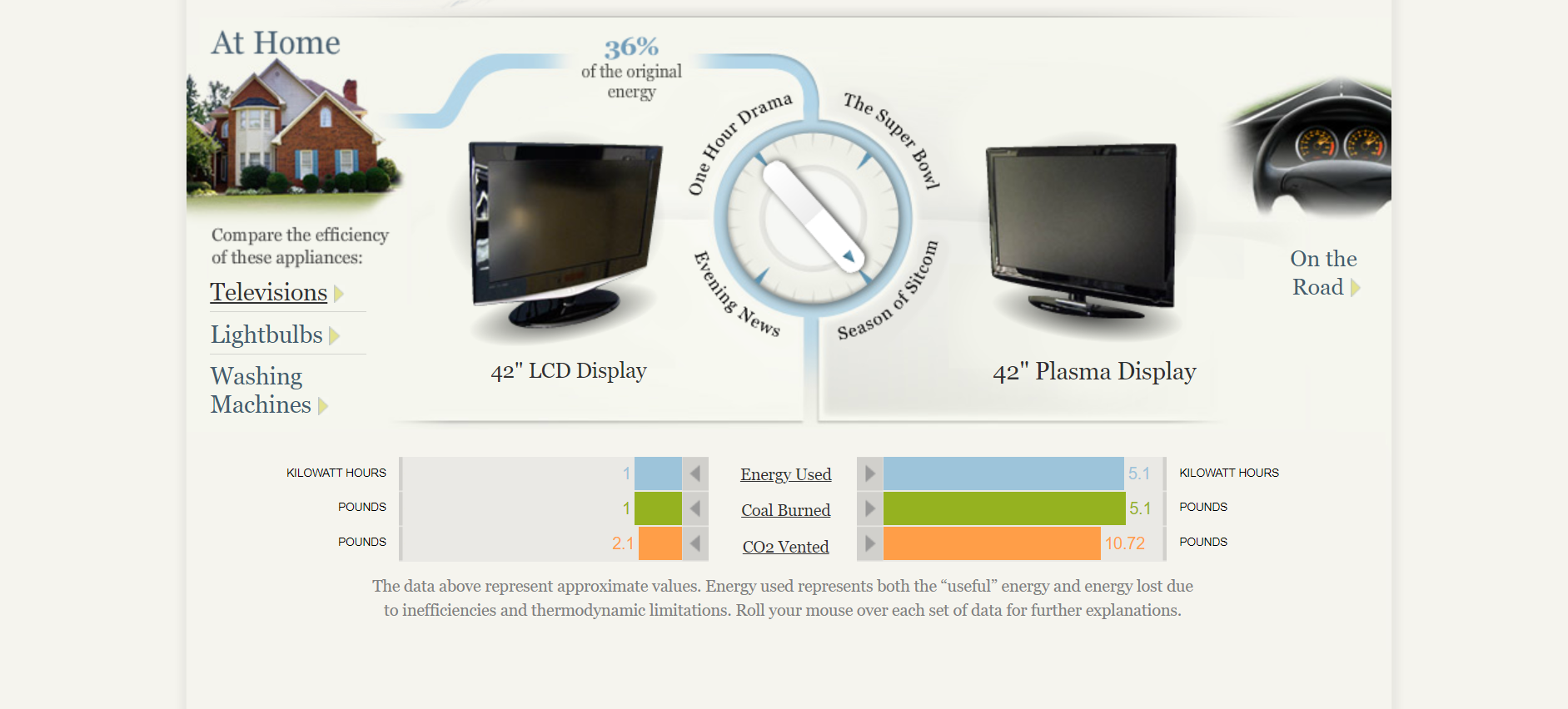
One great feature of this website is that they break up energy usage into homes (including televisions, lightbulbs, and washing machines) and road life. The “At Home” section is very interesting and even allows the reader to turn that dial in the middle of the screen to view the specific number of energy used, coal burned, and CO2 vented.
In Conclusion..
This site is extremely interactive which is why it is so great. There are many great statistics and explanations of how energy is used. Another great feature is that the reader can dive in deeper on a particular category that intrigues them.
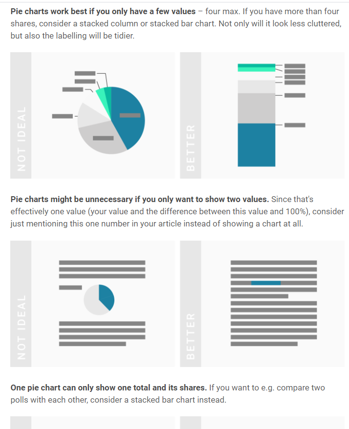
Pie charts are used to compare categorical data and when done right they are extremely effective. They compare parts to a whole and are visually easy to understand. Below I came up with a perfect case to use a pie chart.
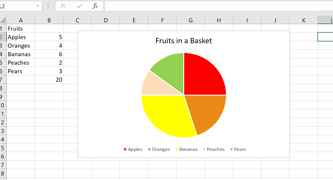
Let’s pretend you have a basket of 20 total fruits. You have five different kinds of fruits: apples, oranges, bananas, peaches, and pears. You want to find out the percentages of each fruit. A pie chart would be perfect for this because it compares a part to the whole.
Pie Chart without data labels Pie Chart with labels
I included chart one and chart two to show the difference between no data labels and displayed data labels. Notice how without the percentages it is still easy to decipher that bananas make up the largest percentage in the basket. While the data labels help, they are not always necessary.
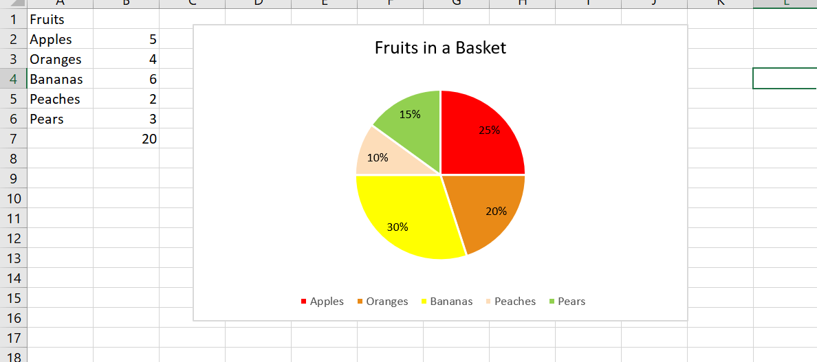
In this example, the pie chart is the most effective choice. I could have used a bar graph, but when trying to find the percentages of each fruit, it is best to use a parts of the whole chart. It is clear that peaches make up the least amount of the basket and bananas occur the most.
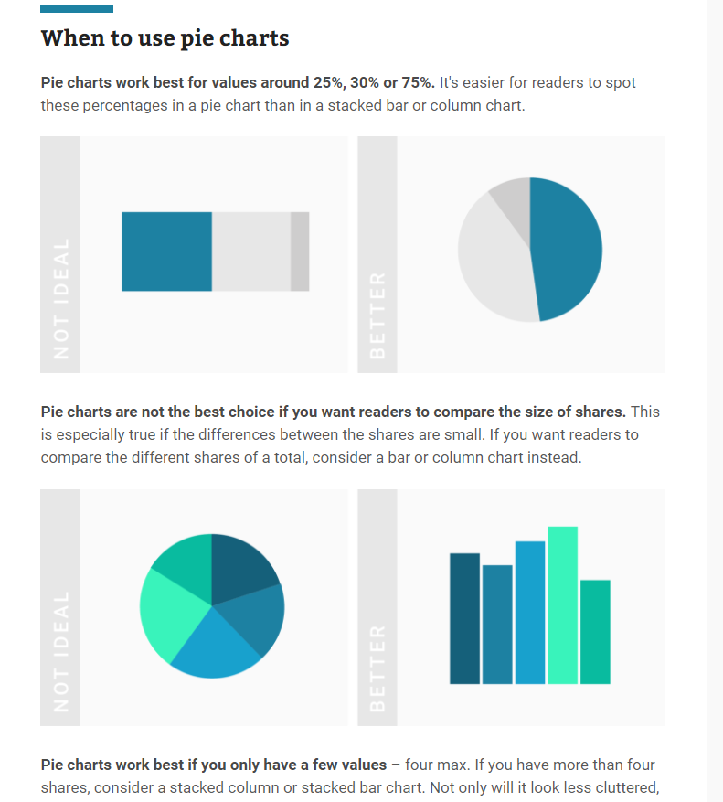
In addition, pie charts should only have around 5 categories and all data should add up to 100. Too many categories can look overwhelming and too cluttered. If the information given is not a part of a whole, this will confuse the reader. Check out https://visage.co/data-visualization-101-pie-charts/
It can be confusing how to know when to use a bar chart or pie chart but when trying to show percentages, it is the most effective and sensible choice. A bar chart can work, however visually looking at a circle and different sections is a better representation of the data. The circle represents the whole, or 100% while the sections represent parts or percentages of that whole. Bar charts do not do this.
Below are some screenshots of a helpful website which explains when to use pie charts.
Pie charts are an extremely effective visualization that are used to find a percentage of a whole. The pie chart must equal 100 and are used for small amounts of categorical data. In the example shared, there were only five different fruits and the goal was to find the percentage of each fruit in the basket which is why this graph was the perfect visualization to use.
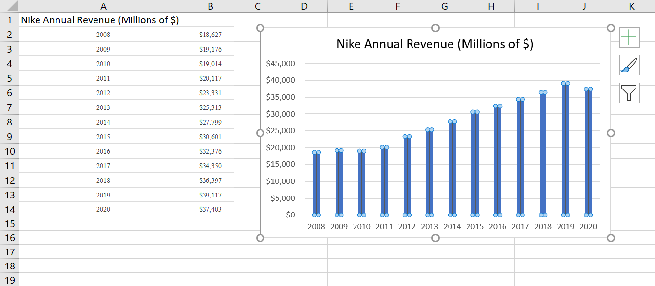
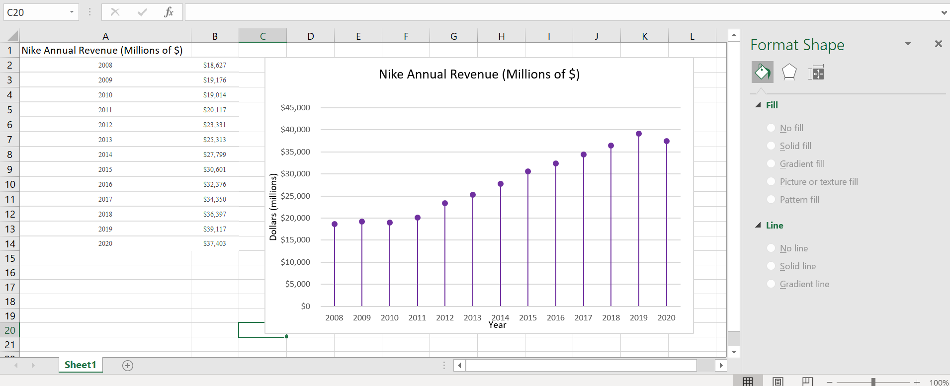
Lollipop charts are alternatives to bar and column charts and are used to compare categorial data. They can be vertical or horizontal and are great tools for large datasets or when the numbers are extremely high. In short, these charts include circles at the ends of their lines to highlight the data value. These charts make the visualization easier to read and more appealing as a big chunk is taken out of the bar or column. The most important part of these graphs is where the lines end, telling us the value.
Below is the lollipop chart that I created using a site called https://excelk.com/en/lollipop-chart/. The site included a few steps to turning any bar graph into a lollipop chart. I found that using this website was much easier than following the textbook.
As for my dataset, I found Nike’s annual revenue over the course of 12 years on https://www.macrotrends.net/stocks/charts/NKE/nike/revenue
The first step was to create a simple bar graph by highlighting the dataset and adding error bars by clicking “Add Chart Elements” and “Error Bars”. In order to get the lollipop effect, right click on one of the error bars and click “Format Error Bars”. In the direction group, select “minus”, in the end style group, select “no cap”, and in the error amount group, enter a value of 100% under the percentage field.
Under the fill and line menu, click on the line which starts with the circle and change the columns to transparent. This way, only a line and circle are visible. Label the x-axis and y-axis and title.
Overall, this site was extremely helpful in creating a lollipop graph. It appears challenging at first, especially in the text, but it was fairly simple. These graphs are great to use for comparative data and are visually more appealing than the typical bar graph.
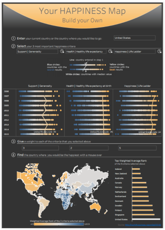
In the image above, you can find the country where you’d be the happiest. By choosing your three most important happiness criteria, you have the ability to find the best country for you. Benchmarks are displayed as orange lines straight down the middle of the diagrams as well as colored dots showing countries with the worst and best results. This can be very helpful and is easy to read.
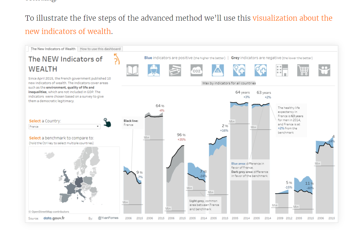
This visualization about the new indicators of wealth cover areas such as environment and quality of life. As there is a lot of information here, benchmarks can be super useful tools in helping understand data. The light blue areas give you a difference in favor of the country selected, the light gray is the common area between the country selected and the benchmark, and the dark grey is the difference in favor of the benchmark. While some visualizations show benchmarks using lines, this one uses shaded areas.
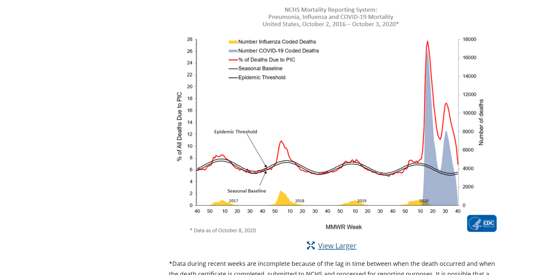
This screenshot above from the cdc website shows mortality rates of pneumonia, influenza, and COVID-19 in the United States between October 2, 2016- October 3, 2020. The graph shows a seasonal baseline (benchmark) with a black line and uses different colored lines and colors to represent several categories.
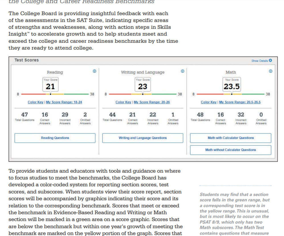
The College Board provides insightful feedback each year with assessments of the SAT exam. Your own score is compared with the corresponding benchmark in Reading, Writing and Language, and Math. These benchmarks are represented by different colors. Red- need to strengthen skills, Yellow- approaching the benchmark, and Green- met or exceeded the benchmark. As they mention, color coding for test scores and subscores show students if they are on the track for college readiness.
Conclusion
Benchmarks are a very useful tool in providing the audience with a number to compare the data to. Whether we notice them or not, they are used daily and can be displayed as lines, areas, different colors, etc.
Each day, data is being collected all across the world. There are hundreds upon thousands of different topics such as psychology, healthcare, and consumer analysis, many of which are free to access. This can be extremely useful for future projects or if you are just looking to expand your knowledge on the comparison of these numbers. Today, I have listed a couple great examples of free datasets that can be used for any project as well as some websites to access even more datasets.
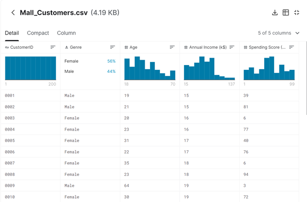
Mall Customers Dataset
Found on https://data-flair.training/blogs/machine-learning-datasets/
This free dataset focuses on the collection of people at the mall. This is not limited to one specific subject such as age but gender, annual income, spending score are all included. This would be a great dataset to use for the comparison of males and females. Potential projects are also listed here which can be extremely helpful for those wanting to create an infographic but maybe do not know where to start.
2. Heart Disease Dataset
Found on https://www.cdc.gov/nchs/fastats/heart-disease.htm
For those who are interested in anything related to health, the site listed above is a great resource for this topic. These include datasets relating to mortality, morbidity, and disease. All of which contain multiple pages of data collection.
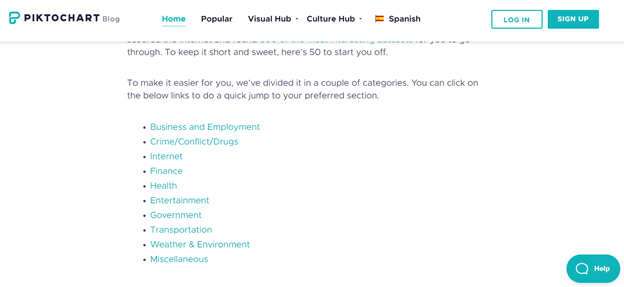
3. Website: Piktochart Blog
Found from https://piktochart.com/blog/100-data-sets/
This is a great website that lists 50 different datasets that are mostly free to access. These categories include finance, internet, etc. (see picture above). With all of these options, you will be able to choose which one works best for you.
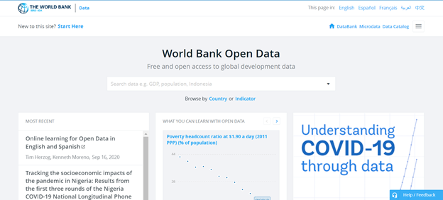
4. The World Bank
Found on https://data.worldbank.org/
With the ability to search any topic you want, the possibilities are endless. The site also contains other features such as a Microdata Library, the ability to open a Data Catalog, Finances, Projects & Operations and more. This is another great website if you are looking to find more free datasets but maybe don’t know where to start.
Conclusion
Overall, there are thousands of datasets online. Some being free, while others requiring a subscription. However, with these free resources there are plenty of options to choose from. The ability to compare numbers of a particular topic whether this is gender, age, ethnicity, or countries is very important and useful in society. The possibilities and projects available are endless.
The Visualizing Health Website is a great tool to use as it is very easy to navigate. This website allows you to create infographics regarding health as well as a way to learn information about their health. There are four sections: About, The Wizard, Browse the Gallery, and Using Visualizing Health.
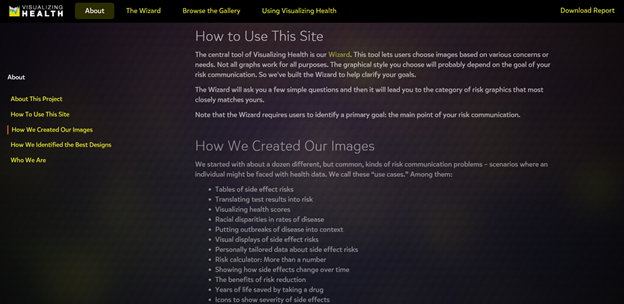
How We Created Our Images, About
The About page is an introduction to the site. This section explains how to use Visualizing Health, some background to how they created their images, as well as who they are. I found this to be a great tool because it is important to understand where the information is coming from and if they are a reliable tool to use.
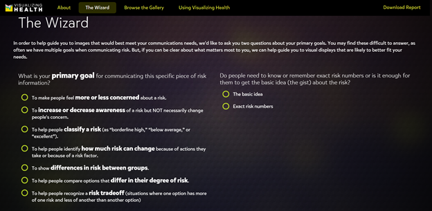
The Wizard
The second section of this website is The Wizard which allows you to search for specific infographic designs based on two questions. These include your primary goals and whether you want it to be general or specific. Once you select a goal, they even give you an example as well as a point to consider. This feature truly helps you understand the difference between the various goals and allows you to make the best choice in order to fit your own individual needs.
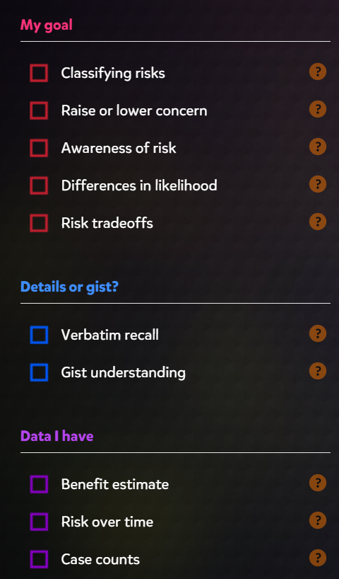
Screenshot of Browse the Gallery section
The gallery contains hundreds of charts and graphs based on your goals, wants, and needs. On the left hand side, you have the ability to filter your searches through there. These options include “My goal”, “Details or gist”, “Data I have”, “Health conditions”, and “Graphic type”. This section displays many different styles of graphics according on your own specific goals.
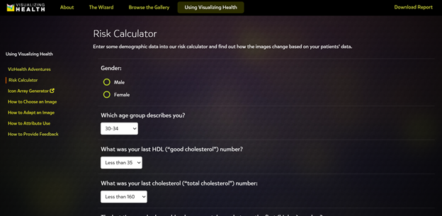
Using Visualizing Health, Risk Calculator
The last section of the website is a how-to page. There are options on the left side (see picture above) which explain how to select the correct image and how to adapt that image as well. This is a great addition for those who are beginners and would like some more help.
Conclusion
This is a great tool for any and all health professionals, including myself. The ability to filter and sort through hundreds of data visualizations is super helpful. It is amazing that there is now a site geared more towards a specific audience. There is a ton of information out there on the internet and it can be difficult to navigate. Visualizing Health seems like a great site I can see myself using.
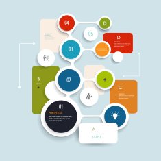
Infographics are used by educators, researchers, students, and others looking to visually communicate with their audience. They are engaging visuals which come in many different shapes and sizes and are used daily in healthcare, classroom settings, etc. There are a number of guides and apps that can be used to effectively create the perfect infographic. Here’s a list of 5 great tools you can use today:
Canva Canva is a free graphic design and video app used by thousands to edit images and create infographics. With this app you can download infographics right from the app or you also have the ability to create them yourself. Canva also has over 60 million downloadable images as well as the ability to create team templates and hundreds of designs to choose from. Apple store rating: 4.9 stars
Piktochart Piktochart is a web based tool used to easily create infographics using ready to go templates. This is another free application and can be great for beginners who are just learning how to create infographics. Similar to Canva, you have the ability to collaborate with teams as well as integrate charts, photos, and icons.
Easel.ly Easel.ly is another web based application which comes with hundreds of free templates to create your own personalized infographic. With the ability to insert your own photos and artwork, the possibilities are endless. There is a huge range of charts, graphs, and images to choose from. Options such as timelines, reports, and even resumes are included in this free membership.
Cool Infographics: Effective Communication withData Visualization and Designby Randy Krum If you are looking for a book to read in your free time, this one by Randy Krum might be worth looking into. With a rating of 4 out of 5 stars on Amazon, Krum reviews the importance of infographics as well as beginner tips on how to create the most effective visualization. Ranging anywhere from $20-$35, this might be worth the purchase if you are looking to expand your knowledge on infographics. https://www.amazon.com/Cool-Infographics-Effective-Communication-Visualization/dp/1118582306
Video Guides- How to Make an Infographic in 5 Steps Video guides such as this one are free on Youtube and can be great for those who do not know where to start. This one by Venngage can be found on Youtube or on Venngage.com and is helpful for the audience in determining what should go into their infographic.
To Sum It Up..
Infographics are very useful in displaying data through a variety of different charts, graphs, images, and texts. They should be engaging and exciting and easily read. Thanks to technology and books, infographic templates, tips, and tricks are more accessible than every before. These tools listed above can help you whether you are a beginner and have little to no experience with creating infographics or even the advanced user who has plenty of experience.