Lumeer.IO offers web-based automated pivot tables that connect users through a cloud and help them to work remotely. I added the video to show how useful this website can be for people that need to work on a project.
Time worked on an assignment by individual assignees. The pivot table above could be useful to help keep track of people working together. This can help the team see individual and collective efforts on the project. We can see who has worked the most by who has the higher percentage and a representation of that as its regular value.
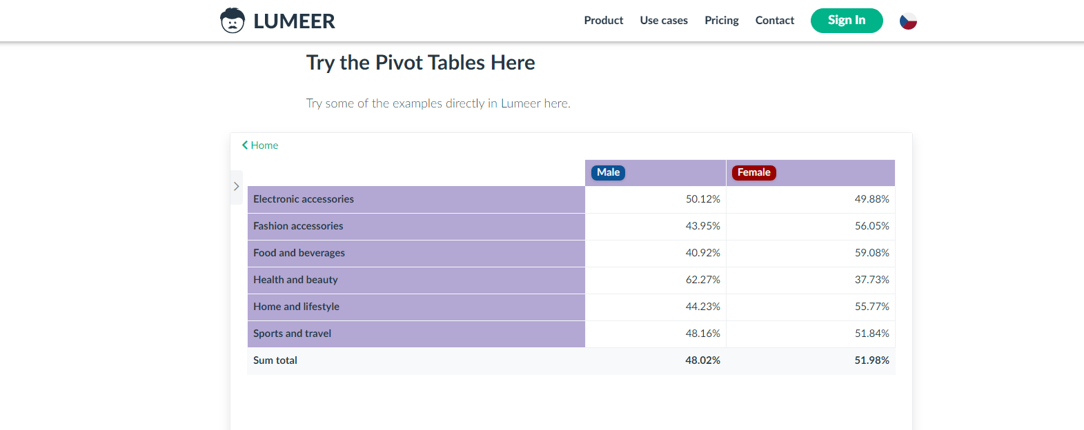
This pivot table could be very useful to the manager of a store. This shows which genders are buying more of a certain category of product. It also shows who is buying more products overall by the sum total. Knowing these trends can help a store to plan accordingly for bigger revenue.
I like that I am able to interact with each element and get more information on that element. This is good for an audience that is being newly introduced to the topic. The chart has other versions focused on specific areas, which is most useful for those audience members. That was a good way to target specific people.
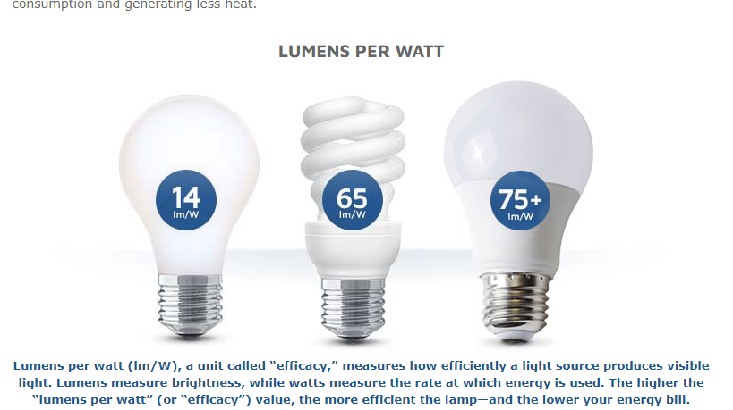
I’ve never paid attention to “lumens per watt” but I most likely will after reading this. Good use of icons and a quick comparison tool. This explains the difference between energy efficiency and brightness output.
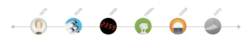
A simple timeline with icons showing how electric lighting technologies have evolved over the years since its inception in 1879. I like this data narrative. It is clean, fast, and enlightening. I thought those bulbs created in the 1990s were invented in the early 2000s, for example.
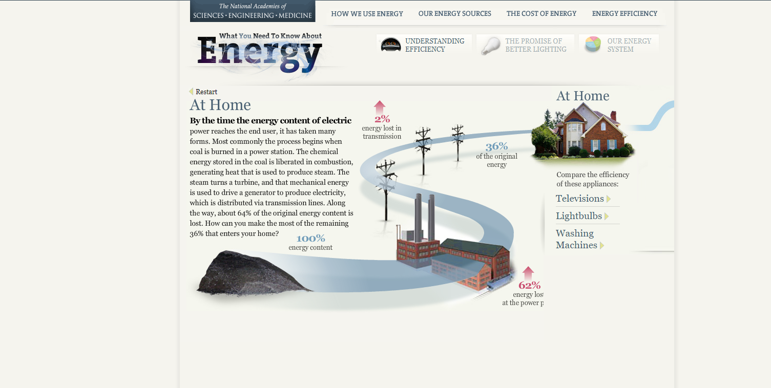
This is a nice attention-grabbing graphic. The red adds to the loss effect of energy. The bold text could have been more descriptive or to the point.
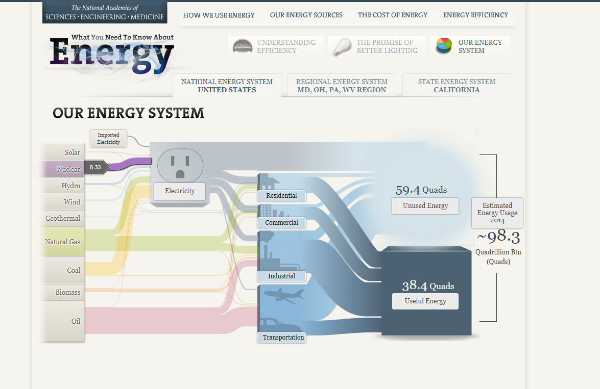
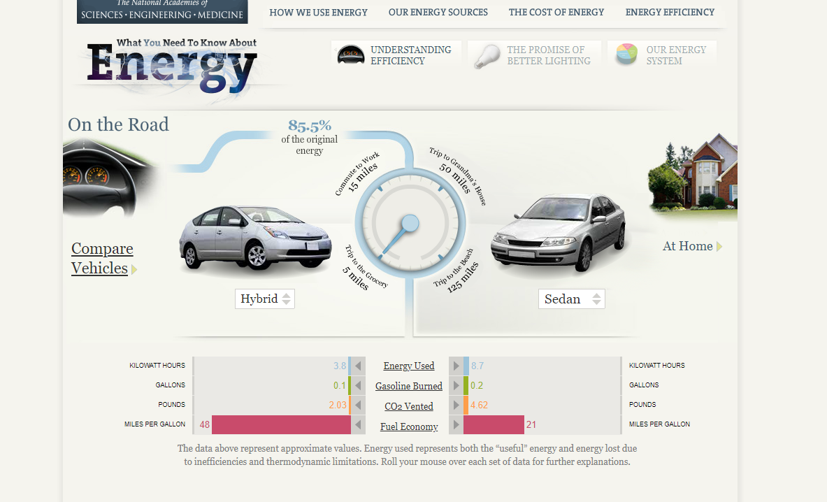
This was a neat interactive tool that was included to see how energy efficiencies compared. I think that the author of this data story did a good job of allowing the audience to interact and become more engaged. Diving deep into car comparisons helps to pique the audience’s interest because a lot of the audience is probably drivers.
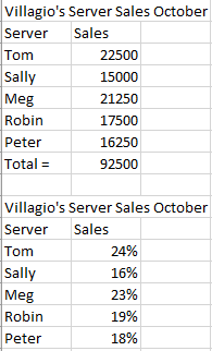
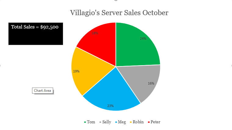
I created a hypothetical restaurant named Villagio’s for my pie chart. We will be looking at how much each server is contributing to our restaurant’s sales for the month of October. We need to set a new sales goal based on this information. This data is best suited for a pie as each individual server is contributing to the total sales.
Total is calculated by using the AutoSum function for all of the first set of “Sales” Amount. Sales percentage is calculated by (Server: “Sales” / Total: “Sales”) and adding the % function to the quotient. The percentages will be our pie slices.Green indicates the highest server. Blue indicates a server that has met $20,000+. Yellow indicates $17001-$19999. Red indicates below $17000-$15001. Gray indicates $15000 and below.
The sales goal for December will be $100,000. We expect Tom and Meg to be our biggest contributors. We will be pushing Sally, Robin, and Peter to produce higher sales for December. We will begin to provide a $200 gift card for the largest contributor to incentivize our workers. We may need to hire an additional server if our current servers do not feel that they can reasonably meet the sales goals.
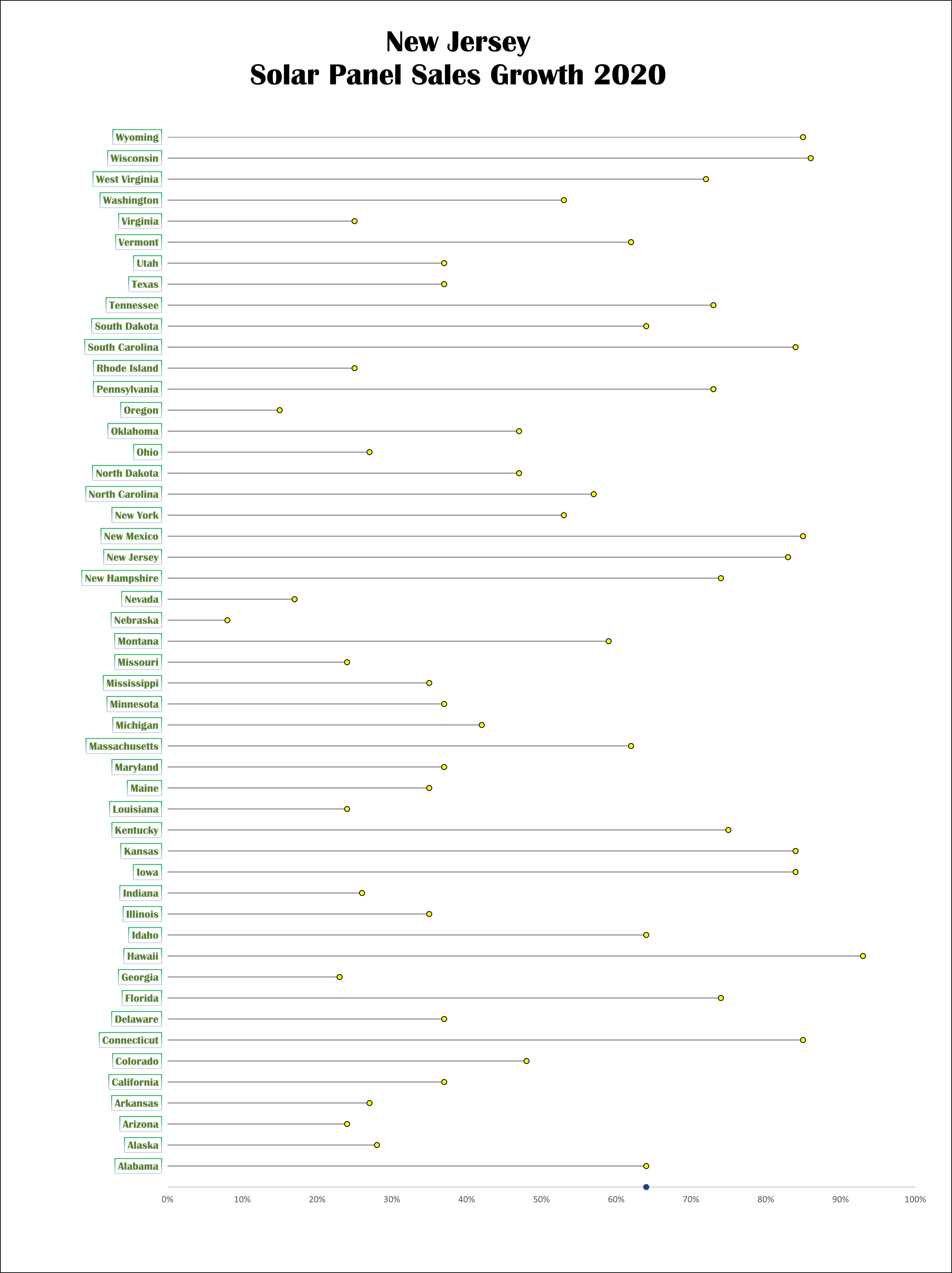
Lollipop charts can be used where bar chart ink may be visually overwhelming. Shrinking visual obstacles can increase the readability for a large set of data. The base of a lollipop chart is a scatterplot. It is a little bit more complex to create than a bar chart, but it is more visually efficient than a blinding wall of bars. We can edit more individual pieces of a lollipop chart than we can with a bar graph. We can replace each dot with a related icon for a more detailed illustration and it won’t clog the graph like in a bar chart.
Solar Panel Sales
For my lollipop chart design, I converted data given to us for a different graph into a theoretical sales graph for solar panels. I used to work for a solar panel company so that was my motivation for creating this. I used green and yellow to help symbolize the data as renewable energy. Yellow for the solar energy. Green for the greener environment.
One of the most common forms of benchmarking is done by utilizing a line graph. The illustrator can choose many different ways to set a benchmark on a line graph either by plotting a point, plotting multiple points, or using a color scheme to represent when the benchmark is reached. Benchmarks are often added as a line to the graph, trending with the businesses’ projections over time.
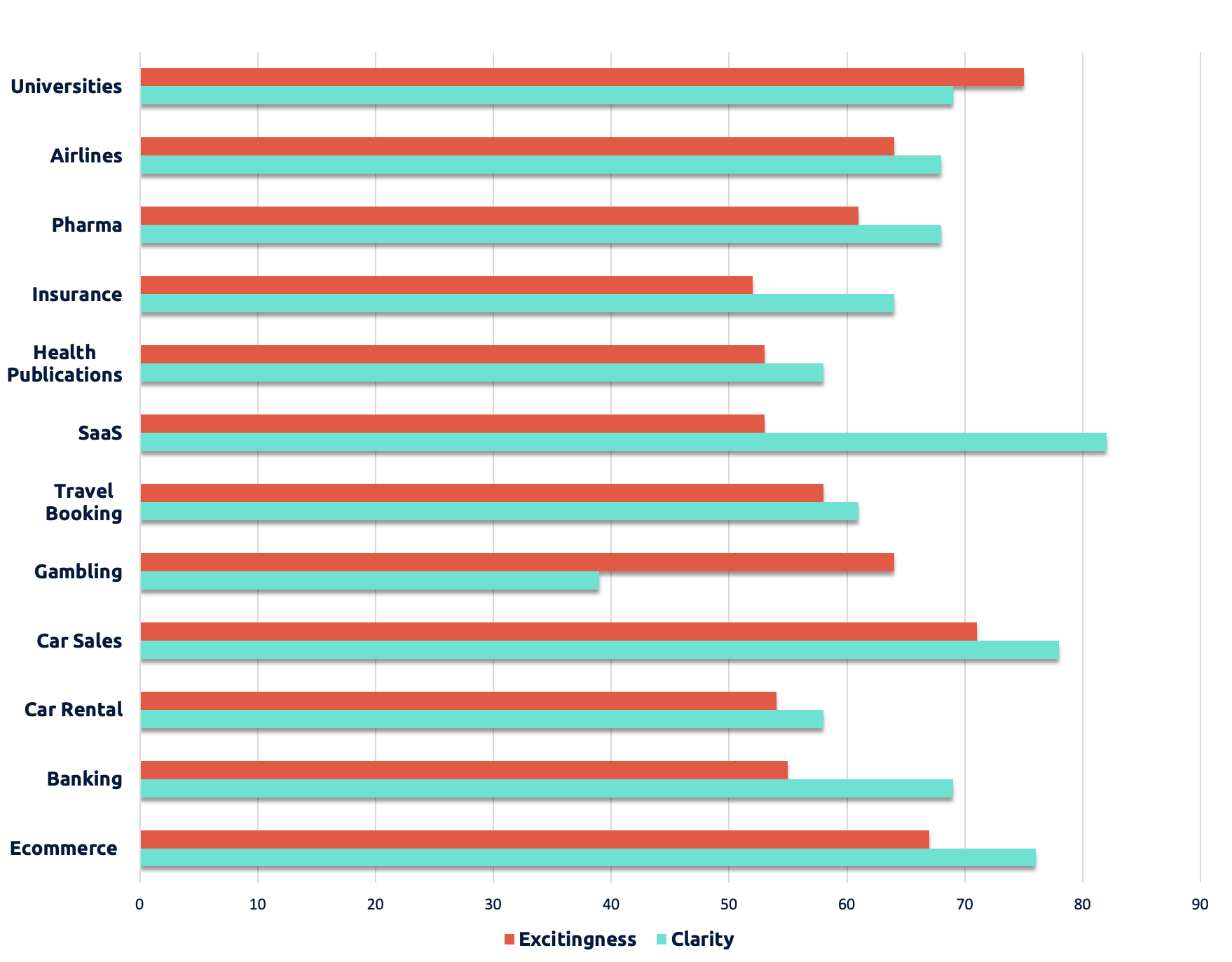
Businesses can use benchmarks to help measure the attractiveness of their company by how they are introducing themselves on certain platforms. For example, the following graph shows how certain companies’ websites are attracting customers with effective design psychology.
Companies can use this type of data to maintain the success that they have achieved in the past and to see where they are capable of improving for the future. It is important for companies to look at the benchmarks of other companies so that they may know where to look for marketing strategies that bring in and maintain customers.
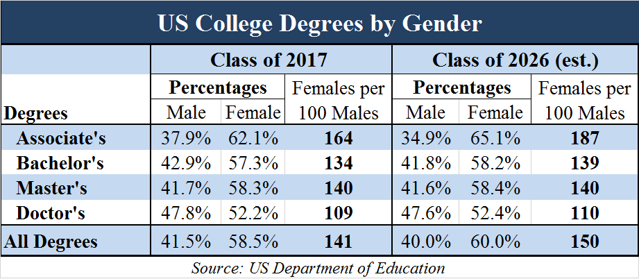
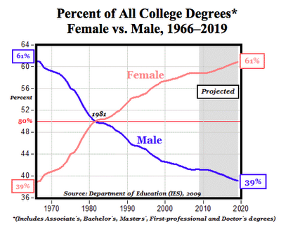
I decided to look at how current gender trends in college may result in a different version of America in the future. Ever since the early 1980s, women have been earning more Associate’s and Bachelor’s degrees than men. It took a little while longer for women to surpass men in earning professional and Doctor’s degrees, but they have earned more of these degrees than men on average ever since about the mid-2000s. The education gap between men and women has been projected to increase in women’s favor as time goes on. Here is the summary of raw data that is available through the Department of Education. https://nces.ed.gov/programs/digest/d19/tables/dt19_318.10.asp
Below is a fairly recent table showing percentages of US college degrees by gender and a projection of how it may look in the future. Tables are an easy way to compare numbers, but they often lack visual appeal. These are good for displaying accurate numbers, but there is not much to draw in the audience. Comparisons must be mathematically interpreted.
These are good for obtaining averages of a data set because there is little work needed to get the numbers.
We can also use a line graph to compare numbers, which is a very effective way to draw in the audience through the color scheme and trends in the data that are easy to interpret through rising/declining figures. The following graph is not very recent, but it gives us a better visual representation of the growing gender gap in American colleges.
Line graphs allow the audience to easily interpret data over a timeline. Color schemes, labeling, and trends increase visual appeal.
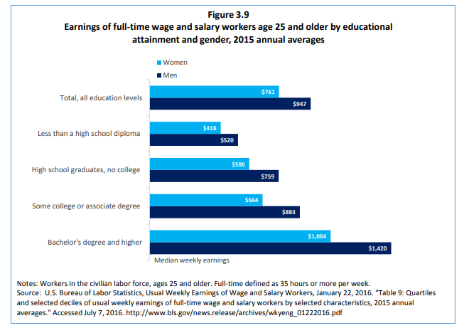
What these numbers mean is that more college-educated women are entering the workforce than men. You would expect these figures to mean that women are the majority of today’s American breadwinners. However, although women have been earning more post-secondary degrees than men in recent times, men still currently dominate the earnings reports while holding the same job positions. This is probably due to a long history of oppression passed down through the generations and complications of motherhood. One argument is that it is difficult to measure work ethic that is not on an individual basis, so we may never know for sure in regards to everyone’s specific situation. We can compare these income inequalities in a bar graph.
Bar graphs are phenomenal for side by side number comparisons that include many subcategories. Color schemes, length of the bars, and data labels make it less difficult to interpret data.
There is a lot to dissect when it comes to gender inequalities because we cannot freely assume that women suffer in all areas of life more than men, but this is a decent general overview of how we can utilize datasets for project use on this subject.
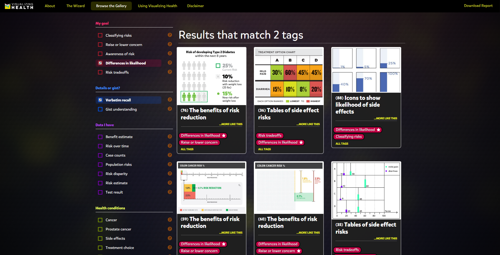
This site appears to be made with only good intentions. I like that the website chose not to host the public’s graphs, being they could be inaccurate and lead to a lot of disinformation. This site can be useful to help the general public have more understanding of how their personal decisions can impact their health. Many people are unaware of how they have affected their overall health through positive or negative decisions.
Here we can see that anyone can use these graphs, and the creators would like to know how we’re using them. It is made clear that completed graphs are to be used for the users’ own objectives, and not for the website’s.
The site used information gained through surveys to test the effectiveness of their images.
3 tools were used to test the effectiveness of their images. This shows that the makers of this site are serious about getting the best possible images out to the public.
The site helps to bring risk factors to light with easily digestible infographics to choose from.
The user is able to choose options from the panel to make it easier to find a template.
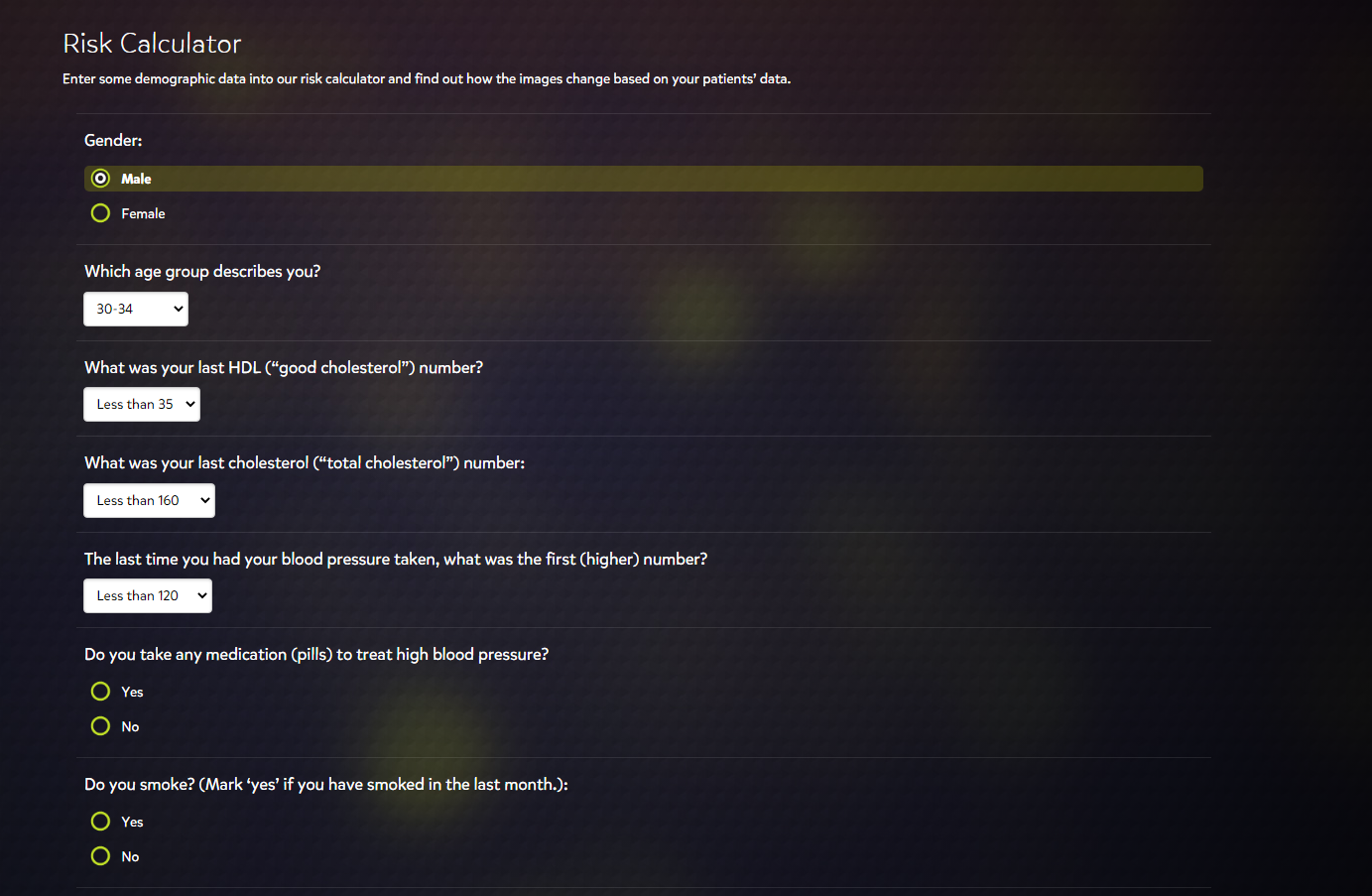
The design of the site is user-friendly. A person not well-versed in technology could easily make some digital graphics from this site. There appears to be some lack of variety in the risk calculator, however. I noticed that the risk calculator’s youngest age group option was 30-34. If we wanted to use the risk calculator for an age group younger than 30, the option would not be available.
These are not all the risk factors to take into account for a patient, but it is a decent general overview to start with for plotting data.
I chose this topic to see what type of cool infographics were already out there that could offer us more of a conscious state to the world around us. I’ve been a scientist for a while now, and I noticed that my curiosity with the facts only grows as time goes on.
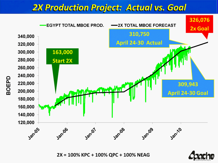
U.S. Intelligence Funding. Courtesy of the NSA’s biggest whistleblower, Edward Snowden.
That’s a lot of money right? Imagine being in control of that amount of money and the only thing you chose to do with it was to spy on people. Notice how one specific area of spending is “Data Processing and Exploitation”. This is surreal when you think about how much of that money could go towards building communities instead of selling them things or watching them burn so they can mount a response. Terror attacks are to blame for a lot of this.
The world is increasingly dangerous, so I’m on the fence about government surveillance, but does it really take this amount of spending to get done on a yearly basis? Are we spending this much to analyze holes in people’s backyards without their consent? Are we watching people through walls from outer space using thermal vision? How much is actually going on in the world to require this? The money seems to speak for itself, as it usually does, which is the scary part. The U.S. intelligence budget has also increased every year. Yikes. Stranger danger. https://www.dni.gov/index.php/what-we-do/ic-budget
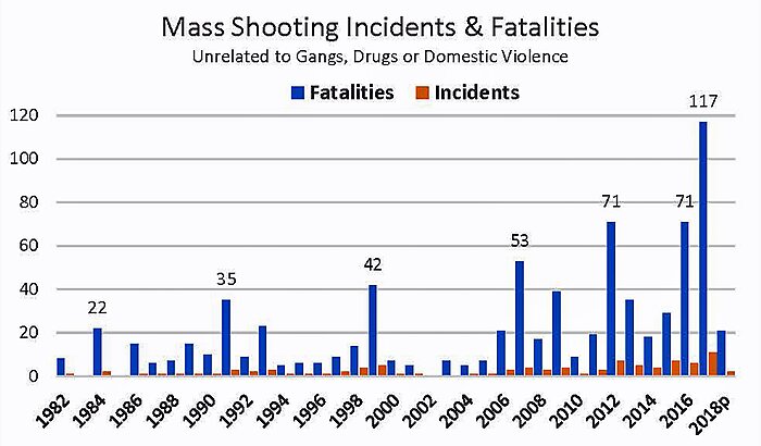
Mass Shootings. Loose motives.
Now, when you look at this graph compared to the last one you may think, “Oh yeah, that money was worth it.” There seems to be a really vile trend growing in America where American citizens are just straight up losing control of their mind and committing hideous acts of violence on their fellow man or woman. These are events that took place at complete random, where the shooter was most likely dealing with inner demons, and reached a deadly level of rage/depression where they could take out their vengeance on complete strangers.
Although these figures are always in the news for people to see, they only seem to be getting worse with most people’s only response being more guns or no guns. These figures also pale in comparison to the total homicide data. I feel that we need to switch the focus to addressing more foundational issues like parenting, bullying (physical/cyber/social), self-destructive tendencies, and mental illness. People are losing their identities more than ever, and shelling up as a defense maneuver. What we’ve come to know is that silence is deadly. Especially, when it comes to not talking about the real issues. https://www.cato.org/blog/are-mass-shootings-becoming-more-frequent