Categories
data visualizations pivot tables

Pivot Tables

Pivot tables are a great feature in Excel that allows you to analyze large data sets very quickly. This short video gives a brief introduction on what they are and how they function.

Here are 3 different times a pivot table can be useful when analyzing data in the real world:

  1. Compare sales totals for different products across regions

You have an endless list of sales data for various products as well as regions. You want to see which products have been bringing in the most money in each respective region but adding up the columns in Excel would take a lifetime. This is a perfect example in which a Pivot Table would come in handy.

How to use the Excel GETPIVOTDATA function | Exceljet

It allows you to rearrange the data so that you can see sales by product and region in less than a minute. You also have the option of displaying the total sales by product as well as grand totals for each region.

2. Show product sales as percentages of total sales

You can also use Pivot Tables to display percentages along with the totals to see how various products are performing compared to each other.

PivotTable percentage of column | Excel, Column, Online training

3. Get an employee head count across departments

Pivot Tables in Excel allow you to quickly count rows that share something in common. You have a list of employees and their respective departments and need to figure out how many employees are in each department. A Pivot Table allows you to quickly summarize this information without having to do a manual count.
Categories
Sankey Diagrams

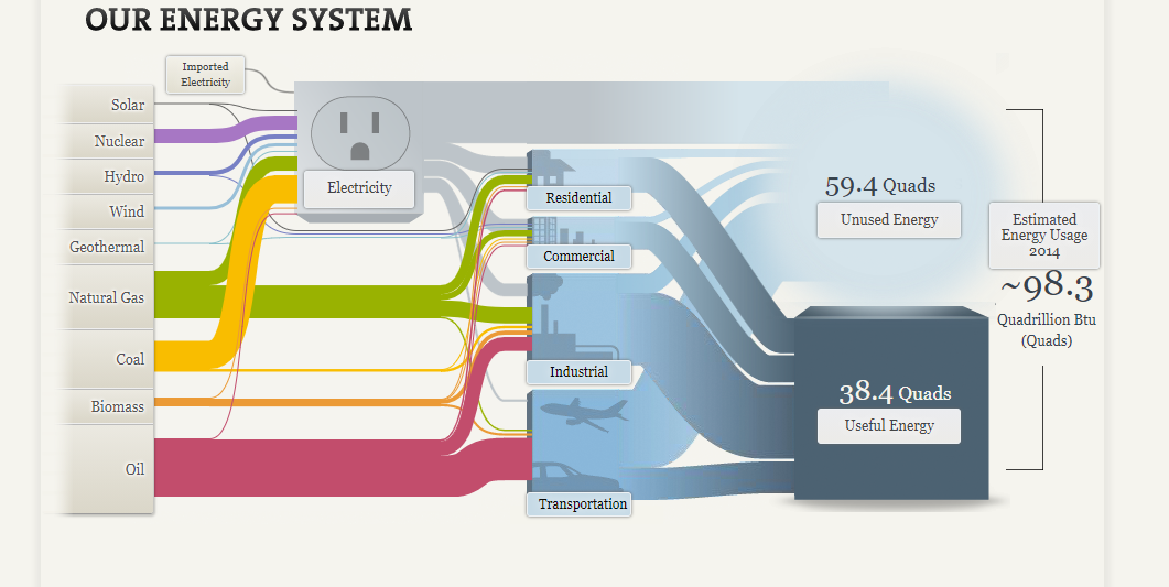
Our Energy System Visualized Through A Sankey

The National Academy of Sciences uses Sankey visualizations to explore our nation’s energy system. Although this type of visualization may be unfamiliar to many of us, Sankeys allow us to visualize flow when there are multiple inputs and outputs, which is why it is a perfect visualization to use when mapping out our nation’s complex energy system.

Based on the thickness of the various colored flow lines depicted in the picture above, you can easily see that oil, natural gas and coal are the nation’s leading sources of energy. The inputs (energy sources) then flow into various outputs (energy uses such as residential, commercial, industrial, transportation and electricity). We can see that the majority of oil is used for transportation purposes while coal is used for electricity. This visualization is also interactive. By clicking on some of the textboxes you can find more detailed explanations about that topic.

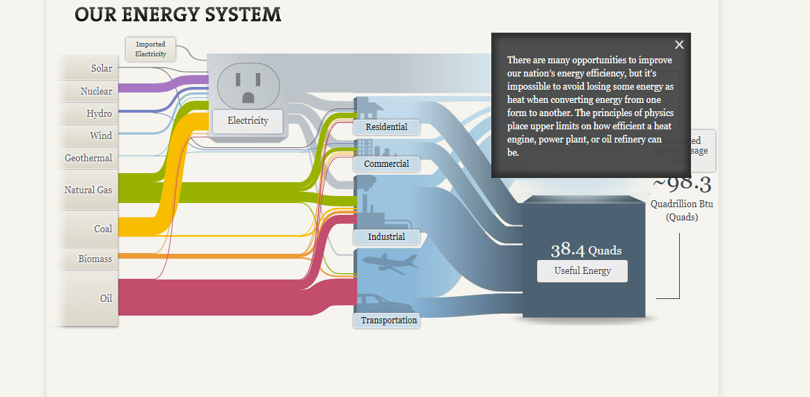
Clicking on “Unused Energy” brings up a text box with an explanation of why some of the energy we produce is lost.

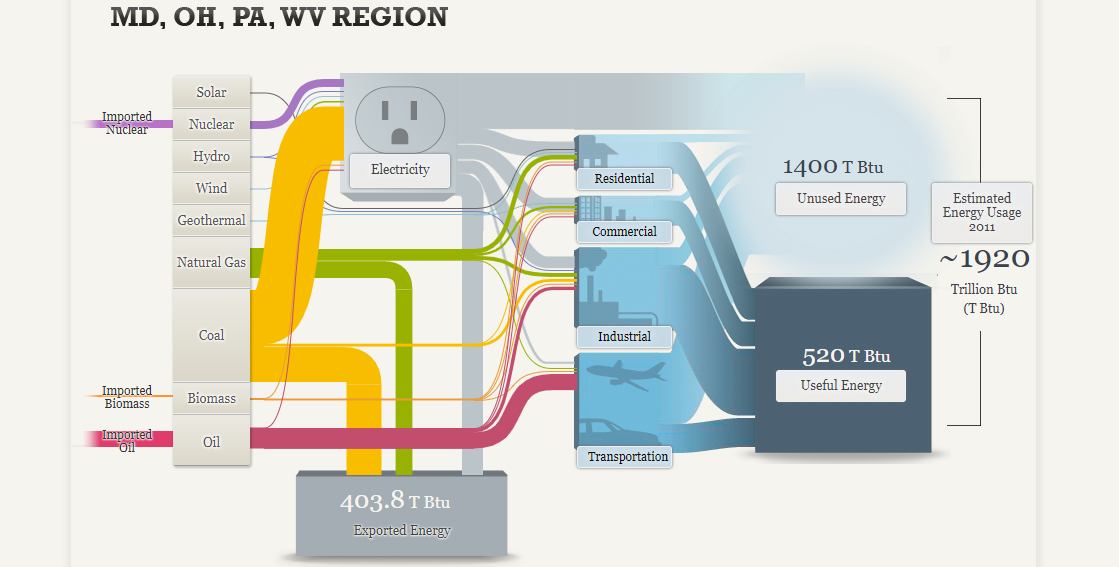
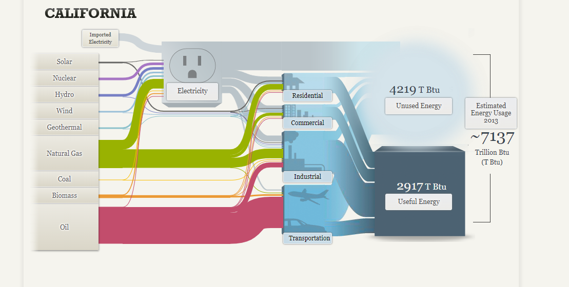
Separate visualizations are also provided for a regional energy system (MD, OH, PA and WV) as well as visualization for California state’s energy system.

Sankey showing the energy system for MD, OH, PA, WV region. It is interesting to note that coal is the largest energy source for this region. Only a small amount of oil is produced in this region which is why the oil is imported.
Sankey showing the energy system for California. Coal and natural gas are the largest energy sources for the state of California while coal use is almost non-existent.

In conclusion, depicting the various energy systems in the United States through use of a Sankey visualization seems to be a great choice. Color coding the various inputs or energy sources allows the reader to quickly decipher which color belongs to which energy source. Since there is also a significant difference in oil, coal and natural gas usage compared to renewables such as solar, hydro, wind and geothermal, it was easy to recognize which sources contributed most towards our energy system and which contributed the least. Furthermore, the reader could easily see how each sector (residential, commercial, industrial, transportation) contributed to either useful or unused energy since these were depicted in starkly different colors.

Categories
Data Visualization and Art Pie charts

Pie Charts

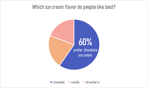
Since people typically have a hard time differentiating angles, pie charts have a very limited use as a data visualization tool. But there are special cases in which a pie chart could help your data stand out. Pie charts are used to represent data as a whole so it is important to make sure your percentages add up to 100%. In order to make your pie chart as effective as possible, it is best to use them for visualizations that don’t need many slices so that the graph is as simple as possible. Pie charts can also be used to highlight one piece of data to make a statement which can be seen in the graph I created down below.

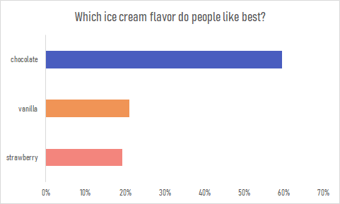
Pie charts are a great way to display simple survey results such as the one used to create the chart. The pie chart I created uses survey data from 104 participants to answer the question of which ice cream flavor is preferred by people. The results show that the majority of participants prefer chocolate ice cream over strawberry or vanilla. This information is highlighted in the pie chart to make the visualization effective. The audience can quickly pick up this information and answer the survey question easily. This data could also be presented in a bar graph such as the one down below. Although the horizontal bar graph is also easy to read and depicts the same story, the pie chart is the more effective chart in this case. It is minimalistic, straight to the point and contains less labels and text overall. The pie chart also compares the categories as a whole while a bar graph is not an effective method for that. More information on the usage and design of pie charts can be found here.

Categories
Data Visualization and Art Design lollipop chart

The Lollipop Chart

The lollipop chart is a variation of the traditional horizontal bar graph. It is used to rank categories, show trends over time or to compare categories. The lollipop chart eliminates most of the text show in a traditional horizontal bar graph, making it more approachable and minimalistic which allows readers to quickly gather information accurately.

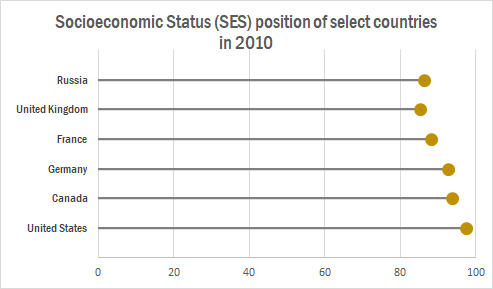
The chart below shows a lollipop graph created in Excel. It displays the Socioeconomic Status rankings of 6 major countries in 2010. The graph has minimal information and therefore is easy to read. The reader can quickly learn that the United States has the highest SES ranking while the UK has the lowest.

This type of chart can be used with any data that can be represented by a standard bar or column chart. It is especially useful when you have a large amount of categories to represent, making a bar graph too cluttered. Lollipop graphs can also be vertical like the one shown below taken from Visualbi. A vertical lollipop graph allows you to add labels inside the lollipop to easily highlight values. To learn more about lollipop graphs and how to create them click here.

Lollipop Chart in SAP Lumira Designer - Visual BI Solutions
https://visualbi.com/blogs/sap/sap-businessobjects/sap-lumira-designer/lollipop-chart-sap-lumira-designer/

Categories
benchmark data visualizations Design Diagrams

Benchmark Comparisons

Adding a benchmark to your visualization can enhance the story to a reader. A visual target allows readers to easily determine whether or not a goal has been met. Benchmarks can be in the form of a line, indicator dots, overlapping bars or combo charts. Depending on the needs of your visual, the best way to display a benchmark will vary. Here are some examples of different visualizations using benchmarks.

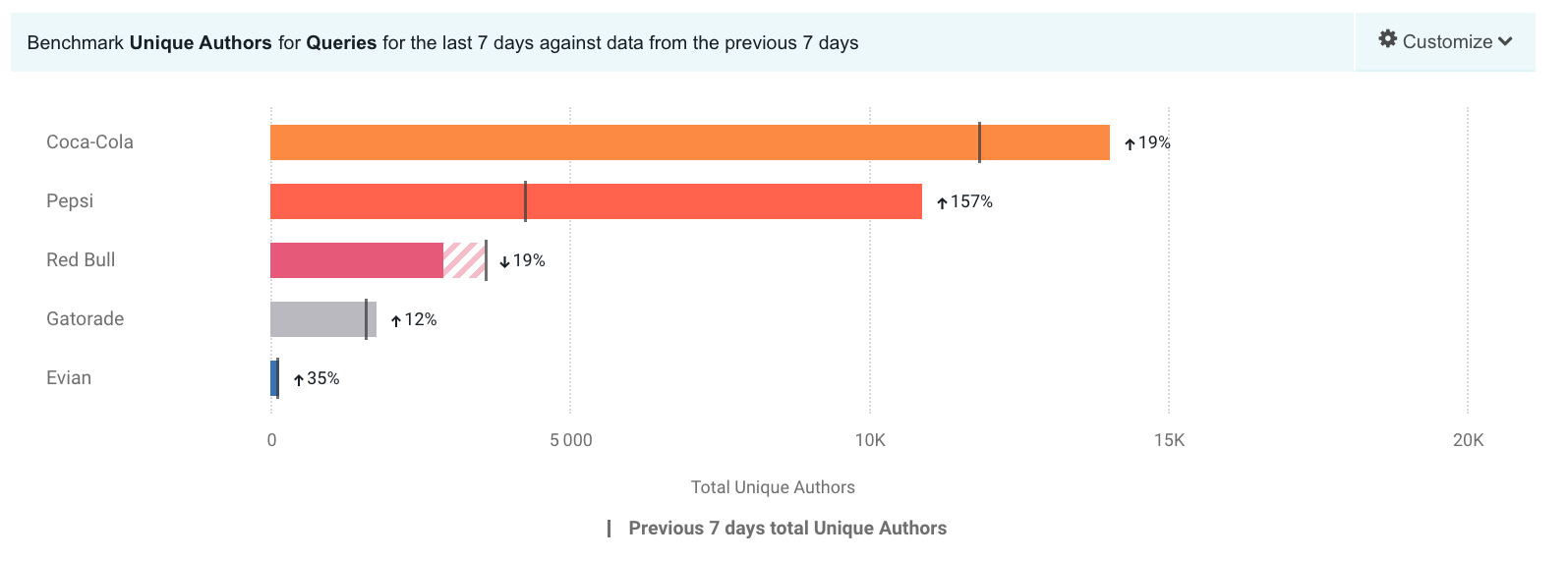
This take on a bullet graph uses a a benchmark line to compare how well different brands are doing relative to the brand’s previous performance. I think the use of a patterned filler to show that a company is not performing as well is unique. Especially for this data set, with only one company underperforming, this benchmark stands out.

https://www.brandwatch.com/blog/introducing-benchmark-the-visualization-for-better-insights/

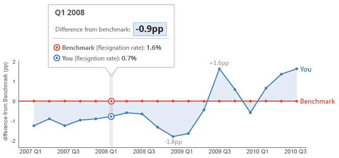
This graph features a line at 0 as the benchmark with another line showing how far off from the benchmark they are. With the benchmark at 0 you can easily see whether or not you are underperforming.

https://ux.stackexchange.com/questions/28749/data-visualization-what-should-be-the-baseline-you-or-the-comparator-seri

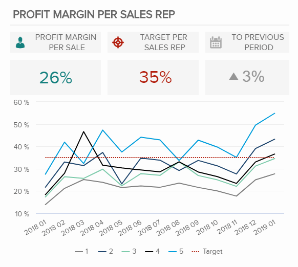
This graph displays the benchmark comparison as a simple dashed line.

https://www.datapine.com/kpi-examples-and-templates/sales

Categories
Color Scheme data visualizations Design Examples Pie charts

Comparing numbers!

Data visualizations can be very effective when comparing two or more numbers. They are a great way to showcase data and to convey a story through numbers. But conveying a story efficiently through data visualizations is not as simple as putting together a quick graph in Excel. There are many ways in which data visualizations can actually distract readers from the message or leave them feeling confused; when used properly they can be a powerful tool that can enhance your data. The video below illustrates how certain aspects of design such as color, size and orientation can enhance your data visualizations.

https://vimeo.com/29684853

While researching data visualizations comparing numbers, I came across two examples that stood out to me. This first visualization illustrates a poorly designed bar graph that has been overly labelled.

data visualization design 5

The graph to the left is distracting and there are several components that are fighting for the readers attention compared to the graph on the right that is simple and straight to the point. In this case, a horizontal bar graph which allows the reader to quickly read the information from left to right is a better choice than the vertical bar graph. Simplifying the graph by taking away the gridlines as well as some of the axis labels helps to reduce some of the clutter in the first graph.

The graph below is another visualization that stood out to me.

data visualization design 4

When creating charts or graphs, people tend to feel the need to distinguish each category with different colors (I know that this is definitely something I do as well). Comparing these two charts side by side, you can see how using different shades of a single color can be more effective than using 5 different colors to differentiate categories; keep in mind to make sure the shades are not too similar. Adding extra “design” elements to the chart is also unnecessary at times such as the black border around the pie graph and the pattern in the “mediocre” slice. By taking away some of these “chart junk” elements, the graph becomes more simplified and can be interpreted quickly and efficiently.

Categories
data visualizations Visualization Tools

Visualizing Health

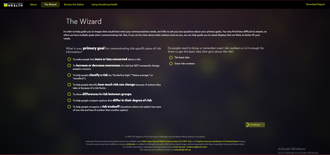
VizHealth is a collaborative project developed by the University of Michigan and the Robert Johnson Wood Foundation. This tool allows users to choose from 54 original data visualizations which have been tested through research amongst the general public. Utilizing The Wizard tool allows users to figure out what the primary goal for communicating the risk is and whether their audience needs to understand the basic idea or to remember exact risk numbers.

Figure 1. The Wizard tool from Visualizing Health.

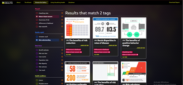
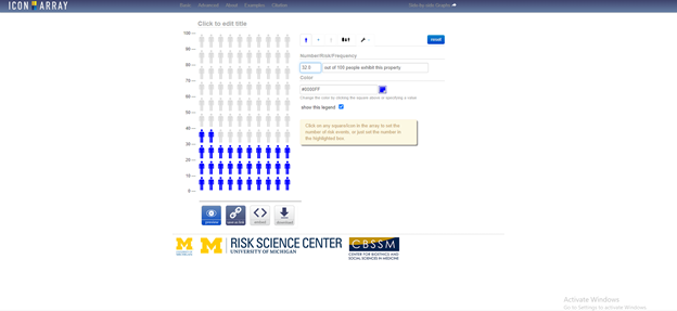
Based on the answer to these two questions, the tool will display graphics that best match your needs. These images can then be modified to fit your own data. You can also browse through the gallery according to specific tags to find the most effective visualization for you. This is a great tool that can be used by anyone from students to professionals as these graphics have already been tested and proven effective to convey information to the general public. There is also an external link to an Icon Array Generator provided by the University of Michigan Risk Science Center that users can utilize to create their own custom images.   

Figure 2. Gallery of 54 graphics that can be downloaded from Visualizing Health. Results shown for raise or lower concern and gist understanding tags.
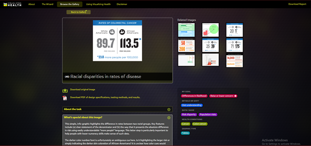
Figure 3. Racial disparities in rates of disease visualization from Visualizing Health. Users can choose to download the original image or view the PDF file detailing design specs, testing methods and results for that specific image.


Fig. 4 External link to Icon Array Generator from the University of Michigan Risk Science Center.