Categories
Uncategorized

Infographics

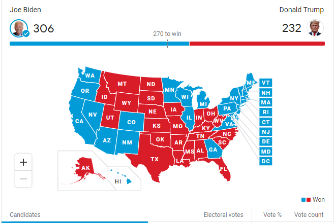
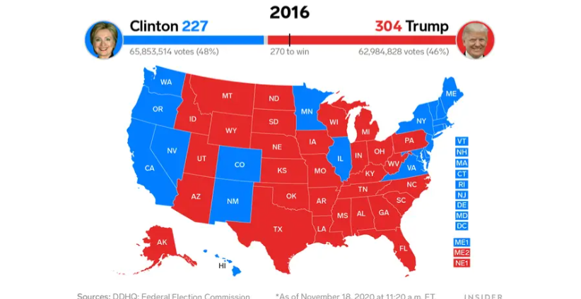
Data visualization helps people get a better grasp of what the data truly entails. Infographics can supply data of demographics, age, sex ect. In the 2020 presidential election this data visualization was most popular in seeing who won the electoral votes based on each state.

Google Finds Balance With Election Results, As Social Media Flounders 11/04/ 2020

Data sets utilize specifying information. In this example, each state is broken down by political party.

See the source image

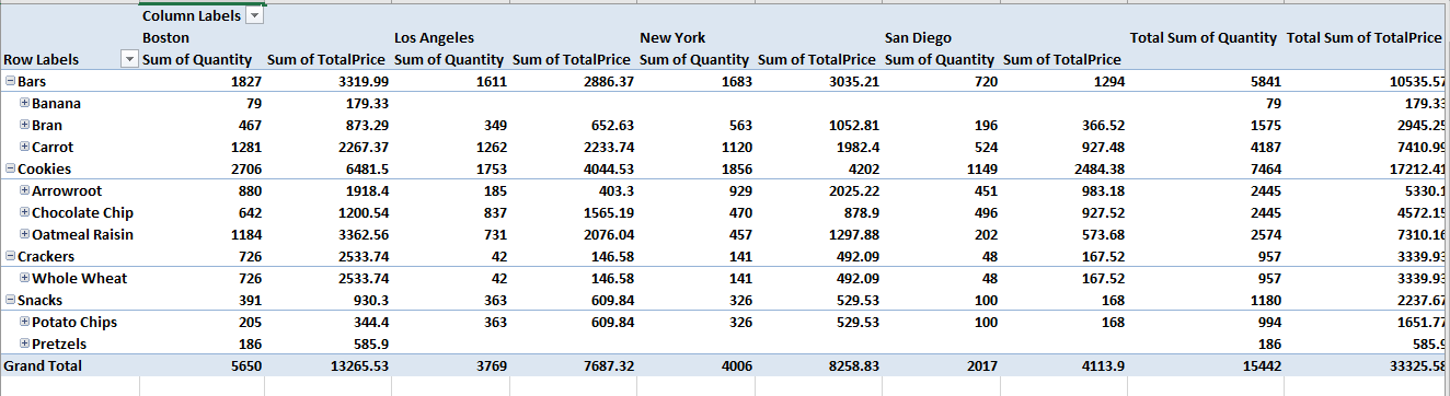
Their are many different data processors that can help you organize your data. A couple examples would be Microsoft excel and Tableau.

Categories
Uncategorized

Pivot Table

Pivot tables are one of the most easiest and the most powerful tool on excel. If you have a lot of data and want a sufficient way of organizing it pivot tables are the way to go. Pivot tables gives you the option to break down data by categories or even sub categories.

This is an example of a pivot table that categories its data with different demographics. In this chart specifically, they compare prices and profit of grocery items in each state.

Pivot tables are one of the many ways in organizing data. And, I believe that it is a vital organizational method used in specific data collection.

Categories
Uncategorized

Comparing numbers

Comparing numbers is another form of collecting data in order to support the outcome of a debatable topic. For example with the 2020 presidential election, each state compared numbers in not only the votes given to each candidate but also how the electoral college could factor in the results of the election.

News stations even compared numbers in regards to the 2016 and 2020 election.

While comparing numbers is useful in data collection it does not supply you with all factors behind situations. In research you should compare numbers as well as other methods of research.

https://www.businessinsider.com/2016-2020-electoral-maps-exit-polls-compared-2020-11

Categories
Uncategorized

Visualizing Health

Visualizing Health is a very valuable website and is useful for making health infographics. This website categorizes visualizing health and makes it easier for consumers to navigate through, as well as provides users with visuals that can be easily understood.

This website also features a unique searching tool called “The Wizard” that helps you narrow down your search within the sight.

Personally, for me, with the help of the Wizard, I found out information about my own health that I can stay informed on. In detail this website provided me with simple visuals that made it easy to understand.

Categories
Uncategorized

Sankey

The above Visual was a really great way to show the different energy sources in the United States and their uses. It was interesting to learn the energy sources in a further depth, the diagram was interactive and very useful. The most interesting fact I found was that, “Coal dominates the region’s energy flow, representing more than half its total energy supply, the greatest contributor to electric power production.” I was unaware and thought oil was a greater contributor in the United States.

The united states estimated Energy usage was about 1920 trillion Btu which is a extremely large amount but the fact that California is 7137 trillion Btu alone is astronomical. Oil is a much larger source in California then coal, which is interesting.

Overall, the site was very interesting and informative. It surprised me with many facts I was unaware of.

Categories
Uncategorized

Lollipop charts

Lollipop charts are perfect to use in similar situations that a bar graph would be used. Lollipop charts are great for comparing different sets of data in a category. This is especially a good chart for showing data with large number values: a long tall “lollipop” can help emphasize the data. It gets the name “lollipop” from its bars with circles at the end that mimic a lollipop. The biggest con of lollipop charts is the circle which can be hard to tell the exact value its marking.

The below chart I found on google is a great example when to use a lollipop chart. The data is all in the higher percentages with emphasizes the old age retirement of the government officials. The chart also projects the long term increase compared to the current 2012. Since the circles land right on the lines the graph values are easy to read.

Categories
Uncategorized

Pie Chart

Pie charts are best used when depicting parts of a whole in data sets. I made this chart below to show the data I found on the American Veterinary site. This data is perfect because it shows the percentages of different pets owned in the United states. The different pet categories are the parts of a whole pet ownership in the united states. The different parts add up to a 100% perfectly because it is the whole ownership broken down. https://www.avma.org/resources-tools/reports-statistics/us-pet-ownership-statistics

See the source image

The above example (found on google) is a perfect example of when to use a pie chart. This chart depicts the grades from a whole class broken into the different letter grades. This is a perfect way to see what percentage of the class did well and how many did not . This may help a teacher determine if a test was difficult for students.

Categories
Uncategorized

Comparison of tools infographics.

Google charts is a simple and easily navigated site. This site is free to all users. Google charts is specialized in chart infographics such as bar graphs, line graphs, and pie charts. Unlike piktohart there is not much room for creativity with very simple formats.

Piktohart is a complex platform with various different additives. In comparison to Google it is free to the public. To upgrade your use of the site upgrades and in website purchases are available. This website specializes in New and innovative infographics. This site gives you a second mind by giving inspiration of different ideas.