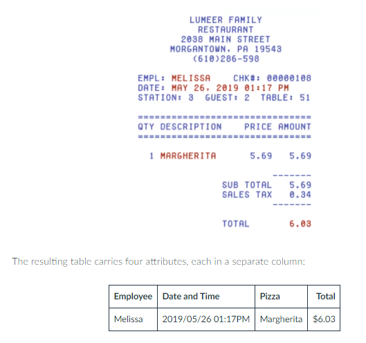
Pivot Tables are an easy and organized way to keep records of numerical data without creating an entire new table for every new data. Below are a few examples of pivot tables. If someone does not know how to begin creating a pivot table, there are numerous tutorials on the internet to explain the process step by step.
The deck of 52 cards can be placed in a pivot table based on its colors, signs, and numbers.
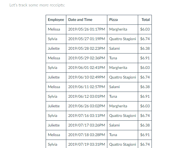
Pivot tables are used by business owners like pizza restaurants to keep record of its daily sales for a week, months, or years.
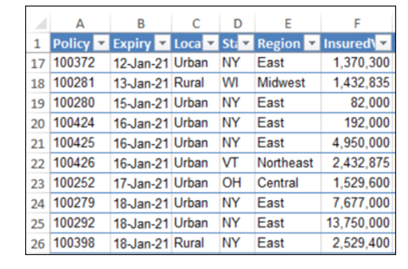
Insurance Policies use Pivot Tables to keep record datas for different states, years and geographical location within each state.
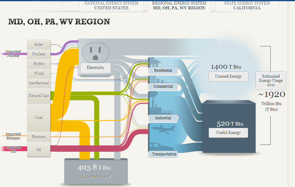
The Sankey visualization about our energy system in America was rather interesting by breaking down the percentages in the different energy sources that are used and by focusing on specific regions to give the reader is a better understanding. Below the Sankey diagram describes the regional energy region and the amount of energy sources it use in total. At first, it was difficult to understand what the numerals meant, but after studying it, it became a little clearer.
Coal is mostly used in this region for various purposes compared to the other sources.
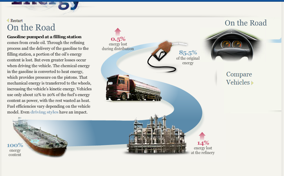
On the Road: This is a breakdown on how much energy is lost before it reaches its original destination. The energy that is lost turns into toxic gas such as Carbon Dioxide. Interestingly, vehicles only use about 12% to 20% out of the 85.5% of energy for power while the rest is used as wasted heat.
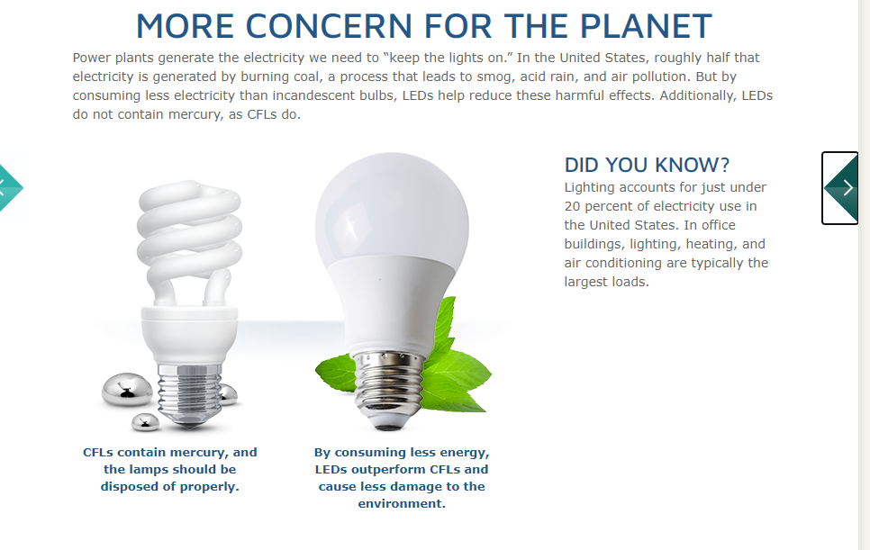
Concern for the planet: Over the decades, lighting has been improved to save energy and help reduce pollution into the air. This visualization shows that much more needs to be done to save our planet. Since America burns a high percentage of Coal based on the Sankey diagrams, LED bulbs have been encouraged in many public places because it burns less Coal and it is cheaper.
Overall, the Sankey diagram is very interesting to use to describe data, but it is important that when using this type of diagram only the relevant information should be used to remove confusion and misunderstanding. As for our energy system, the data allowed the reader to understand just how much energy is wasted daily and the process that occurs to transport the energy to our homes, vehicles and jobs. With this, we should do our part by monitoring what we do with our electricity and try to save energy as best as we can.
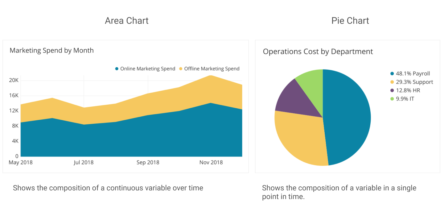
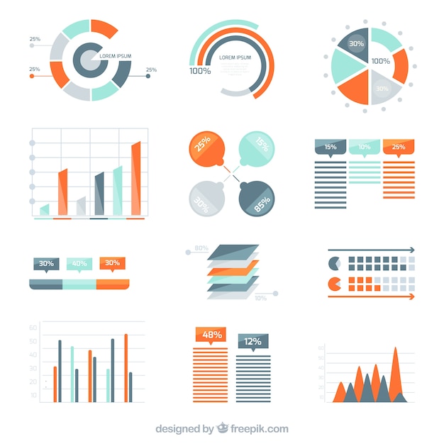
Pie charts are excellent for expressing proportions, especially those that have percentages. Pie charts tell a whole story but then divide it into smaller segments to better understand and visualize what the story is trying to portray. The best way to use pie charts is when expressing 2 to 6 different categories. A pie chart can be used to express the percentages of people with heart disease and those without, or people with BMW and those with Sudan. Pie Charts are most effective if labeled correctly, have few slices, and the colors show each slice with good contrast.
There are good Pie Charts, and there are poor quality pie charts.
There are also different types of Pie Charts to represent data, depending on the type of data and how someone wants their data to be displayed.
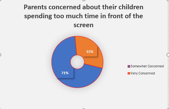
This pie chart is sliced into three sections to portion out the data. It gives the audience a visual of how big the percentage is.
This donut pie chart has a hole in the middle to separate the slices, which allow the audience to pull the slices apart and analyze it.
The colors used in this pie chart represent the slices and their data clearly. The numbers are organized in a clockwise direction and are in order with the legend,making it easy to understand and read.
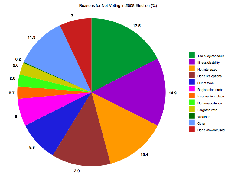
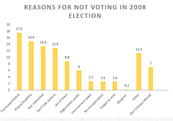
This is the same data as in the pie chart to the left. The data is best represented in a pie chart because with the pie chart, the slices give the audience a better visual of how many percentage or number.
These are some websites explaining how to effectively use pie charts and when it should be used:
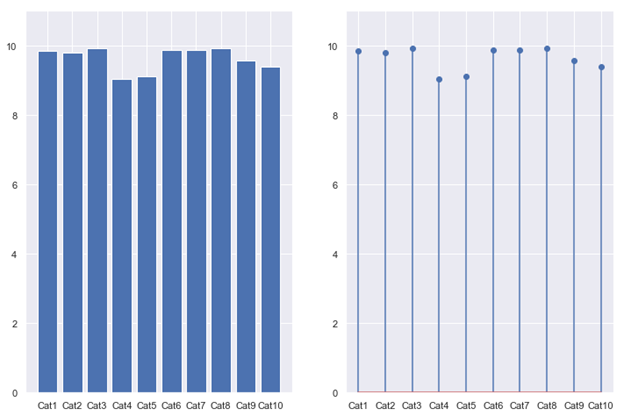
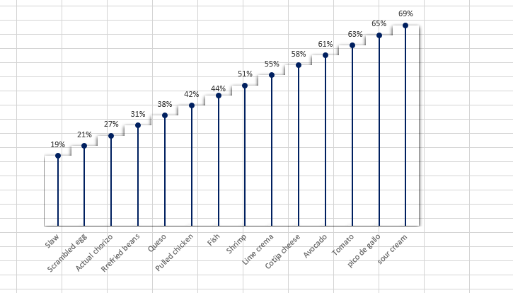
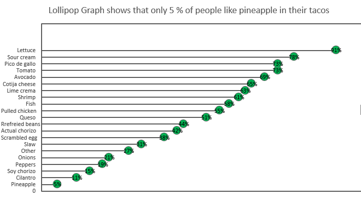
A lollipop graph is a unique way to represent data and make comparisons between different figures or categories. Lollipop charts are favored over bar graphs when displaying figures of high values. Unlike bar graphs that present data in a cluttered way with a stack of bars, the lollipop chart allows the audience to better grasp the information that the chart is represented in a clear and concise manner. However, this type of chart has its limitations, it is not used to analyze for distribution, relationship, or composition.
This figure shows a comparison between a bar graph and a lollipop chart.
There are two different types of lollipop charts, one is with vertical lines, and the other with horizontal lines. Both graphs offer the same visualization, but with different angles.
This is one example of a lollipop chart This example of another type of lollipop chart was created in Excel.
In conclusion, lollipop chars are a great way to keep data simple, clear, easy to understand, and easy to compare and contrast by the audience.
Reference: Stephen ie D.H. Evergreen. Effective Data Visualization. 2nd edition
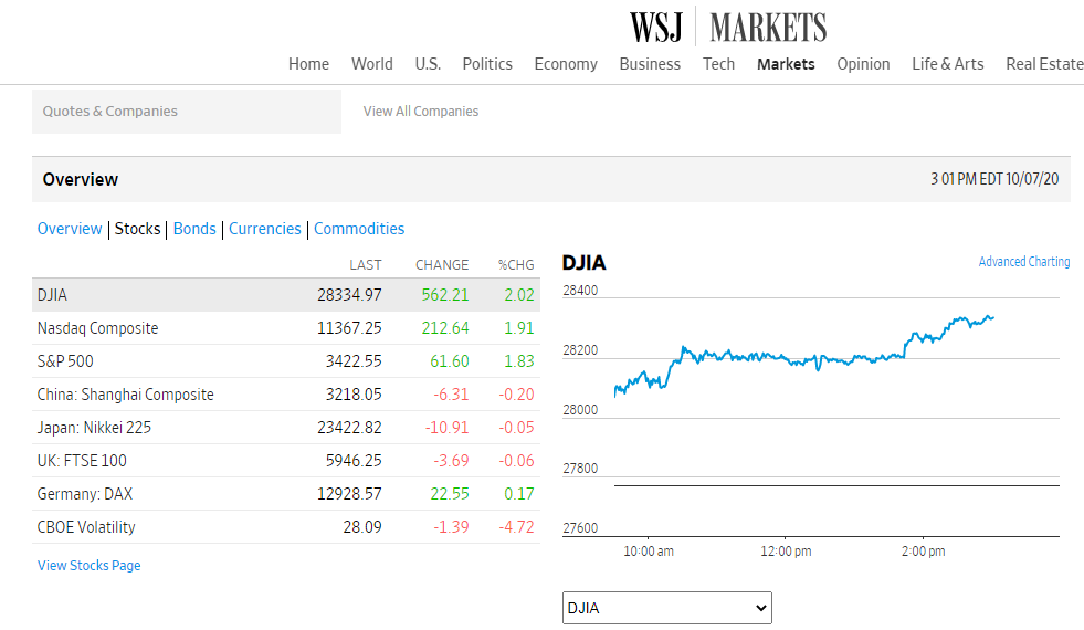
Benchmarking by definition means “A standard or point of reference against which things may be compared or assessed”. This management tool has been around and widely utilized by many businesses for centuries. It may seem like a simple graph or picture, but it adds great quality and a deeper meaning to a story. It helps users understand performances between different organizations’ products and prices for example the rise and fall of the stock market.
T-Mobile uses pink in every advertisement, poster, or package, and the letter T stands out from other companies.
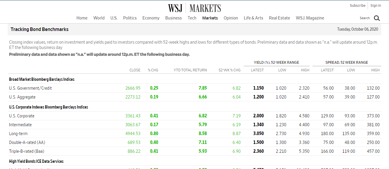
This is another way that WSJ uses benchmarks for comparisons.
The Wall Street Journal (WSJ) is a highly respected newspaper that uses a benchmark to compare the stock market, businesses, travel, and other topics of interest occurring in the U.S and around the world. One way WSJ makes comparisons is by using charts with line graphs to represent and explain data.
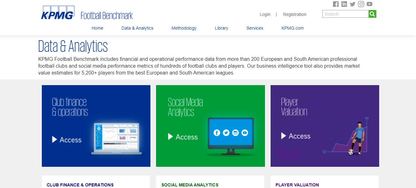
Football (Soccer) Clubs use benchmarks to compare games, players, financial opportunities across Europe, and Sout America. It also uses a benchmark to compare contracts for players.
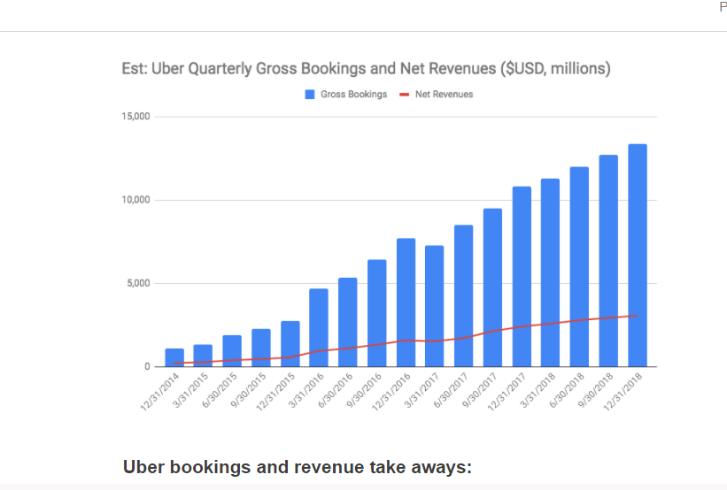
Here is another great example of a benchmark used to compare Uber Gross Bookings & net Revenues from 2014 to 2018. Based on the chart, Uber’s bookings and revenues were very impressive throughout the years.
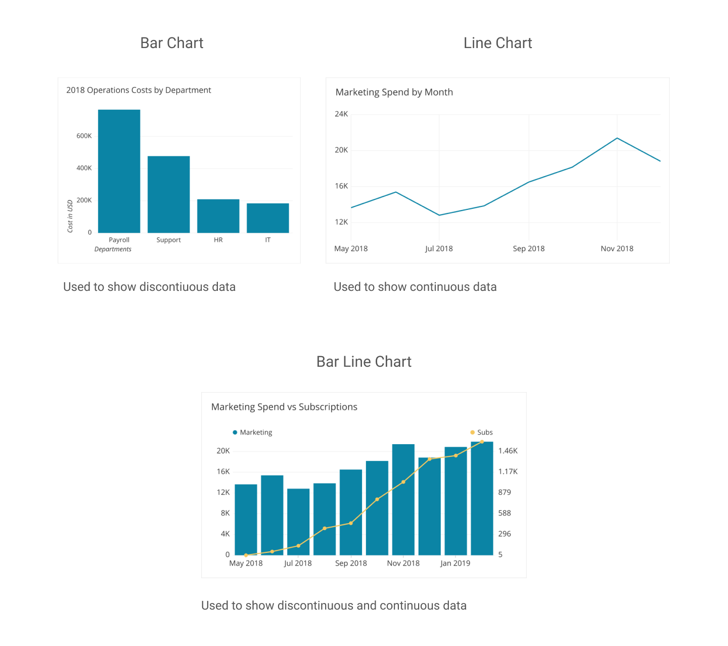
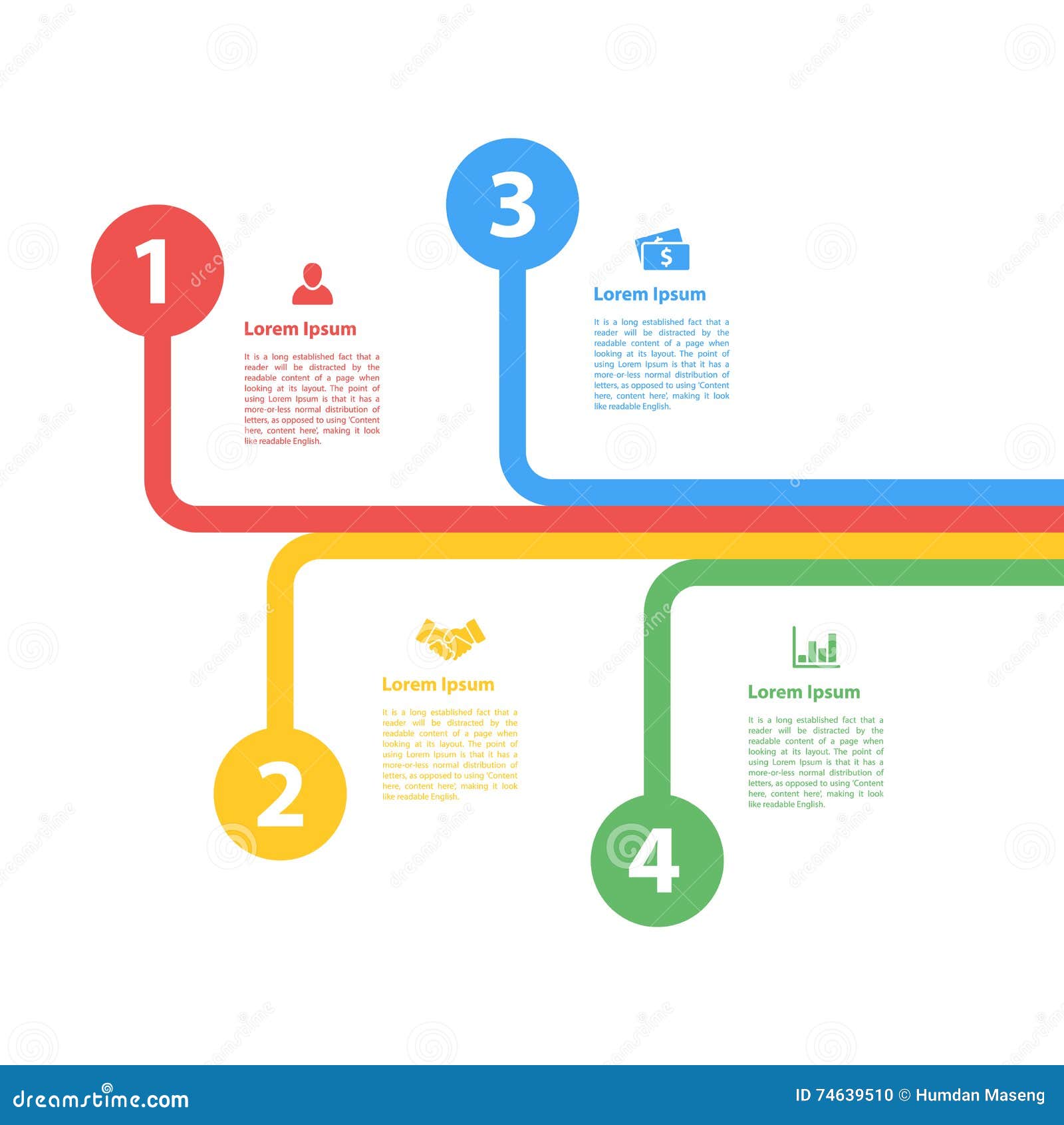
Utilizing the right visualization to display numerical data is important when presenting accurate, and meaningful data to the audience. Numerical data seen through visualization allows the audience to interact with the data and compare the numbers and understand the information that is being displayed on the charts. One major advantage of data visualization is to help the audience see patterns, links, and trends that may not otherwise be visible through text-based information. While some visualizations are meaningful in representing numerical or statistical data, there are visualizations that are not hence, it is important to choose the most appropriate chart to reach your audience.
Examples of Visualizations to Compare Numbers
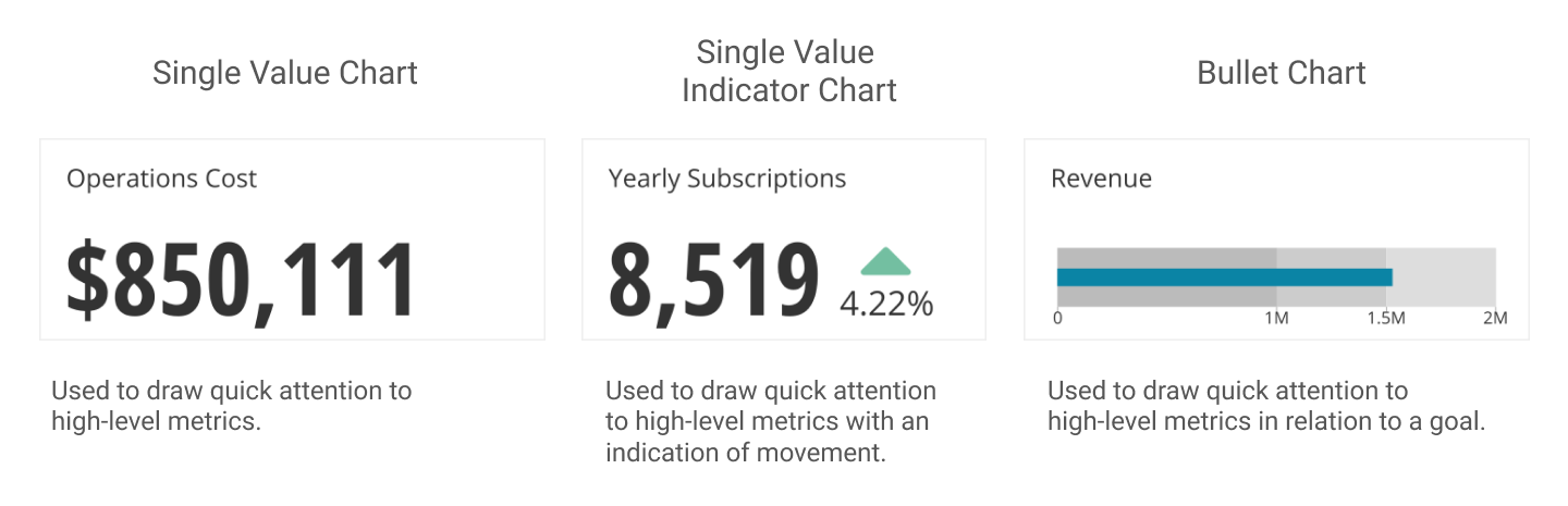
The Single Value Chart is a phenomenal tool for comparing single value digits. Displaying Revenue figures and calculating Operation costs are best used on this type of chart.
2. Composition: This chart is used to display how sets of a whole data are created into smaller divisions to highlight differences of each of the smaller parts to the total value.
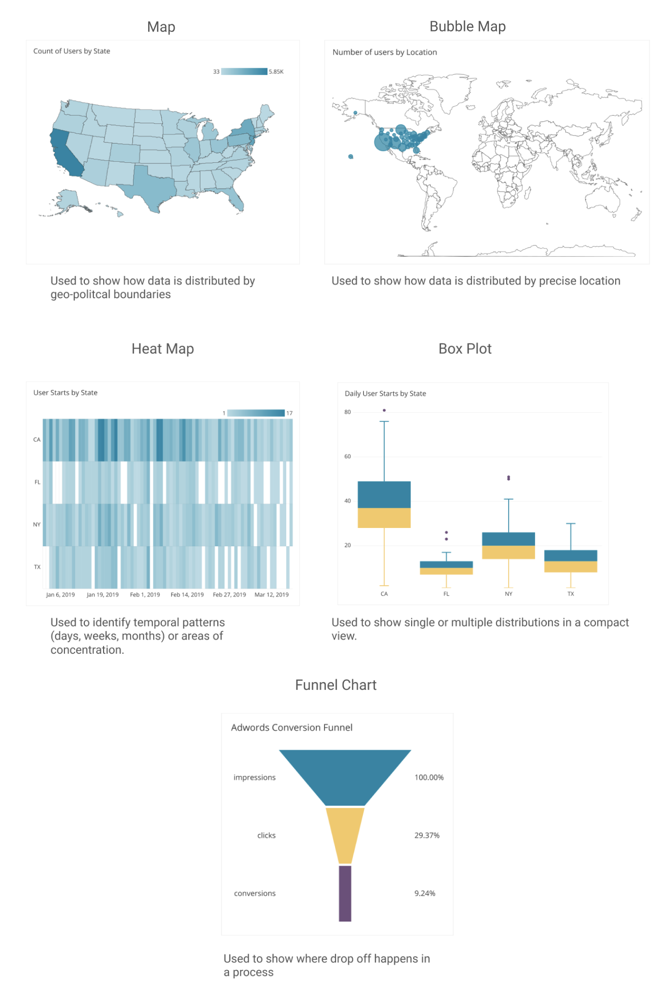
3. Distribution- When displaying data values about a population within an area, the distribution map is helpful to accurately, and clearly represent figures within the specific location.
: is a unique way to transfer medical data about health conditions into charts, graphs, and diagrams that are easily understandable by a broad audience. It enables someone to better understand their health risk, uses icons to represent side effects, and benefits of reducing risk.
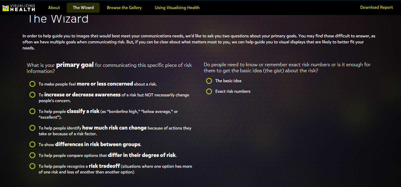
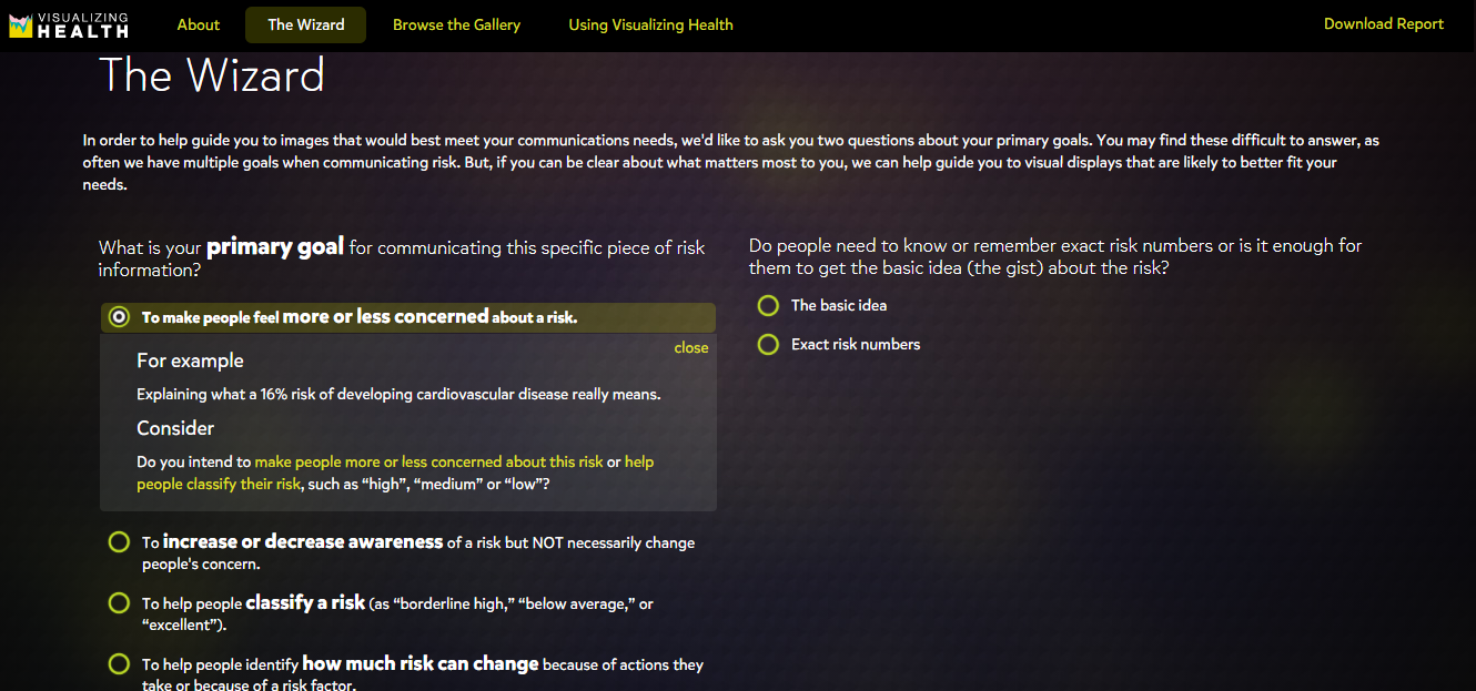
Figure 2: The Wizard
Figure 2: The Wizard is an interesting tool for visualizing health. It’s used to assist individuals in carefully choosing their primary goals when it comes to their health. For example, an individual who smokes a lot might want to know what are their chances is of getting a heart attack, stroke, or lung cancer.
Figure 3: By clicking on the goal, it then displays examples of the risks or racial disparities and it asks for a reason for choosing the goal. This is a great way for individuals who are uncertain about the right steps that are needed to reducing their health risks. The Wizard breaks down complicated medical questions and conversations about health risks into simple questions that the individual can understand through visualizing.
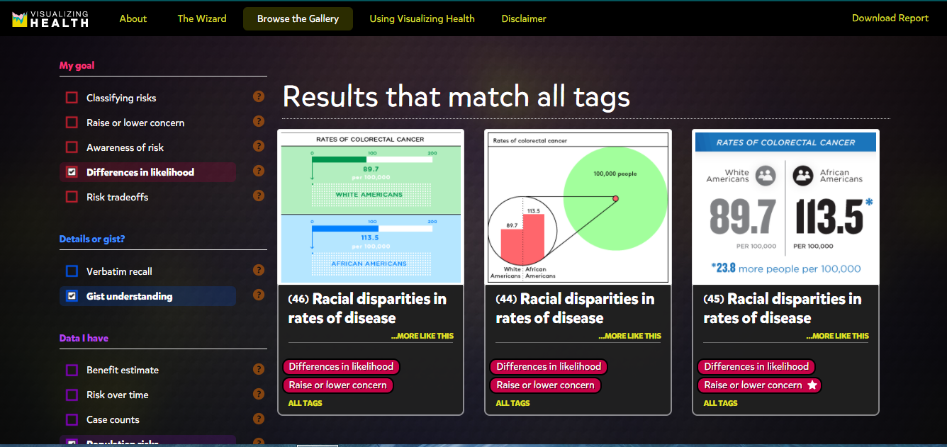
Figure 4
Visualizing Health provides various charts for different goals such as increasing or decreasing awareness, risk reduction, differences in age groups, or race. Each chart breaks down percentages and numbers and only highlights the important data so that the audience can understand the information. It also allows the individual to select different data, the type of graph he/she would like to see the data on, different health conditions, or the type of details that he/she would like to know about a certain health condition.
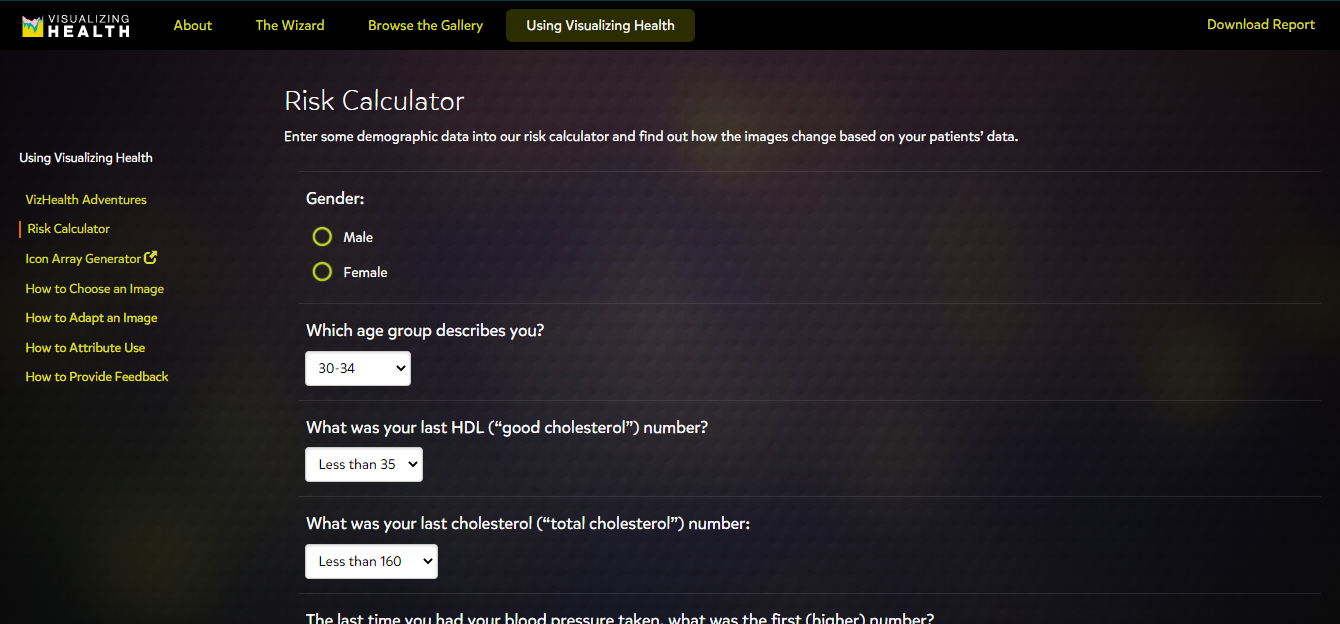
Figure 5: The Risk Calculator
Figure 5: The Risk Calculator is a good way to get an estimate on someone’s risk of a heart attack, stroke, and other serious health conditions. It should be noted that the Risk Calculator is not 100% accurate, but it does give the individual an idea of their condition, which would prompt the individual to visit his/her doctor.
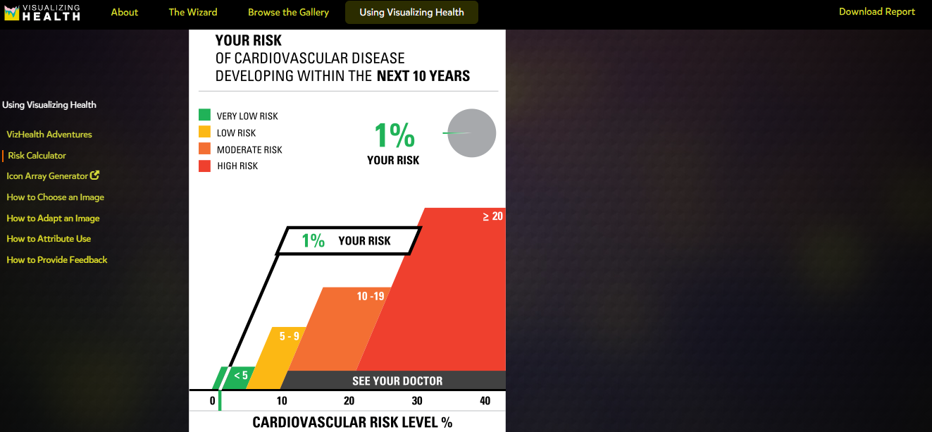
Figure 6: My results using the Risk Calculator on Visualizing Health
Figure 6: My Risk Calculator results indicates that I am 1% at risk for cardiovascular disease and suggests that I “see your doctor”. This provides an excellent opportunity for me to speak to my doctor about reducing my risks on my next visit.
–It is acomputer-supported, representation of visual data to increase cognition.
– It isavisual presentation of data, information to be incorporated quickly & more clearly.
–Another name for Infographics is DataVisualization: present information clearer & effectively through graphic designs.
Did you know who were some of the First Persons To Use Infographics?!
–Early humans drew paintings on cave walls and rocks as a way of telling their story.
– The Ancient Egyptians told their stories of life, religion & work through the use of infographics.
– In 1786, William Playfair used Infographic to create the Commercial & Political Atlas.
William Playfair designed line graphs & bar charts showing the economy of England
–1972-Otto (Otl) Aicher was the first to used Infographics to pictogram the Munich Olympics.
Otl Achie’s pictograms for the olympics are used today throughout society. 2 examples are the stick figure on cross walk signs, male & female stick figures on bathroom signs
– 1975-Edward Tuft is considered the father of Data Visualization.