A Pivot Table is one of the basic data analysis tools. It is a summary of your data. Pivot Tables can help answer many important business-related questions. They are used to pass information.
A Pivot Table can:
group items/records/rows into categories
count the number of items in each category,
sum the items value
or compute average, find minimal or maximal value etc.
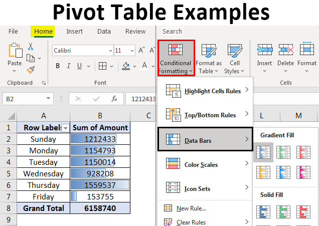
This examples shows how sums and row labels are shown on Pivot Tables
Above is another example of a Pivot Table. This table organizes the data and groups and sorts the information in a way that makes it easier to read. A Pivot Table was a good choice for this data.
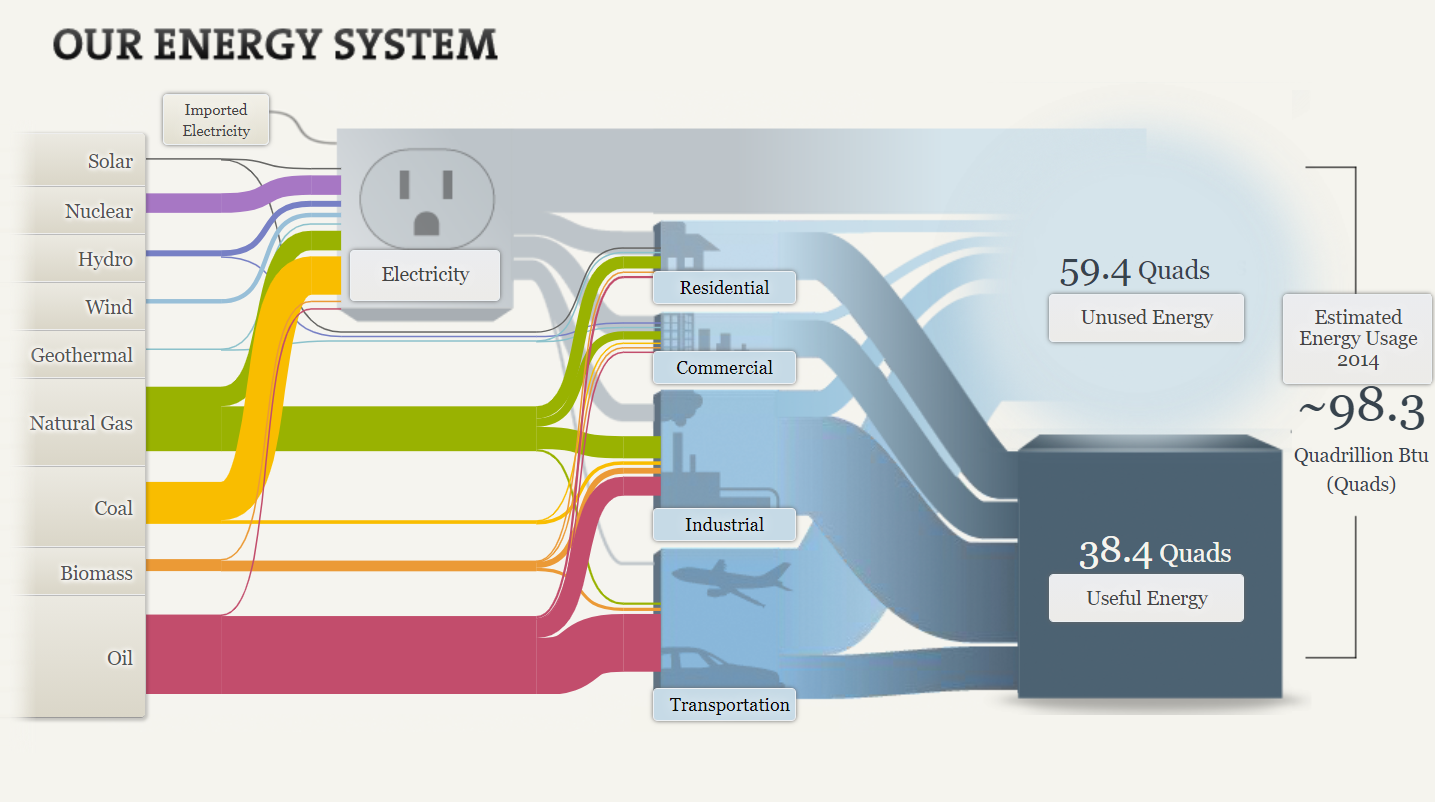
The Sankey website provides visuals to educate viewers on our energy systems. This website begins by displaying the flow of energy in the U.S. through interactive visuals. I clicked on the tab “Our energy system,” to see the overview and layout of information provided. Below, is an interactive chart that is displayed on the Sankey website. It shows how much of each type of energy is used, providing details upon clicking each link. Oil is the most common energy source. This visual can be easier then reading a piece of text, because it shows exactly where things go. The colors may help trigger the memory and draw the viewer in.
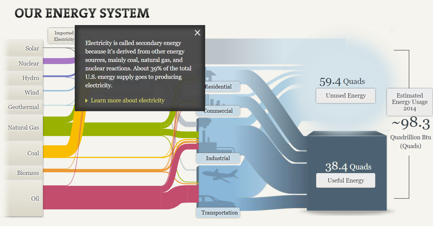
I clicked on “electricity.” As you can see below, a text box pops up, providing information that they want you to know regarding electricity. From this text box we can gather than electricity is secondary energy that is derived from other energy sources. This website gives you the ability to click on any word displayed below, following a textbox, that will provide you with more information about it. I really liked this tool and thought it was a fun and interactive way to retain information.
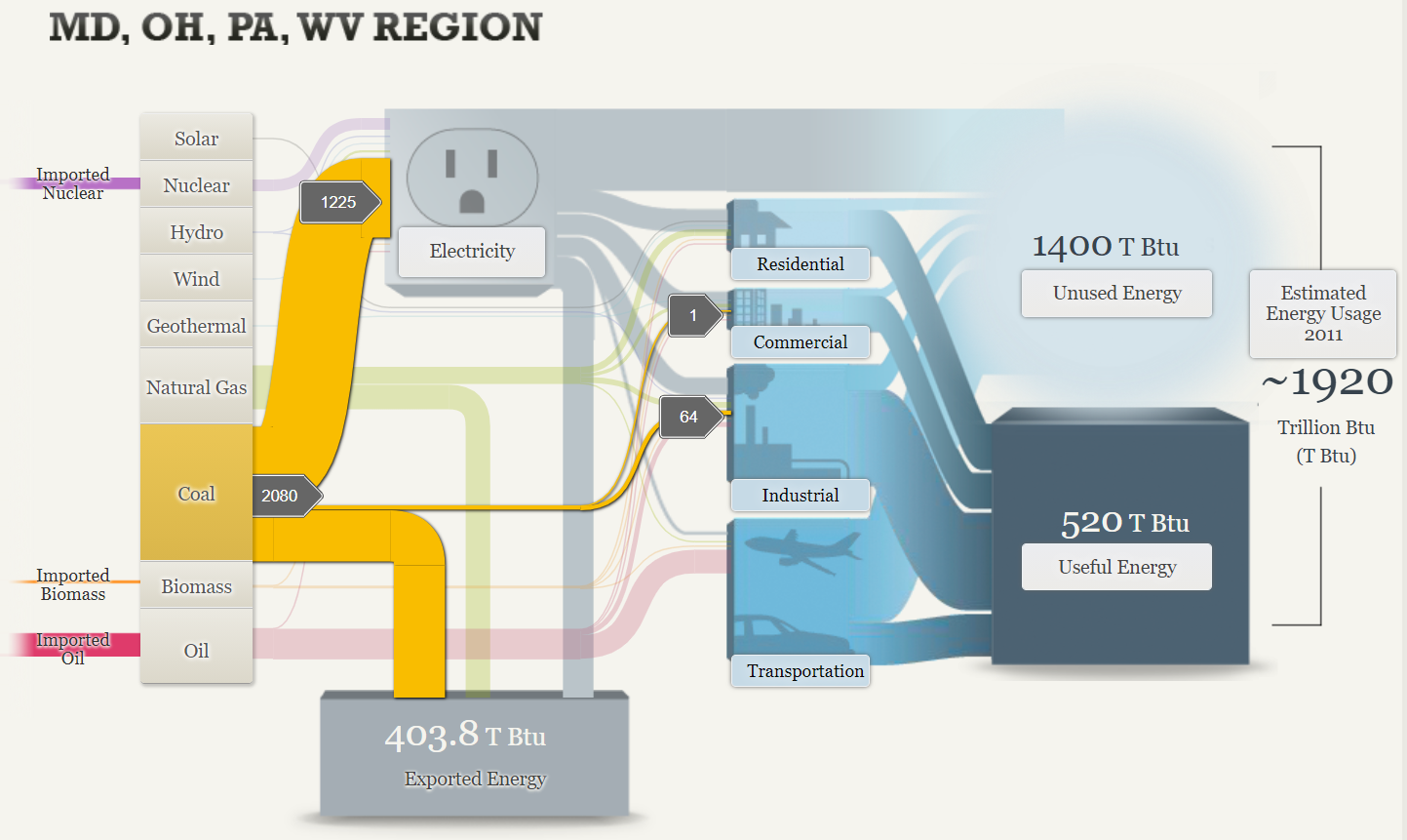
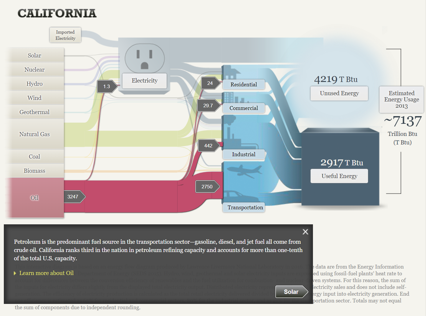
Below are two other tabs on the Sankey site that provide information about our energy system based on location. As you can see, in MD, OH, PA and WV region, coal is the most popular energy source. In California, oil is the most popular energy source.
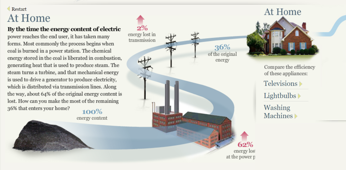
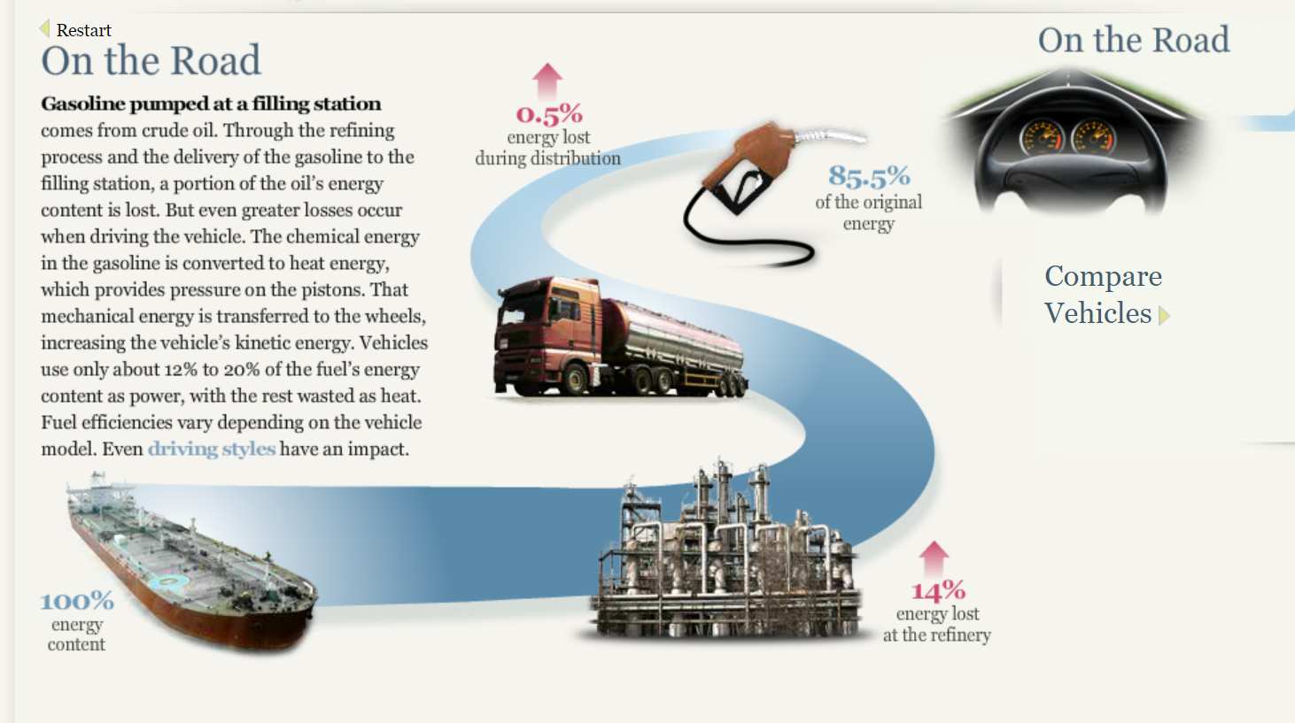
After further exploration of this site, I found visuals displaying information regarding energy at home and energy on the road. Pictures and visuals definitely drew me in, making it easier to process what is being explained.
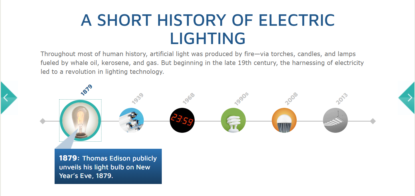
Lastly, I learned about the history of electric lighting. This is an interactive timeline, providing a picture, date, and facts. I find interactive charts and timelines to be very fun. They help you remember what you are reading.
Overall, I thought Sankey was a fun, interactive site, teaching about our energy system in a way that was very visual. This site provided information about the uses, costs, sources, and efficiency of our energy system. I really like the way this data was displayed.
A Pie Chart is a type of graph that displays data in a circular graph. They display the percentage of total. The pieces of the graph are proportional to the fraction of the whole in each category. Each slice of the pie is relative to the size of that category in the group as a whole. The entire pie represents 100 percent of a whole, while the pie slices represent portions of the whole.
Pie Charts are a great way to represent part to whole data, like an actual piece of pie. They are best to use when you are dealing with data that adds up to 100% .
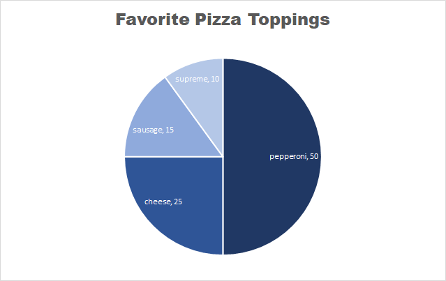
This is an example of a pie chart that I created displaying people’s favorite pizza toppings. Each slice represents a part of the whole, which is 100%.
Some things to note about pie charts
It is best to keep pie charts on the simpler side
Too much data can be distracting and messy
NEVER use 3D pie charts
Always remove the legend – the viewers eyes will be focusing on too many different things
Too many colors on a pie chart can be puzzling
Here is a link to the website that I found these tips on perfecting your pie chart.
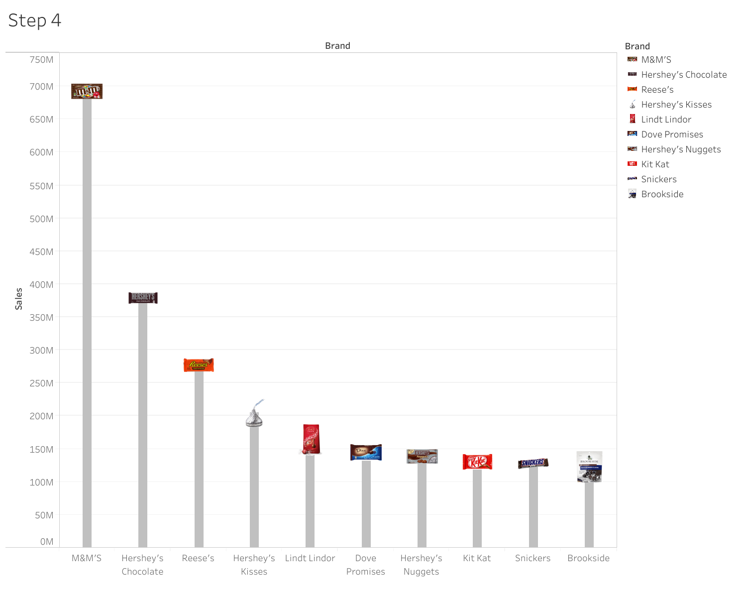
The lollipop chart is a composite chart with bars and circles. It is a variant of the bar chart with a circle at the end, to highlight the data value. Like a bar chart, a lollipop chart is used to compare categorical data. They are visually different alternatives. For this kind of composite chart, we are able to use more visual elements to convey information. The lollipop chart is to be useful compared to a normal bar chart. It is best to use a lollipop chart if you are dealing with a large number of values and when the values are all high. This kind of graph can replace column and bar graphs.
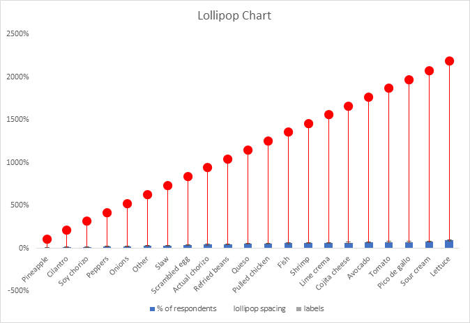
Below is the Lollipop Chart that I created. There is a lot of data in this chart and there are also high percentages. Therefore, a lollipop chart is a great choice to represent this data.
Lollipop Chart By: Taylor Alotto
This is also another example of a Lollipop chart I came across that is a slightly different. This chart was not created by me. I found it so cool how this chart was created and the details that were added. I am linking the website where I found this chart, because the site also shares how to create a lollipop chart. Another cool detail about this site is the graphs are interactive. Check it out! I found the information that was provided on the site useful.
Benchmark data is information collected from industry sources to determine how other firms achieve their high levels of performance. Benchmarks are everywhere. The link that is attached talks about benchmarks and provides a great amount of information on them.
Benchmarks can be great for:
Share your success with clients, grant-makers, regulators, and your Board of Trustees
Feed your performance and quality improvement system
Get folks talking!
Set goals and acknowledge high performance
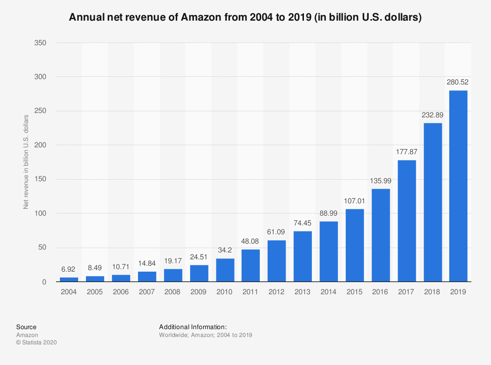
Here is an example of data from Amazon. This is Amazon’s net revenue from 2004 to 2019. The progression of their company is being shown here.
example 1
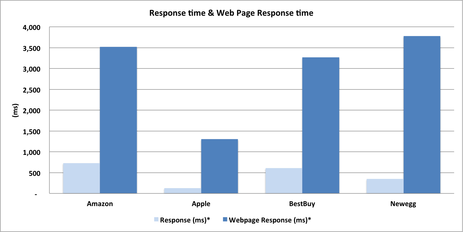
This is another example of a benchmark. This is comparing the response time and web page response time between Amazon, Apple, BestBuy, and Newegg. You can see that the webpage response time is highest for all of them. Overall, Amazon had the highest response time and Newegg had the highest webpage response time.
example 2
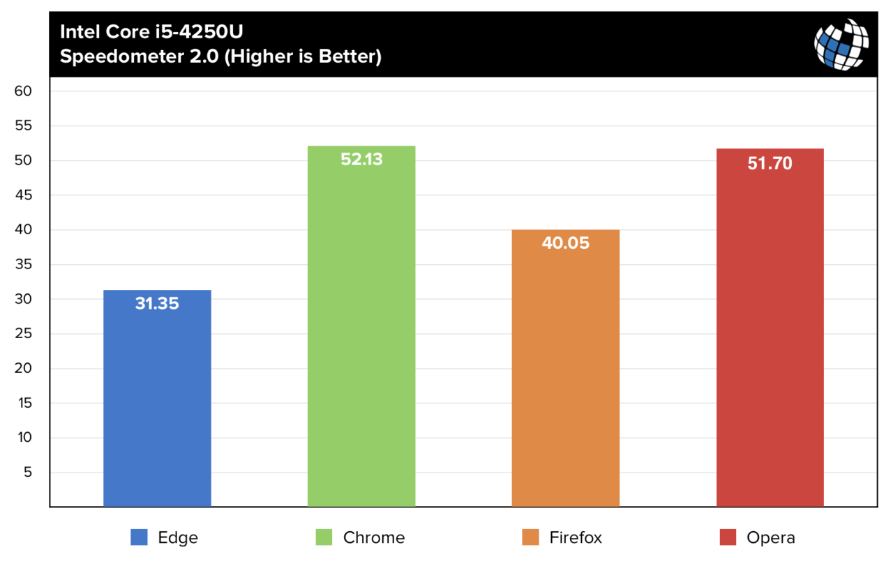
Lastly, this is a benchmark comparing Brower’s. Below they are comparing Edge, Chrome, Firefox and Opera. The highest number is the best therefore, Chrome is the best browser.
Insightful data visualizations can be used to compare numbers. These data visualizations can portray data in various different ways that will compare numbers. Line charts can be used to present data and show how data is similar or different. This kind of chart tends to be easier to view as long as there are not too many lines on the chart. Lastly, line charts are a good way to compare numbers because they show trends, accelerations or decelerations. Horizontal bar graphs can be a good way to present and compare numbers. They provide a nice visual and as long as the data is in order, they are perfect for comparing.
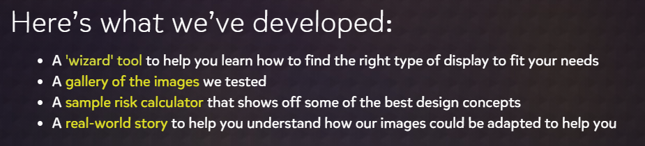
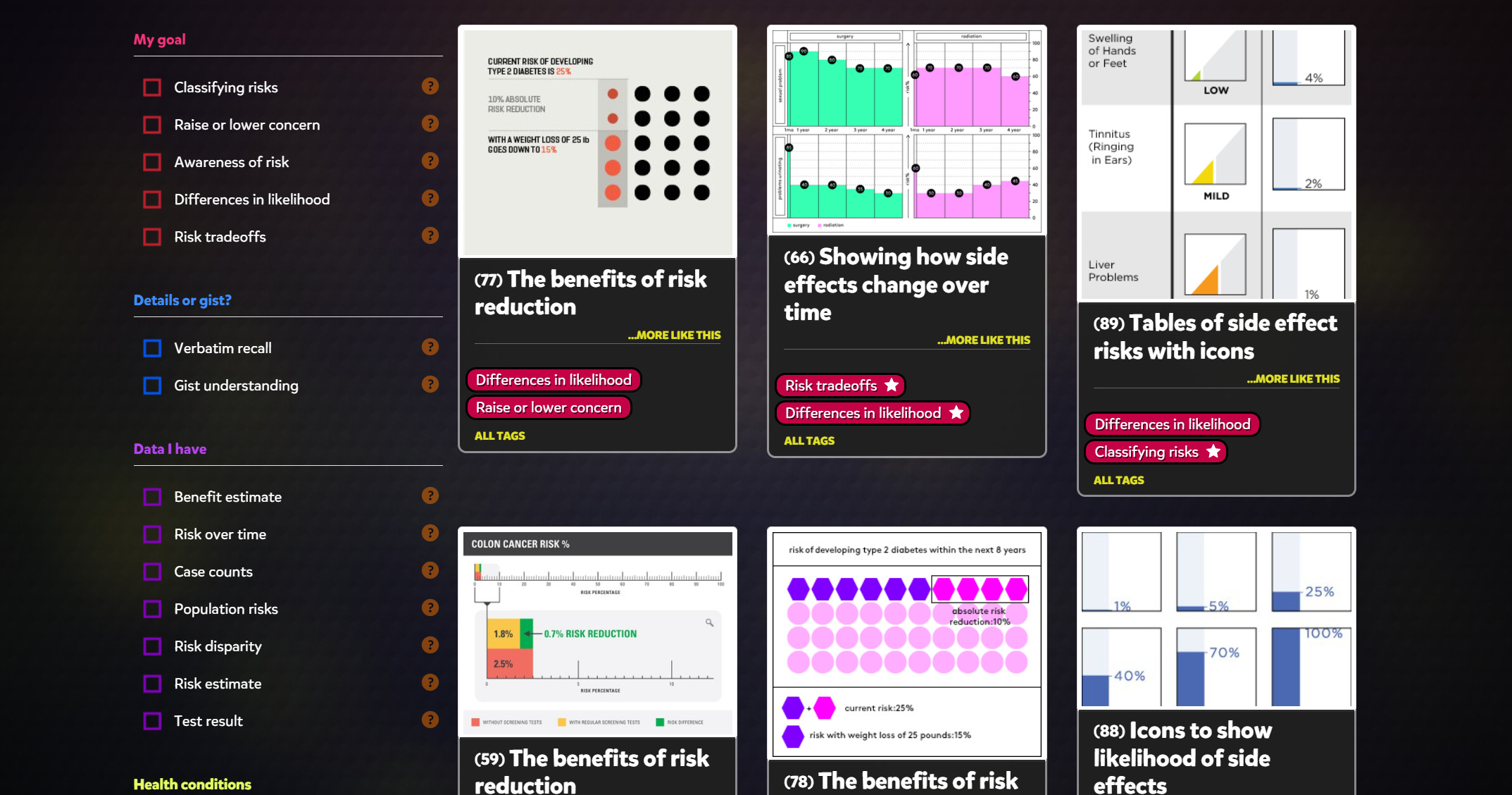
Visualizing health is a website that contains graphic displays of health information that they’ve validated through research among the general public. Visualizing Health was developed by the University of Michigan, with funding from the Robert Wood Johnson Foundation. This website states that data can help people make better decisions about their health. There is a “wizard tool,” a gallery of images, a sample risk calculator, and a real world story. This site contains 54 examples of tested visualizations. The goal of this site was to beautifully display health information.
The Wizard Tool/ Gallery
This tool is designed to help you learn how to find the right type of display to fit your needs. The wizard asks you to choose the information you would like to know more about. I selected my options and the wizard provided me with some data. The picture below is what The Wizard looks like. The second picture shows the data visualizations that came up, which is called “The Gallery”. There are many different options and ways that data is displayed. You are able to choose which way you would like the data presented to you. The wizard will show you the same data many different ways. This is very helpful.
Conclusion
Overall, I think that the Visualizing health website is very beneficial when learning about data visualization. There is a lot of information to view on this website. You can view data 54 different ways, which is extremely helpful.
Data visualizations are a colorful and creative way to present data. It allows you to organize data in a way that’s both compelling and easy to digest. Data visualizations can be animated, colorful, use images, metaphors, and can save you time. They also can explain a process, stimulate imagination, present data in a pretty way, tell a story, and be educational. It is important to choose the best visual for your data and its purpose. It is crucial that your data is understandable. Keeping your visual as simple as possible is the best way to do that. Some examples of data visualizations are charts, tables, maps, graphs, infographics and dashboards.