By Thamina Akther
The first thing that stood out the most after visiting the site and watching the video is the visualizing color and the color coordination of the site. As you can see below, the theme color of the site is very dark, almost pitch black, however, the main topics are highlighted in neon colors. Which is extremely helpful for individuals with astigmatism and light sensitivity like myself.
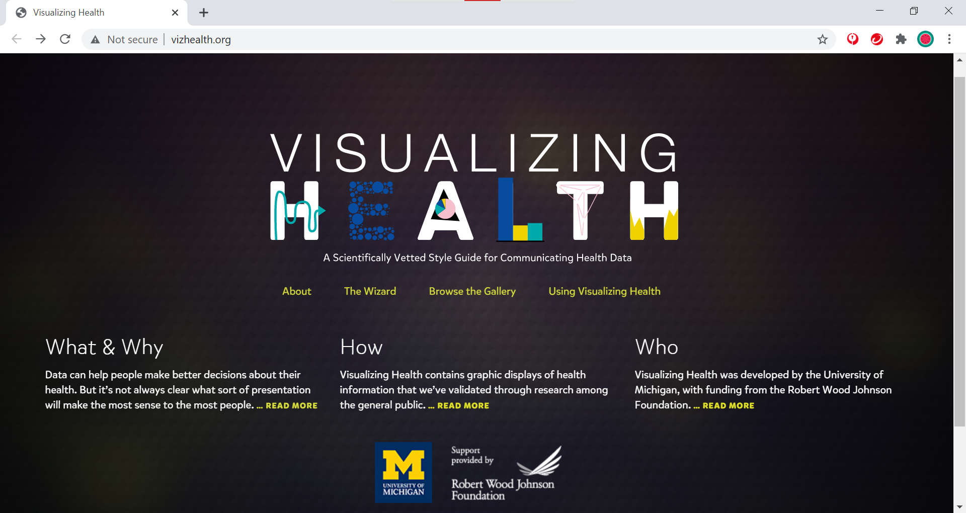
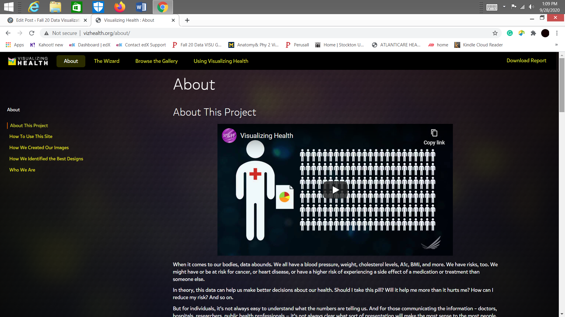
Visualizing health is a scientifically style guide for communicating health data. The homepage of the site contains about four different sections, the about section, the wizards section, browse the gallery section and using visualizing health section .Hence, first and foremost, I visited the ” About” section, in order to learn the purpose of the website. There I was able to watch a video called ” About This Project”, which elaborated on what the project is about and it’s purpose.
According to my understanding the purpose of this website is help individuals learn the right information, along with images for better understanding. Visualizing health also contains a sample risk calculator with design concepts.
Furthermore, after reading the ” About” section, I switched to the ” Wizard” section, where I had to answer some questions in regards to what my primary goal is to learn about the risk factors. In the same page, I was also able to choose whether I wanted to the basic ideas for the risk factors or the exact numbers. In my opinion, these questionnaires are very helpful for first time visitors of the site and also for individuals like myself, who just wants to know what this site is about.

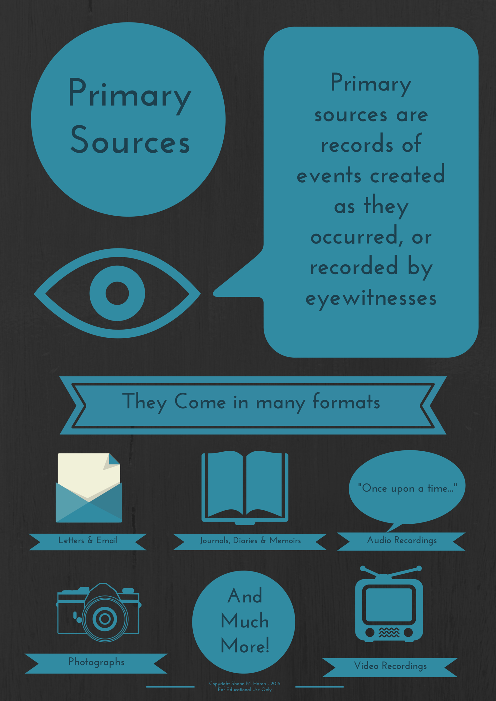
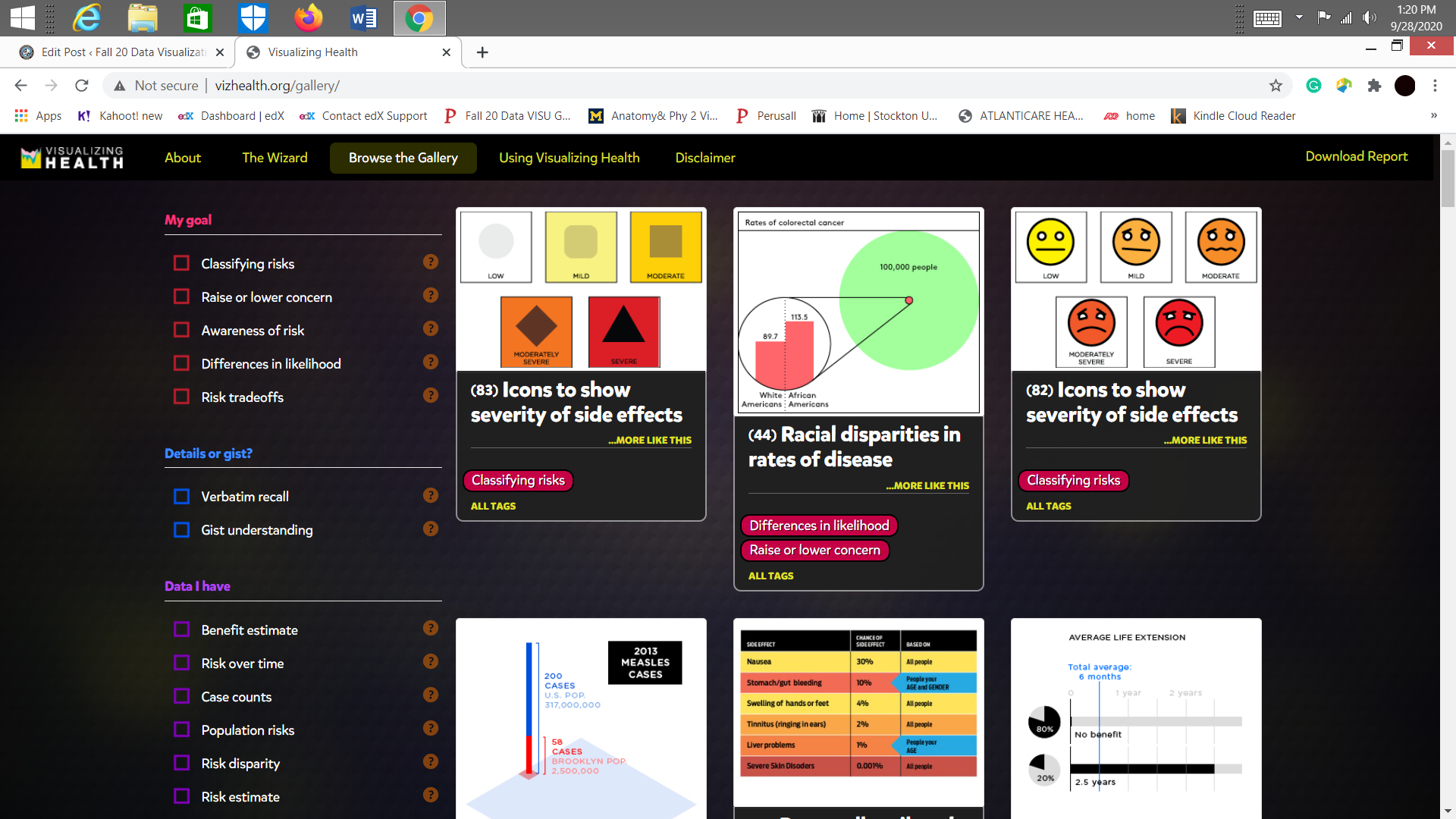
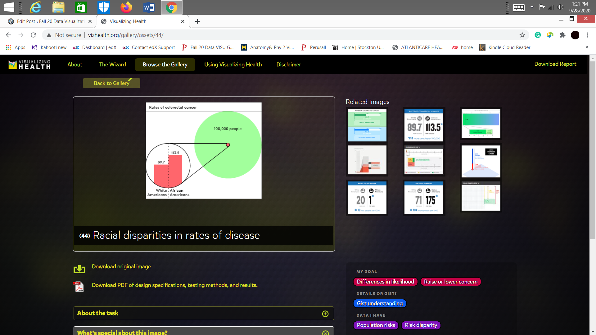
Ultimately, I switched to the gallery section. Which happened to be my favorite section out of the four due to the amount of info graphics and easy to understand information’s. These infographics not only contained primary information but also went in depth about health disparities between different age group, racial disparities in rates of disease, side effects, etc.
In conclusion, my experience with this site has been great so far. I even bookmarked it, as I am curious to learn about about these matters and also about the site. Would recommend as a great tool for health informatics and infographics.