Categories
Uncategorized

Pivot Table Blog Post

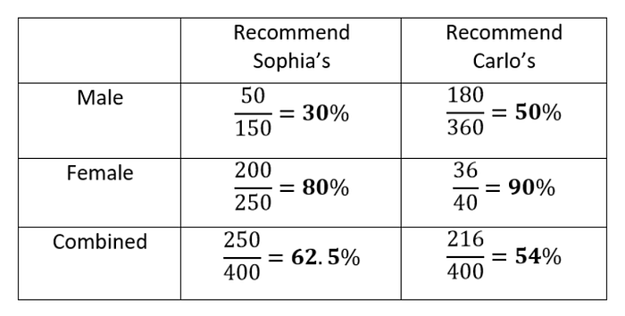
Before realising what pivot table were, I would call them the ‘ranking’ tables, or ‘focusing lists’ or something similar because not only do pivot table allow you to see a list of of data across, easily, they also allow you to order the data you want to look at by whatever column (or even row sometimes) that you want, in other words they let you Pivot the information.

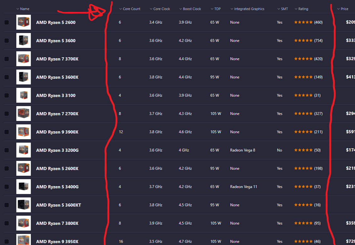
The example above is a website to order Computer parts which I believe incorporate a pivot table in order to help customers home-in on a product that they want to use. If you search for a CPU, for a example, the pivot tables are different then when you search for keyboards, or Storage memory. If you want to pivot the table by price you can click price, if you want to look at the ‘core count’ you may pivot the table that way.

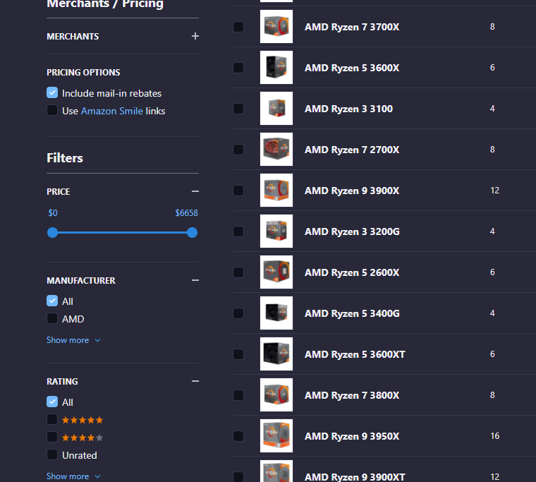
There are more tables and filters on the side to help you focus the data even further, combining the pivot table with other tools such as sliders.

One more Pivot table I was able to find is one I look at every other day by pressing CTRL + SHIFT + ESC on my keyboard in Windows 10.

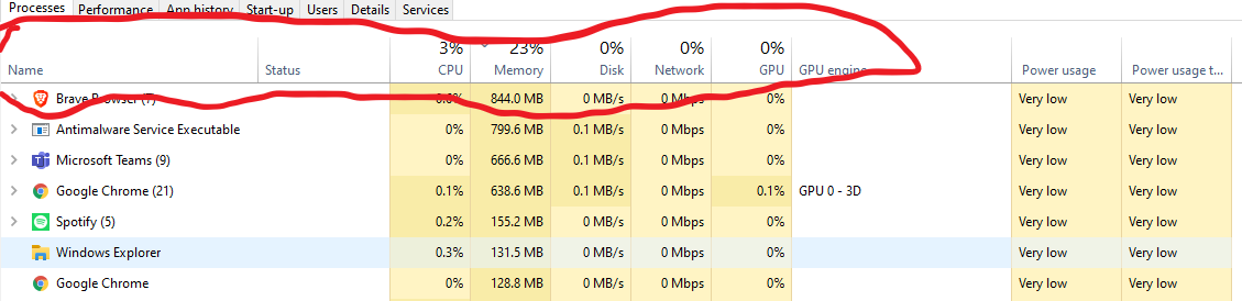
This pivot table allows you to view your computer application activity and you program activity. You can look at the headers and focus or pivot the data. If you want to see how much memory a program is using click that header, if you want to see how much ‘network’ a program is using you can look at that. Or order by power usage.

This is very helpful considering if your computer is running slowly, you can figure out what apps are misbehaving and stop them.

~Haneef Abdul-Jabbaar

Categories
Uncategorized

Sankey Response Post

I will Start of by saying I am very biased toward this style as a STEM major. I this style of info-graphic is reminiscent of of wiring and circuitry.

The fact that you can expand more information by clicking on any certain ‘wire’ and have it highlighted is beautiful and brilliant engineering. in my opinion that is the goal and the utmost peak of an info-graphic or a data story: to be visually engaging and, to educate.

The amount of thought, ingenuity, and information is astounding. Almost no wasted space while not being overly complex and cluttered.
The data story and flow is awesome. Even the dial is interactive.

There is also sources and contact info IN THE SLIDES rather than crammed at the end in a sources page. Which in fine for academic purposes, but realistically you should give credit in the same breath as the when you give the information, especially in this day and age.

Notice the ‘About’ link, and various other information.
Engaging quiz, definition tabs for people who may not know certain words, academic press link. More and more useful information.

A critique I do have is that, even though it’s only one, they used a pie-chart. There are more beneficial ways of relaying this information, but it’s not as bad as most cases and only used as a comparison. You can completely ignore this pie-chart and you would have not missed out on the information so it does it’s purpose of looking pretty, at least.

~Haneef Abdul-Jabbaar

Categories
Uncategorized

Stop Using Pie-Charts

The assignment is to make a good argument for the “perfect use” of a pie-chart. I have found just that

I children’s book, sold in the UK.

A children’s maths book or activity book is probably the only perfect case. Children love look at shapes, and colourful objects, and the illogicality of the pie-chart is the same at any age and any stage of the growing mind

To be Frank, I don’t believe perfect’ case exists, if we define ‘perfect’ as ‘A pie chart would be the best choice, over any other graphical or visual method’. Nevertheless, for the sake of the assignment, I will give an example of acceptable use for a pie chart.

In this example. The slices of the pie is used to give a general size difference to represent the number of the numbers. As we have seen in the ‘bad infographics’ section of the course, too many entries makes pie charts cluttered and pointless. Nevertheless, take a look at this bar chart version of this pie-chart.

Made using the meta chart tool

In this case you wouldn’t keep the percentages, you would use the actual figures each percentages is representing. But the point I want to make is that, that is the entire point of a pie chart: to oversimplify or trivialise the information. Humans do two things poorly: Percentage mathematics and intuitively understanding angle measurement, The pie chart combines two things we are bad and yet these are widely used. The bar graph, however, gets the job done just fine.

For the purpose of the assignment, I chose to use data from a favourite candy bar survey for a pie chart.

SOURCE: https://www.monmouth.edu/polling-institute/documents/monmouthpoll_us_101019.pdf/

As a general rule I keep the elements of a Pie chart below 10. I keep the background a darker colour so that my eyes focus on the pie or wheel, and I keep the colours semi-simple. Keep the labels on the pie chart and the icons labels at the bottom, or the icon legend, is optional, but helps keep reference, even if it is redundant.

In the survey they claim it was taken by over 1100 people. So they took the number an changed it into a percentage. So but if you don’t know that, the percentage is meaningless. God forbid someone assumes a worldwide candy survey. Which would ruin the data considering Chocolate in the UK taste very different, in my opinion.

With that said, pie charts are pleasing to look at. And these days, the general population care more about aesthetics than useful, meaningful information. Here’s an amusing presentation simply titled ‘Pie charts are Evil’ done by Glen Bell, A data governance specialist in Australia.

For the purpose of this assignment I reached out to my university preceptors in both Applied maths and physics, all of them proudly or derisively asserted they have never seen or used pie charts in their entire professional career. This further inspired this section of my blog.

~~Haneef Abdul-Jabbaar

Can you tell I don’t like pie charts?

Categories
Uncategorized

Lollipop Graph

I find that the lollipop graph is useful for small amount of data points, say four to eight. Anything greater than ten and the graph just seems a bit overfilled to me.

I decided to use the data on Worldwide religions to make into a Lollipop graph Both vertical and Horizontal styles

Vertical Lollipops

Unfortunately, I couldn’t get my images to scale properly when I took them out of excel.

The interesting thing about the data is that is seems to be taken in one year (2010) and projected through the future. For example there is projected data for the breakdown in the year 2030. Thus, the numbers may not be accurate to today.

  • Sources
    • https://www.pewforum.org/2015/04/02/religious-projection-table/2020/percent/all/
Categories
Uncategorized

Benchmark or Target Data Examples

From what I understand from the textbook, benchmarks look at a actual data, and compare them to a target data. The target data does not need to be actualised necessarily. It canbe theoretical. In this case, the best example of this to me are the cases of Covid-19, theoretical impact versus the actual impact.

the ‘benchmarks ‘ are coloured.

Notice how the cases in India are compared to possible cases that may occur depending on the responses.

Also the big concept thrown around at the start of the virus’ spread was the “flatten the curve” rhetoric. This lead to many cases of comparing ideal scenarios to the actual cases and data that were being collected.

Example of ideal curve behaviour
Example of cases being put on a similar trend-line in comparison to the target curves.
Categories
Uncategorized

Comparing Numbers

An interesting comparison I found is the separation of years in schooling.

It’s a basic table, but what it fails to represents is that in the UK, you may finished “secondary education” by year 10 or 11. Whilst in the US you are required to do 12 years no matter what. An interesting comparison none the less.

Here is some data comparing schooling days, hours, and time of by select countries.

Perhaps you want to look at survey data and compare that, well be wary of certain tricks that are used!

This may not be interesting, or pretty, but it is very insightful. You’ll notice that the numbers show that male and female audiences separately, preferred Carlo’s shop. As a whole, however, Sophia’s is preferred.

I believe this is very insightful because it looks into a paradox of statistics looking at numbers, known as:

Simpson’s Paradox

This precious little paradox shows that when comparing numbers, it is not always a good idea to take them at face value. There may be factors accidentally, or intentionally ignored when delivering a study. Of course, the boring solution to a case like the one above is to have equal data sets for each group for a proper comparison!

What if you legitimately have an unbalanced data set, that you cannot balance? Then you simply cannot properly compare the data sets. You must change the data.

A funny little presentation by Glen Bell, an Australian data governance specialist, explain how to not represent data.

sources

https://towardsdatascience.com/simpsons-paradox-how-to-prove-two-opposite-arguments-using-one-dataset-1c9c917f5ff9

https://ncee.org/2018/02/statistic-of-the-month-how-much-time-do-students-spend-in-school/
Categories
Uncategorized

Visiualising Health Data

Haneef Abdul-Jabbaar

Blog Post 3

This website and the way it works came at a very interesting time. My dad is currently going through health complications and frequently complains about the feedback that doctors give people such as him. It is not intuitive, to my dad, and many other people. He would have to go to another doctor in order to hear another explanation. Which, realistically, should never have to happen. Especially when health care isn’t always free.  And it’s not necessarily anyone’s fault.

Instantly, someone like me looks for verbatim data, and where the concern should be so I appreciated the tiny quiz. I personally fail to see the benefits in “gist understandings.” Perhaps if you legitimately do not care about your health, but I’m not sure.

The Risk calculators are, without a doubt, my favourite part, and finding intuitive ways to share calculated figures and a beneficial way is a goal of mine. There were a few boring graphs.There is always some difficulty with displaying very small or large numbers, but imagination is key. 

There should always be a balance of visual data and practical knowledge, but In general, seeing more stuff like this may lead to some benefit.  

Categories
data visualizations Examples Infographics

Insightful Data Visualisation

There are several very popular and well done data visuals that I find attractive and useful and I thought I would share

  1. Covid-19 Spread Data such as the one put together by the John Hopkins University. Probably my favourite data set put together in the last decade. The visuals change with data, it’s attractive, and it almost tells a ‘story’ of the Covid-19 and it’s behaviour around the world

2. Plastic Waste data Set. Made by National Geographic. It is kinetic, interactive , stimulating, and, even though some of it is not that pretty, they do that on purpose to show just how gross you should feel about waste.

3. Sydney Morning Herald’s sexual violence infographic.

this data set that was put together no doubt too much more research, and imagination, and time to put together. It is very interactive and tells a story with the data.

Source: https://en.rockcontent.com/blog/data-visualization-examples/