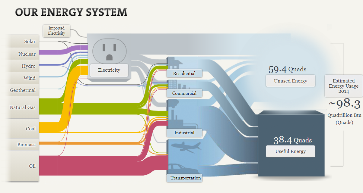
This week I had the pleasure of looking into the inner workings of the US energy system through the National Academies of Science, Engineering, and Medicine. Their approach to visualizing US energy production through the use of a SANKEY graph, pictured below, was very unique but fitting at the same time.

The beginning phase of the graphic already does a lot to convey the basic functions of the energy grid and the its various aspects. The flow from source to energy use is very natural and lends itself well to establishing the fact that the generated energy has to be moved through various stages before reaching its intended destination. When combined with the useful and unused energy figures, it establishes that there is some inefficiency in our current electrical grid that will lead to energy losses during transmission and that our current generation sources are not as efficient as we might believe.

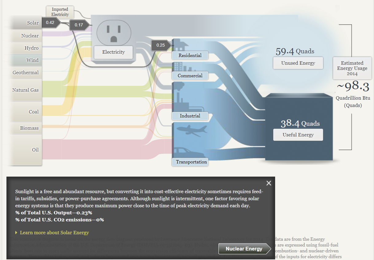
The option to expand the tabs on the left to access more information is useful as well. It helps keep the main space of the graph from becoming too cluttered with information. The breakdown of where the energy goes in terms of electricity and other uses is cool too, as it helps show off the fact that not all energy produced in the US is directly used for electricity generation. Some may be used for industrial process or for other applications like heating for homes an businesses in the case of oil and natural gas.
Overall I found the SANKEY graphic very fitting for this kind of information, but I can see it having very limited usefulness anywhere else. It seems like it would only be a good fit at describing processes that flow naturally from one step to the next.