This website is an excellent tool for those collecting data that concerns the U.S. primary energy sources. You are greeted by a bar graph visualization portraying the “start” button for the visualization but also some insightful information about the energy usage in 2014. While this is not a lot of information to start with, it is enough to entice the audience to delving into the presentation further.
Once you begin the presentation you are greeted by the following visualization pictured below!
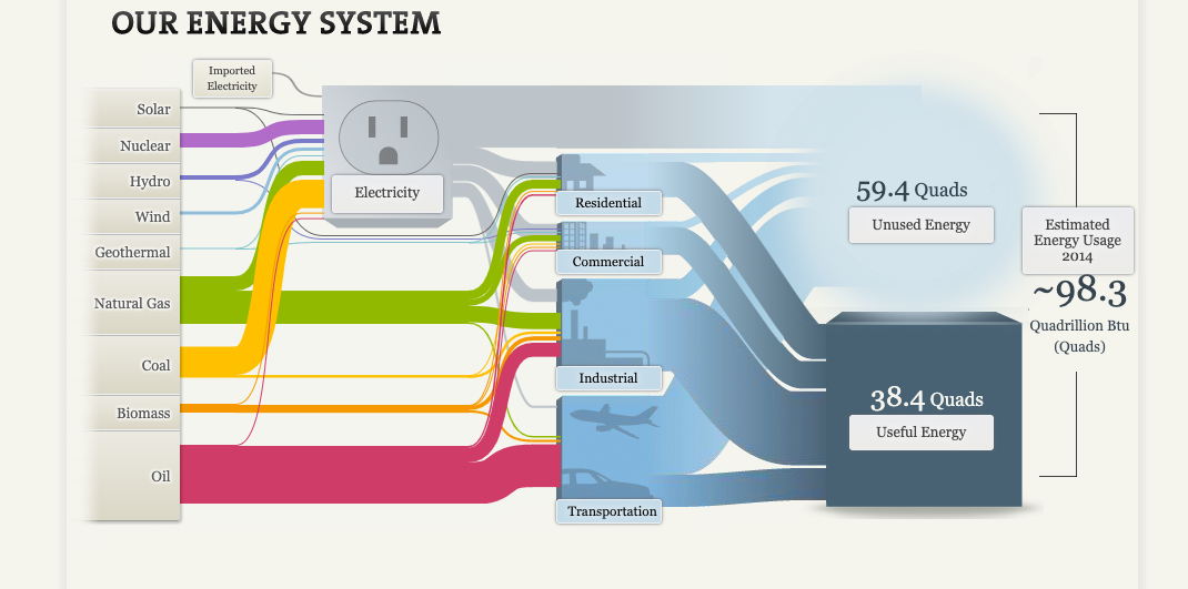
The above visualization contains a lot of information to say the least! The very first thing I notice about this visualization are the colors. Pictured above you see the colorful “cords” on the left hand side of the visualization, and blue tubes on the left. The colors in this visual do wonders to help the audience interpret each individual topic. However, this visual would not be very useful in a presentation where the presenter did not wish to explain this visual. This is because the audience will need some context of where to look on the visualization and why for the presentation. Each topic on this visualization is also a link to a different screen containing data and visualizations concerning the topic selected.
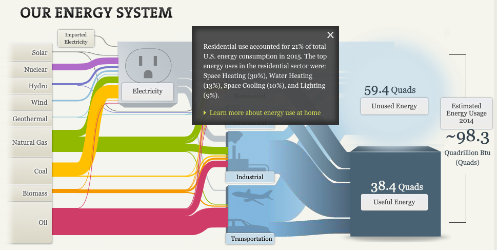
For this blog post, I choose to delve into “residential” energy use. As seen above, a small pop-up appears containing a more information on residential energy use within the U.S. How crazy is it that the residential energy use accounted for 21% of the total amount of U.S. energy usage!?
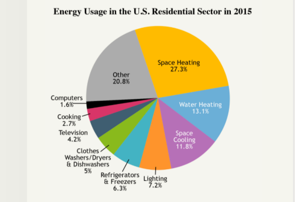
Once navigating to view more information about U.S. residential energy usage, I found this pie chart visualization. In 2015, the largest contributor to U.S. residential energy usage was space heating (27.3%) followed by water heating (13.1%). Space cooling (11.8%) came in third and was followed by multiple other factors that contribute 8% of less. I do think this visual was effective in communicating what it needs to. However, I do feel that the colors distract from each individual topic. I think this would be more effective to use the pie chart to point to one colored factor (such as space heating) and leave the other factors in a grey/ neutral tone.