So off the bat I imagined I was in for a somewhat dull interactive, because how could you possibly top a website called snakey, even though I had no idea what it was about.
I was pleasantly surprised! Mostly because I have a vague and slightly threatening interest in nuclear chemistry (threatening in the sense that I’ve read a lot of books on the subject and vague because come on… there’s a lot to know and I’m a neuroscience student with a full time job. I’m busy). In the technical sense, I’m fully aware of the problems nuclear energy has and can cause (hi, Chernobyl, Three Mile Island, and Fukushima) and that it isn’t exactly the lowest cost form of renewable energy but I was excited nonetheless.
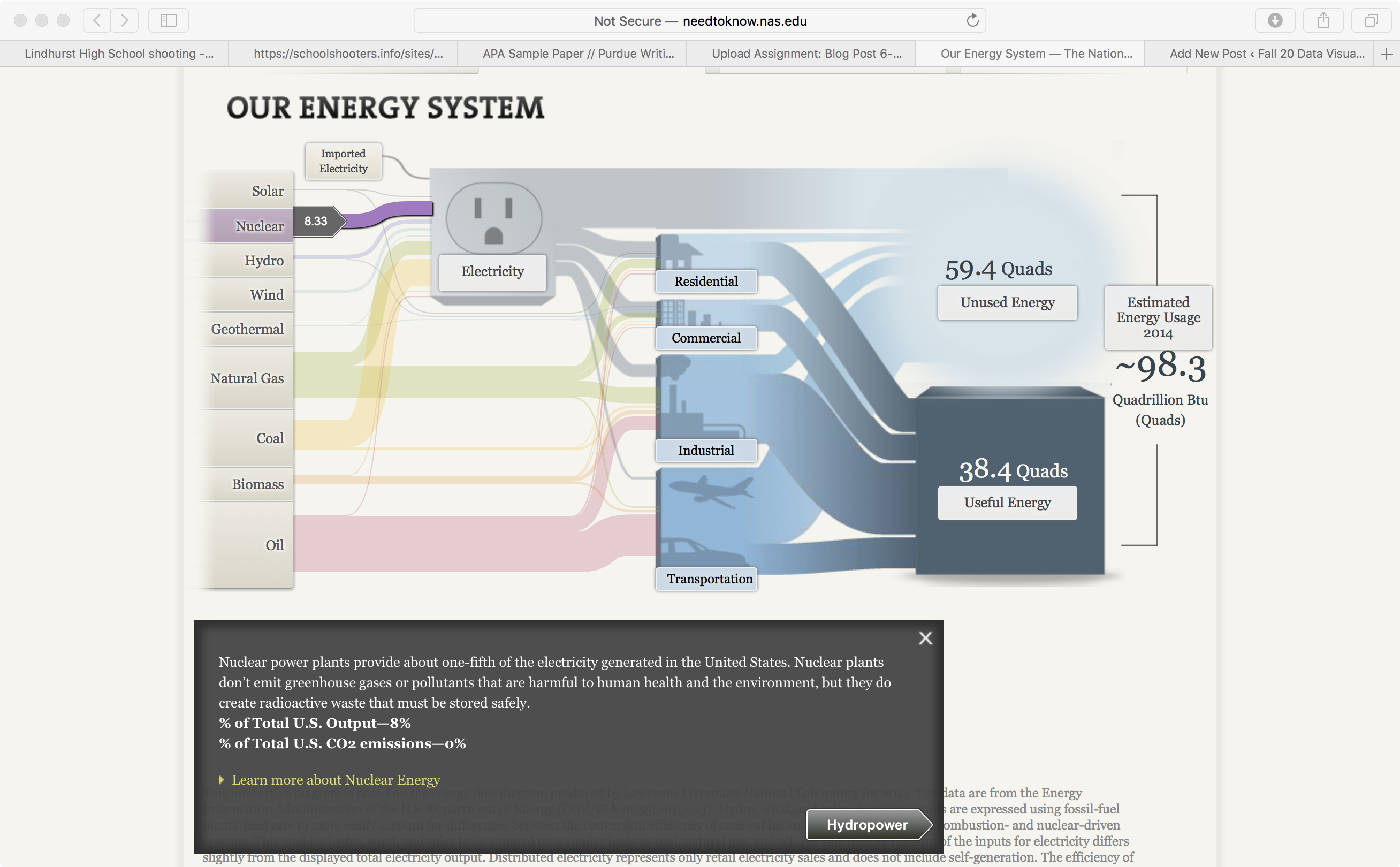
Naturally the first place I went to was the nuclear energy system tab. As previously mentioned I knew that it isn’t a super popular form of energy but I was surprised to see that the data had gone up from the Three Mile Island incident back in 1979. The thing about nuclear energy (other than the extreme danger to those around a reactor if something goes wrong, or the massive amounts of radioactive isotopes that spread through the air and ecosystem in the event of an explosion) is the safe storing of radioactive waste. Uranium has a half life of 4.5 billion years and even then it only gets broken down into radian-226. Uranium waste is highly radioactive and notoriously difficult to store, so it makes sense that it isn’t the most popular form of energy.
Now, for the design.
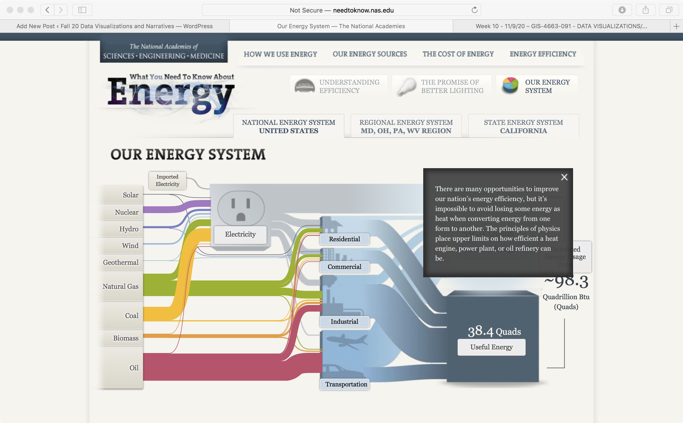
This website still feels like it’s in a beta version. I’m not a wiz with coding or anything but just by looking at it and comparing it with other websites that have been beta’d (Instagram, Twitter and Facebook all were beta at one point) it just feels outdated. I checked to see the copyright year, just in case this website was out of date but it wasn’t. It just looks old. I find the use of clunky graphic and text boxes to be unappealing visually. Having your data pop up in front of your graphic kind of defeats the purpose.