Pie charts are really good at displaying data in a simple form. They are easy to look at and they are not overwhelming with data. They are meant to be simple and are amazing at displaying part-to-whole data.
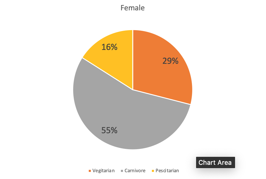
This chart took me no more than 5 minutes to make and I think it’s pretty self explanatory. I think the different kind of eating habits for women. The data set is just made up but I did it just as an example to show how simple it can look. I also changed the colors so that it’s easier to identify the different sections. I think it is so easy to read and it is visually appealing to the eyes.