Pie charts are a very interesting visualization as they cause some uproar for being invaluable and basic. Even with this belief, there will always be a great case for using a pie chart! In this blog you will explore one of these examples to better understand when you should and should not use a pie chart.
Example:
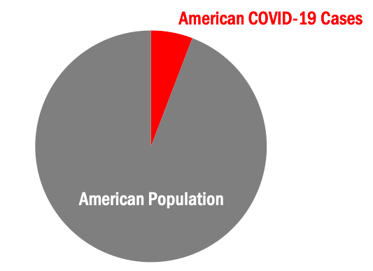
Today, we will explore a case that is perfect to visualize in a pie chart. This case is, coronavirus (COVID-19) cases in the United States versus the United States population. As you can already see, our pie chart will have two slices. A very important rule for pie charts is to stick with four or less slices per visual. This allows your audience to better understand what you are showing them.
Step One:
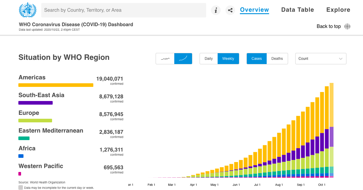
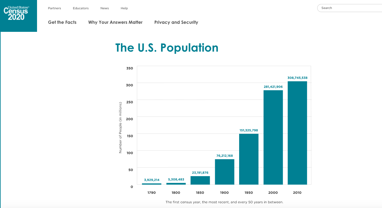
The first step in creating your pie chart is to collect your applicable data. Here I used the World Health Organization’s Coronavirus Disease Dashboard & the United States Census population data from 2010. Both of these resources are pictured below.
Step Two:
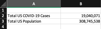
The second step in creating your pie chart is to construct your data in Excel. Pictured below is what the data table in Excel was for this pie chart example.
Step Three:
The third & final step in creating your pie chart visualization is to simply insert a pie chart visual & format your pie chart exactly how you’d like it. Remember, your audience craves something that is clean, clear & concise with it’s information. Do not clutter your pie chart with excess data causing it to have too many slices. Also consider highlighting your “important” data with color and making the other data a neutral color (like grey). An example of this can be seen below in the pictured final product of the United States COVID-19 cases example pie chart.
Wrapping It Up:
Remember, in order to have an effective visual you must only include the needed data and nothing more. A pie chart is a visualization that is best suited for simple datasets where complex datasets may need more then four slices and this is a no-go for pie charts! Allow color to help you highlight specific key details easier to your audience. I’m certain you noticed your eyes peeking at the red slice for COVID-19 U.S. cases in the above pie chart before the grey slice for U.S. population. This was exactly what I had intended the red to do, grab your attention! Using this information you will now understand how to create an effective pie chart visualization!
One reply on “A Case For Pie Charts!”
The Covid pie chart was a really good example , that opened my eyes on the Covid cases in the us. Even though its not a huge chunk, the amount of cases throughout the whole us population is insanely large !