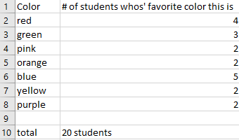
I believe one of the easiest ways to show how a pie chart should be used is to use “people’s favorites” of any topic. I provided a made-up survey of students and their favorite colors (out of 20 students). I plugged in the survey into excel, highlighted it, then inserted a pie chart with that information.

The website I provided explains what a pie chart is, the way to make a pie chart, how to get the percentages for each section of the data for the pie chart, and more.
https://www.mathsisfun.com/data/pie-charts.html