Lollipop charts can be used where bar chart ink may be visually overwhelming. Shrinking visual obstacles can increase the readability for a large set of data. The base of a lollipop chart is a scatterplot. It is a little bit more complex to create than a bar chart, but it is more visually efficient than a blinding wall of bars. We can edit more individual pieces of a lollipop chart than we can with a bar graph. We can replace each dot with a related icon for a more detailed illustration and it won’t clog the graph like in a bar chart.
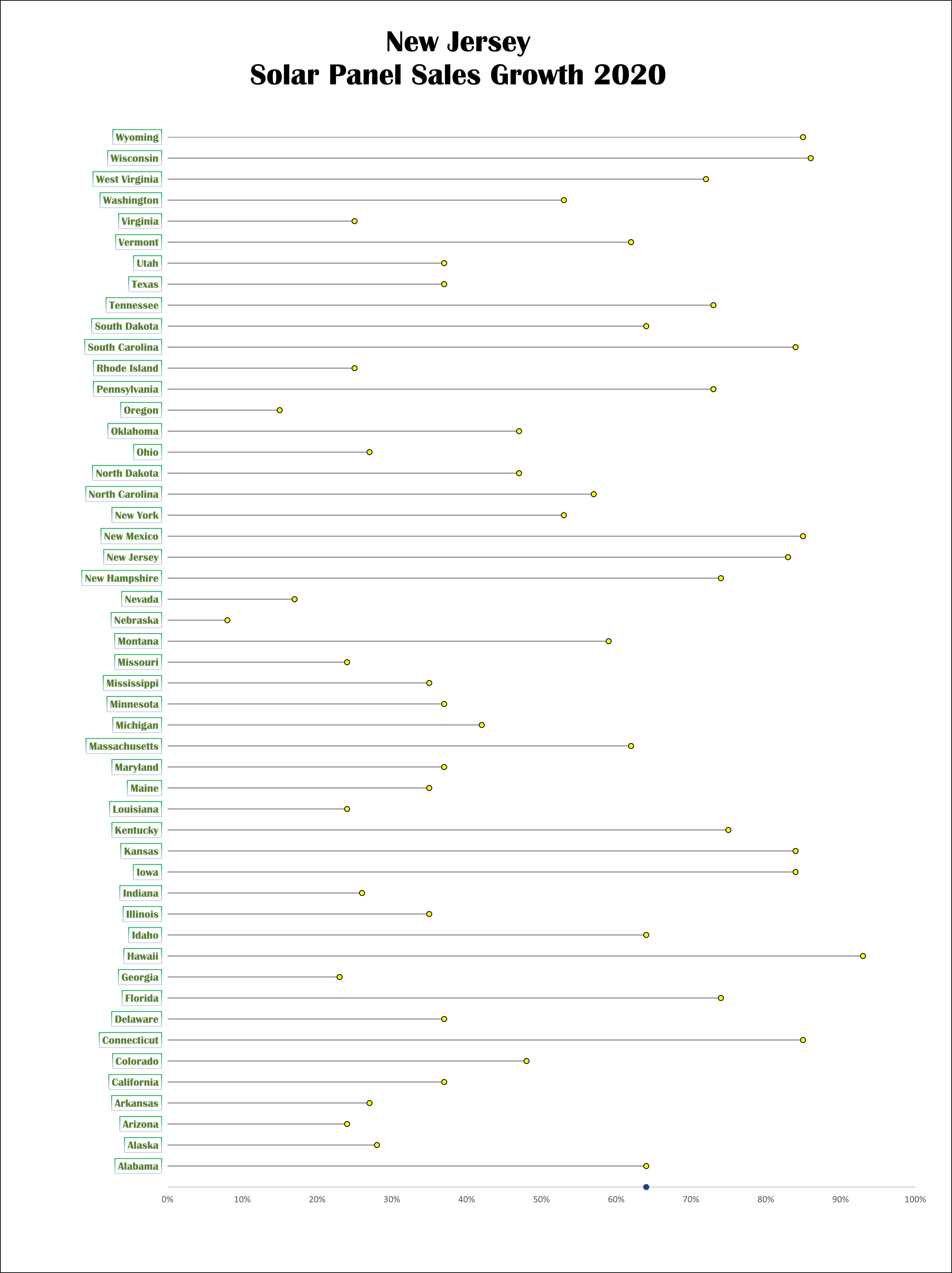
Solar Panel Sales
For my lollipop chart design, I converted data given to us for a different graph into a theoretical sales graph for solar panels. I used to work for a solar panel company so that was my motivation for creating this. I used green and yellow to help symbolize the data as renewable energy. Yellow for the solar energy. Green for the greener environment.