I find that the lollipop graph is useful for small amount of data points, say four to eight. Anything greater than ten and the graph just seems a bit overfilled to me.
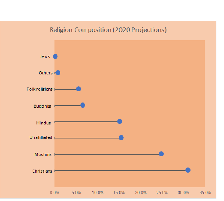
I decided to use the data on Worldwide religions to make into a Lollipop graph Both vertical and Horizontal styles
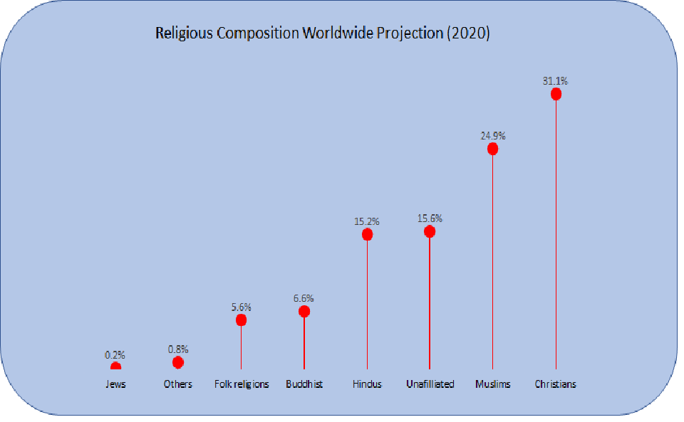
Unfortunately, I couldn’t get my images to scale properly when I took them out of excel.
The interesting thing about the data is that is seems to be taken in one year (2010) and projected through the future. For example there is projected data for the breakdown in the year 2030. Thus, the numbers may not be accurate to today.
- Sources
- https://www.pewforum.org/2015/04/02/religious-projection-table/2020/percent/all/