October 15th, 2020 by Erika Kacprzykowski
Lollipop charts are alternatives to bar and column charts and are used to compare categorial data. They can be vertical or horizontal and are great tools for large datasets or when the numbers are extremely high. In short, these charts include circles at the ends of their lines to highlight the data value. These charts make the visualization easier to read and more appealing as a big chunk is taken out of the bar or column. The most important part of these graphs is where the lines end, telling us the value.
Below is the lollipop chart that I created using a site called https://excelk.com/en/lollipop-chart/. The site included a few steps to turning any bar graph into a lollipop chart. I found that using this website was much easier than following the textbook.
As for my dataset, I found Nike’s annual revenue over the course of 12 years on https://www.macrotrends.net/stocks/charts/NKE/nike/revenue
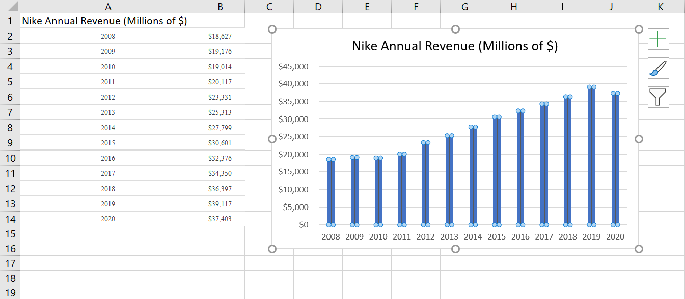
The first step was to create a simple bar graph by highlighting the dataset and adding error bars by clicking “Add Chart Elements” and “Error Bars”. In order to get the lollipop effect, right click on one of the error bars and click “Format Error Bars”. In the direction group, select “minus”, in the end style group, select “no cap”, and in the error amount group, enter a value of 100% under the percentage field.
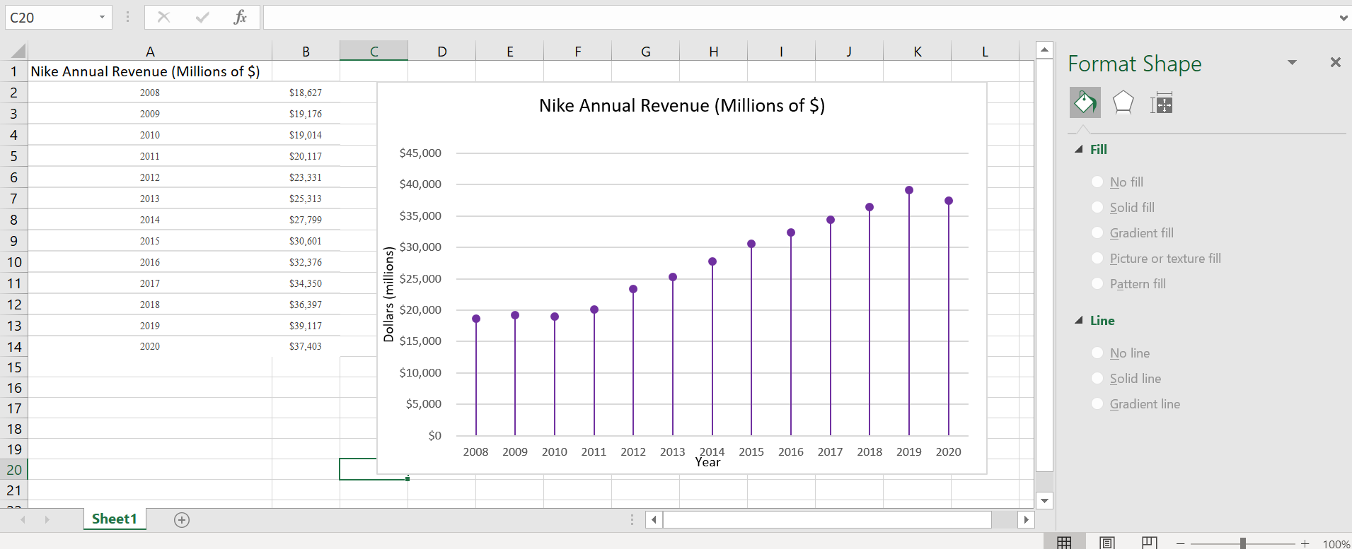
Under the fill and line menu, click on the line which starts with the circle and change the columns to transparent. This way, only a line and circle are visible. Label the x-axis and y-axis and title.
Overall, this site was extremely helpful in creating a lollipop graph. It appears challenging at first, especially in the text, but it was fairly simple. These graphs are great to use for comparative data and are visually more appealing than the typical bar graph.