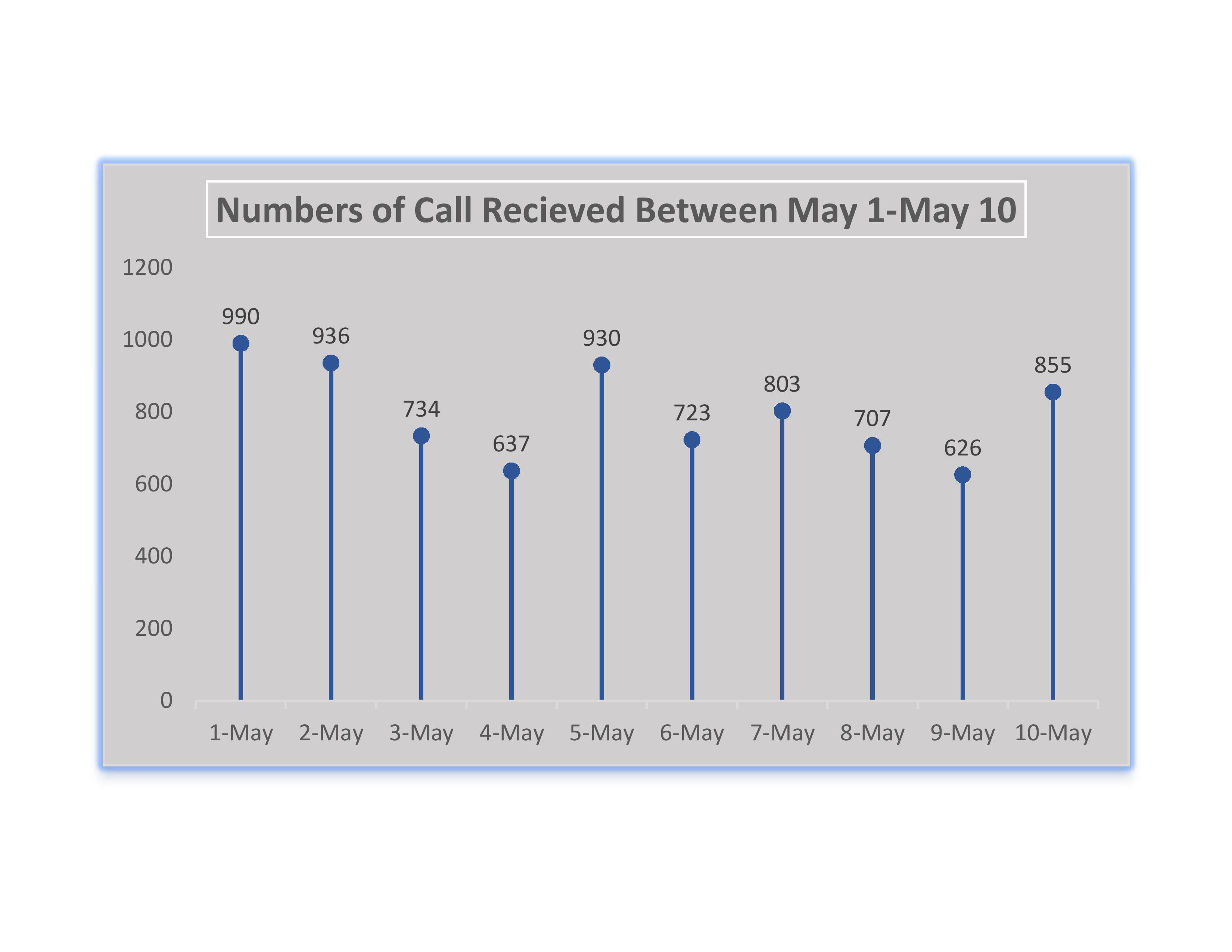
A lolipop chart is a type of modified bar graph. These charts can either be visually attractive or just confusing depending on your data. It is very important to recoginze what data you have when it comes to creating charts and this is also true with lolipop charts. If your data has high number values then a bar graph will look too agressive with columns being too high. This is when a lolipop chart should be used. Instead of a traditional bars in a bar graph, a thin bar will replace the columns and the thin line will have a bulbous end. Below is a lolipop chart representing a high amount of calls that a company recieved within 10 days.
One reply on “Lolipop Charts”
Great description of the lollipop charts! The reader can easily understand the purpose behind these graphs. Your lollipop chart looks great as well. It is very easy to read and an efficient tool. One suggestion would be to put a caption under the photo or in the paragraph. Also where did you find your dataset?