A lollipop graph is a unique way to represent data and make comparisons between different figures or categories. Lollipop charts are favored over bar graphs when displaying figures of high values. Unlike bar graphs that present data in a cluttered way with a stack of bars, the lollipop chart allows the audience to better grasp the information that the chart is represented in a clear and concise manner. However, this type of chart has its limitations, it is not used to analyze for distribution, relationship, or composition.
This figure shows a comparison between a bar graph and a lollipop chart.
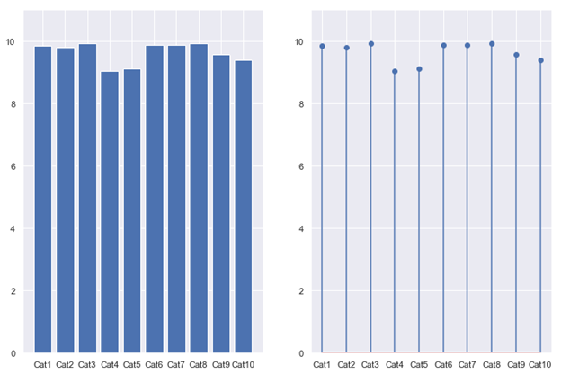
There are two different types of lollipop charts, one is with vertical lines, and the other with horizontal lines. Both graphs offer the same visualization, but with different angles.
In conclusion, lollipop chars are a great way to keep data simple, clear, easy to understand, and easy to compare and contrast by the audience.
Reference: Stephen ie D.H. Evergreen. Effective Data Visualization. 2nd edition
2 replies on “Lollipop chart”
Do you think that there an Atlantic see’ ideas or at least a lake of expectation of drawers to create wonderful photographic visualization? For me, only a drop in the Atlantic Ocean of ….. Sad!
That’s why we need to study this class.
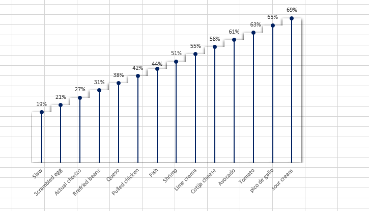
I like the second example you found for the lollipop charts. It looks appealing the way it is setup like a staircase and maintains a bit of the characteristics of a bar graph.
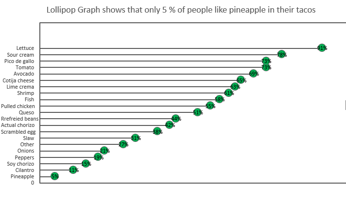
I like how you expanded the dots of your lollipop chart to find a clean place to use the percentage as a data label. This is more readable by removing the need to visually trace the percentages back to the X-Axis.