What is a lollipop graph?
A lollipop graph is a visualization that is great for comparing up to three different types of data such as year to year or before, during and after. Typically, a lollipop graph can be used where a bar graph would be used and is often more visually appealing. Lollipop graphs are not ideal when you are using a dataset with stacked-bars or with data that has very similar end results. An example of this would be an experimental dataset with thousands of results ranging from 0.00 to 0.05. It would be extremely difficult for an audience to differentiate what exact values the bars are representing.
How to create a lollipop graph…
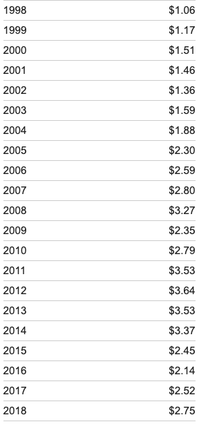
When looking for a dataset to create a lollipop graph with it is important that you choose one that is appropriately measured by a scatter plot, as this is used to create your final visualization. Keeping this in mind, I selected to create my visual using the average gas prices over the past twenty years, this dataset is pictured below.

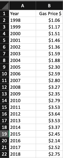
After selecting a dataset I moved into Excel to begin creating my lollipop graph! First, you should translate your selected dataset into a table in Excel, as pictured below using my example dataset.

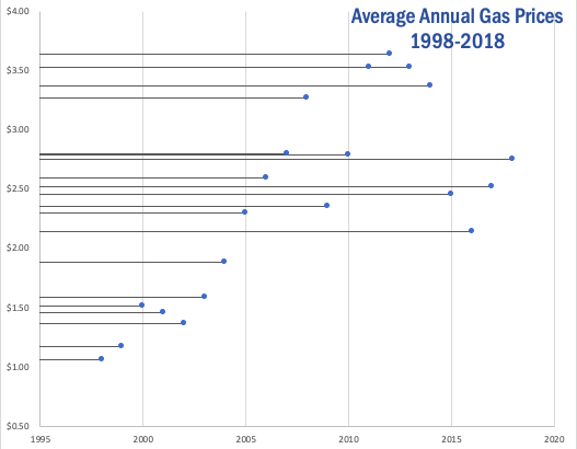
Once you have your dataset translated into an Excel table, you will insert a basic scatter plot graph to represent your data and make a few other formatting changes. These will include adding horizontal error bars, changing the error bars direction & altering the error amount. Once you have completed this your lollipop graph should look similar to the one I produced using my dataset below.

As you can see, a lollipop graph is a much more visually appealing when compared to a simple bar graph. While it may be a little more work to create, it can make a huge difference in what your audience takes away from your visualization.
2 replies on “Lollipop Graphs!”
I really enjoy how you created a mini tutorial on how to create a lolipop chart. That is something i did not include in my post but probaly should have. After all, this is a blog and is meant to inform others !
definitely easier to follow your instructions over the instructions that were in our textbook. I wish I had thought to do this idea for my blog post, so refreshing over the basic boring data for graphs I didn’t even make but got of nytimes website.