October 11, 2020 by Erika Kacprzykowski
Benchmarks are added to graphs to add context and are commonly used throughout the media. Below are some examples found online:
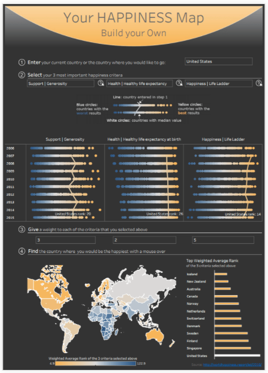
In the image above, you can find the country where you’d be the happiest. By choosing your three most important happiness criteria, you have the ability to find the best country for you. Benchmarks are displayed as orange lines straight down the middle of the diagrams as well as colored dots showing countries with the worst and best results. This can be very helpful and is easy to read.
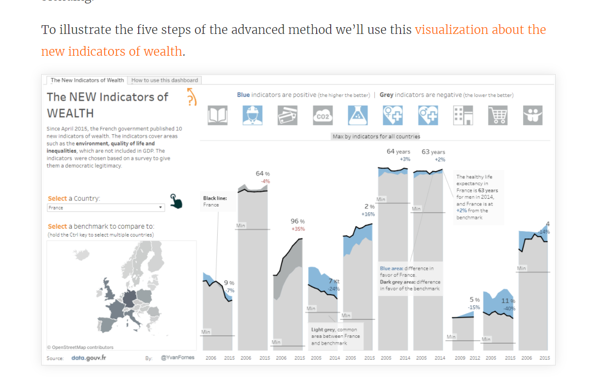
This visualization about the new indicators of wealth cover areas such as environment and quality of life. As there is a lot of information here, benchmarks can be super useful tools in helping understand data. The light blue areas give you a difference in favor of the country selected, the light gray is the common area between the country selected and the benchmark, and the dark grey is the difference in favor of the benchmark. While some visualizations show benchmarks using lines, this one uses shaded areas.
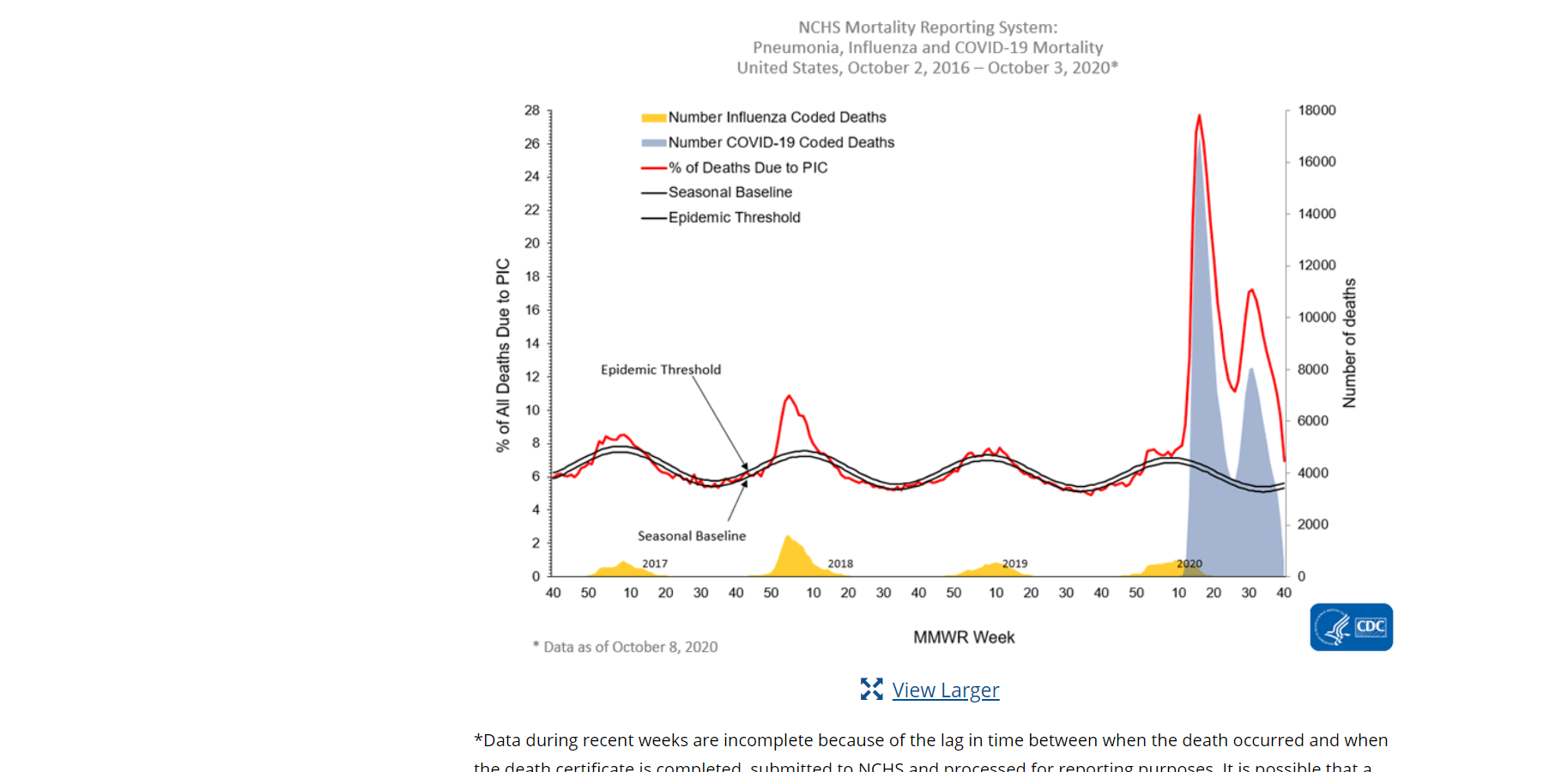
This screenshot above from the cdc website shows mortality rates of pneumonia, influenza, and COVID-19 in the United States between October 2, 2016- October 3, 2020. The graph shows a seasonal baseline (benchmark) with a black line and uses different colored lines and colors to represent several categories.
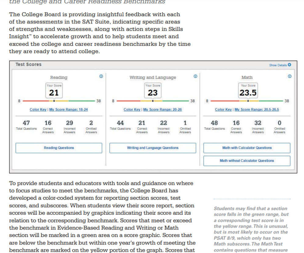
The College Board provides insightful feedback each year with assessments of the SAT exam. Your own score is compared with the corresponding benchmark in Reading, Writing and Language, and Math. These benchmarks are represented by different colors. Red- need to strengthen skills, Yellow- approaching the benchmark, and Green- met or exceeded the benchmark. As they mention, color coding for test scores and subscores show students if they are on the track for college readiness.
Conclusion
Benchmarks are a very useful tool in providing the audience with a number to compare the data to. Whether we notice them or not, they are used daily and can be displayed as lines, areas, different colors, etc.
One reply on “Benchmarks”
I like your reference to the SAT’s. I think that is very relatable to the audience. I also agree with your conclusion and think your blog post was very well written!