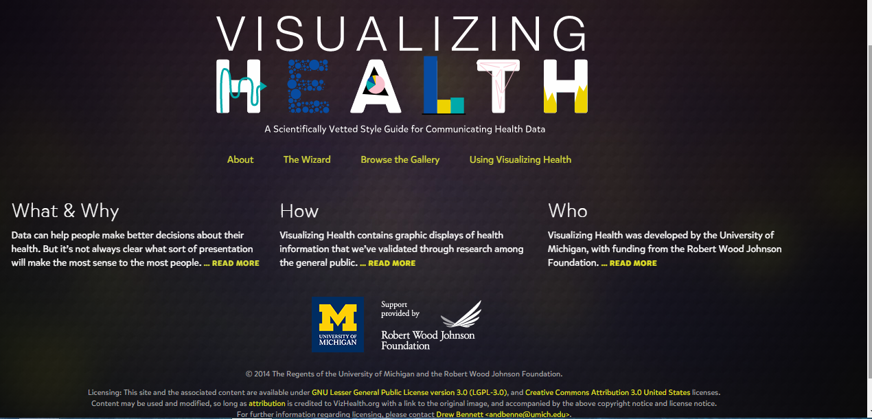
: is a unique way to transfer medical data about health conditions into charts, graphs, and diagrams that are easily understandable by a broad audience. It enables someone to better understand their health risk, uses icons to represent side effects, and benefits of reducing risk.
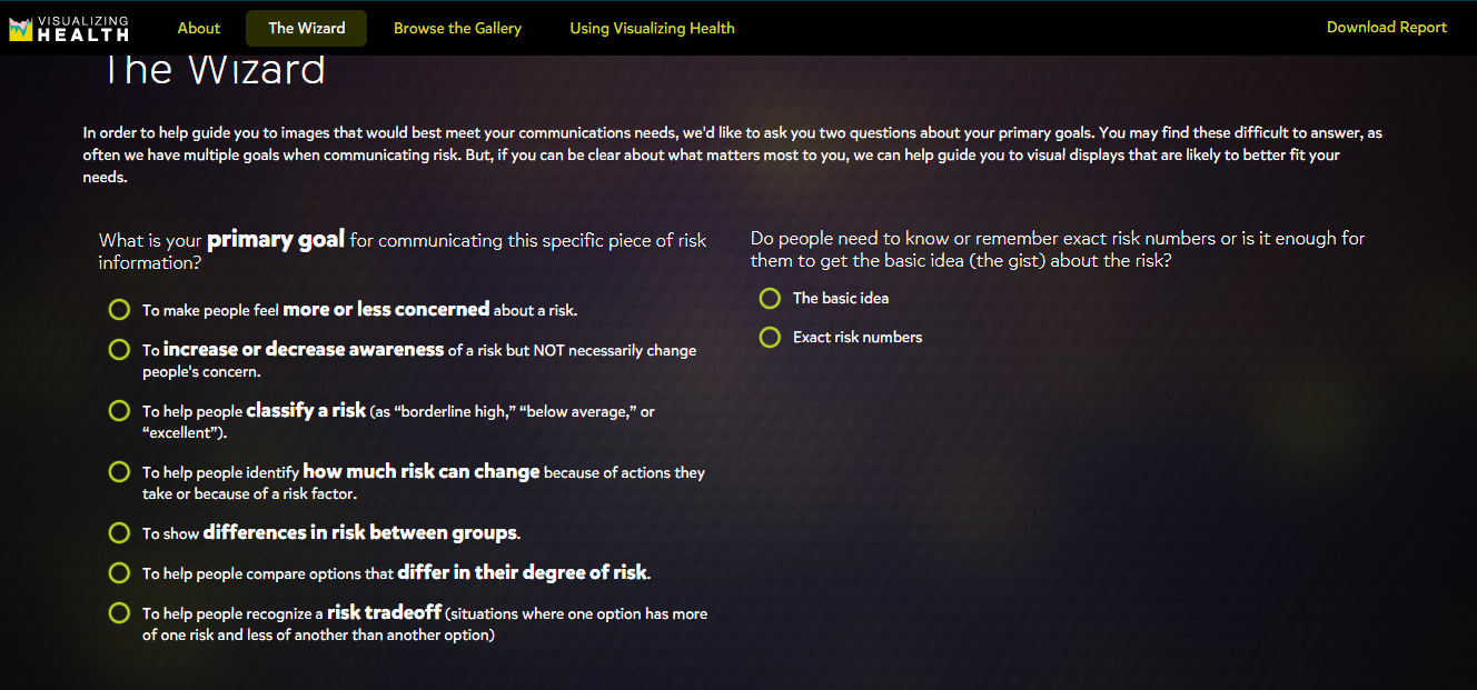
Figure 2: The Wizard is an interesting tool for visualizing health. It’s used to assist individuals in carefully choosing their primary goals when it comes to their health. For example, an individual who smokes a lot might want to know what are their chances is of getting a heart attack, stroke, or lung cancer.
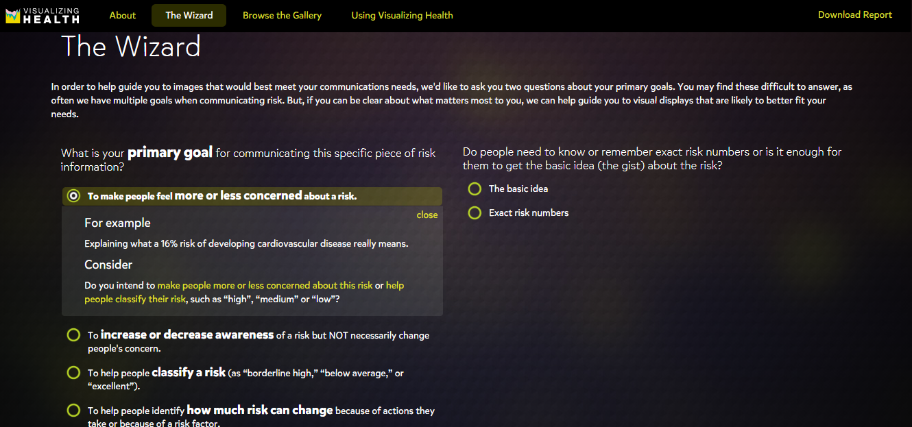
Figure 3: By clicking on the goal, it then displays examples of the risks or racial disparities and it asks for a reason for choosing the goal. This is a great way for individuals who are uncertain about the right steps that are needed to reducing their health risks. The Wizard breaks down complicated medical questions and conversations about health risks into simple questions that the individual can understand through visualizing.
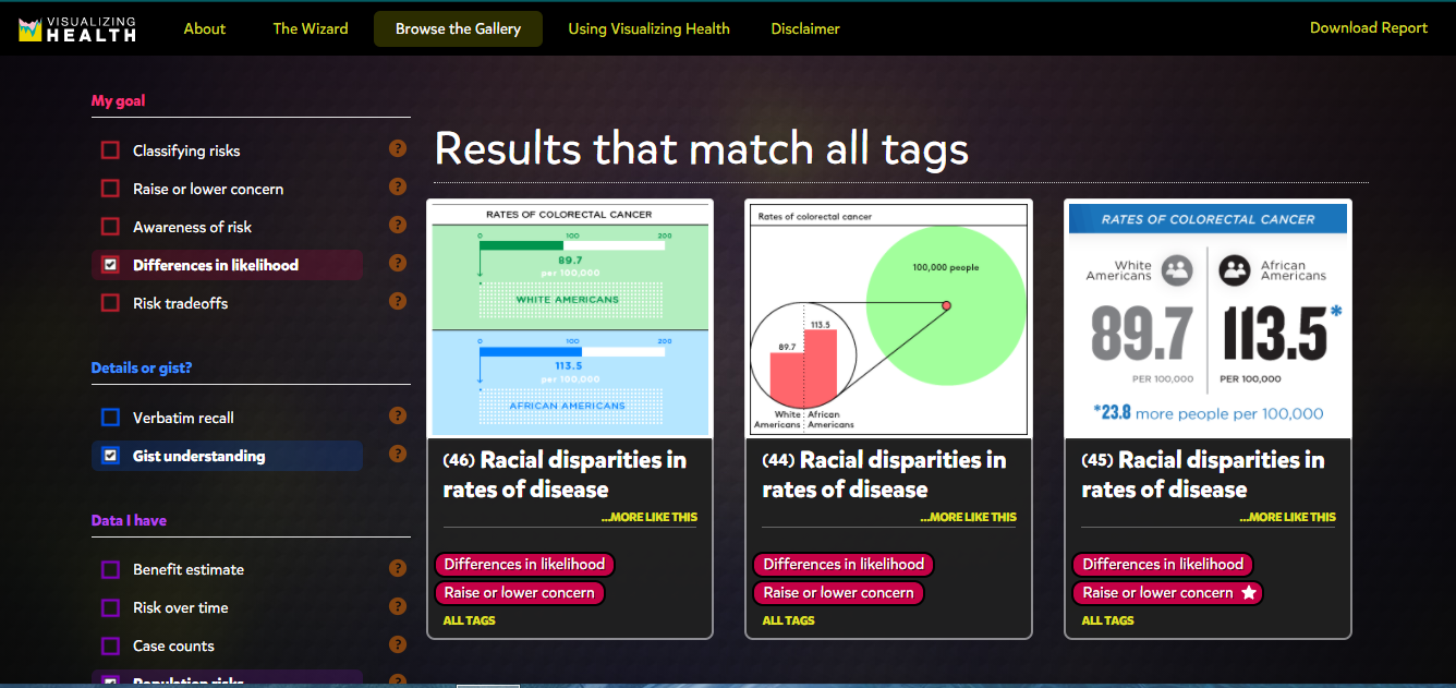
Visualizing Health provides various charts for different goals such as increasing or decreasing awareness, risk reduction, differences in age groups, or race. Each chart breaks down percentages and numbers and only highlights the important data so that the audience can understand the information. It also allows the individual to select different data, the type of graph he/she would like to see the data on, different health conditions, or the type of details that he/she would like to know about a certain health condition.
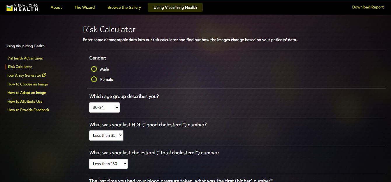
Figure 5: The Risk Calculator is a good way to get an estimate on someone’s risk of a heart attack, stroke, and other serious health conditions. It should be noted that the Risk Calculator is not 100% accurate, but it does give the individual an idea of their condition, which would prompt the individual to visit his/her doctor.
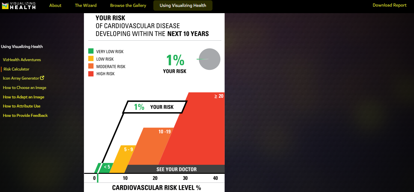
Figure 6: My Risk Calculator results indicates that I am 1% at risk for cardiovascular disease and suggests that I “see your doctor”. This provides an excellent opportunity for me to speak to my doctor about reducing my risks on my next visit.