Visualizing Health offers a wonderful tool to assist you in selecting the appropriate visualization for your dataset. Upon entering the website, you are greeted by the homepage pictured below.

Once on the homepage navigate to “The Wizard” tab, highlighted in green in the photo above. You will then be brought to a new page that asks you to further explain what your primary goal is for your visualization & exactly how much knowledge your audience should take away from your visualization.
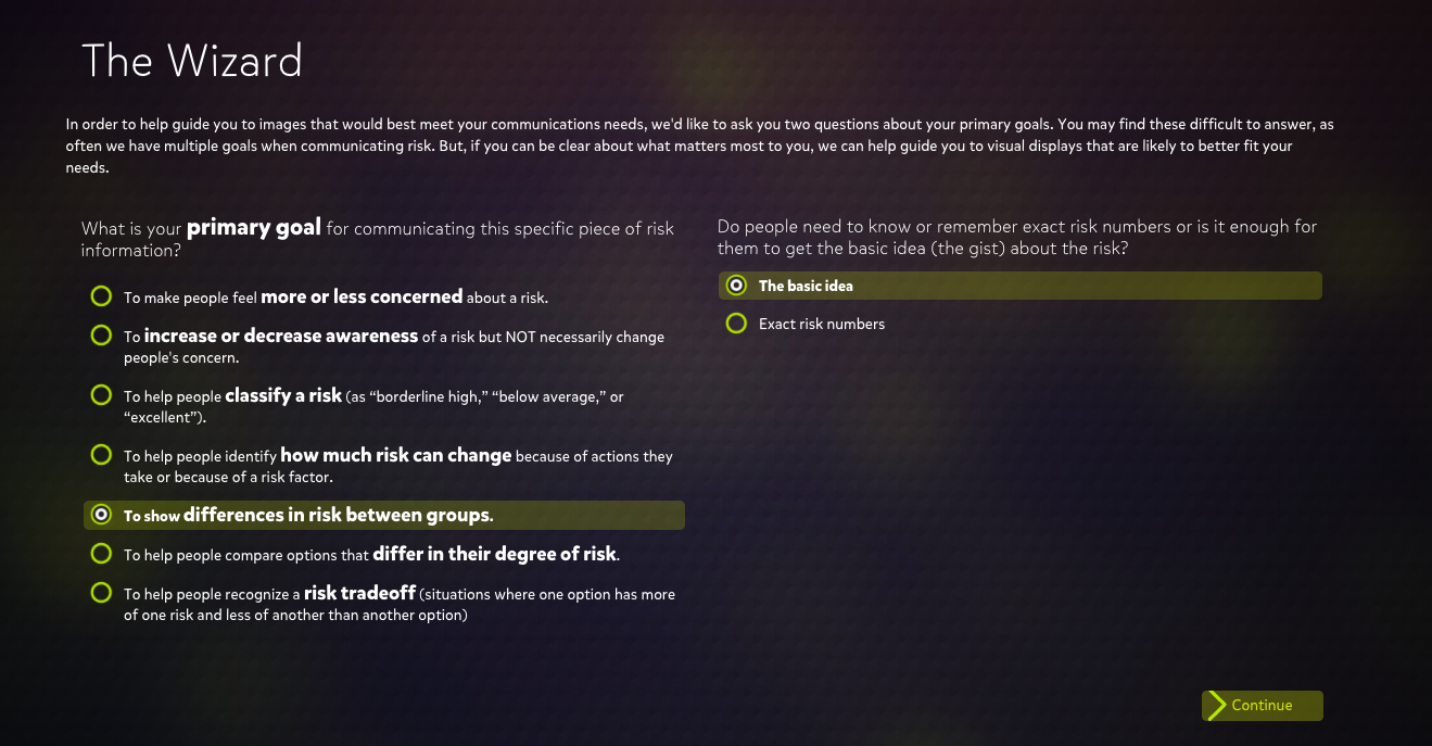
If someone is looking to create a visualization for the differences in risk for two medical conditions over time, they may select the highlighted options in the photo above. Selected is, “to show differences in risk between groups” as the two different medical conditions (sexual & urinating problems) are measured in individuals who had reconstructive surgery and those who choose radiation. It is not crucial for people to understand exact figures, just that one may have a better effect then the other. This is why “the basic idea” is selected.
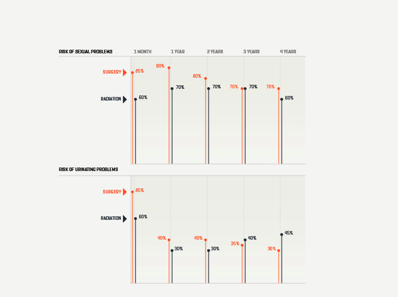
Shown above is one of the numerous visualizations that “The Wizard” recommended for the data set. As you can see, this visualization is clear & direct in communicating that for sexual problems, surgery was a better overall choice for patients. For the case of urinating problems, surgery also appears to be the better overall choice although it could be questionable as a longer term solution.
Visualizing Health is a wonderful website to explore if you find yourself wondering if there is a better way to depict your data. Taking the time to look through this website will offer any user insight into what clean & concise visualizations look like. Keeping this website on hand could be the difference between creating an average visualization, and a perfect one!