I will Start of by saying I am very biased toward this style as a STEM major. I this style of info-graphic is reminiscent of of wiring and circuitry.
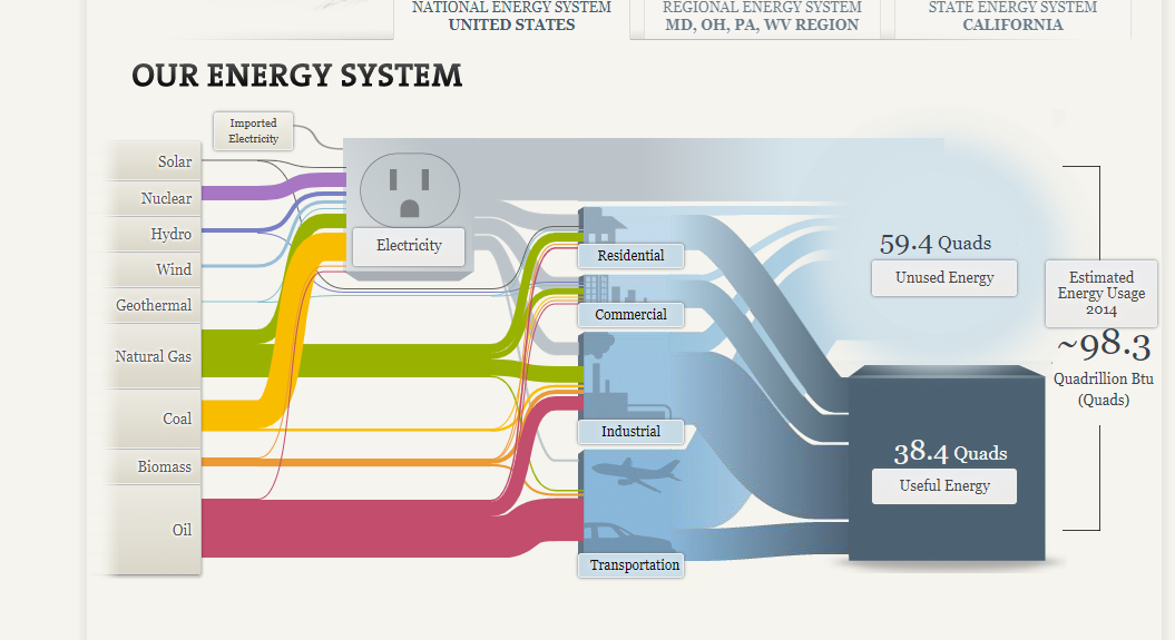
The fact that you can expand more information by clicking on any certain ‘wire’ and have it highlighted is beautiful and brilliant engineering. in my opinion that is the goal and the utmost peak of an info-graphic or a data story: to be visually engaging and, to educate.
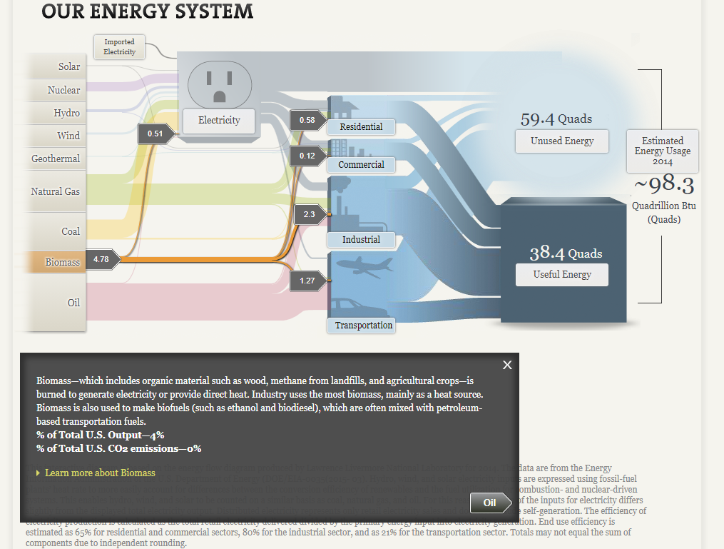
There is also sources and contact info IN THE SLIDES rather than crammed at the end in a sources page. Which in fine for academic purposes, but realistically you should give credit in the same breath as the when you give the information, especially in this day and age.
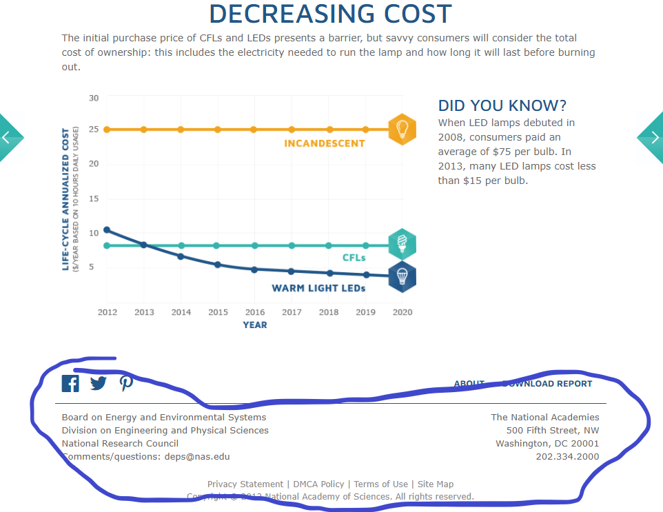
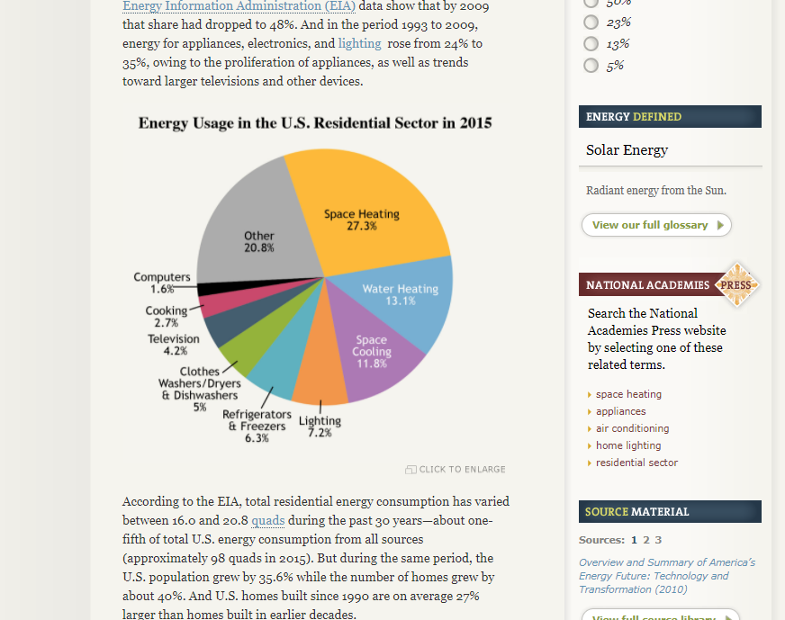
A critique I do have is that, even though it’s only one, they used a pie-chart. There are more beneficial ways of relaying this information, but it’s not as bad as most cases and only used as a comparison. You can completely ignore this pie-chart and you would have not missed out on the information so it does it’s purpose of looking pretty, at least.
~Haneef Abdul-Jabbaar