Categories
pivot tables

Pivot Tables

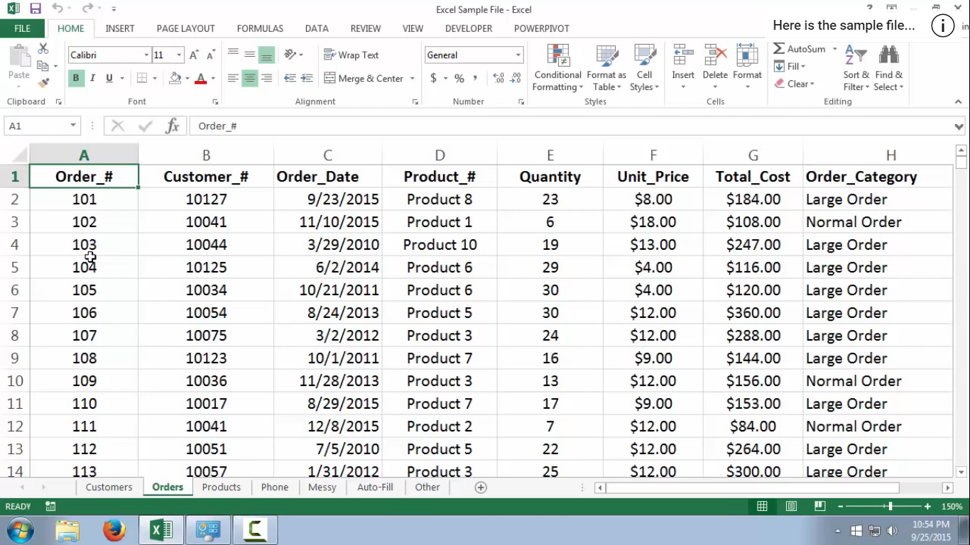
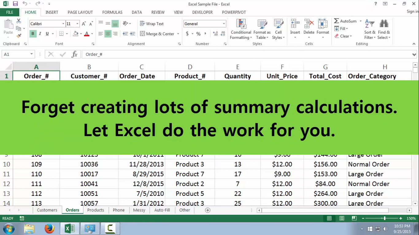
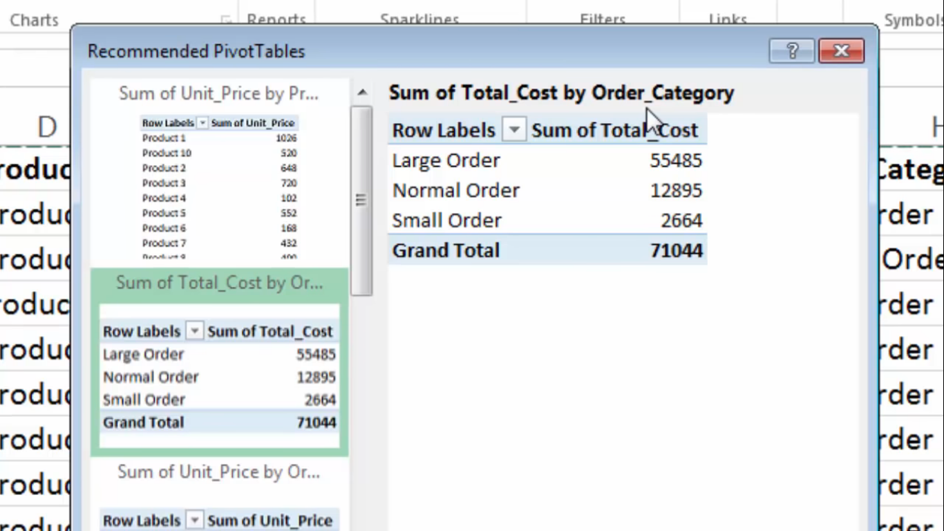
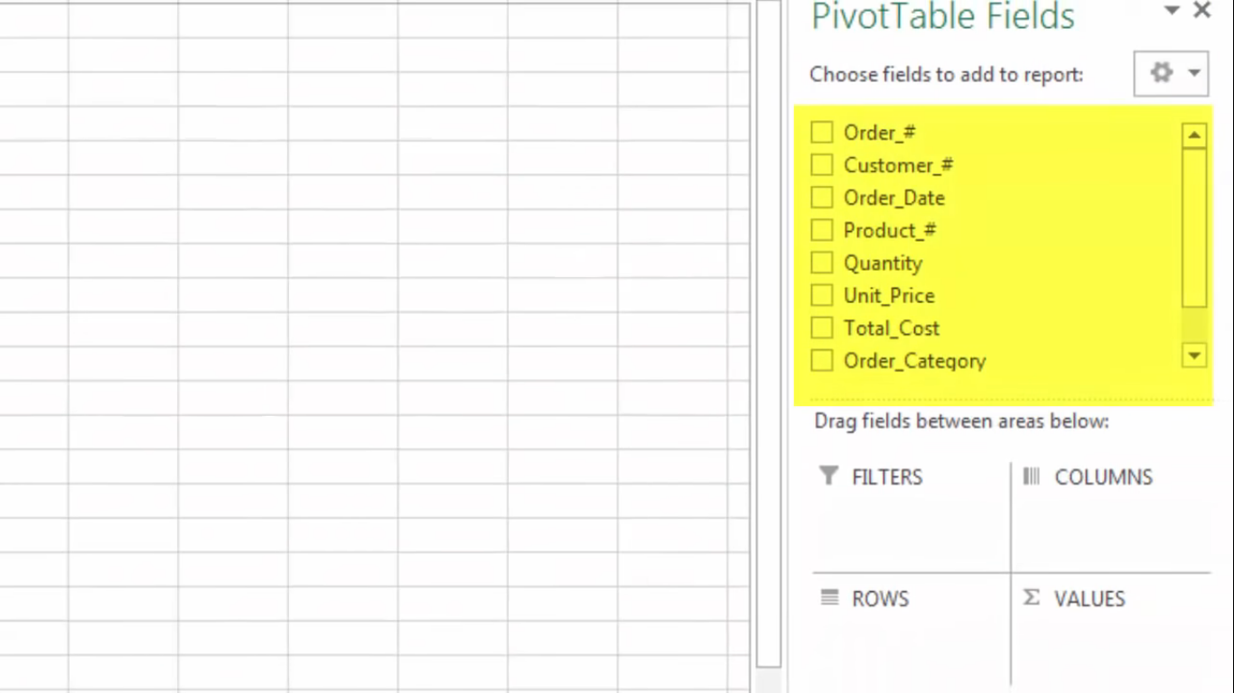
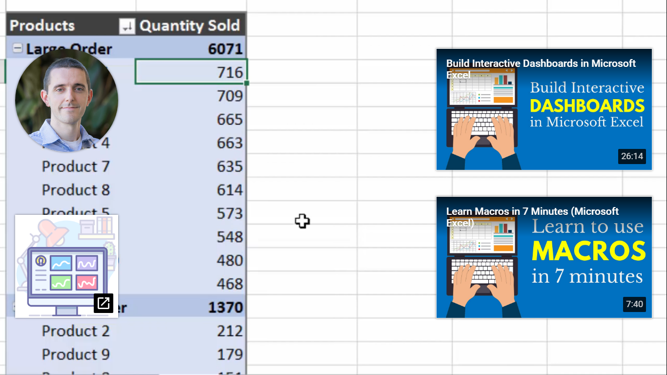
A pivot table shows statistics like averages and sums with various fields that summarize data. I came across a youtube video that explains what a pivot table is, what it contains, and how to make one. The first screenshot, it shows a pivot table and some of the fields the person decided was the best fir for their data.

Here the speaker mentioned how pivot tables show summaries. You can enter calculations to excel and it will calculate the formula for you and continue to add the numbers that come after.
Next, the speaker shows how you can choose the type of pivot table for your data. They are also recommendations on how to display your data. The next slide just shows how you can sort fields to columns, rows etc.
Here I wanted to show the end result but I could not figure out how to take the YouTube icons for other videos out. The speaker color-coded the table so it would be easier for us to read. He also changed labels to “products” and “quantity sold” so readers would understand what the values represent. I found these example and tables easy to use because it is labeled and it is color-coded which helps people look at the table easier. I also find it easy that we do not have to manually plug-in formulas or each number we want to represent. We can highlight the whole row for the formula to apply.