Data visualization helps people get a better grasp of what the data truly entails. Infographics can supply data of demographics, age, sex ect. In the 2020 presidential election this data visualization was most popular in seeing who won the electoral votes based on each state.
Data sets utilize specifying information. In this example, each state is broken down by political party.
Their are many different data processors that can help you organize your data. A couple examples would be Microsoft excel and Tableau.
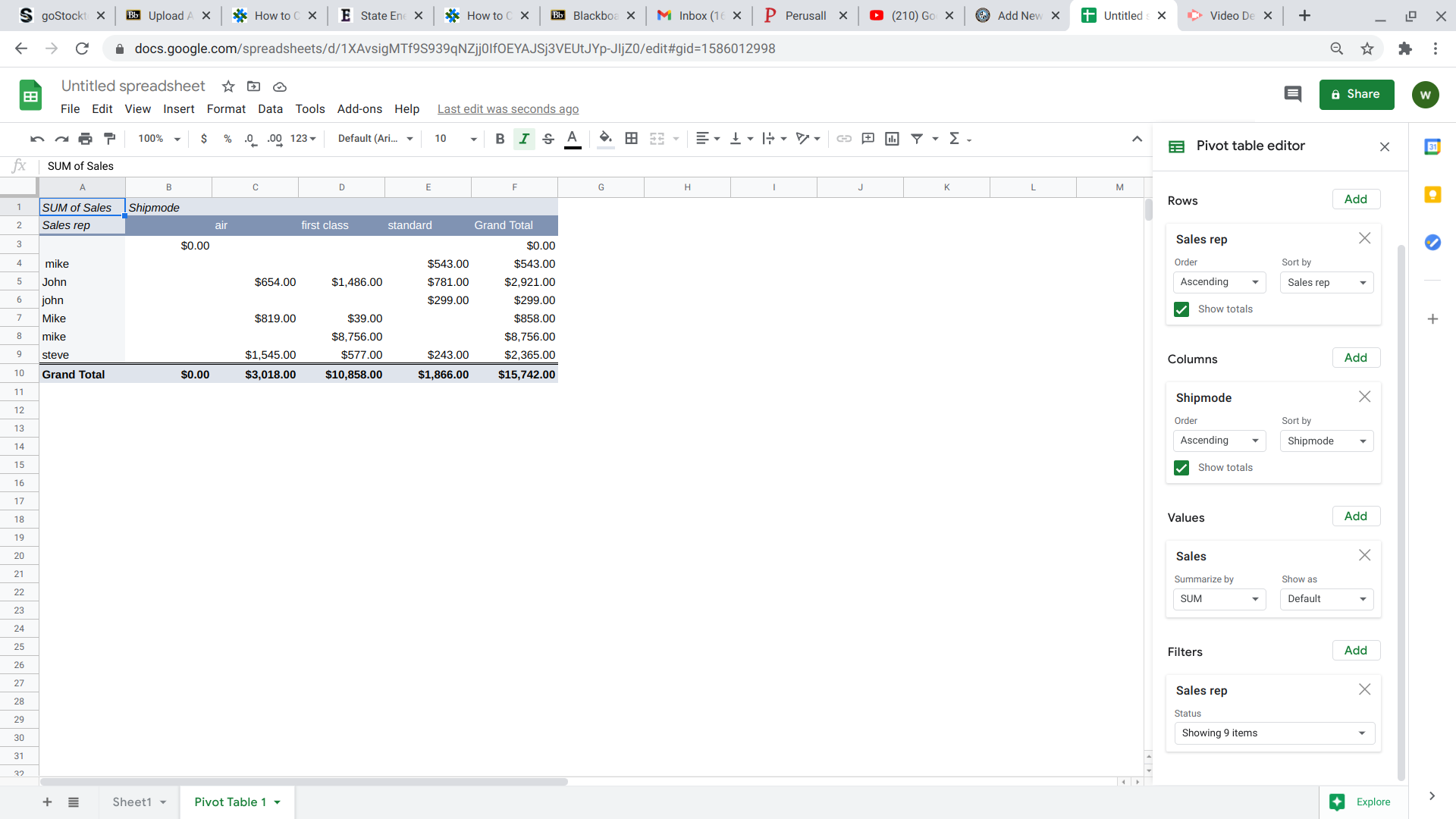
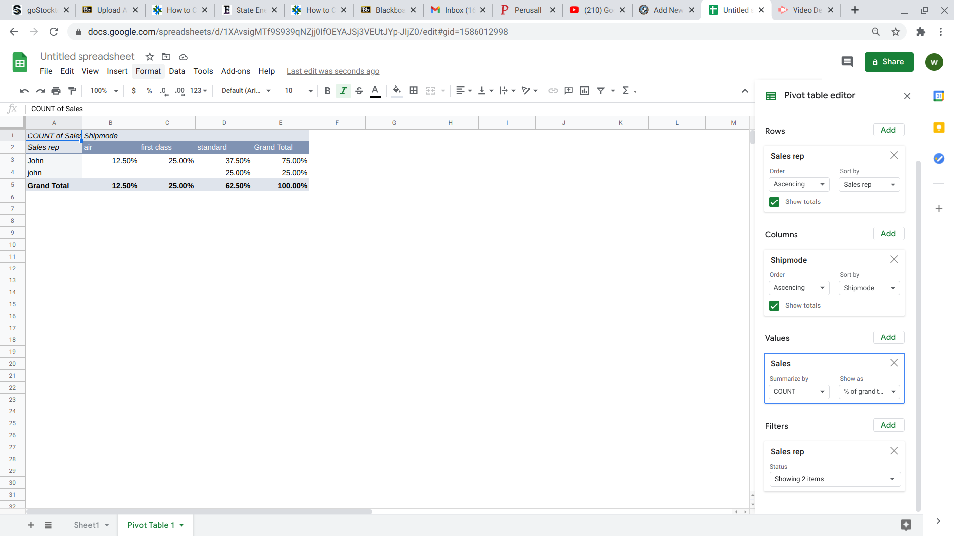
Pivot tables are great when you have alot of data that you want to quickly interpretThey work great for sales reports!The really cool thing is that you can add filters. i chose to filter by the names of my sale people. i liked that idea so much that i decided to pin point on one single salesman. That really comes in handy when you are making employee evaluations.
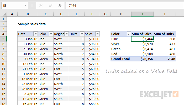
A pivot table is a tool that allows creators to summarize, organize, and sort (by sums, averages, etc) their data sets. Pivot tables are simple to create and allows creators to manipulate what exactly the chart focuses on. A few examples, I found during research, shows the different uses as well as highlight how the table makes comprehension of data go much smoother.
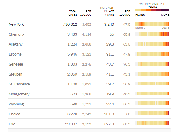
The above pivot table was an example I found that was updated in real-time and created by the New York government to keep residents updated on the amount and averages related to Covid-19 deaths. It is well organized and listed by individual counties throughout the state.
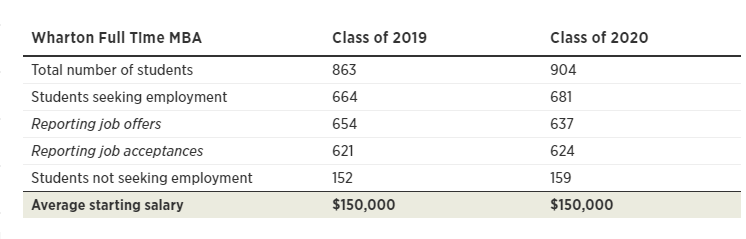
A much smaller but straight to the point pivot table I found on the inquires website highlights the average income graduates receiving after attending Wharton college. It shows slight changes between the comparison years but puts emphasis on starting salaries. The intended purpose of this table was more for persuasion on why students shoule attend this institution.
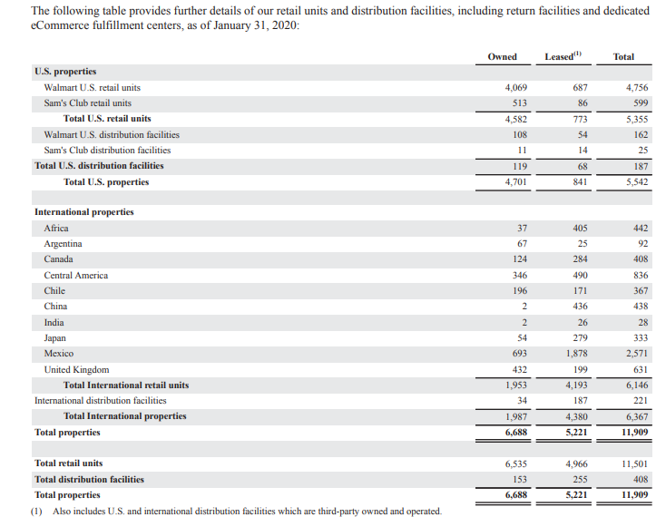
Another use I found for a pivot table was an annual report of business earnings and spending. Large corporations, such as Walmart release annual data for public analysis. The use of the pivot table above makes the data easier to understand and follow. This particular chart highlights the properties worldwide owned by the Walmart Corporation.
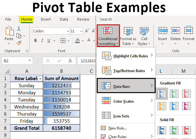
Pivot tables have a larger variety of uses because the table can be manipulated to place emphasis on specific areas. Here is a beginners guide to creating and using pivot tables.
A Pivot Table is one of the basic data analysis tools. It is a summary of your data. Pivot Tables can help answer many important business-related questions. They are used to pass information.
A Pivot Table can:
group items/records/rows into categories
count the number of items in each category,
sum the items value
or compute average, find minimal or maximal value etc.
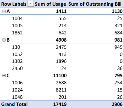
This examples shows how sums and row labels are shown on Pivot Tables
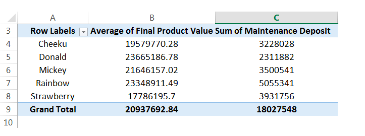
Above is another example of a Pivot Table. This table organizes the data and groups and sorts the information in a way that makes it easier to read. A Pivot Table was a good choice for this data.
Pivot tables are one of the most easiest and the most powerful tool on excel. If you have a lot of data and want a sufficient way of organizing it pivot tables are the way to go. Pivot tables gives you the option to break down data by categories or even sub categories.
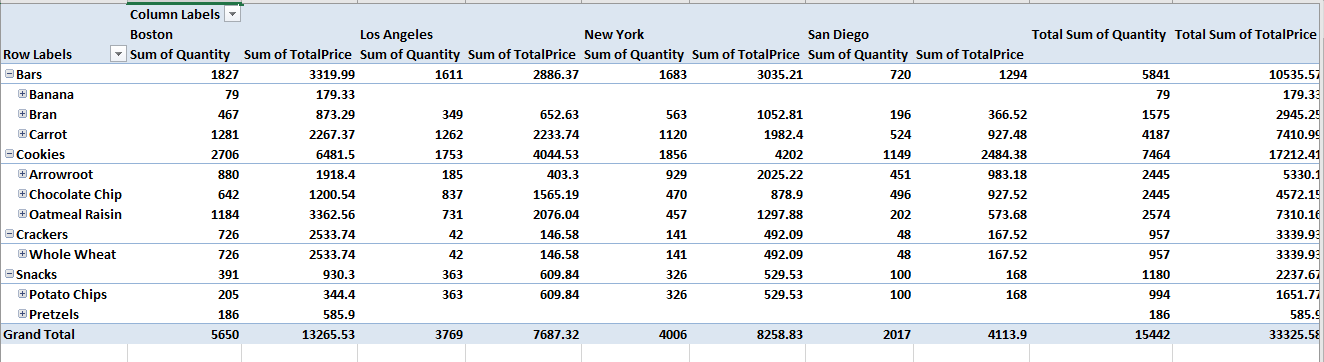
This is an example of a pivot table that categories its data with different demographics. In this chart specifically, they compare prices and profit of grocery items in each state.
Pivot tables are one of the many ways in organizing data. And, I believe that it is a vital organizational method used in specific data collection.
a pivot table is a summary of a larger set of data. Its packaged in a chart & filtered, which makes it easier to pinpoint the data that’s relevant to what you are looking for.Pivot tables are used to summarize, sort, reorganize, group, count, total or average data stored in a database. Which is very helpful in a lot of jobs where you have to deal with large sets of data.The biggest setback with pivot tables is that they are difficult to make although newer versions of Excel make it pretty easy, by recommending that which pivot tables would fit into your needs.
Pivot Tables are essentially reports that companies use for their own personal checks and balances. What sets them apart from statistical charts is the fact that they are very interactive. Instead of having a multitude of confusing formulas, you can have a very simple table where you can choose what variables you want to compare.
In my research, I found a lot of interesting ways to use Pivot Tables. This website was particularly helpful in simplifying what the tables are used for and how to construct one.
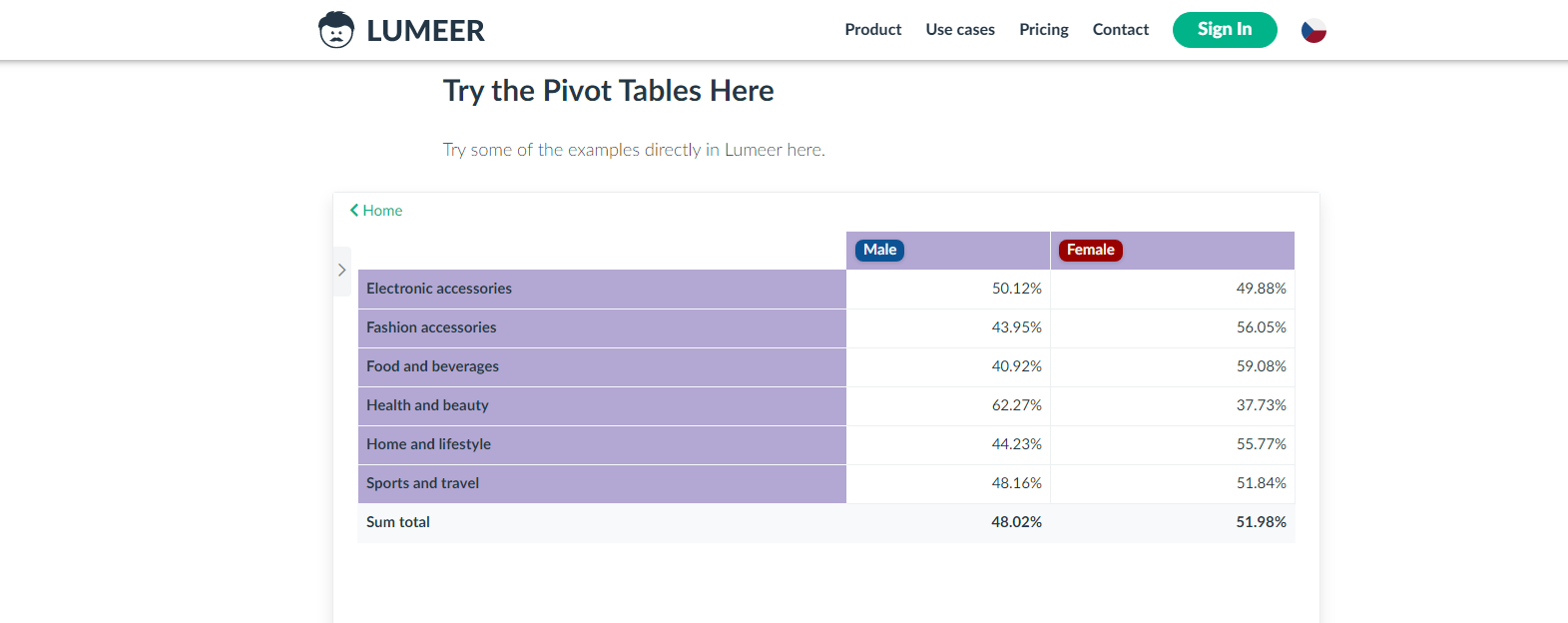
Lumeer.IO offers web-based automated pivot tables that connect users through a cloud and help them to work remotely. I added the video to show how useful this website can be for people that need to work on a project.
Time worked on an assignment by individual assignees. The pivot table above could be useful to help keep track of people working together. This can help the team see individual and collective efforts on the project. We can see who has worked the most by who has the higher percentage and a representation of that as its regular value.
This pivot table could be very useful to the manager of a store. This shows which genders are buying more of a certain category of product. It also shows who is buying more products overall by the sum total. Knowing these trends can help a store to plan accordingly for bigger revenue.