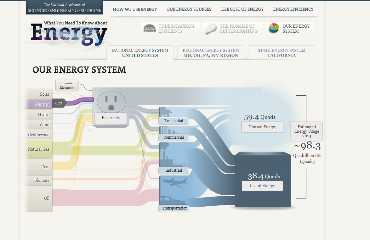
I like that I am able to interact with each element and get more information on that element. This is good for an audience that is being newly introduced to the topic. The chart has other versions focused on specific areas, which is most useful for those audience members. That was a good way to target specific people.
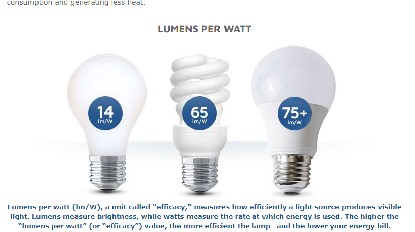
I’ve never paid attention to “lumens per watt” but I most likely will after reading this. Good use of icons and a quick comparison tool. This explains the difference between energy efficiency and brightness output.
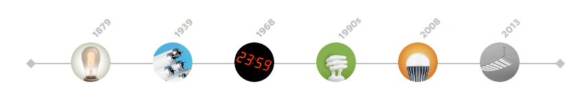
A simple timeline with icons showing how electric lighting technologies have evolved over the years since its inception in 1879. I like this data narrative. It is clean, fast, and enlightening. I thought those bulbs created in the 1990s were invented in the early 2000s, for example.
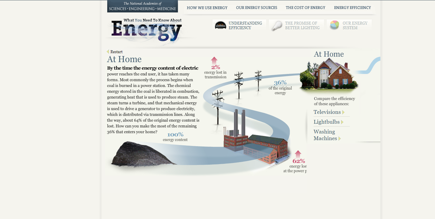
This is a nice attention-grabbing graphic. The red adds to the loss effect of energy. The bold text could have been more descriptive or to the point.
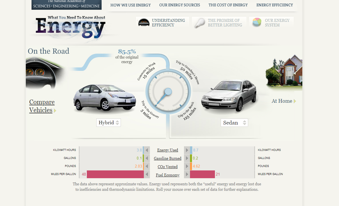
This was a neat interactive tool that was included to see how energy efficiencies compared. I think that the author of this data story did a good job of allowing the audience to interact and become more engaged. Diving deep into car comparisons helps to pique the audience’s interest because a lot of the audience is probably drivers.