I really enjoyed this website. The interactivity alone was awesome, paired with the interesting data. The energy chart was really to navigate and understand.
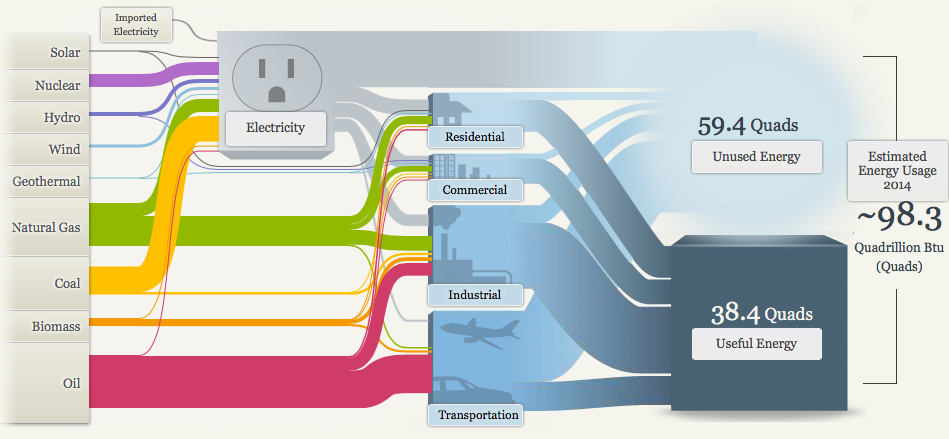
Each of the colors represented the forms of energy really well and puts a lot of our energy production into perspective. As you can see, Oil (In Red) is represented as the largest because it’s one of our main forms of producing energy for transportation.
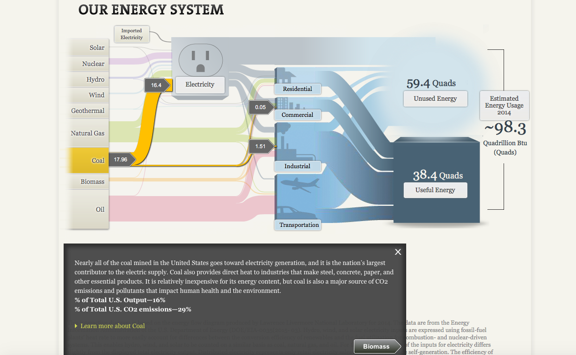
Clicking on each stream will give you facts about the energy you’re interested I researching and it will then conduct you to the next part in which this certain material is used in the energy making process. In this specific instance, coal is mainly used to produce electricity.
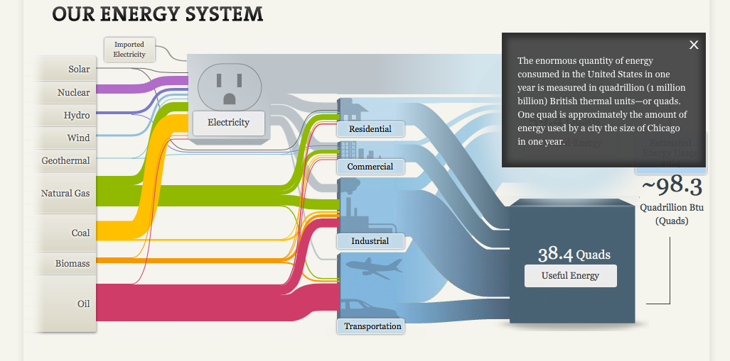
All of this adds up into useful energy which is measured to be about 38.4 Quads. If you would like to check out this chart for yourself, click the link here: http://needtoknow.nas.edu/energy/interactive/our-energy-system/