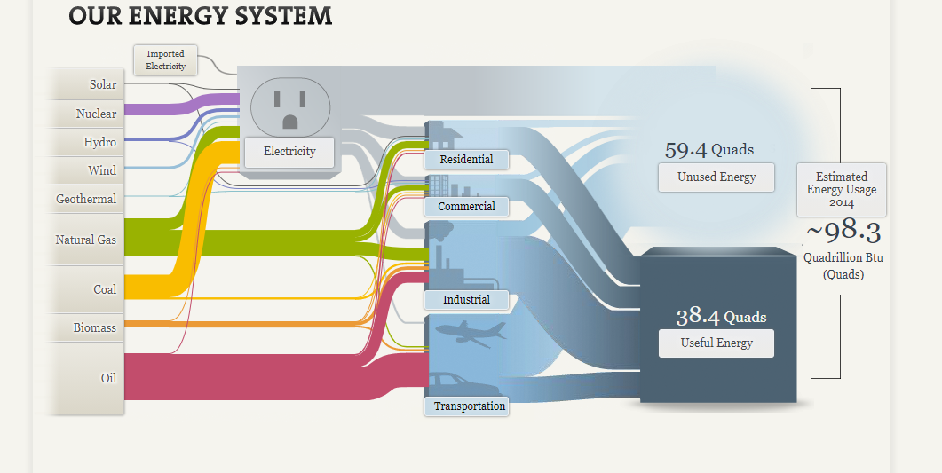
The National Academy of Sciences uses Sankey visualizations to explore our nation’s energy system. Although this type of visualization may be unfamiliar to many of us, Sankeys allow us to visualize flow when there are multiple inputs and outputs, which is why it is a perfect visualization to use when mapping out our nation’s complex energy system.

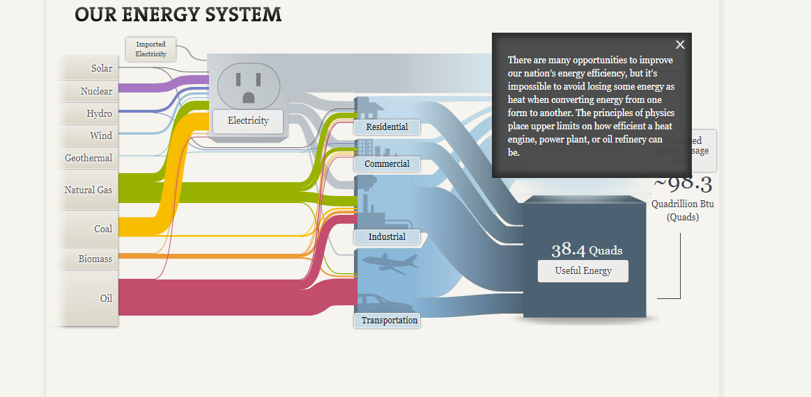
Based on the thickness of the various colored flow lines depicted in the picture above, you can easily see that oil, natural gas and coal are the nation’s leading sources of energy. The inputs (energy sources) then flow into various outputs (energy uses such as residential, commercial, industrial, transportation and electricity). We can see that the majority of oil is used for transportation purposes while coal is used for electricity. This visualization is also interactive. By clicking on some of the textboxes you can find more detailed explanations about that topic.

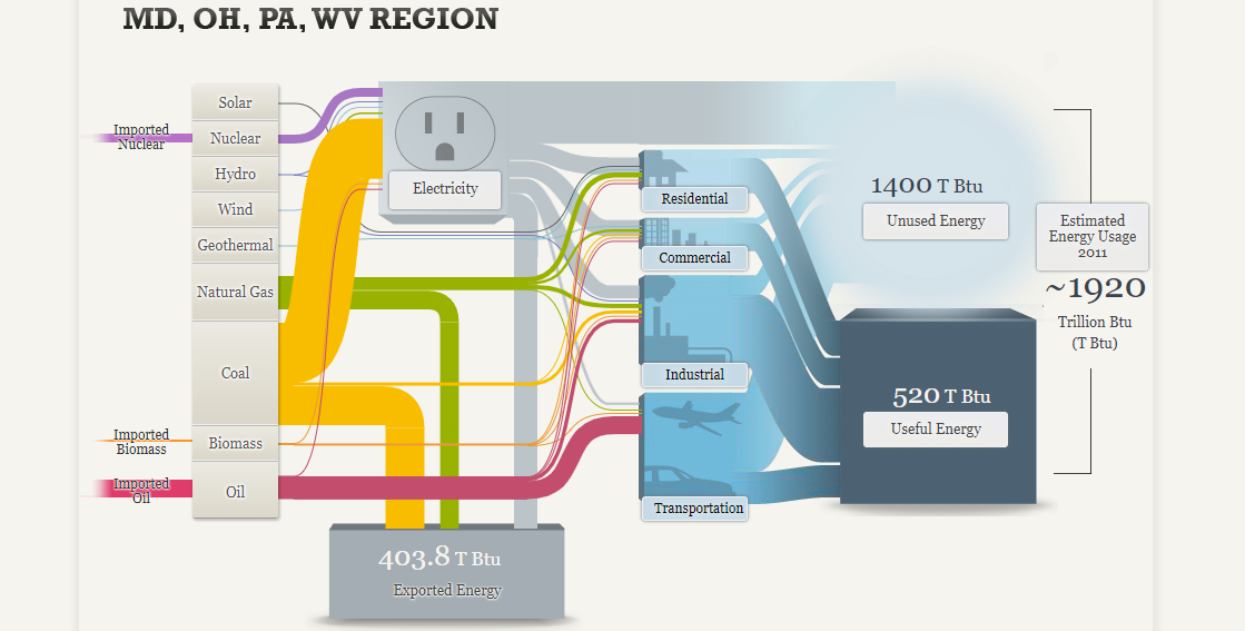
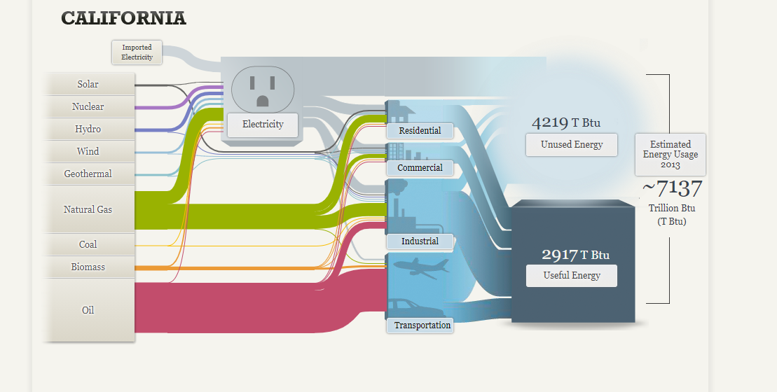
Separate visualizations are also provided for a regional energy system (MD, OH, PA and WV) as well as visualization for California state’s energy system.


In conclusion, depicting the various energy systems in the United States through use of a Sankey visualization seems to be a great choice. Color coding the various inputs or energy sources allows the reader to quickly decipher which color belongs to which energy source. Since there is also a significant difference in oil, coal and natural gas usage compared to renewables such as solar, hydro, wind and geothermal, it was easy to recognize which sources contributed most towards our energy system and which contributed the least. Furthermore, the reader could easily see how each sector (residential, commercial, industrial, transportation) contributed to either useful or unused energy since these were depicted in starkly different colors.