My initial reaction to this visualization is that it looked kind of boring but then I actually started to play around with it and it was super simple to navigate. It is formulated just like a website and they made each section of the homepage really easy to read and it wasn’t overwhelming.
When you first click start you get redirected to another animation which is the one below
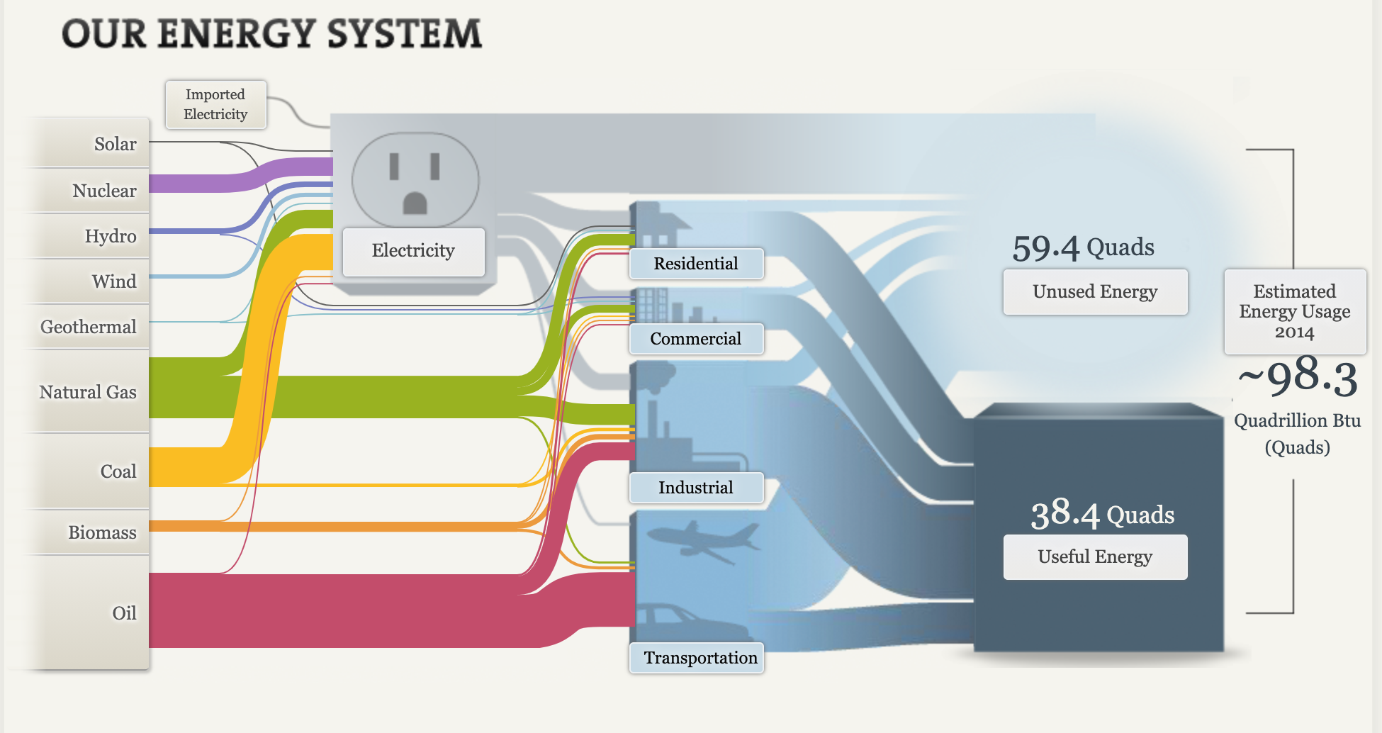
It was an interactive animation and each part of the animation puts a different data set up for the respective category. Aside from the data. set, they give a description on the data which I thought was pretty cool!
The next part of the presentation was where they compared homes and vehicles. I thought it was really nice to see the side by side comparisons of the cars.
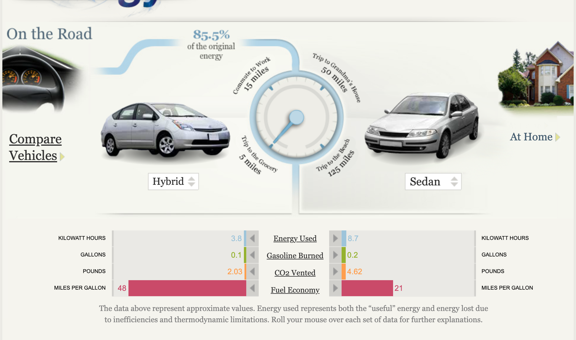
The back to back bar graph in the bottom is a really easy way to share the facts about each car and it is really clean. There isn’t too much information on the side but it is also the perfect amount of information to get the point across clearly and affectively.
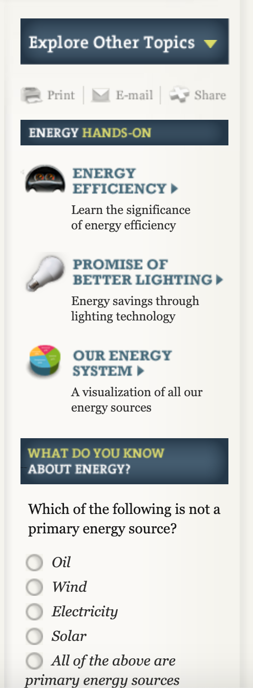
Lastly, I thought it was a great idea to put the side “advertisement” shown below. It’s an easy and smart way to get the attention of the audience to explore the rest of the page. Overall, I thought it was a super easy page to navigate and it definitely catches the audiences attention from the beginning to the end.