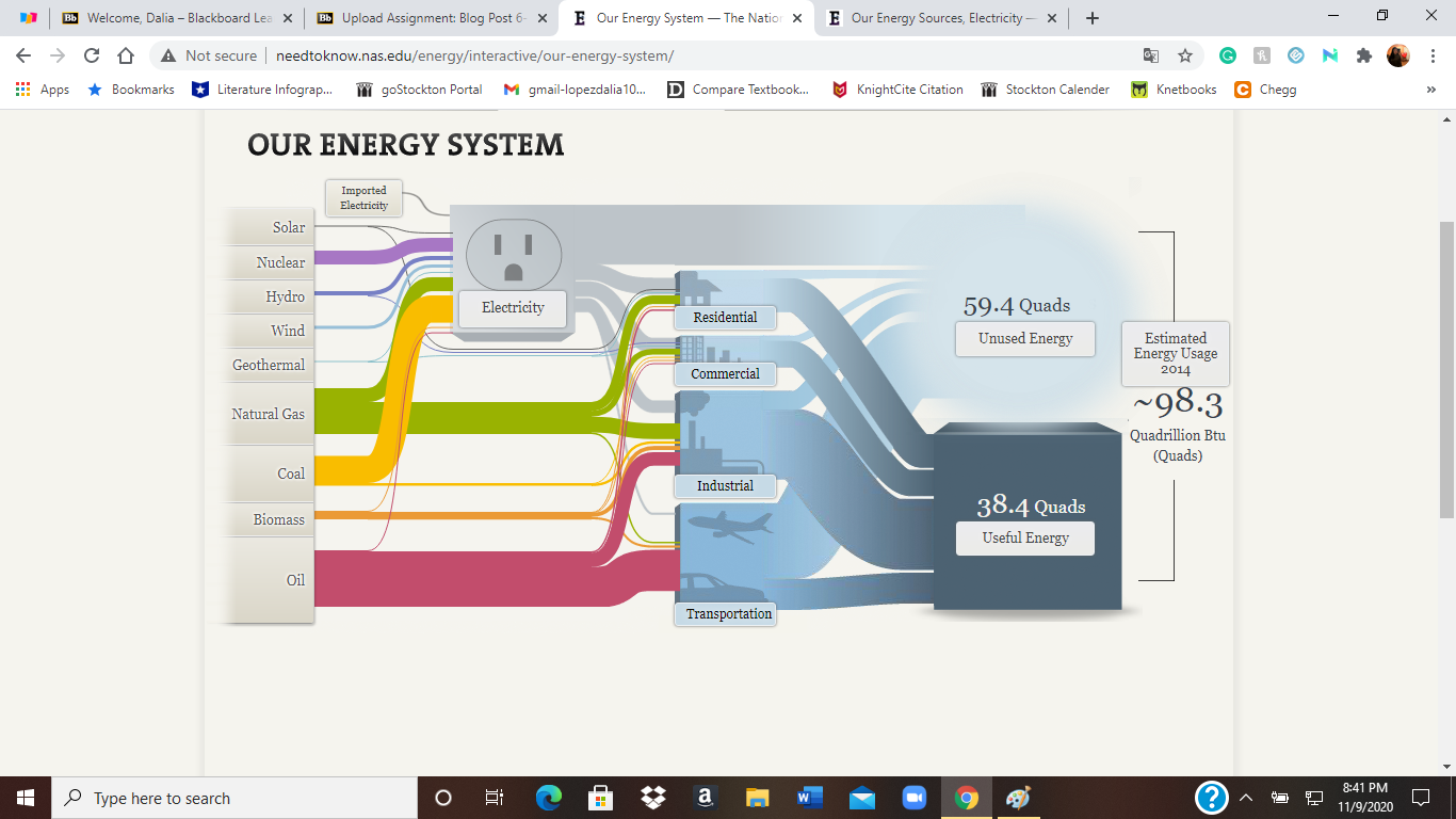
My first impression of the Sankey visualizations was that they were confusing. I just saw too many options to click on, I did not know where to start. After I started selecting more options on the National Energy System United States, I started to understand each click just lead to information about a certain topic. For example, when I clicked on Geothermal, I learned that high temperatures of geothermal fields conduct electricity. A small number of homes and use this energy for heating and cooling also.
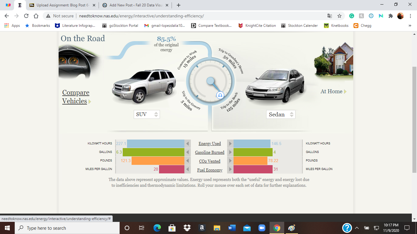
I enjoyed the interactive visuals of comparing cars and the energies they produce. I got to choose the cars and distances I wanted to compare. It was an easy visual to follow. I liked how easy it was to understand the energies they produced. For example, I knew that driving lets out carbon dioxide, but I did not know it was measured by pounds. Which still sounds pretty odd to me. Overall the SUV used more energy than a sedan.
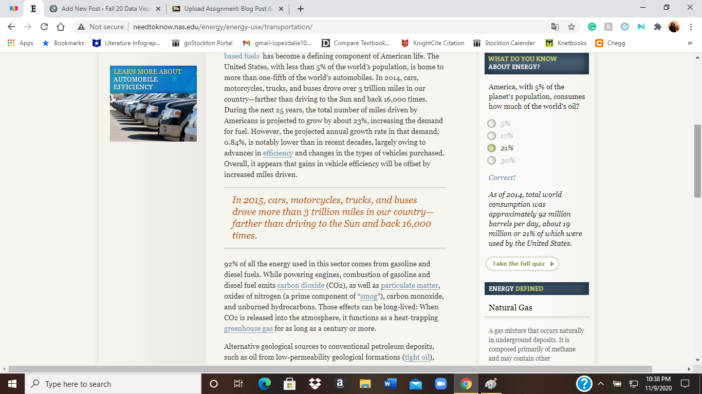
When I was looking at information on our transportation, a quiz, definitions, and hands-on activities pop up on the sides. The quizzes caught my attention. I thought it was a nice way to keep students interacting with the website. It made it less boring to just read paragraphs of information. I continued to finish the quiz and learned that ever since the beginning of the industrial revolution CO2 atmosphere concentrations have increased by 43%.