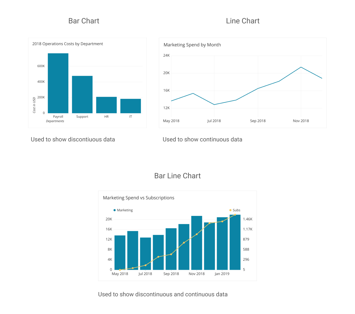
Data is everywhere. It’s been said ad nauseam, but advances in technology at scientific methodology have made it possible to collect and display data more efficiently. The major problem, however, is making sense of a set of data. Often, people ask, “What do these numbers mean,” especially when attempting to compare two or more numbers. Thankfully, data visualization makes it easier to comprehend the data and its message. The only problem is figuring out how to tell a story by comparing numbers using data visualization.
Prior to the emergence of the COVID-19 pandemic, I rarely pay attention to the political climate in the United States, opting instead to focus on my academics or escape to virtual worlds via computer gaming. Yet deep down, I’ve always wondered if others like me do pay attention to politics and other news topics, especially where a presidential election is concerned.
How interested have people been in previous elections?
Pulling data from Google Trends, I went ahead to see how interested Americans have been in previous elections since the year 2000. However, the data only goes as far back as 2004, since Google implemented search interest trend analysis around that time.
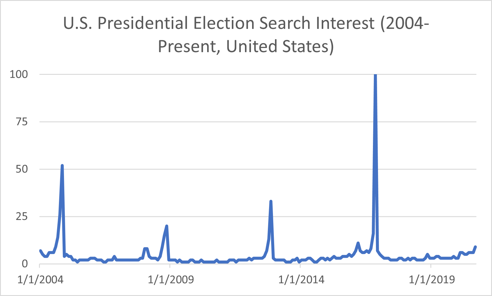
There are four significant peaks in search interest (shown in the chart above), and those spikes occurred in November of each general election year– 2004, 2008, 2012, and 2016– when the polls opened to the public on Election Day. In 2004, George W. Bush won his second term as President, though the search interest pales compared to 2016’s peak. That year, businessman Donald Trump ran for office and won the Electoral College vote to become the 45th president of the United States despite losing the popular vote to Hillary Clinton. Initially, in March of that year, Americans thought someone like him wouldn’t be able to secure the presidency. I recall seeing memes on the internet emerging around when he announced his candidacy but thought nothing else of it until he won the election. Based on the data from previous years, I can guess that search interest will spike again this year around Election Day. With issues such as COVID-19 and social unrest in the wake of George Floyd’s death at the hands of police officers, the search interest peak among U.S. voters will most likely dwarf that of 2016’s data.
When the search interest data is viewed another way, say on a map of the nation, it’s evident that some states had a stronger interest in election results than others.
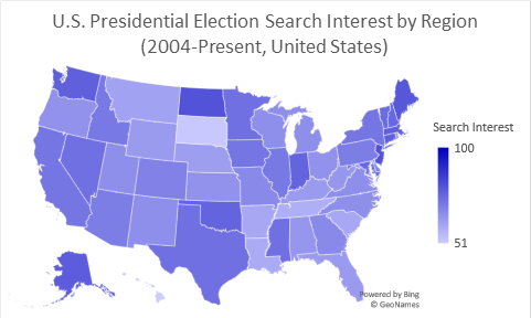
Some regions on the map, such as the District of Columbia and smaller states like New Jersey, do not have data labels tied to them due to graphing limitations in Excel. Still, Google Trends does show that the District of Columbia has the highest volume of interest when it comes to the presidential election. After that, New Jersey comes in second on a top-five comparison chart, followed by North Dakota, Maine, and Alaska.
The data provided by Google trends gives a general idea of how interested Americans are in general elections. But what do those numbers look like among demographics, and what do Americans look for in a candidate?
Breaking down election interest among demographics
Moving forward, I decided to pay a visit to the Pew Research Center’s website, which holds a repository of data trends for this year’s presidential election. The topics covered range from election-related social movements to hot-button issues such as COVID-19 and police reform.
One issue that Donald Trump has made a fuss about for the past four years is voter fraud, but it seems that more Americans are paying attention to those claims, especially where fraud resulting in Trump’s re-election is concerned. President Trump has allegedly made moves to attempt to block mail-in voting, a move that health experts say is more pandemic-friendly than in-person voting. Political analysts believe that if Americans are encouraged to vote by mail, the results could spell the end of Donald Trump’s presidency. Moreover, there is media documentation of President Trump crying foul on mail-in voting as a means of committing voter fraud.
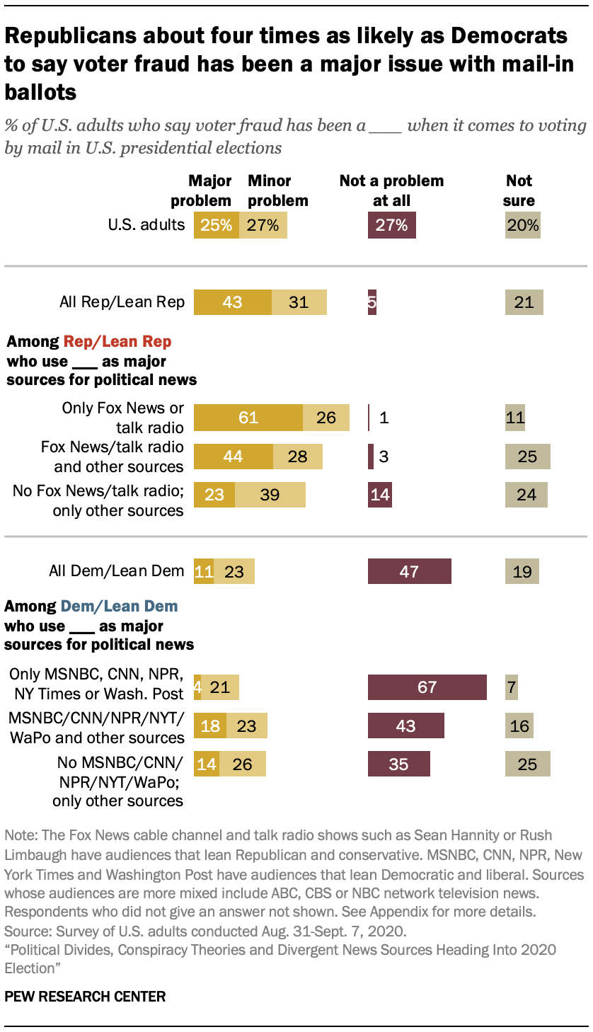
However, the Pew Research Center’s data shows that it’s mostly Republican voters who share President Trump’s sentiment about voter fraud. Democrats, on the other hand, do not seem to be concerned about the issue. Furthermore, the research shows that voter preference in news sources may influence political opinion. The disclaimer states that Republican voters tend to watch Fox News or listen to radio talk shows, while Democrats prefer to get their news from MSNBC and the New York Times.
Political divide based on news source is one matter facing the nation this election year, but influence from conspiracy theorists and foreign powers is quite another. Misinformation propagated by groups such as QAnon and Russian government-backed “troll farms” has led to confusion about the election, even paranoia, and cases of domestic terrorism.
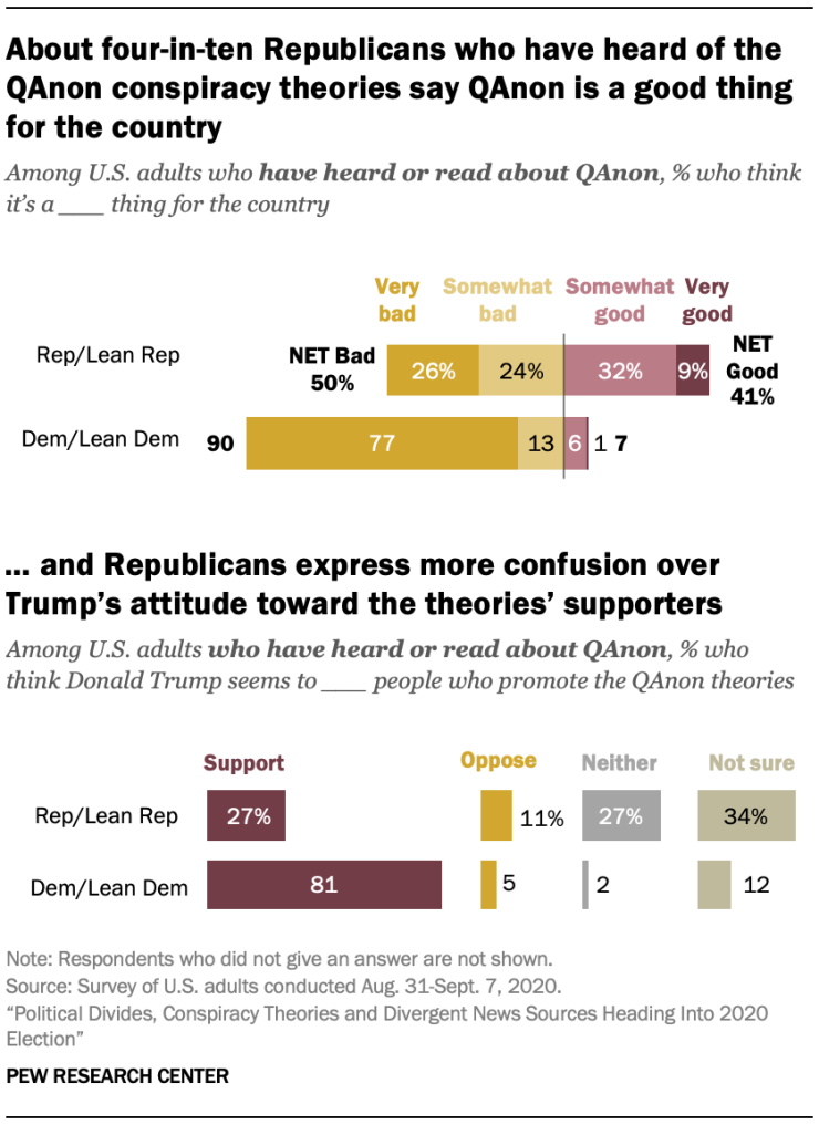
Roughly 47% of registered American voters have heard about QAnon. Among those who have heard o the conspiracy theory group, 40% of Republican-leaning voters believe that QAnon’s claims chalk up to being a good thing. On the other hand, 90% of Democratic-leaning voters believe that the misinformation QAnon spreads is bad for the country. Moreover, QAnon isn’t the only roadblock in getting clear-cut, unbiased information about the election. Since Donald Trump’s election, numerous reports have been published exposing negative influence on the United States’ affairs from global powers such as Russia. Many of those reports center on online “troll farms” funded and backed by the Kremlin. Their purpose is to flood social media sites such as Facebook with misleading information about Trump’s opponents in the hopes that their false claims would be shared by unsuspecting and uneducated users. Even worse, many Americans fear that hackers supported by foreign governments will alter the election results or create other forms of chaos that would impact the election.
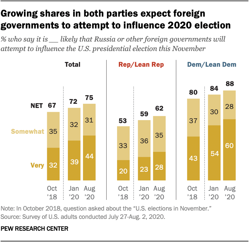
Two years ago, 67% of Americans in both parties believed that Russia would attempt to influence the U.S. elections in some capacity, with 50% of Republicans believing that Russia would interfere with the election compared to 80% of Democrats who expect it. The Pew Research Center asked the same question twice this year amid the COVID-19 pandemic, and the results show an increased concern in election interference by the Russians or other foreign countries. 75% of Americans reported in August that they are concerned that Russia would try to interfere with the election, likely in favor of Donald Trump; 62% of Republicans and 88% of Democrats said the chance of foreign interference occurring would be possible.
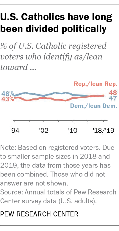
What surprised me the most was a report on Catholic voters. According to the Pew Research Center, Catholics in the United States are “split down the middle politically,” with 48% leaning toward Republican policy and 47% leaning toward the Democratic approach. Furthermore, Catholics are swing voters: in 2016, 52% of Catholics voted for Donald Trump versus 44% who voted for Hillary Clinton, while the percentage clocked in at 54% to 45% in favor of Barack Obama when he ran against John McCain in 2008.
As someone who grew up in a Catholic household that often voted Republican, I can attest to how my parents’ beliefs shaped mine, at least until I arrived at an age where I decided to forge my fate. Once I became a registered voter, I turned my back on voting Republican vs. Democrat, opting to support independent candidates despite not knowing anything about politics. That was the case until this year when COVID-19 took the world by surprise and changed everything. Still, I carried on and shut politics out of my mind, once more focusing on my studies and learning more about the virus. Then a report came out exposing Donald Trump for covering up the seriousness of the pandemic. I had a feeling he was downplaying the issue to keep the American public from panicking. Still, the fact that he made moves to politicize the plague for his benefit infuriated me to no end. It was then that I knew that he had to go, for the sake of the nation’s health.
Conclusion
Data visualization can help voters make informed decisions on candidates and national issues and reflect trends in voting patterns. It is especially apparent in the partisan divide between Republican and Democrat voters today, though it doesn’t have to be that way. Regardless of your political beliefs, it is imperative to know that every voice counts, including yours. Now more than ever, the fate of the United States rests in her people’s hands. Whether you choose to go in-person to the polls or submit your ballot by mail…