Categories
Color Scheme data visualizations Design Examples Pie charts

Comparing numbers!

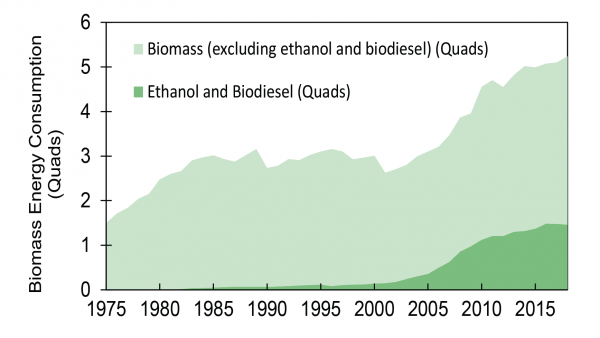
Data visualizations can be very effective when comparing two or more numbers. They are a great way to showcase data and to convey a story through numbers. But conveying a story efficiently through data visualizations is not as simple as putting together a quick graph in Excel. There are many ways in which data visualizations can actually distract readers from the message or leave them feeling confused; when used properly they can be a powerful tool that can enhance your data. The video below illustrates how certain aspects of design such as color, size and orientation can enhance your data visualizations.

https://vimeo.com/29684853

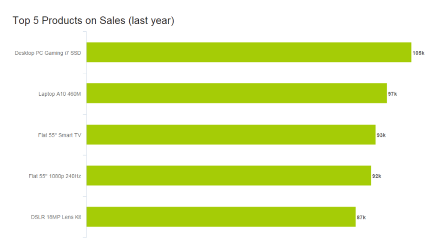
While researching data visualizations comparing numbers, I came across two examples that stood out to me. This first visualization illustrates a poorly designed bar graph that has been overly labelled.

data visualization design 5

The graph to the left is distracting and there are several components that are fighting for the readers attention compared to the graph on the right that is simple and straight to the point. In this case, a horizontal bar graph which allows the reader to quickly read the information from left to right is a better choice than the vertical bar graph. Simplifying the graph by taking away the gridlines as well as some of the axis labels helps to reduce some of the clutter in the first graph.

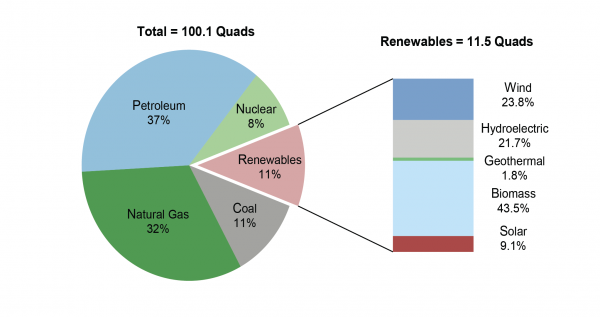
The graph below is another visualization that stood out to me.

data visualization design 4

When creating charts or graphs, people tend to feel the need to distinguish each category with different colors (I know that this is definitely something I do as well). Comparing these two charts side by side, you can see how using different shades of a single color can be more effective than using 5 different colors to differentiate categories; keep in mind to make sure the shades are not too similar. Adding extra “design” elements to the chart is also unnecessary at times such as the black border around the pie graph and the pattern in the “mediocre” slice. By taking away some of these “chart junk” elements, the graph becomes more simplified and can be interpreted quickly and efficiently.

Categories
Uncategorized

Tools that Help Construct Visualizations that Compare Numbers

There are so many tools to help you create visualizations but a lot of them are kind of animated, which is fine but sometimes you need something that is going to help you bring out some data that needs to be shown. There is a software that could be used on your desktop, mobile device or even online.

Tableau is good for all types of graphs, scatterplots, line graphs. You name it and you can literally make it happen. They even have diagrams that you can choose from like the map of the country or even the whole world. Let’s say you need to compare cases of COVID between New Jersey and Florida, you would be able to show the hotspots in both regions.

In the image shown is an example of how you can use the maps in different ways. You can keep track of trends and even combine different types of charts, graphs, diagrams to bring together a full visualization of data.

Categories
Examples Visualization Tools

Comparing Numbers

A clean & concise visualization is critical for your audience’s understanding of what your selected topic may be. Without this, your audience is likely to struggle with the content presented to them as they will not grasp the important topics you had hoped they would. When designing a visual that involves comparing numbers, it is crucial that you only include what is most important for your topic at hand. This is because if you overload your visual with too much information, your audience will become overwhelmed and leave your presentation feeling more confused about the topic, and this is exactly what we should attempt to avoid.

As you can see in the above visual, there is one main point being conveyed to the audience with three measured categories. The main point of this visual is to show what the future of workplaces may adapt to become. Each one of the three measured categories is given a specific color that all of its data is highlighted in. This does wonders for your audience’s understanding! This is because your audience can quickly identify that the red 69% of the doughnut is portraying that employees could be paid based on their performance rather than hours worked as commonly seen today. As you can see, this visual is very effective in communicating only the data it needs to and contains no extra information or frills that could grab the audience’s attention away from the main points.

Seen above is a vertical bar-graph that depicts the revenue of new customers for a company over a specific time span. As seen in the legended below the x-axis, the blue vertical bars represent the number of new customers and the orange trend line represents the revenue generated from these new customers. With this visual we can clearly see that this company had a large uptake in new customers from before March of 2015 until May of 2015. We can also see that this company did not have nearly as many customers in September of 2014 but they still generated more income off of these customers then they did in November of 2014. This visual is very easy to understand upon first glance and does not leave room for your audience to have many questions about what this data is portraying. This is exactly what you should be aiming for when creating your own visuals comparing numbers.

Above is a short three minute video explaining exactly what data visualization is and why it is crucial in everyday life. This video highlights how a data visualization should be constructed and how these visualizations can benefit more than just the person that created them.

Categories
Uncategorized

Visualizing Numbers

I think it can be pretty easy to forget how much millions and billions actually are.

This can be thought of in several ways. A billion pounds of water will weigh more than a million. A billion pounds of anything is too much, and a billion of anything is a hoard of resources.

NowThisNews via youtube.com

End World Hunger 11 Billion Dollars
Jeff Bezos 72.8 Billion Dollars
Warren Buffet 75.6 Billion Dollars
Bill Gates 80.6 Billion Dollars
Me 11.23$ an Hour
IISD.com, Worlds Billionaire Club (as of 2017).

The next time you think of defending Jeff Bezos, remember that you and him are not alike. You are closer to poverty than you ever will be to being a billionaire.

This is one million in numerical terms

1,000,000

This is one billion in numerical terms

1,000,000,000

This is how much Jeff Bezos is worth (as of 2017)

$72,800,000,000

This is how much a teacher makes on average in New Jersey (as of 2019)

$58,000

“It is possible to have too much of a good thing”

Aesop

facTofusion.com, Jeff Bezos rising net worth
Categories
Data Sets

Renewable Energy in the US

A Brief Introduction

Given my background in Sustainability, I chose to explore the trends of energy production and consumption in the United States. Energy in the United States is an interesting topic as, due to its sheer size and geographic diversity, the United States has the potential to utilize a wide variety of renewable energy sources. Information regarding the production and consumption of energy in the US has been cataloged by the Energy Information Administration (EIA) ever since it was founded in 1974. In addition to providing the raw data, the EIA also publishes a wide variety of reports and infographics that can serve as excellent resources when designing your own graphics. Despite the EIA’s usefulness, I found that University of Michigan has put together a fact sheet that can serve as a much better introduction to the topic for those who are not already familiar with the Energy field. It is this fact sheet that I will be highlighting and discussing in the following sections of this post.

Michigan Fact Sheet

Drawing from the EIA’s statistics and other sources, the Michigan fact sheet has put together a number of graphics that make it easy to compare the energy production of all types of renewable energy sources. Below are examples of the two main types of data comparisons that the fact sheet displays, changes over time and differences between countries.

These graphs help translate the raw data presented by the EIA into something that is easier to understand at a glance. They are perfect for displaying simple, overarching trends for their respective fields, but their simplicity makes them ill-suited for handling data with many facets. This is where the following graphics excel.

The field of energy production can be quite complex when accounting for all the various ways of generating energy and the scale at which that energy is generated/utilized. These graphics help the viewer understand this fact by visually differentiating between the individual sub-categories of a much larger piece of data.

Categories
Uncategorized

-COMPARING NUMBERS-

Insightful data visualizations can be used to compare numbers. These data visualizations can portray data in various different ways that will compare numbers. Line charts can be used to present data and show how data is similar or different. This kind of chart tends to be easier to view as long as there are not too many lines on the chart. Lastly, line charts are a good way to compare numbers because they show trends, accelerations or decelerations. Horizontal bar graphs can be a good way to present and compare numbers. They provide a nice visual and as long as the data is in order, they are perfect for comparing.

Horizontal Bar Graph
Line Chart
Categories
Data Sets

Men versus Women in College

Datasets for Potential Project Use

I decided to look at how current gender trends in college may result in a different version of America in the future. Ever since the early 1980s, women have been earning more Associate’s and Bachelor’s degrees than men. It took a little while longer for women to surpass men in earning professional and Doctor’s degrees, but they have earned more of these degrees than men on average ever since about the mid-2000s. The education gap between men and women has been projected to increase in women’s favor as time goes on. Here is the summary of raw data that is available through the Department of Education. https://nces.ed.gov/programs/digest/d19/tables/dt19_318.10.asp

Below is a fairly recent table showing percentages of US college degrees by gender and a projection of how it may look in the future. Tables are an easy way to compare numbers, but they often lack visual appeal. These are good for displaying accurate numbers, but there is not much to draw in the audience. Comparisons must be mathematically interpreted.

These are good for obtaining averages of a data set because there is little work needed to get the numbers.

We can also use a line graph to compare numbers, which is a very effective way to draw in the audience through the color scheme and trends in the data that are easy to interpret through rising/declining figures. The following graph is not very recent, but it gives us a better visual representation of the growing gender gap in American colleges.

Line graphs allow the audience to easily interpret data over a timeline. Color schemes, labeling, and trends increase visual appeal.

What these numbers mean is that more college-educated women are entering the workforce than men. You would expect these figures to mean that women are the majority of today’s American breadwinners. However, although women have been earning more post-secondary degrees than men in recent times, men still currently dominate the earnings reports while holding the same job positions. This is probably due to a long history of oppression passed down through the generations and complications of motherhood. One argument is that it is difficult to measure work ethic that is not on an individual basis, so we may never know for sure in regards to everyone’s specific situation. We can compare these income inequalities in a bar graph.

Bar graphs are phenomenal for side by side number comparisons that include many subcategories. Color schemes, length of the bars, and data labels make it less difficult to interpret data.

There is a lot to dissect when it comes to gender inequalities because we cannot freely assume that women suffer in all areas of life more than men, but this is a decent general overview of how we can utilize datasets for project use on this subject.

Categories
Uncategorized

Comparing Numbers

An interesting comparison I found is the separation of years in schooling.

It’s a basic table, but what it fails to represents is that in the UK, you may finished “secondary education” by year 10 or 11. Whilst in the US you are required to do 12 years no matter what. An interesting comparison none the less.

Here is some data comparing schooling days, hours, and time of by select countries.

Perhaps you want to look at survey data and compare that, well be wary of certain tricks that are used!

This may not be interesting, or pretty, but it is very insightful. You’ll notice that the numbers show that male and female audiences separately, preferred Carlo’s shop. As a whole, however, Sophia’s is preferred.

I believe this is very insightful because it looks into a paradox of statistics looking at numbers, known as:

Simpson’s Paradox

This precious little paradox shows that when comparing numbers, it is not always a good idea to take them at face value. There may be factors accidentally, or intentionally ignored when delivering a study. Of course, the boring solution to a case like the one above is to have equal data sets for each group for a proper comparison!

What if you legitimately have an unbalanced data set, that you cannot balance? Then you simply cannot properly compare the data sets. You must change the data.

A funny little presentation by Glen Bell, an Australian data governance specialist, explain how to not represent data.

sources

https://towardsdatascience.com/simpsons-paradox-how-to-prove-two-opposite-arguments-using-one-dataset-1c9c917f5ff9

https://ncee.org/2018/02/statistic-of-the-month-how-much-time-do-students-spend-in-school/
Categories
data visualizations Uncategorized

Comparing Numbers

Data is all around us, in different shapes and forms, and sometimes it is hard to decipher. Using visuals to compare data can make all the difference in comprehension, as long as itself is clear and concise. I found a video from Visme that gives a few pointers and explanations on how to improve Data Storytelling.

I felt it was important to share this video because comparing numbers is not just bar graphs and digits, it is a way to get information out to viewers. It is a type of storytelling that uses minimum words but insinuating on a focal point that helps the reader understand clearly.

Tools

Online charts is a free website I found that is simple to use and can create a variety of charts and graphs in just a few minutes. It allows users to construct multiple types of charts and manipulate color, font, and data input.

Home page of Chart tools
Data input page
Finished Product

Users can download their graphs into different formats, such as, jpg. and pdf.

Covid-19 and Education

As I was looking through UNICEF’s website I noticed a separate link just for data and found some well-created infographics that are not only current and relevant but perfect examples of comparing numbers. Covid-19 has created devastation all over the globe and continues to do so today. Children around the world are feeling the impact due to the pandemic, not only home life but in their education. Below are a few infographics that I felt highlighted the five tips from the video above and accentuated their intended purpose while comparing numbers.

A well labeled graph comparing prior undernourished children to current and projected scenarios.

A representation of children affected by school closures due to Covid-19.
A projection graph comparing the possibility of economic decline due to the pandemic.

If you take a look at all three graphs you can easily read and understand the visualizations set forth. Each graph has a focal point which is portrayed using colors, patterns, and contrasting visuals. The graphs all are labeled properly with limited distraction, making them readable. All of these graphs read left to right following the rule of thumb of conventions, each comparison with a time line keeps the time line on the x-axis to avoid confusion. I think

Categories
data visualizations Examples How Two Or More Numbers Are Alike Or Not

Comparing Numbers

I am going to be showing examples of insightful data visualizations that compare numbers.

  1. The first one is from a website named datapine.
Sales graph in the form of line chart: amount of sales by payment method

In this line graph, the number of how many sales were made by various payment methods is being shown, different months and years, and how they changed over time. The lowest was abut 20k being used by bank transfers. The highest was about 90k being used for credit card payments. For credit cards, September seems to go very low. With these numbers and information being presented we can take many guessed on why people only use certain payments a certain amount of times at a certain time in point.

2. The second example is from a website named venngage.

Simple Comparison Table Infographic Templates

This website provided this infographic as an example of how companies highlight features and pursued buyers to buy certain products. They use the phone they want you to buy and compare it to one that has fewer features or different features than the newer one. Most of the info involves numbers, from screen size, cost of the phone to GB’s, and the weight of the phone.

3. Lastly, from the same website venngage.

Healthy Food Comparison Infographic Templates

This is an example of an infographic comparing and contrasting the number of grams of protein certain foods have. They bolded those numbers because they were most important for people to see. This is an easy infographic to follow. You just look at the food item, then it tells you the number of calories (they vary) it contains and gives you the protein it contains in grams.