Categories
data visualizations

Benchmark Comparisons

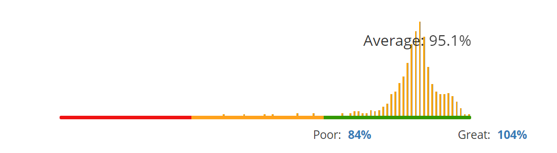
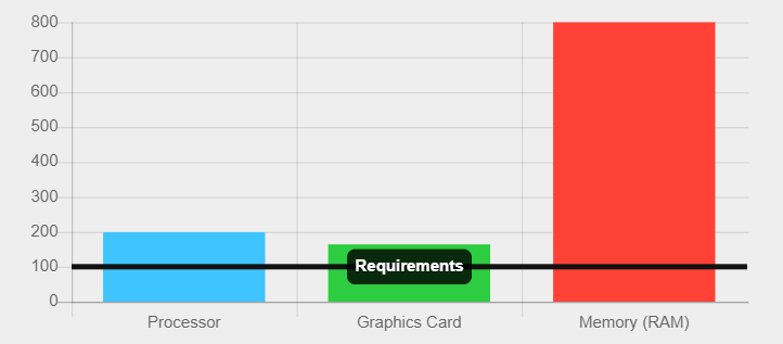
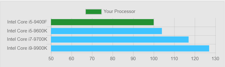
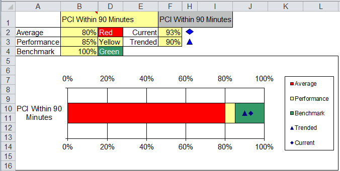
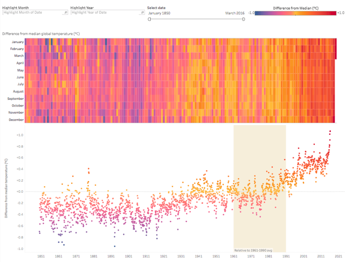
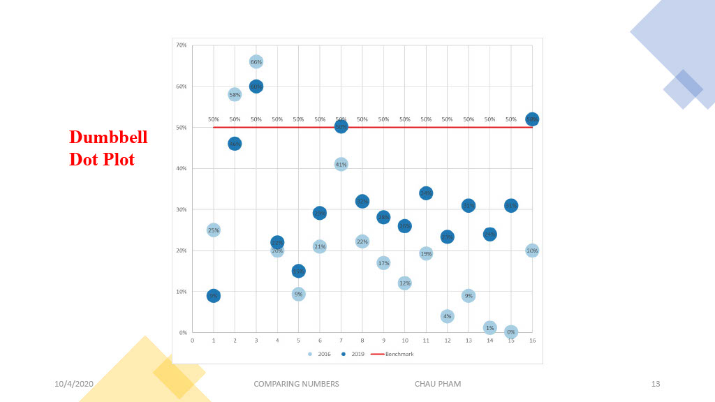
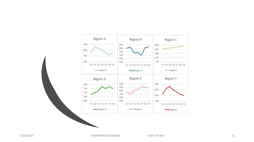
Benchmarking by definition means “A standard or point of reference against which things may be compared or assessed”. This management tool has been around and widely utilized by many businesses for centuries. It may seem like a simple graph or picture, but it adds great quality and a deeper meaning to a story. It helps users understand performances between different organizations’ products and prices for example the rise and fall of the stock market.

10-K

T-Mobile uses pink in every advertisement, poster, or package, and the letter T stands out from other companies.

This is another way that WSJ uses benchmarks for comparisons.

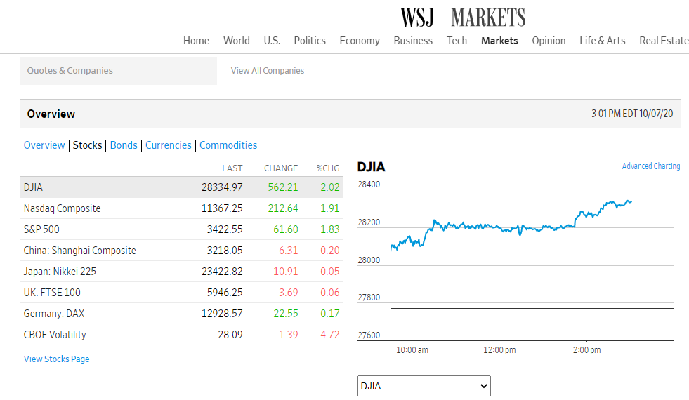
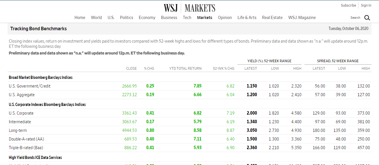
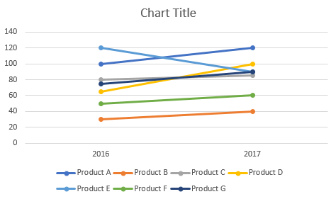
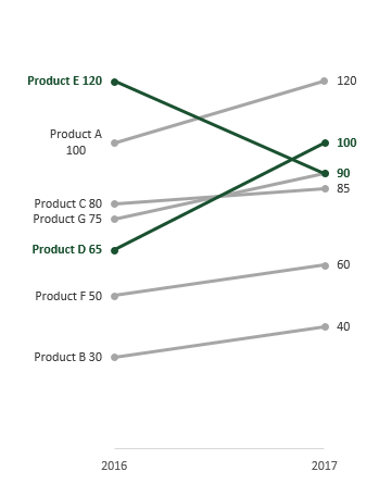
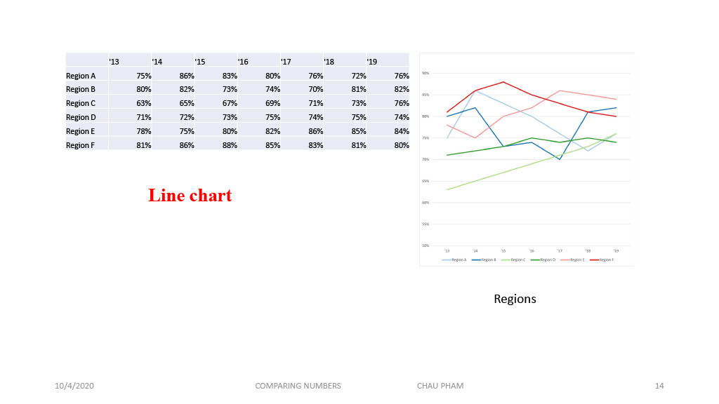
The Wall Street Journal (WSJ) is a highly respected newspaper that uses a benchmark to compare the stock market, businesses, travel, and other topics of interest occurring in the U.S and around the world. One way WSJ makes comparisons is by using charts with line graphs to represent and explain data.

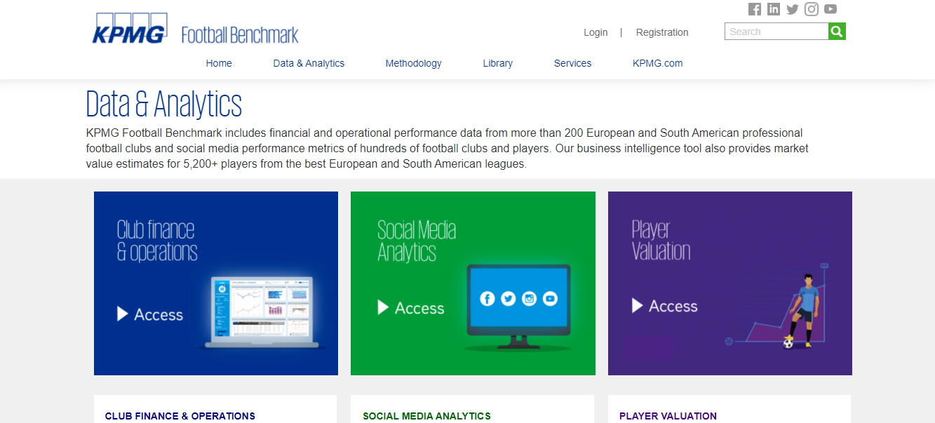
Football (Soccer) Clubs use benchmarks to compare games, players, financial opportunities across Europe, and Sout America. It also uses a benchmark to compare contracts for players.

https://footballbenchmark.com/data_analytics

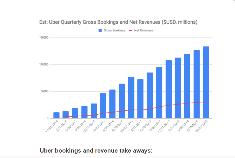
Here is another great example of a benchmark used to compare Uber Gross Bookings & net Revenues from 2014 to 2018. Based on the chart, Uber’s bookings and revenues were very impressive throughout the years.

https://www.rocketblocks.me/blog/uber-metrics.php

Categories
data visualizations

Benchmarks

October 11, 2020 by Erika Kacprzykowski

Benchmarks are added to graphs to add context and are commonly used throughout the media. Below are some examples found online:

https://www.tableau.com/about/blog/2017/8/two-approaches-benchmarking-tableau-75859

In the image above, you can find the country where you’d be the happiest. By choosing your three most important happiness criteria, you have the ability to find the best country for you. Benchmarks are displayed as orange lines straight down the middle of the diagrams as well as colored dots showing countries with the worst and best results. This can be very helpful and is easy to read.

https://www.tableau.com/about/blog/2017/8/two-approaches-benchmarking-tableau-75859

This visualization about the new indicators of wealth cover areas such as environment and quality of life. As there is a lot of information here, benchmarks can be super useful tools in helping understand data. The light blue areas give you a difference in favor of the country selected, the light gray is the common area between the country selected and the benchmark, and the dark grey is the difference in favor of the benchmark. While some visualizations show benchmarks using lines, this one uses shaded areas.

https://www.cdc.gov/coronavirus/2019-ncov/covid-data/covidview/index.html

This screenshot above from the cdc website shows mortality rates of pneumonia, influenza, and COVID-19 in the United States between October 2, 2016- October 3, 2020. The graph shows a seasonal baseline (benchmark) with a black line and uses different colored lines and colors to represent several categories.

https://collegereadiness.collegeboard.org/pdf/educator-benchmark-brief.pdf

The College Board provides insightful feedback each year with assessments of the SAT exam. Your own score is compared with the corresponding benchmark in Reading, Writing and Language, and Math. These benchmarks are represented by different colors. Red- need to strengthen skills, Yellow- approaching the benchmark, and Green- met or exceeded the benchmark. As they mention, color coding for test scores and subscores show students if they are on the track for college readiness.

Conclusion

Benchmarks are a very useful tool in providing the audience with a number to compare the data to. Whether we notice them or not, they are used daily and can be displayed as lines, areas, different colors, etc.

Categories
data visualizations

Benchmark Infographics

Over this past summer, I was given the chance to upgrade my current laptop to a newer model. This presented me with the problem of deciding what kind of laptop I should buy and what parts I should be looking for. During my search, benchmarking infographics became the most important tool for finding the best deal for my needs.

PC Benchmarkers

There are a variety of free websites that allow you to test combination of PC parts to determine if they fit your needs. Each of these sites presents their results in the form of graphics relating their results to a general benchmark.

When evaluating the performance of a specific GPU, as pictured above, the results are presented based on their percentile position in comparison to other models. In this case, the percentile line serves as the benchmark that allows the observe to visualize how well the product they are looking at stack up to others.

In addition to using the benchmark as an axis, other benchmarking infographics present their benchmarks as a more traditional minimum border. In the graphic above, the minimum requirements of a specific piece of software are presented as the benchmark. This border line allows the person viewing the graphic to see how well the parts of their PC are suited to the programs they wish to use.

It is also possible to turn the information you are studying as a benchmark itself, such as with this graphic. By doing this, you could compare other options and visually see which ones could be improvements.

Categories
Uncategorized

Who are Essential Workers?

2020 has been a mess of year. With outbreak of Covid-19 in early march, which has us now in a pandemic, the term essential workers has been bought up a million times. At first, many people were not to sure who exactly essential workers were. To clear this up, the New York Times posted a handy benchmark graph as seen below.

More intrestingly, This graph shows the share of essential workers who are women. 52% of ALL essential workers are women. Evenmore, they make up for more than half of the workers in social work and in the healthcare field. The simplicity of this benchmark graph makes it easy to anayzle the data of who are essential workers in the Covid-19 pandemic.

Categories
Uncategorized

Benchmark Graphs & The Election.

The presidential election is a topic that brings about many different types of visualizations. One search on google and you will be bombarded with statistics for each candidate. Below we will look at simple visualizations that have been generated by CNN for each presidential candidate.

Above you see a visualization that depicts how each candidate is polling nationally. You can find the article this visual is captured from here. It is quite apparent to see that according to this visual, Biden has the overall support for the presidency. One thing that this visual does that is very helpful for the audience is highlighting the trending candidate’s (in this case Biden) numbers with their associated party color (blue for Biden, red for Trump). This visualization also included other news sources & polling agencies results to ensure that there were no extreme cases.

In the visualization above you immediately notice that there are not as many polling agencies listed for results. This is because after viewing the national polling for each candidate, the article allows us to narrow in on exactly how each candidate is polling within the states, here I selected New Jersey. Based off this visual for NJ, you notice that Biden has over half of its support with trump staying consistent around 35%.

In the above visual Texas was selected and as you can see right away, this visualization looks a bit different then the two prior. Immediately your eyes are drawn to the red highlighted percentages for Trump. However, as you view the entire visualization you notice that only two of the entire five polling agencies were able to determine a difference between the two candidates. The last three polling agencies were unable to determine if there was more or less support for Trump/ Biden because the final percentages they came up with, were within the margin of error.

Categories
Visualization Tools

Benchmarks

When looking for data visualizations with benchmarks I expected various graphs that had to do with scores. There is a score that you are expected to achieve, and they mark it either on a scale or display it on charts/graphs.

SAT Percentiles and Score Rankings (Updated 2020)
As soon as I understood what a benchmark was I thought about the way we get results for the SATs. This is an example of a benchmark on a scale for writing and math scores on the SATs. They also use the color yellow to point it out. Also, for the scores it was on a scale from 200-800.
https://blog.prepscholar.com/sat-percentiles-and-score-rankings
Comparison Chart Against Average
This graph shows the average subject scores of Legolas vs the class averages in gray. The benchmark in this graph would be that gray/class averages, which is what they are comparing Legolas too.
https://usefulgyaan.wordpress.com/2014/04/18/comparing-series-against-average-or-benchmark/.
delta-chart-excel
For this graph, they are showing the performance (yellow), average (red), and benchmark (green) of Primary PCI being able to treat patients within the first 90 minutes of contact with the medical system. Here the benchmark is being used as the color green on the chart.
https://www.qimacros.com/quality-tools/delta-chart-excel/

Categories
data visualizations Visualization Tools

COMPARING NUMBERS

https://exceloffthegrid.com/the-ultimate-guide-to-slopegraphs-in-excel/

One amazing tools we can use when comparing 2 numbers is a slope Graph.

https://exceloffthegrid.com/the-ultimate-guide-to-slopegraphs-in-excel/

The Slopegraph, not to be confused with a “Slope Graph”, are very good at highlightingthe story of how just one category decreased when other categories increased.

https://www.visme.co/bar-graph-maker/

The thing about bar graphs and people, is that, even though humans are good at detecting length, making bar graphs advantageous. But they lack the nuianssce that is sometime neccesarry to make the story behind the data clearer.

The concept behind this data tool was first developed by Edward Tufte, an American Statistician.

https://washingtonmonthly.com/magazine/mayjune-2011/the-information-sage/

He is also the author of The Visual Display of Quantitative Information.

As Tufte notes in his book, this type of chart is useful for seeing:

  • the hierarchy of the countries in both 1970 and 1979 [the order of the countries]
  • the specific numbers associated with each country in each of those years [the data value next to their names]
  • how each country’s numbers changed over time [each country’s slope]
  • how each country’s rate of change compares to the other countries’ rates of change [the slopes compared with one another]
  • any notable deviations in the general trend

https://charliepark.org/slopegraphs/

Here is an Example of his original concept, directly from his book

Categories
data visualizations

Benchmark

First of all, I want to explain what a benchmark infographic is before I begin my comparison. The word benchmark itself means something that is used to mark a standard in which others can be measured by or judged by. So, it would only make sense if a benchmark infographic is a graph that portrays that same content as the meaning of the word. Benchmark graphs can be used in any style of visualization and simply serves the purpose of indicating where that standard lies within the graphic.

To be honest, during my research I expected to find more benchmark graphics that pertained to business. I expected to find graphs that involved a company’s earnings and if they are meeting their “minimal required business”. What I didn’t expect to find were Benchmarks that involved the current pandemic. In my mind, I didn’t see how exactly a benchmark would be implied for a virus.

http://health.hamiltontn.org/AllServices/Coronavirus(COVID-19).aspx

The graph above uses a double dashed benchmark line, the yellow is the standard before the outbreak and the red is the standard they would like to stay under for the number of new cases. the dark solid benchmark vertical line marks a significant period of time to use for further research.

https://news.utexas.edu/2020/03/26/a-new-texas-covid-19-pandemic-toolkit-shows-the-importance-of-social-distancing/

I found this way of indicating the bench line the most interesting because they shaded in a whole section that they wanted to highlight. The data set on the graph shows where some of the hospitals started at and even one coming back down below the 90% reduction mark. The colors are also very significant in the graph the benchmark being a cool calm blue and the data that exceeds the benchmark area is red as in hot, or dangerous.

https://www.cdc.gov/coronavirus/2019-ncov/covid-data/covidview/index.html

The above graph comes from the CDC and using the benchmark dashed line as the baseline mark. It is comparing weeks versus hospital visits for Influenza-like illnesses. The reason the benchmark line is here is to show the normal range as opposed to the spikes of visits. Giving a reader a visualization point to base measurements off of is important to accurately paint the picture.

https://healthblog.uofmhealth.org/wellness-prevention/flattening-curve-for-covid-19-what-does-it-mean-and-how-can-you-help

This infographic uses a dashed line to indicate the number of people a hospital can treat at a time. Using a bell-curved graph to show the readers why it is important to take the steps and be precaution during the pandemic. They are indicating if people step up the curve stay below the benchmark standard.

The way I have understood the differences in the benchmark indicators is that if its a dashed line it seems to be more of a recommendation or goal. Whenever I’ve seen a solid line the information seems to be more important or must meet the requirement. I think if a line is colored it indicates the importance, the example above the double-lined benchmark had a yellow and red line, from my schema, I know yellow is cautious and red dangerous. I think it is important for people to understand what they are reading so, they don’t have to try to interpret the information and interpret it wrong. People need to be given a standard to base information off of as a way to compute it properly.

Categories
Uncategorized

How To Translate Significant Data Into Your Work

Before we begin, ask yourself these 5 Questions…

  1. Who is your audience?
  2. What is the question they want answered?
  3. What answer am I giving them?
  4. How will I transfer this information to them?
  5. Will they have a follow-up question the need answered?

After answering these questions, you must then create your infographic. In an article on tableau.com, we find 5 new ways to convey our information in an effective way.

Number 1: The Right Charts and Graphs are Key.

Bar Graphs, Pie Charts, Histograms, etc., we need a physical representation of our data. By showing these, our reader can get a good sense of why the data is significant.

Number 2: Predictable Patterns.

We love to see patterns and symmetry in everything we do. Visually, it makes everything look clean and neat. It also helps us understand the data better. An extra long column or a outlier on a chart can show us the abnormalities in our data.

Number 3: Clear Color Cues.

Just like patterns and symmetry, colors have an effect of the human brain too. Some colors may be to harsh like neon yellow. Some colors maybe be too drab and dull like gray. But when you have colors that catch your eye, data can become visually pleasing.

Number 4: Use Familiar Shapes and Designs for Simplicity

If I were to show you the outline of a house, you would know it’s a house. By making your data easy to understand, you’re doing everyone a favor. Simplicity is key when making and Infographic.

Number 5: Everything You Do Is Intentional.

Every placement of an image and every passage you right is done for a specific reason. You should be accurate and not withhold any information, but you should also be concise. Make your data visually pleasing and minimal, but don’t make it boring. These are very vague restrictions, but they also give you a lot of room to be creative.

Find even more presentation tips and tricks at Tableau.Com!

Categories
Uncategorized

Comparing numbers

Some images for relaxing!

Thank you!