The charts were made by Excel base on the data set from Chapter 5 of the book Effective Data Visualization 2 edition of Stephanie D.H. Evergreen. If you want to display data set with dots, you can use the lollipop chart.
I am not sure whether cost of ink and paper is one of advantage for using them.
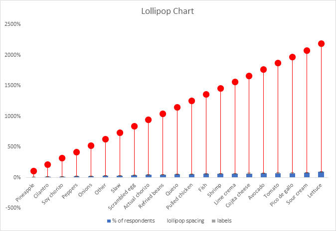
Lollipop charts are alternatives to traditional bar graphs that present their data in more visually appealing ways. They are best used when the differences between the data you are trying to present is quite large. When using a standard bar graph, this can make the chart look very cluttered and impeded the viewers ability to quickly discern what the chart is trying to say. The lollipop chart gets around this issue by forgoing the use of wide bars and instead using small columns ending dots, similar to a lollipop, to show the end point of the data. Ben Neville, a blogger at the data visualization site Tableau.com, has a post that looks much deeper into the topic than I do here.
My Lollipop Chart
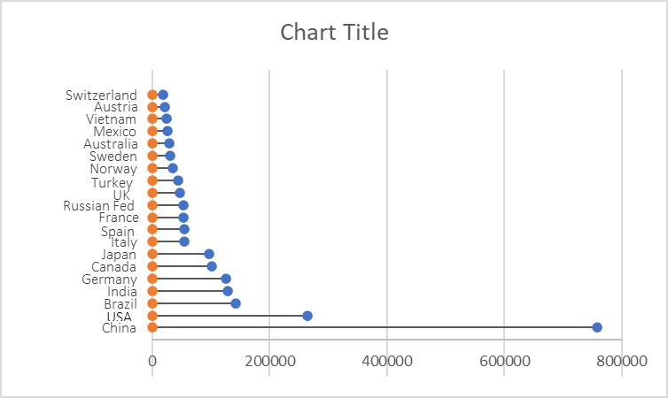
As you all are probably aware of by now, I am very interested in renewable energy, so I have decided to look into the renewable energy capacity of the top 20 producing countries. This data can be found on the International Renewable Energy Agency’s website. I created mine by following the steps outlined in the “Effective Data Visualization” textbook.
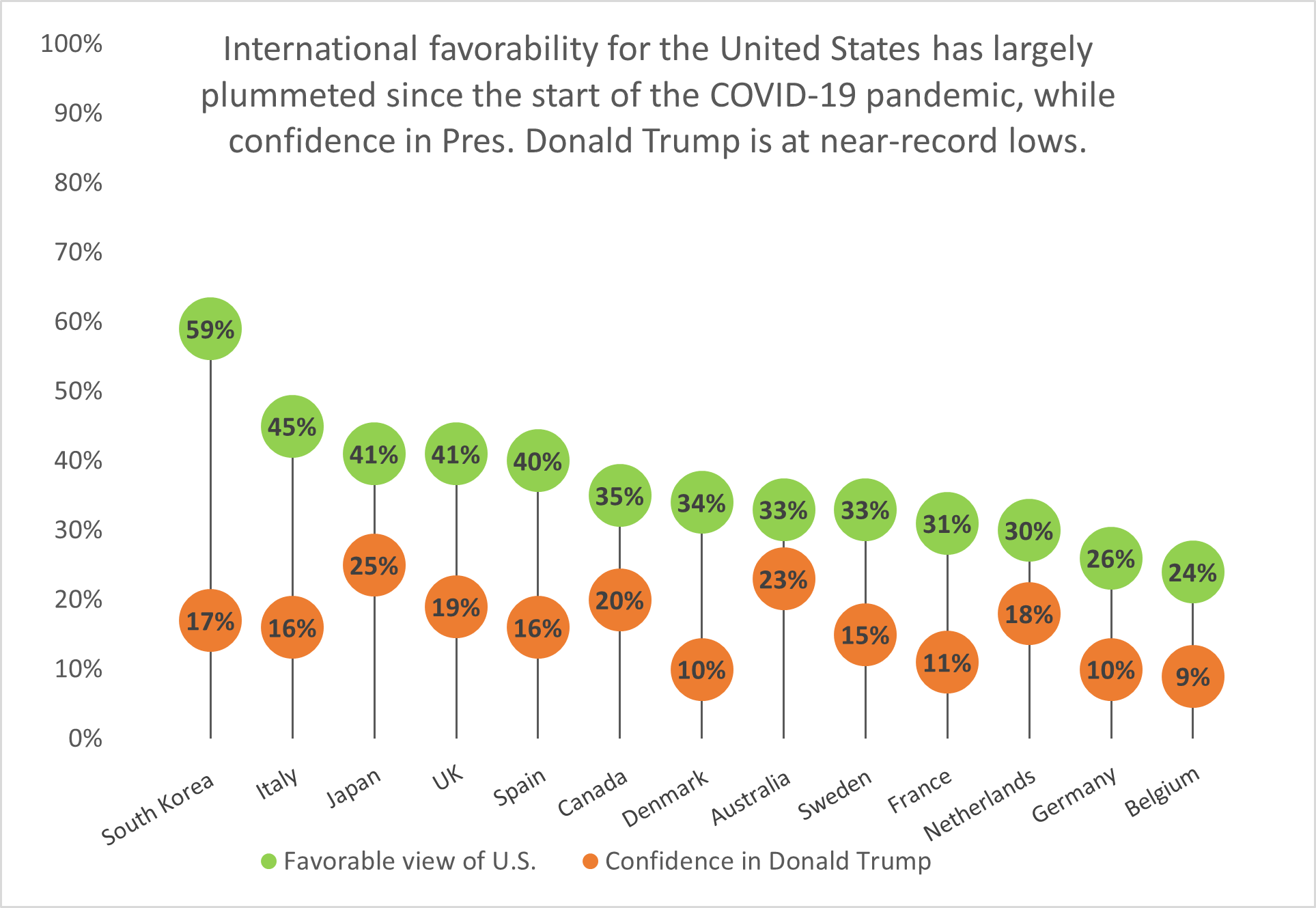
It is no secret that a majority of the United States thinks poorly of President Donald Trump, especially given his handling of the ongoing COVID-19 pandemic among other issues. But what do the nation’s overseas allies think of him? A Pew Research report published on September 15, 2020 details how the United States’ image waned on the global stage since Trump took office, and the numbers are damning.
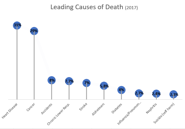
South Korea has the highest approval rating of the United States’ image out of thirteen nations surveyed, yet it holds little confidence in President Trump’s ability to lead the U.S. Fourteen points behind South Korea is Italy with a 45% approval rating, while Belgium holds the least favorable view of the United States and the lowest confidence in Trump.
Lollipop charts like this one are a visually-appealing alternative to column or bar charts because they cut down on the amount of space the chart ink takes up; instead, they focus on the data points themselves and showing how they rank among other categories.
Lollipop Charts, like the name infers, look like little lollipops and is used as a visual infographic. Like many other charts, lollipop graphs are used to compare different variables of data. A lot like a bar graph lollipop charts compare the size and ending points of the data set.
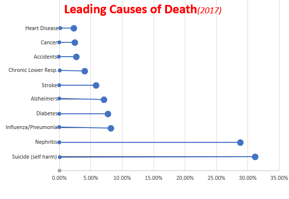
As you can see from both charts above, which I made using Microsoft Excel, lollipop charts can be vertical or horizontal depending on the user’s preference. The pros of using a lollipop chart as opposed to a bar graph are that it puts focus on the end data points rather than the whole graph and it allows for less visual distractions. Colors can still be used but in a minimal way that does not make a chart seem overwhelming. Lollipop charts also allow for sharing a lot of data without losing its visual aesthetics.
While looking at tutorials on how to make a lollipop chart and the different tools available, I came across an article. This article titled “Lollipop charts, Why & how, Story Telling with Lollipops” written by Dario Weitz, is a great resource as to why and how to use a lollipop chart. The author touches base on the pro’s, con’s, and even the similarities of using this specific graph.
Lollipop charts are alternatives to bar and column charts and are used to compare categorial data. They can be vertical or horizontal and are great tools for large datasets or when the numbers are extremely high. In short, these charts include circles at the ends of their lines to highlight the data value. These charts make the visualization easier to read and more appealing as a big chunk is taken out of the bar or column. The most important part of these graphs is where the lines end, telling us the value.
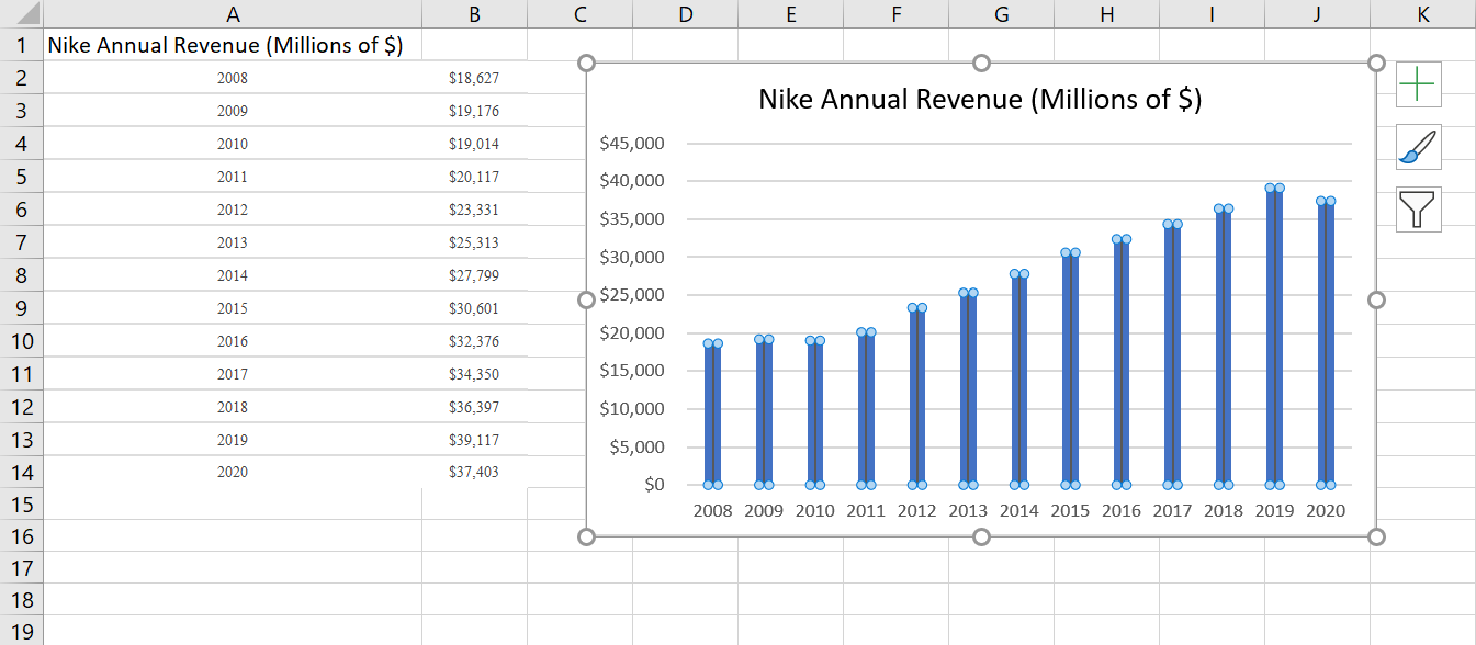
Below is the lollipop chart that I created using a site called https://excelk.com/en/lollipop-chart/. The site included a few steps to turning any bar graph into a lollipop chart. I found that using this website was much easier than following the textbook.
As for my dataset, I found Nike’s annual revenue over the course of 12 years on https://www.macrotrends.net/stocks/charts/NKE/nike/revenue
The first step was to create a simple bar graph by highlighting the dataset and adding error bars by clicking “Add Chart Elements” and “Error Bars”. In order to get the lollipop effect, right click on one of the error bars and click “Format Error Bars”. In the direction group, select “minus”, in the end style group, select “no cap”, and in the error amount group, enter a value of 100% under the percentage field.
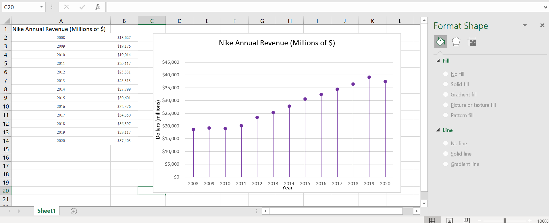
Under the fill and line menu, click on the line which starts with the circle and change the columns to transparent. This way, only a line and circle are visible. Label the x-axis and y-axis and title.
Overall, this site was extremely helpful in creating a lollipop graph. It appears challenging at first, especially in the text, but it was fairly simple. These graphs are great to use for comparative data and are visually more appealing than the typical bar graph.
The lollipop chart is a composite chart with bars and circles. It is a variant of the bar chart with a circle at the end, to highlight the data value. Like a bar chart, a lollipop chart is used to compare categorical data. They are visually different alternatives. For this kind of composite chart, we are able to use more visual elements to convey information. The lollipop chart is to be useful compared to a normal bar chart. It is best to use a lollipop chart if you are dealing with a large number of values and when the values are all high. This kind of graph can replace column and bar graphs.
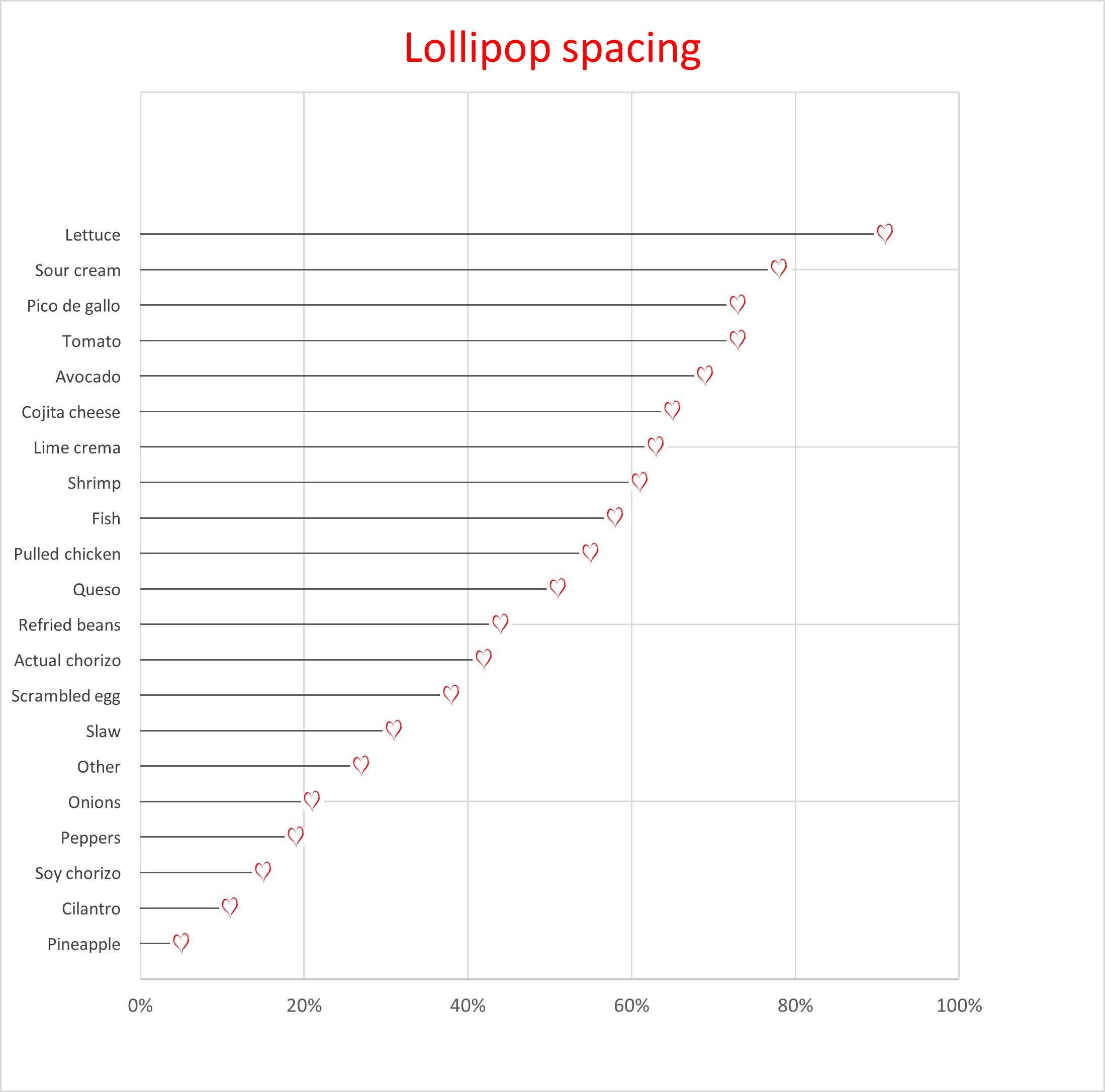
Below is the Lollipop Chart that I created. There is a lot of data in this chart and there are also high percentages. Therefore, a lollipop chart is a great choice to represent this data.
Lollipop Chart By: Taylor Alotto
This is also another example of a Lollipop chart I came across that is a slightly different. This chart was not created by me. I found it so cool how this chart was created and the details that were added. I am linking the website where I found this chart, because the site also shares how to create a lollipop chart. Another cool detail about this site is the graphs are interactive. Check it out! I found the information that was provided on the site useful.
When looking at a comparison infographic, sometimes it’s difficult to determine the standard for comparing two or more things. One solution is to apply a benchmark to the chart, but there are many ways to go about it.
Benchmark comparisons in the news
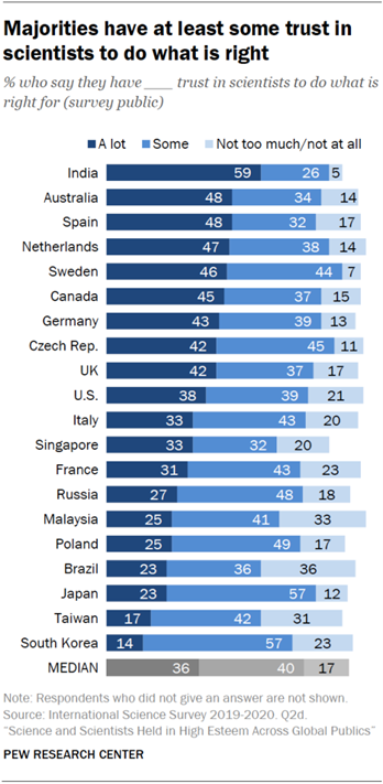
As someone who has a professional interest in the natural sciences, it saddens me to look at the news and discover that not everyone in the United States trusts scientists to do the right thing. More often than not, the media cites misinformation and alleged government propaganda as sources for such distrust. However, I do sometimes wonder what opinion people from other countries have of scientists. Recently, I read a Pew Research Center report about the scientific community’s relationship to the general public, and I was surprised that people in countries like India and the Netherlands have far more trust in their nation’s scientists than the American public has in ours.
On the other end of the spectrum, I found myself wondering why nations like Japan and South Korea are skeptical of scientists. They are among the world’s leaders in technological advances, yet the people don’t seem to trust scientists to do the right thing. When compared to median values, the United States exceeds the benchmark, if only by a slight margin, which gives me hope that the vocal minority that distrusts scientists will one day see their error and learn to trust science.
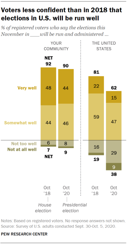
Another way of showing a benchmark is by comparing positive and negative values to determine favorable perspectives. With the United States presidential election fast approaching, the public is more divided than ever on whether or not this year’s elections will be run well. It is likely that a divide in partisan politics and factors like the current COVID-19 pandemic and ongoing police brutality protests are responsible for this immense discourse.
Based on Pew Research Center’s data, I estimate that conservative-leaning voters believe that the election will be handled well. On the other hand, liberal-leaning voters believe that this year’s election will run into a series of blunders or be subject to manipulative interference. As someone who wants to see Donald Trump and his alleged enablers voted out for the sake of the rest of the nation, I am hoping for the best but preparing for the worst.
What about comparisons related to topics I enjoy?
Even when I am not catching up on the news, I still enjoy looking at comparisons for the things I love. For example, I’ve been playing Square Enix’s Final Fantasy XIV Online (shorthand: “FFXIV”) for about a year, and have a strong interest in joining the small community of players who spend most of their time on high-end or difficult pieces of content. When a new piece of content comes out, one of the first places I go to look for information is FF Logs. Their tools analyze combat data and give players a sense of their overall performance and where they can improve. They also have statistical charts that show performance averages for each of the game’s 17 combat classes (jobs). For example, one of the most difficult “raid dungeons” currently in the game goes by the name of “Eden’s Verse: Refulgence.” (shorthand: “E8”). Raids in FFXIV typically have two modes of difficulty, normal and “savage,” with the exception of specially-themed “ultimate” raids. The community typically pays attention to statistics and ranking for savage raids. In the first few weeks of release, Eden’s Verse: Refulgence (Savage) (shorthand: E8S) proved to be a difficult challenge for most raid groups.
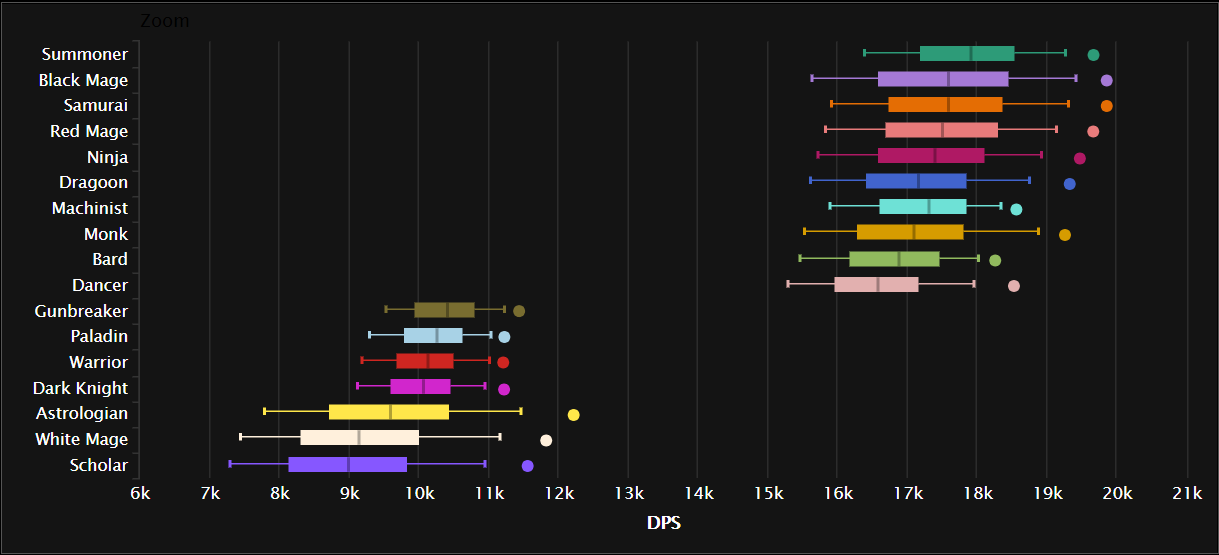
A box plot comparing the minimum, lower quartile, median, upper quartile, and maximum damage per second (DPS) for all 17 jobs in one of Final Fantasy XIV Online’s more difficult fights. Source: FF Logs.
Combat jobs in FFXIV are divided into three major roles: tanks, healers, and damage per second (DPS). The box plot chart above shows an aggregate ranking for job performance in E8S over the course of two weeks across all percentiles. DPS jobs typically put out far greater damage than tanks or healers, with magic-based DPS jobs having the highest damage output. The only exception to that rule is the samurai job, which is typically described as being a selfish DPS job that brings little party support to a fight as it deals heavy hits at melee range.
Viewed from a different perspective– say, comparing the maximum and minimum percentiles for E8S damage– certain trends seem to appear among the 17 jobs, and it reflects in how well the player performs in the fight. The best players in the world generally fare much better and clear the raid faster than players who barely have a grasp of their jobs or exhibit poor performance.
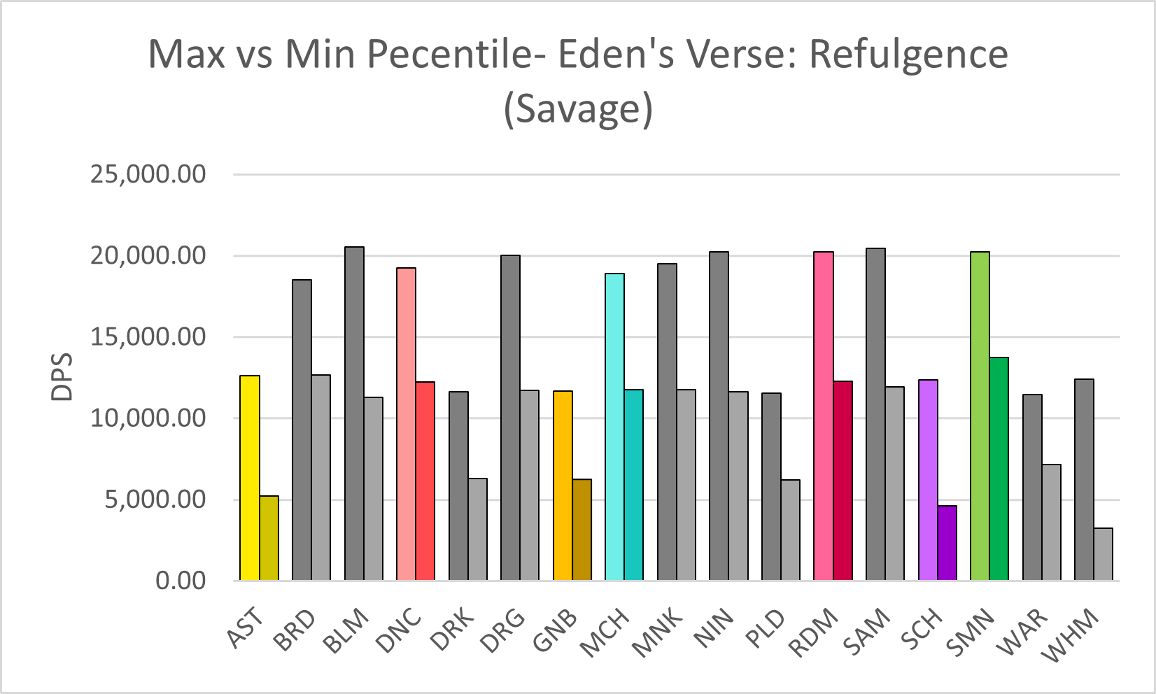
A chart comparing the damage per second (DPS) output for E8S, in the maximum and minimum percentiles, across all 17 jobs in Final Fantasy XIV Online (job abbreviations are used). The jobs I play the most are highlighted in color. Source: FF Logs.
Compared to others who play the same jobs as me (color-highlighted in the chart above), I would say that I am somewhere between the two extremes. However, in the case of the job I play the most, red mage, I tend to lean toward the lower end of the spectrum. I recall running a four-person dungeon once with some of my friends a few months before the COVID-19 pandemic exploded. One of them, who went in with a tank job, had a third-party tool open to analyze everyone’s damage output in real-time (which is against the developer’s terms of service, but Square Enix doesn’t crack down on third-party tools if players don’t discuss them publicly in-game), and once the program crunched the numbers, he uploaded the data to FF Logs and sent me a link to the log over Discord. As I looked it over, he laughed in voice chat and likely shook his head at how low my damage output was. Another one of my friends, a healer who did significantly better than me, pointed out that at least I knew my spellcasting priority rotation as a red mage and the random black mage who got matched with our three-player party did less damage than me. I didn’t care that my damage output was sub-par, though. I was happy just to run content with my friends.
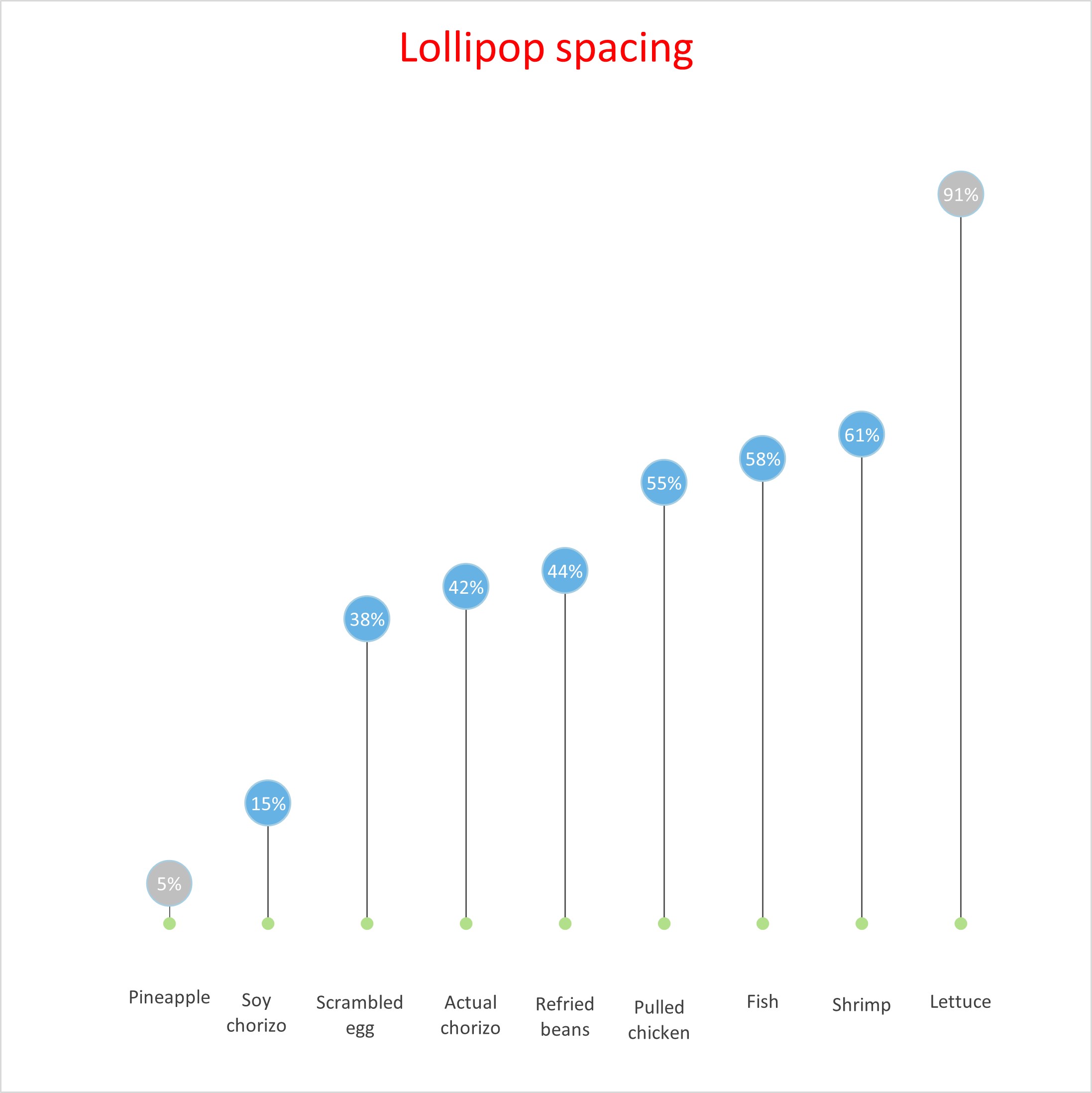
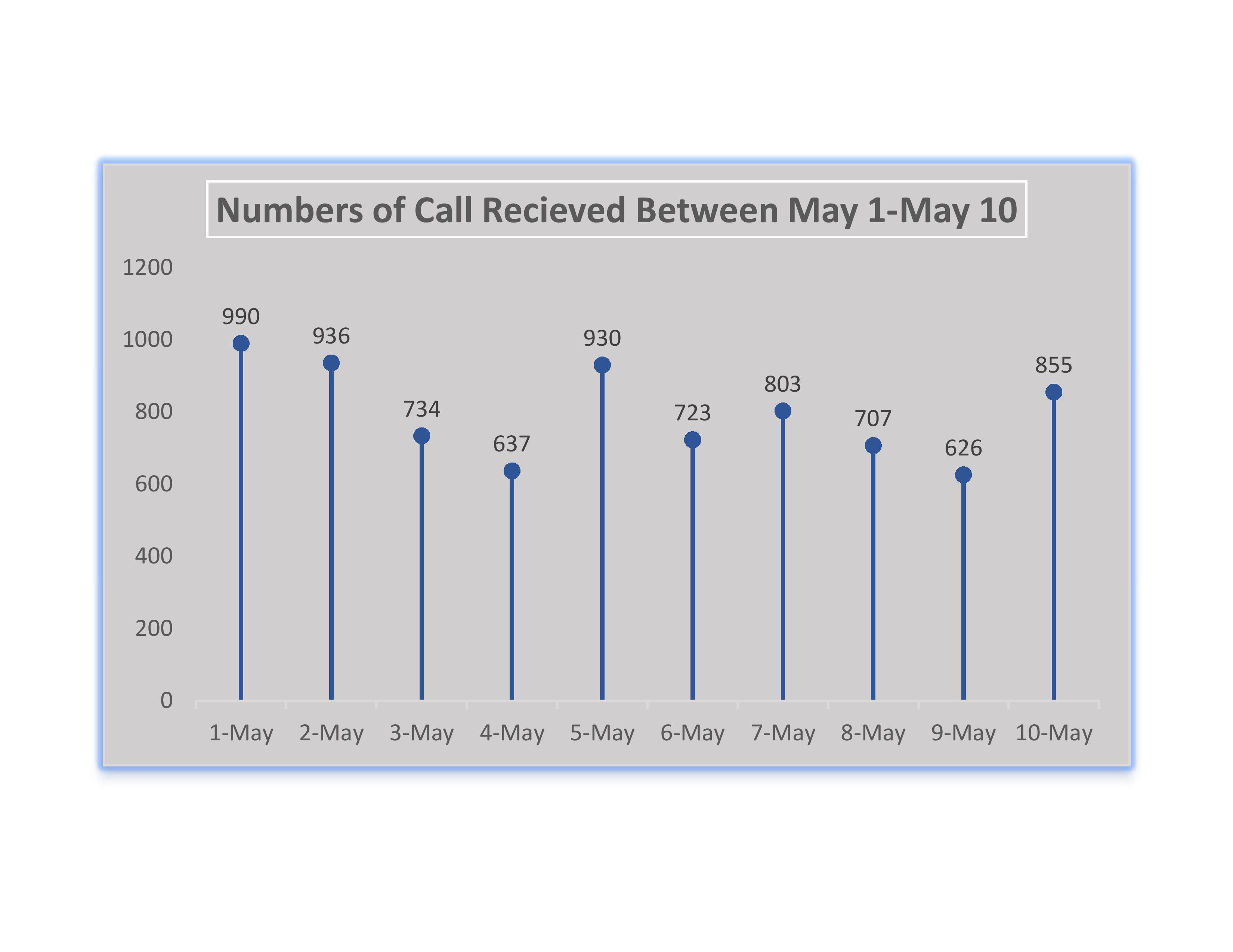
A lolipop chart is a type of modified bar graph. These charts can either be visually attractive or just confusing depending on your data. It is very important to recoginze what data you have when it comes to creating charts and this is also true with lolipop charts. If your data has high number values then a bar graph will look too agressive with columns being too high. This is when a lolipop chart should be used. Instead of a traditional bars in a bar graph, a thin bar will replace the columns and the thin line will have a bulbous end. Below is a lolipop chart representing a high amount of calls that a company recieved within 10 days.
This week we all created lollipop charts. While looking online for different explanations on how to make a lollipop chart, I came across a really easy one. It did not explain the steps clearly towards the end but I figured it out with the textbook for the last few steps. Compared to the textbook this website: excelk.com went straight to the end product in a few steps.
A lollipop chart is just like a bar graph, but easier to follow when you need to display a large number of values and when those values are high. This type of chart is also more appealing to look at.
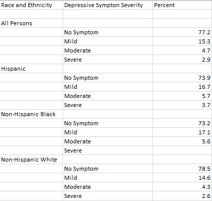
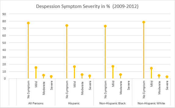
For my data set, I was looking through the CDC website and came across Depression in the US Household Population. They had graphs displaying the percentage of symptoms persons of ages 12+ with depression. I picked to use race and ethnicity as my x-axis vs gender, and ages. But also the PDF form which included the data set.
I will say this lollipop graph was pretty easy to make thanks to the website I used. The only problem I came across is trying to change the colors on each of the x-axes ( I wanted no symptom, mild, moderate, and severe on the graph to have their own color to better distinguish the severities.) I also wanted to add data labels, but I could not figure out how to.
This graph shows persons of ages 12 and over by the severity of depressive symptoms and their race and Hispanic origin in the US, 2009-2012.
A lollipop graph is a visualization that is great for comparing up to three different types of data such as year to year or before, during and after. Typically, a lollipop graph can be used where a bar graph would be used and is often more visually appealing. Lollipop graphs are not ideal when you are using a dataset with stacked-bars or with data that has very similar end results. An example of this would be an experimental dataset with thousands of results ranging from 0.00 to 0.05. It would be extremely difficult for an audience to differentiate what exact values the bars are representing.
How to create a lollipop graph…
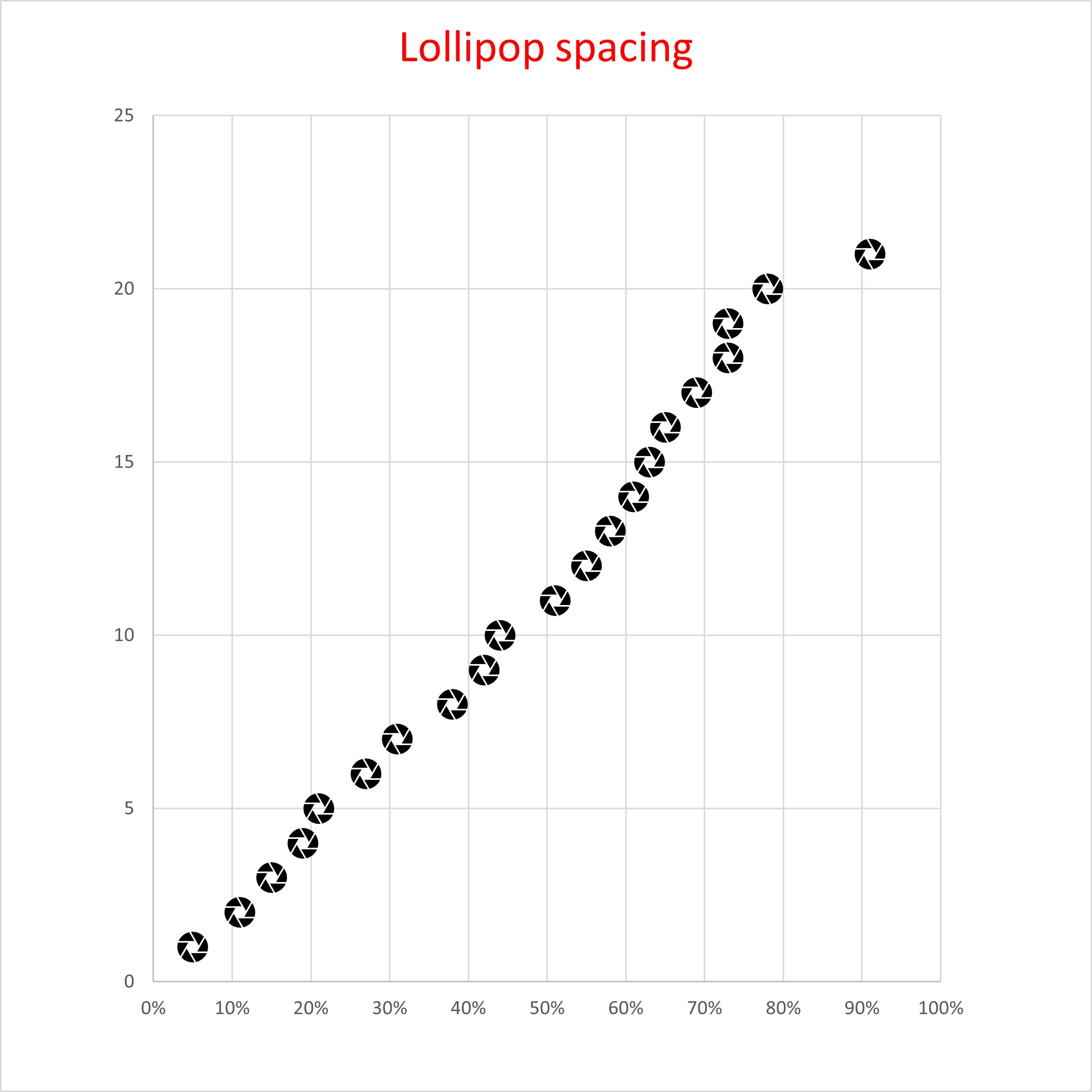
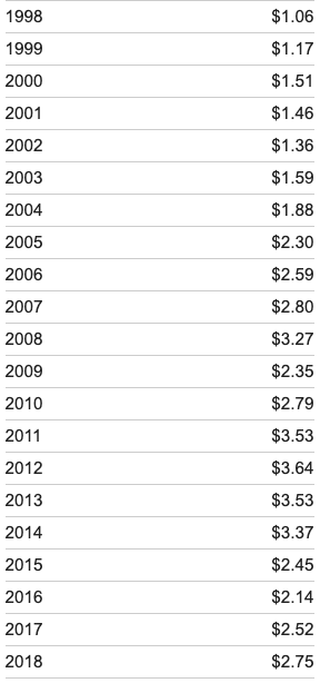
When looking for a dataset to create a lollipop graph with it is important that you choose one that is appropriately measured by a scatter plot, as this is used to create your final visualization. Keeping this in mind, I selected to create my visual using the average gas prices over the past twenty years, this dataset is pictured below.
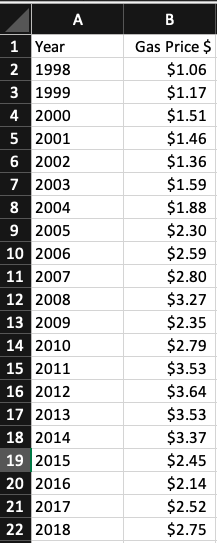
After selecting a dataset I moved into Excel to begin creating my lollipop graph! First, you should translate your selected dataset into a table in Excel, as pictured below using my example dataset.
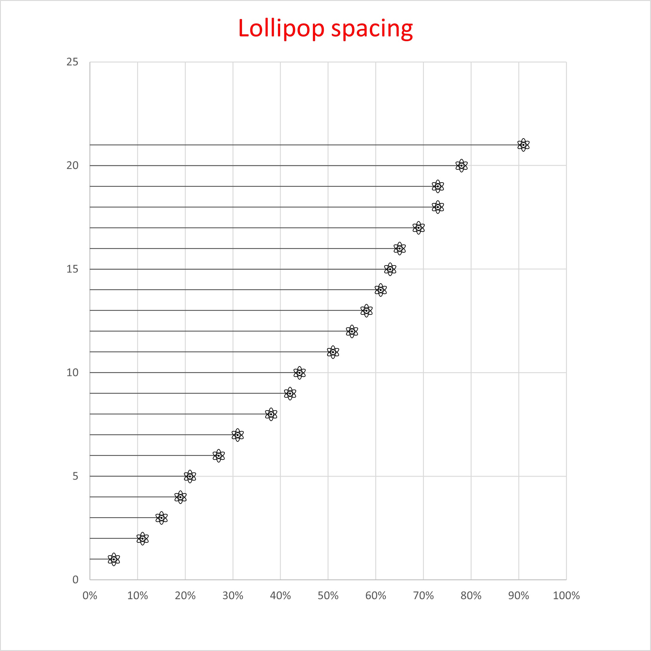
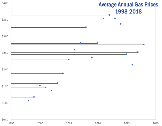
Once you have your dataset translated into an Excel table, you will insert a basic scatter plot graph to represent your data and make a few other formatting changes. These will include adding horizontal error bars, changing the error bars direction & altering the error amount. Once you have completed this your lollipop graph should look similar to the one I produced using my dataset below.
As you can see, a lollipop graph is a much more visually appealing when compared to a simple bar graph. While it may be a little more work to create, it can make a huge difference in what your audience takes away from your visualization.